Picking a metallic finish for your stickers sounds straightforward until you hold a gold sample next to a rose gold one and realise they are speaking to completely different audiences. The foil colour you choose communicates your brand’s personality before anyone reads a word of your label. Get it right and the sticker feels inevitable. Get it wrong and even a beautifully designed label can undercut the product it is meant to sell.
This guide runs through each finish available on Paperlust’s gold foil stickers, explaining what it signals, which brand types and colour palettes it suits, and what background stock it pairs with. If you want a broader primer on how hot foil stamping works or when to use foil versus standard print, the foil stickers guide covers that ground. Come back here when you already know you want metallic and need to decide which one.
At a glance
Which metallic finish should you choose?
A quick decision table before you read the detail.
- Gold: premium, traditional, warm-toned brands and gifts. Suits cream, white, navy, forest green, black backgrounds.
- Rose gold: romantic, modern-luxury, beauty and lifestyle. Suits blush, dusty rose, warm white, soft grey.
- Silver: contemporary, minimal, tech or industrial brands. Suits white, charcoal, navy, cool grey, black.
- Copper: artisan, earthy, handcrafted feel. Suits kraft brown, terracotta, olive green, off-white.
- Holographic: youthful, novelty, entertainment, cosmetics. Suits black or dark backgrounds for maximum prismatic effect.
- All five finishes are available from $0.25 per unit (inc. GST), minimum 10 stickers, produced in Melbourne in 3-5 working days.
- The 10-unit minimum sits well below the 500 to 1,000 units most Australian foil printers require, so small-batch, test, and event runs are genuinely practical.
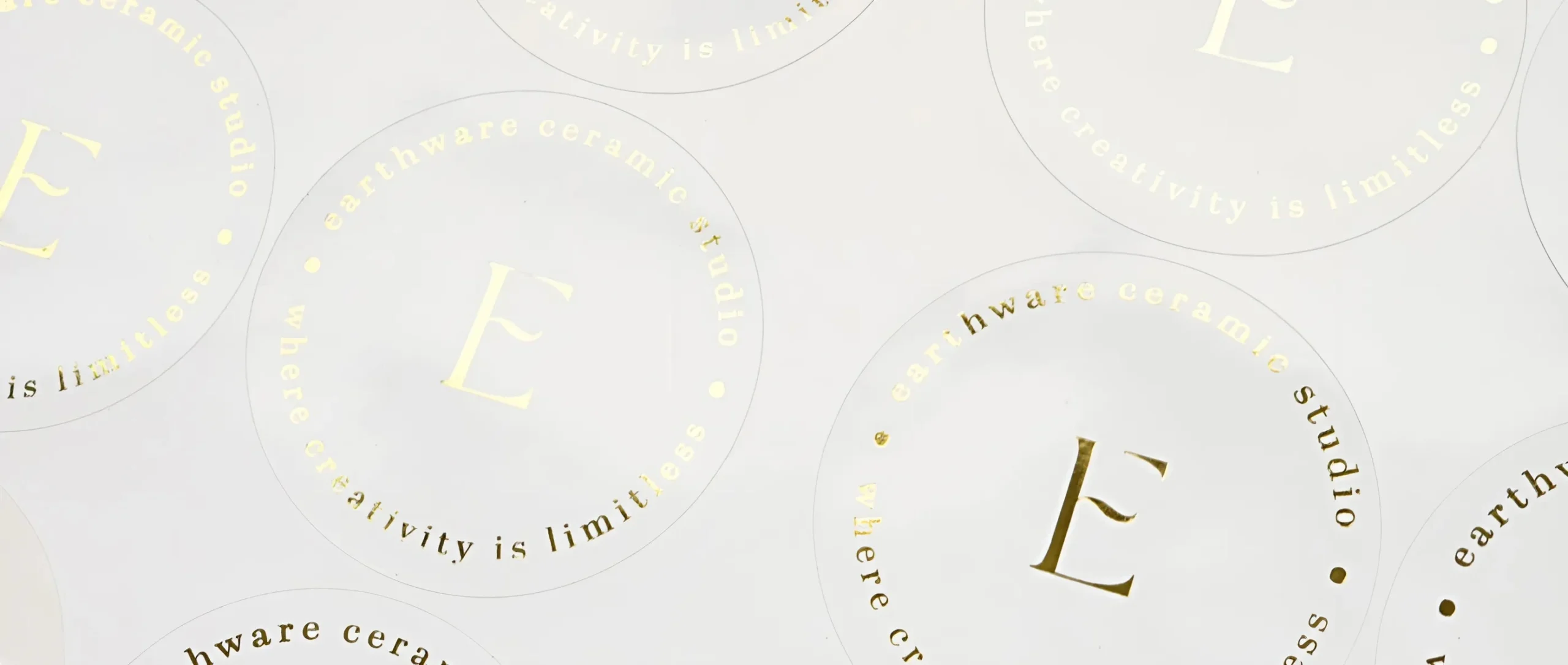
Gold Foil: The Classic Premium Statement
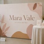
Gold is the default choice for a reason. It carries centuries of cultural shorthand for quality, celebration, and occasion. On a product label, a gift tag, or a bottle seal, gold foil communicates that something inside is worth the price.
What it signals: Prestige, warmth, tradition, and craftsmanship. Gold reads as celebratory rather than cold, which is why it thrives on food products, candles, chocolates, spirits, and ceremonial items. It is the finish that makes a plain white box feel like a gift.
Brand types it suits: Established luxury brands, boutique food and beverage producers, artisan candle makers, florists, gift hamper businesses, jewellers, and anyone whose core value proposition is quality or occasion. It also works well for B2B businesses that want to project authority, such as law firms or private client services, where gold leans dignified rather than flashy.
Colour palettes that pair well: White and cream are the most reliable backgrounds because they let the foil carry all the visual weight. Deep navy and forest green create a classic high-contrast look that reads instantly as premium. Black is the highest-drama option, particularly effective for spirits, perfumes, or cosmetics where the label is part of the product’s luxury cue. Avoid cool-toned backgrounds like slate or pale blue, where gold can look slightly muddy rather than warm.
Best use cases: Product labels for candles, honey jars, olive oil, boutique wine or spirits, packaging seals, gift tags, thank-you stickers, brand identity labels for premium packaging.
Rose Gold Foil: Warm, Romantic, Modern Luxury
Rose gold sits at the intersection of warmth and softness. It arrived in the mainstream around 2014 and never fully left, largely because it occupies a space that neither gold nor silver can. It is premium without being imposing, feminine without being limiting, and warm without being traditional.
What it signals: Modernity, romance, elegance with personality. Rose gold tells a customer that a brand is considered, tasteful, and in touch with what feels current. It is less authoritative than gold but more approachable.
Brand types it suits: Beauty and skincare brands, wedding-adjacent businesses (stationery studios, florists, event stylists), jewellers targeting younger buyers, lifestyle brands, boutique clothing or accessories labels, and personal care products. It is also the finish of choice for small-run wedding favour stickers and envelope seals, where couples want metallic warmth without the formality of classic gold.
Colour palettes that pair well: Blush pink is the obvious partner but not the only one. Dusty rose, warm white, champagne, and soft sage all work beautifully. Rose gold also holds its own on pale grey backgrounds, where the warmth of the foil provides a gentle contrast. Avoid saturated or cool-dominant palettes, where the subtle warmth of rose gold reads as an afterthought rather than a deliberate choice.
Best use cases: Skincare and beauty product labels, wedding favour tags, boutique packaging, baked-goods stickers, personalised gift labels, subscription box branding, craft business packaging.
Silver Foil: Clean, Contemporary, Versatile
Silver is the most neutral of the metallic finishes, which makes it the most versatile. It reads as modern and precise without carrying the traditional warmth of gold. In the right context it can look expensive, technical, or elegantly minimal depending entirely on the design it supports.
What it signals: Clarity, precision, modernity, and sleekness. Silver says the brand is current and considered. It does not carry the celebratory warmth of gold, but that is often exactly what is needed. For tech companies, professional services, or products where premium means clean rather than opulent, silver foil is the stronger choice.
Brand types it suits: Technology brands, healthcare and pharmaceutical businesses (where silver reads as clinical and trustworthy), premium food packaging where the brief is modern rather than traditional, cosmetics targeting a younger or more minimalist buyer, and any brand where the packaging’s primary job is to feel precise and high-end rather than warm. Silver is also the go-to finish for businesses that use cool or greyscale brand palettes.
Colour palettes that pair well: White is the most reliable base because the contrast is sharp and clean. Charcoal, dark grey, and black backgrounds make silver feel almost chrome-like and highly contemporary. Navy can work well where there is enough separation between the deep blue and the cool metallic. Avoid warm-toned backgrounds like cream or sand, where silver tends to look out of place.
Best use cases: Tech product labels, cosmetics, health supplements, professional certification stickers, high-end packaging for minimal brands, premium bottle seals for beverages positioned as modern rather than traditional.
Silver foil sticker on clean white product packaging, showing the sharp, modern contrast.
Shot list: Notion 371cf489-eda5-8142-ad77-d6db8a2a117e
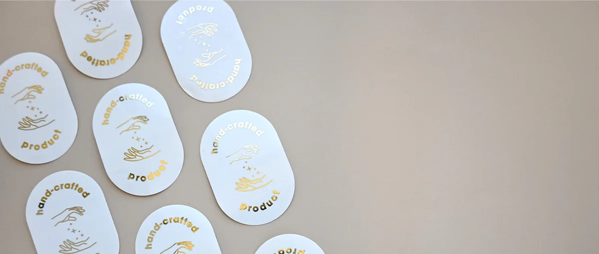
Copper Foil: Artisan, Earthy, Handcrafted Warmth
Copper is the underused finish in the metallic range, which is exactly its advantage for brands that want to stand out. It has the warmth of gold but with a richer, earthier undertone that immediately reads as artisan and handmade. It is the finish that suits markets where craft and provenance matter.
What it signals: Craftsmanship, authenticity, earthiness, and a slight sense of the handmade. Copper performs best in contexts where the product story involves small-batch production, local sourcing, or artisan skill. It does not pretend to be gold and is better for it.
Brand types it suits: Small-batch food producers, specialty coffee and tea brands, craft breweries and cideries, handmade soap and candle makers, zero-waste or eco-conscious brands, independent bakers and cake makers, and any brand whose identity is built around process and craft rather than scale. Farmers market stallholders and small food businesses with a strong provenance story often find copper does more work than gold.
Colour palettes that pair well: Kraft paper is the natural partner for copper foil. The warm-brown background and the rich metallic tone share the same earthy register and the combination is immediately legible as artisan. Terracotta, olive green, off-white, and warm cream also work well. Dark brown or deep forest green backgrounds create a heritage feel. Avoid cool or pastel palettes, where copper’s earthiness fights rather than harmonises.
Best use cases: Artisan food labels, small-batch candle packaging, craft brewery bottle labels, specialty coffee bags, handmade product packaging, eco-conscious gifting brands.
Holographic Foil: High-Impact, Novelty, Entertainment
Holographic is the most visually dynamic finish in the range and also the most context-dependent. Done right, it is extraordinary. Used in the wrong setting it can undercut the perceived value of a product faster than any other finish choice. The holographic stickers guide covers the full strategic context, but the short version for this comparison is that holographic works as a deliberate statement, not as a default upgrade.
What it signals: Energy, novelty, youthfulness, collectibility, and spectacle. Holographic foil catches light in a way no other finish does, shifting through the spectrum as the angle changes. For brands where excitement and visual interest are the product, this is a major asset. For brands positioning on quiet luxury or professional authority, it becomes a liability.
Brand types it suits: Youth-facing lifestyle and streetwear brands, gaming and entertainment companies, beauty brands targeting a playful or Gen Z buyer, collectible and limited-edition product runs, event merchandise, candle or cosmetics brands with a maximalist aesthetic, and any business where the sticker itself is part of the entertainment.
Colour palettes that pair with it: Dark backgrounds are essential for making holographic foil read as premium rather than cheap. Black is the strongest base because it lets the colour-shifting effect take centre stage with no competition. Deep navy and forest green also work. Light or white backgrounds dilute the visual effect and can make the finish look washed-out rather than dynamic.
Best use cases: Merchandise labels, gaming or entertainment product packaging, beauty advent calendars, limited-edition product runs, event stickers, youth fashion hang tags, cosmetics targeting a maximalist audience.
Holographic foil sticker on a dark background, showing the rainbow prismatic shift.
Shot list: Notion 371cf489-eda5-8142-ad77-d6db8a2a117e
Choosing Your Background Stock
The foil finish is only half of the equation. The material underneath shapes how the metallic colour reads.
White matte stock suits all five finishes and is the safest default. It provides clean contrast and lets the foil carry the design.
Clear stock creates a no-label look where only the foil elements are visible. Gold on clear is particularly effective for glass product jars or bottles, where the sticker appears to float. Rose gold on clear works well for cosmetics.
Selective foil versus full coverage is the other key variable. Selective foil, where metallic accents sit on top of a full-colour printed design, is versatile and adds dimension without committing to an all-metallic aesthetic. Full foil coverage is higher-impact but more demanding of the design. For a first foil order, selective foil on a specific logo or text element is usually the lower-risk starting point.
Selective Versus Full-Coverage Foil
Spot or selective foil applies the metallic finish only to designated elements, typically a logo mark, a script typeface, or a border detail. The rest of the sticker is standard digital print. This approach works across all five metallic colours and is particularly effective for brands that want to add one premium signal to an otherwise clean design.
Full-coverage foil applies the metallic finish across the whole sticker face. It is high-impact and instantly visible, but it demands a strong, simple design. Overly detailed artwork or fine typography can be difficult to read when rendered entirely in foil. For first-time foil orders, selective foil is generally the more versatile choice.
Side-by-side: a selective-foil sticker (logo only in gold) versus a full-coverage gold foil sticker of the same design.
Shot list: Notion 371cf489-eda5-8142-ad77-d6db8a2a117e
What to Order
All five foil colours are available on Paperlust Print Shop’s foil stickers in Australia, from $0.25 per unit (inc. GST) with a minimum of 10 stickers per design. Production runs 3-5 working days in our Melbourne studio. Both selective foil and full-coverage options are available, on white matte or clear stock.
If you are ordering stickers for a wedding, a product launch, or a small-batch run where the quantity is low, the 10-unit minimum is a genuine advantage. Most Australian printers offering hot foil require 500 to 1,000 units, so a boutique brand or a couple would normally have to commit to hundreds of stickers just to access a foil finish. A 10-unit minimum means you can trial gold against rose gold, or order exactly what a small run needs, without overordering. For styling your wedding favour labels, envelope seals, or bonbonniere packaging with foil finishes, see our guide to wedding favour stickers in gold and rose gold.