Letterpress business cards are the only format where people physically stop to ask about your card. The debossed impression, the weight in the hand, the way the design sinks into the fibres of the stock: it registers as something made rather than manufactured. If that is the result you are after, this guide will help you understand exactly what letterpress is, which stocks carry the impression best, how it compares to foil and embossing, and what your artwork needs to do to survive the press.
- Letterpress creates a recessed (debossed) impression pressed DOWN into the stock. The design is sunken, not raised.
- Best stocks are thick cotton or duplex-bonded card at 550gsm or above. Thin or coated stocks crush rather than hold the impression.
- Letterpress differs from: embossing (design pushed UP, raised), flat foil (metallic flush to surface, no texture), and raised foil (metallic and raised, completely separate process).
- Blind deboss uses no ink; the impression alone carries the design in light and shadow. Coloured ink on the impression adds contrast.
- Design minimum line weight: 0.5pt or above. Fine serifs and reversed-out text below 8pt will not hold a clean impression.
- At Paperlust, duplex business cards offer the thick bonded stock that letterpress-style deboss finishes demand, starting from $2.69 inc. GST.
What letterpress actually is (and what it is not)
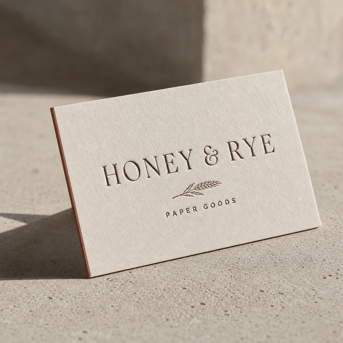
The term “letterpress” describes a printing process, not a finish. A plate or type is set, inked, and pressed under high mechanical pressure directly into the paper surface. The result is a debossed impression: the design sits below the level of the surrounding card. It is recessed. It catches shadow. Run a fingernail across it and you feel the valley in the stock.
This is the defining characteristic. The design goes DOWN.
That single fact separates letterpress from every other premium finish:
- Embossing pushes the design UP from below. The result is raised and proud of the surface. Embossed cards have a bumpy, tactile foreground. The opposite of letterpress.
- Flat foil applies a metallic film flush to the surface. No texture change, no impression. The card reads as smooth with a mirror-bright element.
- Raised foil is both metallic and elevated above the surface. It is a hybrid of foil application and a relief build-up process. Raised, shiny, and dimensionally proud.
When someone in Australia searches for “letterpress business cards,” they are almost always looking for that deep, pressed-down impression on thick stock. The confusion arises because embossed cards and raised-foil cards are often marketed under the same “tactile premium” umbrella. They are genuinely different products with different plate requirements, different stocks, and a completely different feel in the hand.
Blind deboss vs. coloured ink letterpress
Within letterpress itself, there are two main approaches:
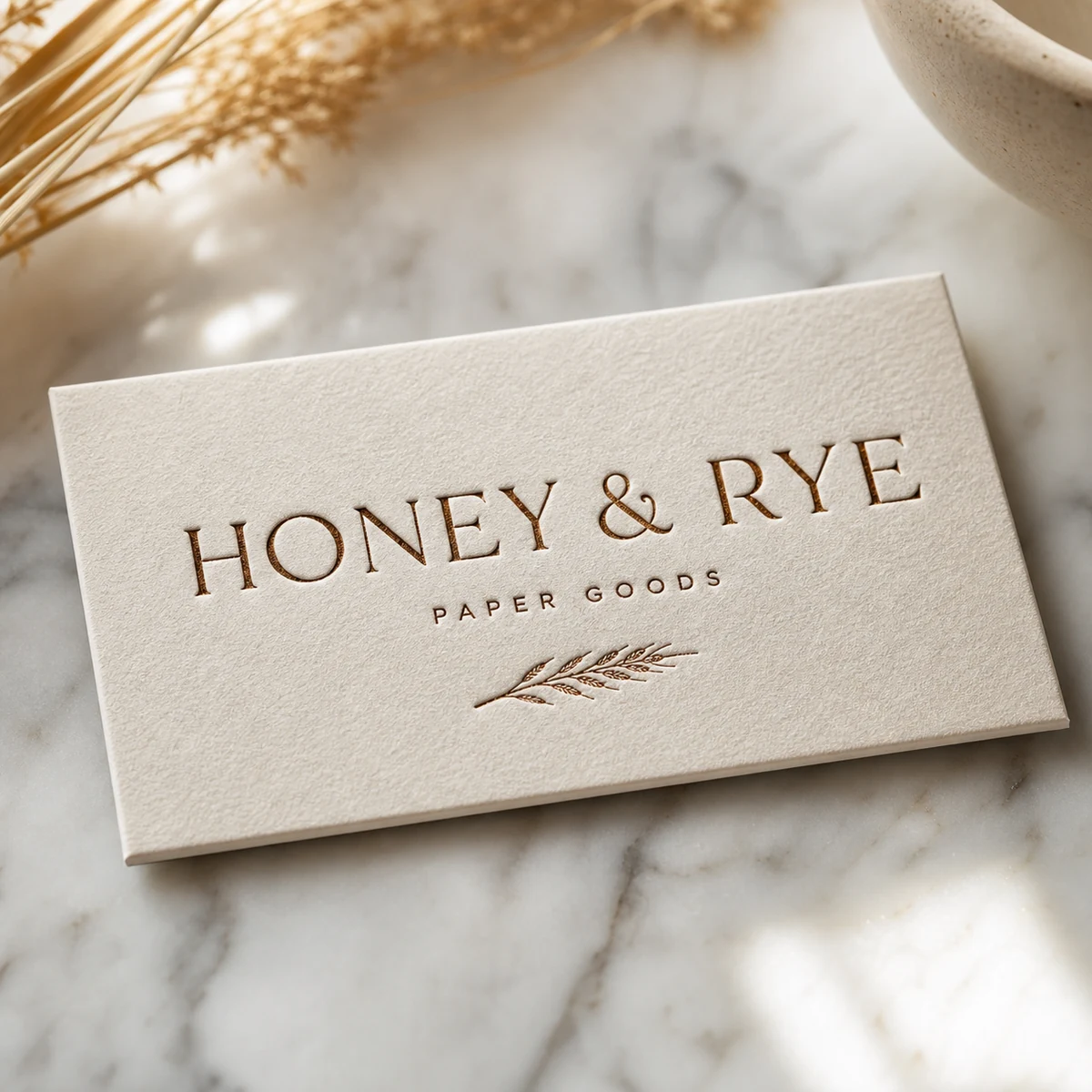
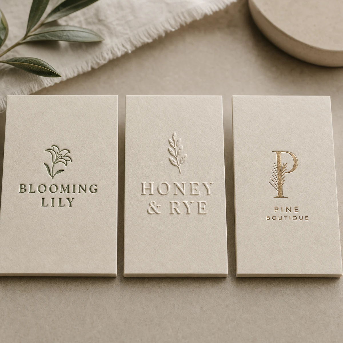
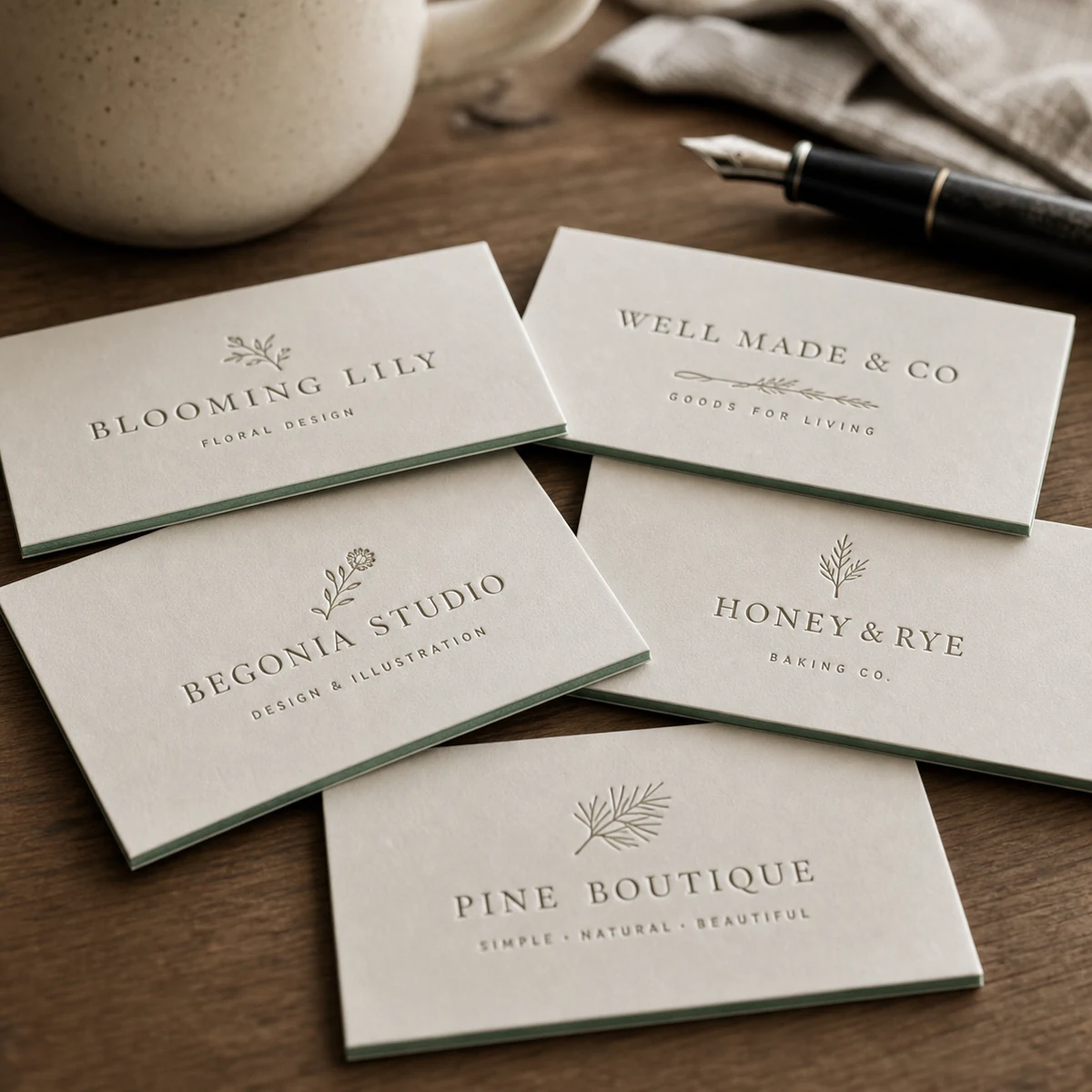
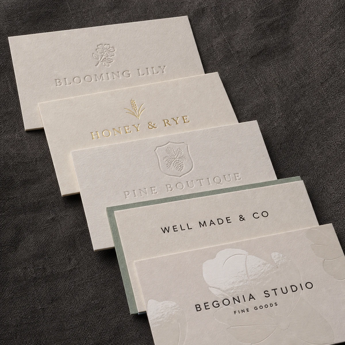
Blind deboss uses no ink at all. The plate presses into the cotton and leaves only an impression. The design exists as shadow and depth. On pale or natural cotton stock, the effect is extremely refined. It reads as deliberate restraint. Blind deboss works best when the design is simple, the impression is deep, and the stock is natural-toned rather than bright white.
Inked letterpress adds a hand-mixed ink into the impression. The colour fills the debossed area, giving contrast alongside texture. This is the more commonly recognised version: a navy or forest-green monogram pressed into heavy cotton, the ink sitting slightly lower than the surrounding surface. The ink tonal range is broad, from muted earth tones to dense, opaque darks.
A card can carry both. A monogram in blind deboss on the front with a business address in a single inked colour on the reverse is a common combination.
The stock question: why cotton and duplex card
Letterpress requires thick, fibrous, compressible stock. The impression is made by force, and the paper needs enough body to deform under the plate and stay deformed. Thin or coated card gives you two problems:
- The impression is shallow or indistinct, because the stock has nowhere to compress into.
- The card can warp or crack at the impression point under sustained pressure.
Cotton paper is the classic answer. Made from cotton fibre rather than wood pulp, it is significantly softer, more porous, and more compressible than conventional coated card. It accepts deep impressions cleanly and holds them. Over time it does not yellow or become brittle in the way wood-pulp stock does. The natural warmth of cotton fibre (usually a slightly creamy, off-white tone) suits the handcrafted quality of the letterpress process.
At Paperlust, letterpress cards start at 300gsm, with Wild Cotton Double Thick at 600gsm as the premium option.
Duplex card is a different construction that achieves similar weight: two separate paper stocks bonded together, back-to-back, into a single substantial card. Because the two plies can be different stocks, the cut edge shows a fine two-tone seam where the bonded layers meet, and you can mix stocks on either face, which opens up design options not available on single-ply stock. A duplex card at around 600gsm bonded weight holds a deboss impression as well as heavy cotton card does. Our duplex business cards at Paperlust start from $2.69 inc. GST and are available in matte, linen, metallic, kraft, and colour stock combinations.
Letterpress vs. foil vs. emboss: a decision guide
| Finish | Effect | Direction | Best for |
|---|---|---|---|
| Letterpress (deboss) | Tactile impression; shadow and depth | DOWN (recessed) | Heritage brands, minimalist identities, premium solo-colour designs |
| Embossing | Raised relief; foreground texture | UP (raised) | Logos that need visual prominence, crest and seal motifs |
| Flat foil | Metallic mirror finish, flush to surface | Flat (no texture change) | Gold or silver brand elements; shine without texture |
| Raised foil | Metallic and proud of the surface | UP + metallic | High-impact luxury; maximum visual drama; Paperlust duplex cards |
| Spot UV | Clear gloss sheen over selected areas, flush | Flat (sheen-only differential) | Contrast between matte and gloss on same card face |
| Scodix | Digital clear or colour polymer raised finish | UP (polymer relief) | Fine-detail 3D texture on short-run premium cards |
The choice is simpler when you work backwards from the brand. Letterpress suits identities built on restraint, craft, and longevity. Law firms, architects, bespoke consultants, independent designers, studios. Foil suits identities where metallic colour is part of the brand language. Emboss suits identities where a logo or crest needs to be the tactile focal point. These are not competing options so much as different tools for different brand statements.
Design tips for a clean letterpress impression
Letterpress is unforgiving of poorly prepared artwork. The plate presses with uniform force, so every element in your design will be pressed simultaneously. Fine details that would print cleanly with digital ink can fail completely under the press.
Line weights and type
- Minimum line weight: 0.5pt. Anything thinner risks dropping out entirely or printing as an uneven smear. For safety, build key elements at 1pt or above.
- Serif fonts: letterpress excels with serifs, but only at sufficient size. A well-cut serif at 10pt or above will show the fine strokes clearly. Below 8pt, the thin strokes in the serif will fill in or disappear.
- Sans-serif fonts: more forgiving at smaller sizes because the strokes are more uniform in width. A clean sans-serif at 7-8pt will survive the press better than a fine-stroke serif at the same size.
- Reversed-out text (white on dark): the ink must not fill in the counters of the letters. Keep reversed-out type at 9pt minimum, using a rounded or open-counter typeface.
Layout and whitespace
Letterpress rewards simplicity. A design that works as a digital card with eight elements and three font sizes will be chaos as a letterpress card. The impression demands space around it to register.
The strongest letterpress cards carry one primary element (a monogram, a logo, a single word) with supporting text in a secondary position. The impression needs room to breathe. Generous margins, a single type family, a maximum of two text weights.
Avoid fine-detail illustration in vector form unless it has been tested at the actual scale. A detailed crest that looks sharp as a digital print will lose its fine-line detail under the press.
Colour
For inked letterpress, stick to one or two Pantone-matched colours. Letterpress is not a CMYK process. Colour is mixed by hand from Pantone references, and registration across multiple colours requires care. Two-colour letterpress on heavy cotton is achievable and beautiful. Four-colour process is not a letterpress application.
For blind deboss, colour is irrelevant. The impression is the design.
When letterpress is and is not the right call
Letterpress business cards are the right call when:
- The brand identity is built around craft, precision, or heritage. Architects, law practices, bespoke tailors, fine jewellers, independent studios.
- The card is meant to be kept, not collected and filed. Letterpress cards end up on desks, pinned to boards, and kept in wallets longer than standard cards.
- The design is genuinely minimal. If the artwork cannot hold up at one or two elements, letterpress will not save it.
- Budget allows for it. Letterpress and duplex-bonded stocks carry a higher per-unit cost than digital print. At Paperlust, duplex cards (the recommended base for pressed finishes) start from $2.69 inc. GST.
Letterpress is not the right call when:
- The design requires full-colour photography or gradient fills.
- The brief calls for a card that looks modern and digital-native. Letterpress reads as analogue. That is its strength and its limitation.
- The quantity required is very low. Plate setup for letterpress means that very small quantities are expensive per unit relative to digital print.
What to order at Paperlust
Paperlust Print Shop’s duplex business cards are the natural base for premium pressed and finished business cards in Australia. Two paper stocks bonded to around 600gsm equivalent, available in matte, linen, metallic, kraft, and colour stock combinations.
Compatible finishes on duplex cards at Paperlust:
- Flat foil (gold, rose gold, silver, copper, and more) for metallic elements flush to the surface
- Raised foil for metallic elements proud of the surface
- Spot UV for selective gloss over matte stock
- Scodix for fine digital relief texture
Production times after proof approval: 3-5 working days for standard rectangle duplex, 7-10 working days for die-cut shapes and premium foil finishes.
Shipping: flat-rate Australia-wide. International orders ship worldwide at AUD $35 via DHL.
A designer proof is delivered within 1-2 business days of placing your order. Two rounds of edits are included at no extra cost.
View the full range and configure your card: duplex business cards at Paperlust Print Shop.
FAQ
Are letterpress business cards actually debossed?
Yes. The letterpress process presses a plate into the paper surface under high pressure, creating a recessed impression. The design sinks into the stock; it is not raised. The technical term for this is debossing. Embossing is the opposite, where the design is pushed upward to create a raised surface. When people refer to “letterpress business cards,” they are describing a debossed, tactile impression on thick cotton or bonded card stock.
What is the best paper stock for letterpress business cards in Australia?
Thick cotton stock and duplex-bonded card are the two best options. Cotton paper, made from cotton fibre rather than wood pulp, is soft, compressible, and holds a deep impression without warping. Duplex card bonds two paper stocks together to achieve similar weight and body, typically 600gsm or above. Both hold the letterpress impression cleanly. Thin or coated stocks are not suitable because they cannot compress deeply enough to retain a sharp impression.
What is the difference between letterpress and embossing?
Letterpress creates a recessed impression: the design goes DOWN into the paper surface. Embossing creates a raised relief: the design is pushed UP from below and sits proud of the surface. Both are tactile finishes, but the effect and the tooling are completely different. Letterpress is often used with ink in the impression; embossing is typically used without ink, relying on the raised shape for visual impact.
What is the difference between letterpress and foil stamping?
Foil stamping applies a metallic film to the paper surface. Flat foil sits flush to the card and reads as a mirror-bright metallic element with no texture change. Raised foil sits above the surface, combining a metallic sheen with a dimensional build-up. Neither is letterpress. Letterpress uses no foil and creates a debossed impression rather than a surface application. A letterpress card and a foil card look and feel completely different: one is about depth and shadow, the other is about metallic light.
What design file do I need for letterpress business cards?
Prepare your artwork as a vector file (AI or PDF) with all text converted to outlines. Ensure no element falls below 0.5pt in line weight, as finer strokes will not hold under the press. Use Pantone references for inked letterpress colours rather than CMYK values. For blind deboss, the artwork should be a single-colour black plate showing the impression area only. Keep the design simple: a maximum of two type weights and generous whitespace around the primary element.
How long does it take to produce letterpress business cards in Australia?
At Paperlust, a designer proof is delivered within 1-2 business days. After proof approval, duplex cards with premium finishes take 7-10 working days in production. Standard rectangle duplex cards take 3-5 working days. Flat-rate shipping is available Australia-wide, with express options available at checkout. For urgent requirements, speak with the team about rush production availability.