Real estate is a trust business, and the business card you hand across at an open home, at a networking breakfast, or during a listing presentation is making a silent argument about the kind of agent you are. A limp, standard-print card undermines everything your pitch just said. A heavy, precision-finished card reinforces it before you have spoken a word. This guide covers 12 premium designs calibrated specifically for Australian property professionals – from the information hierarchy your state regulator requires, to which finishes justify the price premium, to how to set up a bulk order for a team of 12 agents.
Quick reference
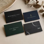
Real Estate Business Cards at a Glance
The essentials before you order.
- Licence number: legally required on all AU real estate advertising, including cards – place it at the base front in small type
- Standard size: 90 x 55mm (Australian standard) – unique shapes are possible but test wallet compatibility first
- Premium finishes for RE: Scodix (from $0.20/card) and raised foil (from $0.24/card) deliver the strongest first impression at listing presentations
- Info priority: name first, then brokerage/agency logo, then one phone number, one email – never cram in multiple numbers
- Photo: use for high-volume open home networking; skip it when positioning for prestige listings where the brand is the headline
- Delivery: free overnight Startrack Australia-wide on all orders
Paperlust Print Shop
Premium Business Cards for Australian Real Estate Agents
Scodix, raised foil, Spot UV, duplex and flat foil – all produced in Melbourne, shipped free overnight.
What Makes a Real Estate Business Card Actually Win Listings
The metric most agents use is wrong. “Does it look professional?” is the wrong question because every agent thinks their card looks professional. The right question is: does this card make a recipient pick it up off the desk two days later?
Research on tactile marketing consistently finds that material quality affects perceived credibility before any information is processed. In real estate specifically – where the agent is asking a vendor to hand over their largest asset – the physical quality of a business card functions as a proxy for how that agent handles detail. A card that flexes when held, prints on flimsy stock, or feels identical to every other card in the wallet communicates nothing useful.
Three properties drive re-engagement with a card after the initial meeting:
- Weight and rigidity: cards below 350gsm feel disposable. Premium finishes often push effective weight to 400gsm+ through laminate and coating. Duplex cards at 500gsm create an immediately distinct experience.
- Surface differentiation: a card with two distinct surfaces – matte background plus a Scodix-raised logo element, or soft-touch laminate with selective Spot UV highlights – creates a tactile reason to engage. Single-surface cards (all gloss or all matte) are forgettable in isolation.
- Legibility under constraint: RE cards get read in poor light, at arm’s length, and at speed. High-contrast type at 10pt minimum with ample white space reads in conditions where light grey body copy at 8pt does not. This is a measurable design parameter, not a preference.
The 12 designs below are built around these three principles applied to the specific contexts Australian property agents work in – from suburban open homes to prestige inner-city listing presentations.
The 12 Highest-Converting Real Estate Business Card Designs
Each of the following designs is described at the level of detail needed to brief a designer or evaluate a proof: stock, finish, typeface style, information hierarchy, and the RE context it performs best in.
1. Midnight Scodix Prestige
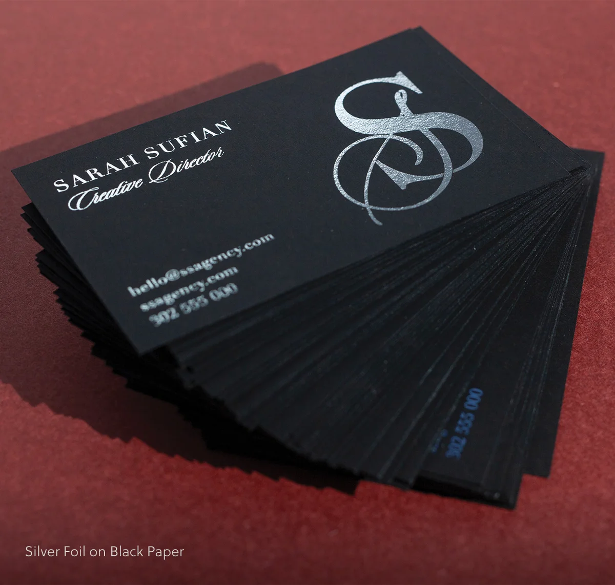
A 400gsm matte black base card with Scodix digital emboss applied to the agent name and agency logo. The raised gloss elements sit 3D against the flat matte surface – tactile, unmistakeable. Typography: name in 22pt Garamond Italic (or equivalent old-style serif) in off-white, brokerage in 9pt caps with tight tracking, contact fields in 11pt light sans-serif in pale grey. Information hierarchy: name (raised Scodix) > brokerage logo (raised Scodix) > mobile > email > licence number in 8pt cream at base. No photo. The card is entirely brand and name-forward. Best for: boutique luxury agencies and top-performing principals presenting for prestige listings where the brand carries more weight than the face.
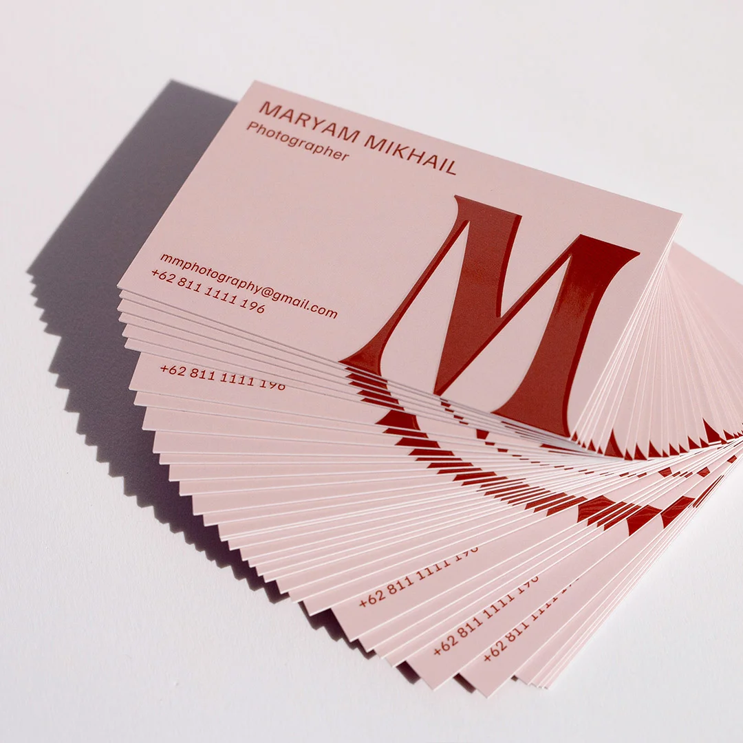
2. Ivory Raised Foil Estate
Warm ivory 380gsm premium stock. Rose gold raised foil on agent name and a thin horizontal rule beneath it; the matte ivory everywhere else creates the contrast. Typography: name in 24pt Playfair Display-style serif in raised rose gold, designation in 10pt Helvetica-style sans in dark charcoal, contact block in 12pt charcoal. Information hierarchy: name (raised foil) > designation > brokerage name > mobile > email > area specialty > licence number. Property suburb tagline optional below designation. Best for: residential sales agents operating in middle-to-upper market segments who want a warm, sophisticated look without going fully dark.
3. Charcoal Spot UV Architect
350gsm charcoal-grey matte base with a soft-touch laminate across the full card. Spot UV coating applied selectively to a fine architectural line graphic (abstract building silhouette or geometric grid pattern) spanning the upper third of the card, and to the agency logo mark. Agent name and contact in white on the charcoal base. Typography: name in 20pt bold sans-serif in white, all-caps designation in 9pt with 200pt letter-spacing, contact fields in 12pt light sans in pale grey. Information hierarchy: logo (UV emboss) > name > designation > mobile > email > suburb specialty > licence number. Best for: commercial real estate agents, project marketing teams, and agents in inner-city markets where a contemporary, minimal aesthetic aligns with the property types being sold.
4. Deep Forest Duplex
A 500gsm duplex card with deep forest green front stock bonded to a natural cream back. The material is the statement here – no specialty coating needed when the card weighs almost as much as a small book. Front face: agent name in 22pt Garamond in cream, area specialty tagline in 11pt italic cream below, nothing else. Reverse: full contact block in black on cream – mobile, email, website, brokerage name, licence number – in clean two-column layout with generous white space. Typography is restrained; the material does the talking. Information hierarchy: name and specialty (front, green) > full contact block (reverse, cream). Best for: lifestyle property specialists, rural and coastal agents, and boutique independents who want to signal permanence and quality without any obvious luxury finish.
5. Bone White Flat Foil Minimal
380gsm bright white premium stock. A single pale gold flat foil horizontal rule (0.75pt) divides the card into a name block above and a contact block below; the agency logo appears in flat foil at top-left. Everything else is black type on white. Typography: name in 22pt bold Helvetica Neue, designation in 10pt all-caps, contact in 12pt regular. The foil is used with maximum restraint – one rule, one logo treatment – which gives it more presence than a card where foil appears on five elements. Information hierarchy: logo (flat foil) > name > rule (flat foil) > mobile > email > website > licence number at base. Best for: franchise agents who need to meet brand compliance guidelines but want a finish step above the default print run.
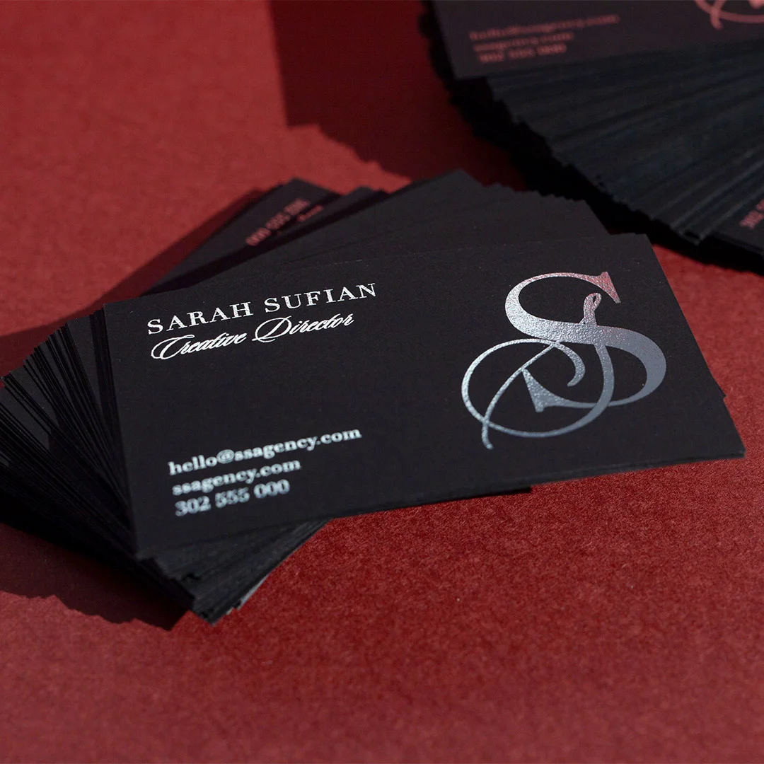
6. Black Photo + Raised Foil
Matte black 350gsm stock, front face clean with a gold raised foil name plate containing name and designation in raised mirror-bright gold. Reverse: professional headshot in high-contrast black-and-white duotone (not full-colour) occupying 100% of the reverse face, with brokerage logo and contact block reversed out in white over the photo. Typography: name and designation on front in raised foil only (no other type needed on front); contact on reverse in 12pt white sans-serif. Information hierarchy: name + designation (raised foil front) > contact block (photo reverse). The photo is on the reverse, not the front – this ensures the card is first read as a brand artifact, then personalised when flipped. Best for: agents who attend high-volume open homes, auctions, and first-home buyer events where face recognition is a genuine commercial advantage.
7. Slate Grey Scodix Logo Hero
Mid-grey 350gsm matte premium card. The agency logo mark receives full Scodix digital emboss in gloss, making it tactile and visually dominant even on a grey ground. Agent name in white 20pt bold sans-serif sits beneath the logo. Contact fields in pale grey 12pt light sans. Information hierarchy: logo (Scodix) > agent name > designation > mobile > email > suburb specialty > licence number. This design foregrounds the brand over the individual – correct for agents whose brokerage carries strong local awareness, where the logo is the trust signal. Typography is entirely secondary to the embossed logo element. Best for: franchise-aligned agents in markets where brand recognition drives initial vendor enquiry.
8. Warm Blush Lifestyle Reverse
Warm blush 350gsm matte stock on front, full-bleed property lifestyle photograph on the reverse – a twilight exterior of a residential property, or a bright coastal home, chosen to represent the agent’s specialty market. Front: agent name in 22pt bold serif in deep charcoal, designation in 10pt all-caps, mobile, email, and QR code linking to the agent’s property listing page. Brokerage logo top-right. Licence number at base. Typography: classic and clean – high contrast on the blush ground. Information hierarchy: logo + name (front) > contact block with QR (front) > aspirational property image (reverse). The reverse image positions the agent within the market without a word of copy. Best for: residential specialists in aspirational coastal, inner-city, or lifestyle markets where the property type itself is a status signal.
9. Deep Navy Coloured Paper Flat Foil
270gsm deep navy coloured paper stock with pale silver or pale gold flat foil on agent name and brokerage logo. The flat foil reads as mirror-bright against the dark ground. Typography: name in flat foil at 22pt bold sans; brokerage in flat foil 9pt caps. Contact block in cream or white 12pt light sans. Licence number in cream 8pt at base. No photo. Information hierarchy: logo (flat foil) > name (flat foil) > designation > mobile > email > licence number. Navy is a high-trust colour associated with authority and competence – well-documented in financial and legal services, and increasingly used by premium real estate agencies wanting differentiation from the standard white card. Best for: agents looking for a colour-forward card without duplex pricing.
10. Terracotta Vertical Format
A vertical-orientation card (55mm wide x 90mm tall, portrait) in warm terracotta or sage green 350gsm coloured paper. The upper 40% of the card face is a full-width block of the card’s base colour with the agency logo reversed out in white. The lower 60% carries contact information in dark type on the same card ground. This vertical format stands out physically in any card holder or stack. Typography: logo reversed out in white at upper panel; name in 20pt bold dark charcoal in lower panel; contact fields in 12pt regular. Information hierarchy: logo (upper panel) > name > designation > mobile > email > licence number at base. Best for: independent agents and boutique agencies wanting format differentiation at open homes where they know their card will be compared directly against competitors.
11. Spot UV QR Code Modern
Clean white 350gsm premium matte card with soft-touch laminate. Spot UV applied to the QR code panel (which makes the QR module catch the light and draws the recipient’s eye to it) and to the agency logo. Black type on white for all other elements. Typography: name in 20pt bold sans, single-line designation below, mobile and email in 14pt light. The QR code links to the agent’s current listings, Google review page, or appraisal booking form – whichever drives the most relevant next action. Information hierarchy: QR code + logo (UV highlight) > name > designation > mobile > email > licence number. Note: Spot UV does not impair QR scannability provided the QR module is rendered at the correct resolution. Best for: buyers’ agents, agents actively building review profiles, and digital-first agents who track lead source by UTM parameter.
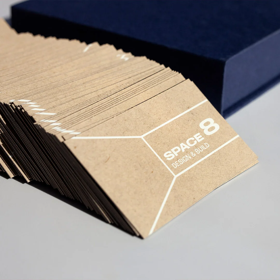
12. Ivory Wild Cotton Double Thick
600gsm Wild Cotton double-thick card stock from Paperlust’s letterpress range, used here as a substrate for Scodix premium emboss on name and logo. The cotton fibres visible in the stock communicate craft and permanence in a way no coated stock can replicate. At 600gsm, this card is the heaviest in the lineup – the weight difference is perceptible to anyone who handles business cards regularly. Typography: name in 22pt Caslon-style serif, pressed finish, deep charcoal. Contact fields in 12pt light sans. Licence number in 8pt light at base. Information hierarchy: name (Scodix emboss on cotton) > brokerage logo > mobile > email > suburb specialty > licence number. Best for: principals and independent agents who have held their position in a market for 10+ years and whose card needs to signal permanence as much as contact details.
Luxury vs Volume: When to Splurge on Scodix or Foil
The question is not “which finish is best?” but “which finish is right for which distribution context?” A $0.20/card Scodix card used in bulk at a community open home is wasteful. A $0.28/card standard business card handed to a vendor at a $4M listing presentation is a missed opportunity. The right answer depends on where and how you are distributing cards.
There are three primary RE distribution contexts, each with a different finish calculus:
Listing presentations
This is the highest-value contact point. The vendor has already invited you into their home. The decision being made (which agent gets the listing) is worth thousands of dollars in commission. At this point, your card is not just contact information – it is the physical artifact the vendor will pick up after you leave and look at while deciding. Premium finishes – Scodix, raised foil, or duplex – have their highest ROI here. The cost delta between a standard card and a Scodix card is a rounding error relative to the commission at stake.
Open homes and auctions
Volume context. You may distribute 30-80 cards per event. Here, Spot UV strikes the right balance – premium enough to stand out from a standard print, but priced for volume distribution. Raised foil and Scodix are still appropriate if your budget allows; standard cards are the floor, not the ceiling.
Networking events and industry connections
Mixed context. Cards given to property managers, conveyancers, mortgage brokers, and other referral sources need to survive a desk environment – they will be handled repeatedly. Duplex cards perform well here because the weight and material quality make them hard to discard casually. Flat foil on a white stock is also strong in this context.
The finish-by-tier comparison below maps each finish to the contexts where it delivers the best return.
| Finish | Visual Effect | Tactile | From (inc. GST) | Production | Best RE Context |
|---|---|---|---|---|---|
| Standard | Full-colour print, matte or gloss laminate | None | $0.28/card | 24hr available | High-volume open home distribution; team bulk cards |
| Coloured Paper | Printed on tinted card stock; colour is the card, not a background | None | $0.49/card | 24hr available | Format differentiation on a budget; navy, sage, terracotta |
| Spot UV | Selective gloss elements on matte base – logo and name highlights | Slight ridge, detectable by fingertip | $0.14/card | Longer production – not 24hr | Open homes, auctions, networking – premium at volume |
| Raised Foil | Mirror-bright metallic name or logo with 3D relief | Raised bump – clearly perceptible | $0.24/card | Longer production – not 24hr | Listing presentations, referral partner cards |
| Scodix | Digital emboss in gloss – selective raised areas on matte or dark base | Tactile 3D relief, highest WOW factor | $0.20/card | Longer production – not 24hr | Listing presentations, prestige property, principal cards |
| Flat Foil | Mirror-bright metallic – logo, rule, or text in gold, silver, or rose gold | Flat surface – no ridge | $1.52/card | 24hr available | Franchise compliance with luxury feel; referral network |
| Duplex | Two card stocks bonded together; visible edge contrast | Extra thickness and rigidity – unmistakeable weight | $2.27/card | Longer production – not 24hr | Top performers, principals, high-LTV client presentations |
Choosing a finish for your next listing presentation?
Scodix and raised foil deliver the strongest tactile first impression at the moment it matters most – when the vendor picks your card up after you leave.
Real Estate Information Hierarchy: What to Lead With
The single most common design mistake in real estate business cards is treating the card as a form to be filled in rather than a communication to be designed. A card crammed with name, photo, mobile, office number, fax, email, website, address, brokerage logo, tagline, and QR code communicates nothing clearly – it communicates everything at the same volume, which means the recipient’s eye has no place to land.
In Australia, there is also a legal dimension. All states and territories require licensed real estate agents to display their licence number on advertising material. Business cards are advertising material. The requirement applies regardless of whether you are an individual agent or a corporate entity. The licence number does not need to be large – 8pt at the base of the card is standard – but it must be present and legible. Check the current requirement for your state: Consumer Affairs Victoria, NSW Fair Trading, or the relevant regulator in your jurisdiction.
The following table defines the correct priority order for information placement on an Australian real estate business card, with notes on why each element sits where it does.
| Element | Priority | Placement | Notes |
|---|---|---|---|
| Agent name | 1st | Front, largest text element – minimum 20pt | The card is a personal introduction first. Name must be immediately readable. |
| Brokerage logo | 2nd | Front, top-left or top-right – consistent with brand guidelines | Franchise agents must follow placement rules; independents have full control |
| Professional designation | 3rd | Below name, 10-11pt | “Sales Agent”, “Principal”, “Buyers Advocate”, “Property Manager” – keep to one line |
| Mobile number | 4th | Front, prominent – 13-14pt minimum | One number only. Multiple numbers create friction. If you have a team number, put it on the reverse. |
| Email address | 5th | Front, below mobile | Professional domain (firstname@agencyname.com.au) signals permanence; avoid Gmail for listing presentations |
| Licence number | Mandatory | Front, 8pt at base or reverse in small type | Legally required in all AU states for licensed agents. Must be legible – not invisible grey on grey. |
| Suburb specialty | Optional | Below designation or reverse | “Inner West Auctions Specialist” reinforces local authority. Only include if genuinely defensible. |
| Website or QR code | Optional | Front (QR) or reverse (website URL) | QR linking to listings or review page adds a measurable digital touchpoint |
| Social media handles | Optional | Reverse only | LinkedIn relevant for commercial agents; Instagram for agents with an active listing feed |
| Office / physical address | Avoid | – | Most vendors and buyers never need your office address. It uses space that could carry a stronger element. |
QR Codes and Property Listings: Modern Touch-Points
QR codes on real estate business cards have crossed from novelty to utility. The question is no longer whether to include one but what the QR code should point to and how to design around it.
The most effective QR destinations for Australian RE agents, in order of conversion value:
- Appraisal booking page: if your agency or website offers an online appraisal request form, this is the highest-value destination. Someone who scans your card and books an appraisal in the same session is a qualified lead.
- Current listings page: a dynamic URL that shows your current active listings positions you immediately as productive and market-active. Use your agency portal or profile page, not a static file.
- Google Business Profile review page: for agents actively building social proof, a QR linking directly to the “Write a review” page removes friction. Especially effective when handed to a satisfied vendor immediately post-settlement.
- Agent profile video or interview: a 60-90 second video introduction creates a personal connection that a static card cannot. YouTube or Vimeo URL works; ensure autoplay is disabled on mobile.
Design considerations: a QR code printed at less than 25mm x 25mm on a standard business card may fail to scan reliably on older phone cameras, particularly in lower light conditions at open homes. Test scan your proof before approving print. The Spot UV QR code design (design 11 above) uses UV coating on the QR panel specifically because the light-catching effect draws the recipient’s eye to the code – this is a function, not just aesthetic.
UTM parameters appended to the QR destination URL let you track exactly how many people scan the card, and from which card batch. This is rare discipline in real estate marketing and immediately separates agents who measure from those who guess.
Photography on Real Estate Business Cards: When It Works, When It Hurts
Agent headshots on business cards are common. They are not always correct. The decision depends on what the card needs to accomplish and who will receive it.
When photos work well:
- High-volume, in-person distribution – open homes, community events, door-knocking. Face recognition is a genuine commercial advantage when you are distributing to hundreds of people who will encounter you again at future open homes.
- Property management contexts – landlords and tenants appreciate knowing whose face matches the name on the card calling them about their property.
- Markets where the agent has strong personal brand – if people call your office and ask for you by name, your face is a trust asset worth putting on the card.
When photos are counterproductive:
- Prestige listing presentations – in the upper end of any market, the listing decision is made on evidence: your track record, your marketing proposal, your understanding of the property’s positioning. A photo makes the card about you personally in a context where professional credibility and agency brand are the relevant signals. Designs 1, 4, 7, and 12 above are deliberately photo-free for this reason.
- Commercial and investment property transactions – commercial RE buyers and investors are evaluating your financial acumen and market knowledge. Face-forward cards can work against a technical credibility positioning.
- When the photo quality is inadequate – a pixelated, poorly lit, or outdated headshot is actively damaging. If you cannot supply a professional headshot at 300dpi that looks current, omit it entirely.
If you use a photo, place it on the reverse rather than the front face where possible. This preserves the front face for name, brokerage logo, and contact information – the elements that must be read first – while retaining the personalisation value of the image.
Premium Finishes Compared for Real Estate Agents
Here is how each premium finish actually works, and what that means for design briefs and proof review.
Scodix digital emboss
Scodix is a digital process that builds up a raised UV polymer on selected areas of the card surface. Unlike raised foil (which is always metallic) Scodix can be applied over any printed element – a logo in navy, a name in white, an abstract geometric. The raised area is clear gloss, so the colour beneath shows through. The result is a tactile, 3D element with a gloss surface. Minimum element size for Scodix emboss is approximately 14pt for text; finer detail below this threshold risks bleed between raised areas. The key design constraint is that Scodix must be used selectively – applying it to 50% of the card surface produces a card that reads as uniformly textured, not as one with premium elements. Apply it to the logo, the name, or one graphic element maximum.
Raised foil
Raised foil combines the mirror-bright metallic surface of foil with a 3D raised element. It is the most visually dramatic finish in the lineup – the combination of reflective and tactile quality is unique. Available in gold, silver, rose gold, and other metallic colours. Raised foil requires a minimum element size for clean registration; text below approximately 18pt in raised foil risks fill inconsistency in fine serif characters. Bold sans-serif type at 20pt+ is ideal. Critical note: raised foil is not letterpress. It produces a raised bump, not a debossed impression – if you want the texture pressed into the card (not built up on it), that is a different product.
Spot UV
Spot UV is a selective clear gloss varnish cured over specific areas of a matte-laminated card. Unlike Scodix, it sits flat on the surface with a very slight ridge perceptible to a fingertip but not obviously raised. Its power comes from the contrast between the matte and gloss surfaces – in changing light conditions the card appears to shift as it is tilted. Key design rule: the maximum UV coverage should not exceed 30% of the card face. At higher coverage, the contrast between coated and uncoated areas diminishes and the finish loses its effect. Best used on logo marks, name blocks, and geometric graphic elements; avoid fine lines below 0.5pt.
Flat foil
Flat foil delivers the mirror-bright metallic surface without the raised element. It sits flush with the card surface and has a clean, precise edge. Because it requires no die tooling (unlike foil stamp), the per-card cost is the main variable. Flat foil is the fastest foil option at Paperlust – available on a 24-hour production run for Standard and Premium stocks. The colour range includes gold, pale gold, rose gold, silver, copper, holographic, and bold metallics. For real estate cards, gold flat foil on a white stock (as in design 5 above) achieves an upmarket look at a cost point accessible for team rollouts.
Common Real Estate Business Card Mistakes
These errors appear consistently across agent card reviews and represent measurable design failures, not matters of taste.
Eight or more text elements on the front face
Every element on a card competes with every other element for the reader’s attention. When eight or more items appear on a standard 90x55mm face – name, photo, two phone numbers, email, website, brokerage, tagline, licence number, and physical address – none of them register cleanly. Audit your card ruthlessly: if removing an element would not reduce the card’s utility for 90% of recipients, remove it.
Font at or below 8pt for non-licence fields
Contact information below 8pt on a business card stock is difficult to read in poor light, at arm’s length, and for any recipient with average or below-average vision. The licence number can legitimately sit at 8pt because it is a compliance element, not a contact field. Mobile numbers and email addresses should be no smaller than 12pt.
Low-quality or outdated headshot
A 2018 photo on a 2026 card creates a dissonance the recipient notices immediately even if they cannot articulate it. If you include a photo, it must be professional, well-lit, current, and supplied at 300dpi at the print size. Any compromise on these criteria means the photo is net negative.
Multiple phone numbers
Mobile, office direct, and office general are three numbers that collectively tell the recipient they need to figure out which one to call. Give them one number – your mobile. If a team office number is genuinely required, put it on the reverse.
Fax numbers
Remove them. No clarification required.
Generic taglines that say nothing
“Your Trusted Real Estate Agent” appears on more Australian agent cards than any other tagline and on none of the most effective ones. A tagline earns its space if it carries specific, credible information: “Eastern Suburbs Sales Specialist Since 2009” is specific. “Committed to Excellence” is not.
Missing licence number
Beyond the aesthetic problem of an overcrowded card, the single factual omission that creates legal exposure is the missing licence number. This is not optional in any Australian state. If your current print run omits it, replace the run.
Standard print for premium contexts
Handing a standard matte print card to a vendor at a prestige listing presentation when your competitors are carrying Scodix or raised foil cards is a missed opportunity with a fixed cost. The cost of upgrading 250 standard cards to Scodix is a fraction of one commission. Calibrate your finish to your commission bracket.
Budget vs Premium Tiers: Australian Cost Breakdown
The following pricing reflects Paperlust Print Shop’s from rates (inc. GST) at volume. Exact per-card costs vary by quantity – higher quantities produce lower per-card costs. All orders include free overnight Startrack delivery Australia-wide.
Budget tier – high volume distribution
Standard business cards from $0.28/card. Available on 24-hour production. Correct for: open home distribution cards, new agent starter runs, team volume cards where brokerage brand is the primary carrier. At 500 cards, total cost is in the range of $100-$140 plus GST before quantity discounts. Standard cards can be professionally designed and print beautifully – the finish tier is the only limitation.
Mid tier – premium without prestige pricing
Spot UV from $0.14/card and Scodix from $0.20/card both fall into the mid-tier at volume. Spot UV at $0.14/card makes it accessible for agents who want a tangible upgrade at open home volumes. Scodix at $0.20/card is similarly accessible. Both require longer production than standard – plan 3-5 additional business days and order before you need them. Raised foil at $0.24/card and coloured paper at $0.49/card also sit in this range. For an agent ordering 500 cards in Scodix, the total cost premium over standard is approximately $40-60 – a genuine upgrade for a meaningful investment.
Premium tier – principal and prestige cards
Flat foil from $1.52/card and duplex from $2.27/card. At 250 cards, flat foil costs roughly $380 and duplex roughly $570. These are the correct tiers for principal cards, prestige listing cards, and any card you want to have a 10-year run without looking dated. Duplex in particular is a format statement that no other common finish replicates – the visible bonded edge and the weight-in-hand experience set it apart from every standard card in the same wallet.
Mass-Producing for a Team or Brokerage: Bulk-Order Considerations
Real estate agencies face a specific operational challenge with business card production: individual agents have individual details (name, mobile, email, designation, licence number), but brokerage branding must be consistent across all cards in the team. This creates a tension between personalisation and brand compliance that the ordering process needs to resolve cleanly.
Template-based approach
The most efficient method for teams of 4+ agents is a shared card template with brokerage branding, logo placement, and design locked – with individual name, mobile, email, and licence number as the only variable fields. Paperlust’s design team can set up the master template; each agent’s proof is generated from it. This ensures brand consistency without requiring each agent to navigate design decisions.
Staggered orders vs batch orders
Batch ordering 500 cards per agent in one print run reduces per-card cost and simplifies logistics. The trade-off is that an agent who changes brokerage, changes their mobile number, or earns a new designation has surplus cards that are now incorrect. For agents in their first two years in real estate – where role and contact changes are more frequent – smaller initial runs (200-250 cards) with faster production cycles are often the correct strategy. For established agents with stable details, a single annual print run at volume is more cost-effective.
Finish consistency across a team
A brokerage where principals carry duplex cards and junior agents carry standard cards creates an unintended hierarchy signal. If budget is the constraint, a consistent Spot UV or Scodix run across the full team is achievable at mid-tier pricing and positions the entire team above the standard-print floor. Consistent finish across a team also means every card handed out at a team event carries the same premium impression regardless of which agent delivers it.
For international distribution from Australian agencies – particularly for offshore investor clients in Singapore, Hong Kong, or the UK – orders over $350 USD ship free via DHL Express, typically arriving within 2-4 business days after dispatch.
Ready to order?
Order Your Real Estate Business Cards
Individual or team orders. Free overnight Startrack shipping Australia-wide. Proofs in 1-2 business days.
FAQs
Yes. All Australian states and territories require licensed real estate agents to display their licence number on advertising materials, and business cards are classified as advertising materials under relevant consumer protection legislation. The requirement applies to individual agents and to corporations. The licence number does not need to be large – 8pt type at the base of the card front is standard practice – but it must be present and legible. If you are unsure of the specific requirement in your state, check with NSW Fair Trading, Consumer Affairs Victoria, or the equivalent regulator in your jurisdiction.
The standard Australian business card size is 90mm x 55mm. This size fits standard cardholders, wallets, and the card pocket on most compendiums. Vertical (portrait) orientation at the same dimensions is increasingly used as a format differentiator – the same 90x55mm card turned 90 degrees immediately stands out in any stack. Non-standard sizes are possible but should be tested for wallet compatibility before committing to a full run.
Both are selective finish processes that create a contrast between treated and untreated card areas, but they work differently. Scodix is a digital emboss process that builds up a raised polymer on the surface – the result is clearly raised and tactile, detectable immediately by touch. Spot UV is a flat clear varnish cured on selected areas over a matte laminate – the surface remains flat with only a slight ridge, and the effect is primarily visual (gloss vs matte contrast) rather than tactile. For real estate business cards where the first impression is tactile as much as visual, Scodix typically delivers a stronger response. Spot UV is the better choice for volume distribution where per-card cost is a factor.
It depends on context. Photos work well for agents doing high-volume in-person distribution – open homes, auctions, community events – where face recognition is a practical commercial advantage. They are less appropriate for prestige listing presentations or commercial property contexts, where the professional credibility signal from the brokerage brand and agent track record carries more weight than a personal image. If you do use a photo, place it on the reverse rather than the front face, and ensure it is a professional headshot at 300dpi. An outdated or low-quality photo is actively damaging and is better omitted entirely.
Most active agents distribute 500-1,000 cards per year in normal market conditions, higher in buoyant markets with frequent open homes. For new agents, an initial run of 250-500 cards is sensible – enough to get through the first six months while remaining open to detail changes (phone, email, designation, brokerage). Established agents with stable details and a consistent distribution rate should order 500-1,000 at a time to benefit from volume pricing. Agents should also carry two tiers if budget allows: a premium card (Scodix or raised foil) for listing presentations, and a high-volume card (Spot UV or standard) for open home distribution.
At minimum: agent name, professional designation, brokerage name or logo, one mobile number, email address, and licence number. Website or QR code is strongly recommended but not mandatory. Physical office address, fax numbers, and multiple phone numbers should generally be omitted – they consume space that makes the essential elements less legible without adding utility for most recipients.
Yes. Paperlust Print Shop can produce a consistent template with shared brokerage branding and design, with individual agent details (name, mobile, email, licence number, designation) as variable fields. Each agent’s proof is reviewed separately before print. Batch orders for teams reduce per-card cost and simplify logistics. Contact the Print Shop team to discuss team order setup – the design brief and template workflow are handled by Paperlust’s Melbourne studio.
Standard business cards and flat foil cards are available on 24-hour production from proof approval. Scodix, raised foil, Spot UV, and duplex cards require longer production and are not available on 24-hour rush. Designer proofs are delivered within 1-2 business days of placing an order, with two rounds of edits included at no extra cost. Plan for premium finish orders 7-10 business days before you need the cards in hand, especially for team runs where multiple proofs require individual review.
For listing presentation cards, yes – unambiguously. The delta between standard print and Scodix at volume is typically a few cents per card. At a listing for a property worth $1.5M or more, the commission at stake makes the cost of the card irrelevant. The question is not whether Scodix is expensive (it is not, at volume) but whether you are distributing premium-finish cards in contexts where the first impression matters. For open home volume distribution, Spot UV is the better cost-performance trade-off. The ideal setup is two card variants: a Scodix or raised foil card for listing presentations and high-value contacts, and a Spot UV or standard card for high-volume events.
PDF (print-ready, with bleed and crop marks) is the standard for business card production. If you are working with a designer, ask them to export to PDF/X-1a or PDF/X-4 with 3mm bleed on all edges, all fonts embedded or outlined, and colour mode set to CMYK (not RGB). Image elements within the design should be embedded at 300dpi at print size. If you are using the Paperlust Print Shop’s design service, the Melbourne design team handles all production file preparation from your brief – you do not need to supply a print-ready file.
Yes. Paperlust Print Shop offers a $5 sample pack and a $20 full swatch kit. The $5 sample pack includes examples across different print finishes so you can assess paper weight, texture, and surface quality before committing to a bulk order. The $20 swatch kit covers all available paper stocks. Custom samples in your specific design are also available for most print methods at $15 per sample, giving you a proof in your actual design at the finish you have chosen before approving a full run.