There is a particular kind of business card that stops a conversation. It is not the one packed with six fonts, a busy background pattern, and five contact methods squeezed into 90mm x 55mm. It is the one that arrives clean, confident, and completely clear about what it wants to say. That card gets kept. The cluttered one gets recycled.
Minimalist business card design is not about doing less work; it is about making sharper decisions. A well-executed minimal card uses white space, typography, and print finish to communicate that you know exactly what matters and what does not. Done right, it is one of the most powerful first impressions a brand can make.
This guide covers the principles behind great minimalist card design, the elements to include (and cut), the finishes that complement a clean aesthetic, and the mistakes that quietly undermine an otherwise strong design.
- White space: treat blank areas as a design element, not wasted space
- Typeface: one or two fonts maximum; use weight and size to create hierarchy
- Colour palette: one brand colour plus neutral, or monochrome only
- Information: name, title, one primary contact method, website; nothing else
- Print finish: matte stock as a base; spot UV or raised foil as a single accent
- Card size: standard 90mm x 55mm; any deviation should serve the concept
- Stock weight: minimum 350gsm; thin cards undercut the premium feel
Why Minimalism Works on a Business Card
The psychology of restraint
Human attention is finite, and first impressions form within seconds. When a business card presents one clear message, your name, your role, how to reach you, the recipient’s brain files it instantly. When a card presents twelve competing elements, none of them register clearly.
Design researchers have long noted that visual complexity triggers cognitive load. A cluttered card forces the viewer to work harder, which creates a subtle sense of friction. A minimal card removes that friction and lets the quality of the object itself do the talking. The silence around the text becomes part of the message.
There is also a confidence signal at play. A business card that uses generous white space implies the person behind it does not need to justify themselves with volume. Restraint reads as authority.
What recipients actually remember
Studies on memory and visual design consistently show that people retain information better when it is presented in isolation rather than surrounded by noise. For a business card, that means the fewer elements you include, the more clearly each one is remembered.
In practice: if your card features your name prominently, a clean job title, and a single web address, that is exactly what the person will recall when they reach for it three days later. If it features a tagline, two phone numbers, a physical address, social handles, a QR code, and a decorative border, the recall rate for any single piece of information drops sharply.
The goal of a business card is to be remembered and to be acted on. Minimalism serves both.
The Core Principles of Minimalist Business Card Design
White space is an active ingredient
In design, white space (also called negative space) is not emptiness; it is breathing room. It guides the eye, creates emphasis, and signals quality. The most common mistake on minimalist business cards is leaving too little of it.
A good rule: your margins should be at least 5-6mm on all sides, and the total text area should occupy no more than 50-60 per cent of the card face. The rest is intentional. If you find yourself shrinking font sizes to make everything fit, that is a signal to cut information, not margins.
Asymmetric layouts can work well for minimalist cards: placing content to one side with generous open space on the other creates dynamism without adding visual noise. The key is that the empty area must feel deliberate, not accidental.
Typography carries the entire design
When you strip away decorative elements, your typeface becomes the visual personality of your card. This means font choice matters more on a minimal design than on a busy one.
For minimalist cards, the safest approach is one typeface in two weights: a heavier cut for your name, a lighter cut for everything else. Geometric sans-serifs (Futura, Montserrat, Circular) read as modern and clean. Refined serifs (Garamond, Freight, Playfair) read as considered and premium. Mixing the two, a serif name above a sans-serif contact line, is a classic pairing that works because it creates hierarchy without visual conflict.
Avoid script or display fonts unless they are your primary brand typeface. One decorative font at name size is the maximum. Two decorative fonts is a design problem.
Point size and tracking (letter spacing) are your tools. Generous letter spacing on an all-caps name in a light-weight font is one of the most reliably elegant treatments you can apply to a minimal card. It takes up more horizontal space, which justifies the white space around it.
Colour restraint
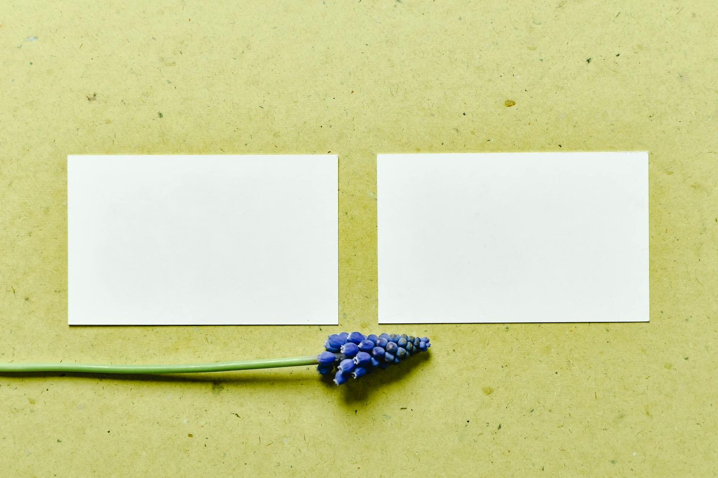
A truly minimalist palette means: one colour or two, at most.
The most impactful minimal cards tend to fall into one of three categories:
- Monochrome: black on white, or white text on a dark stock. Zero colour decision-making, maximum elegance.
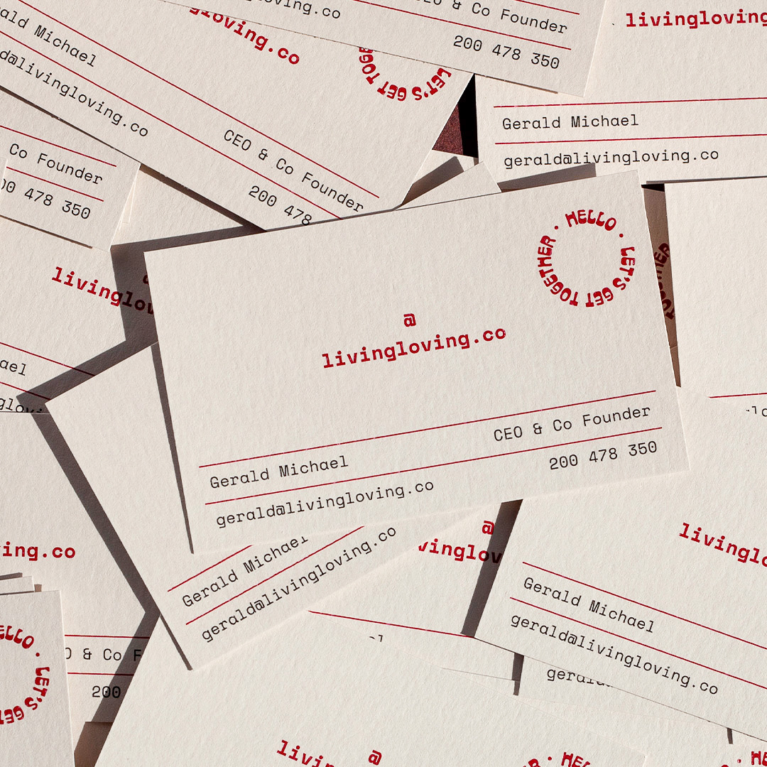
- One brand colour on white: your logo colour appears once, usually in the logo mark or as a rule/accent, and black handles all the text.
- Neutral with a metallic accent: a cream or grey stock with a single gold or silver foil element. The metallic reads as colour without being a colour in the traditional sense.
Avoid using more than one non-neutral colour, even if both are on brand. Two strong colours competing on a small card is almost always too much.
What to Leave Off Your Card
Minimalist design is largely an editing exercise. Most business cards fail not because they are missing something, but because they are holding onto things they should cut.
The following elements are strong candidates for removal:
- Physical address: unless clients visit your premises, this information adds noise and may become outdated. Your website handles it.
- Multiple phone numbers: choose one. If you genuinely need to offer both a mobile and office number, consider whether a mobile-first contact approach removes the decision entirely.
- Social media handles: unless social is a primary business touchpoint (you are a social media manager, for example), these clutter the card without adding value. Your website URL points to all your channels.
- QR codes: these can work, but only if they are designed into the card, not added as an afterthought. A QR code dropped onto a minimal design almost always breaks it. If you want to use one, make it the centrepiece, not an addition.
- Taglines: short, punchy taglines occasionally work on the reverse. On the front, they compete with your name for hierarchy and usually lose.
- Decorative borders, watermarks, and background textures: if these are not doing specific work (establishing brand identity, creating contrast), they are noise.
A useful filter: ask yourself what happens if you remove each element. If the answer is “the card still communicates everything a new contact needs to follow up,” remove it.
Print Finishes That Complement a Minimal Aesthetic
Minimalist design places more weight on the physical quality of the object. When there is less to look at, what remains is felt and touched more closely. This makes your choice of stock and finish more consequential, not less.
Standard matte stock as your base
Matte stock is the natural home for minimalist business card design. It is anti-glare, reads as premium, and lets the typography sit clearly without reflective distraction. For AU readers ordering standard cards, a 350-400gsm matte stock gives you the rigidity that reinforces the quality signal of the design.
Standard business cards printed on matte stock are the most cost-effective entry point for minimalist design, from $0.28 per card at Paperlust Print Shop, and produce a result that looks and feels far more expensive than the price suggests. The design is carrying the weight, not the finish.
Spot UV for purposeful contrast
Spot UV applies a high-gloss varnish to a specific area of the card while the rest remains matte. On a minimal design, this creates a subtle, tactile contrast: your logo mark or name appears to catch the light while everything else recedes.
The key word is purposeful. Spot UV on a minimalist card works only when it is applied to a single, deliberate element. Applied to multiple elements or to a background pattern, it stops being a minimal treatment and becomes a busy one. One spot UV element. That is the rule.
Spot UV business cards from Paperlust Print Shop start from $0.14 per card, making it an accessible way to add that tactile dimension without moving to a full foil treatment.
Raised foil for quiet luxury
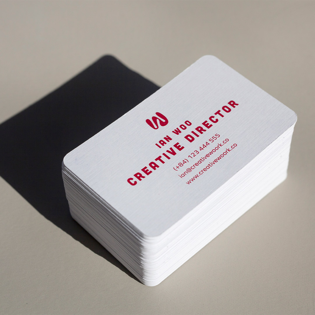
Raised foil (also called dimensional foil or sculptural foil) creates a physical texture: the foiled area sits above the surface of the card and catches light from every angle. On a minimal card, a raised foil logo in silver or gold becomes the only thing you need to look at.
This finish is particularly effective when the rest of the card is completely plain: clean white or cream stock, black typography in a single weight, and a small raised foil mark where the logo sits. The foil element carries all the luxury while the minimal layout keeps it from feeling ornate.
As with spot UV, restraint is non-negotiable. One raised foil element on a minimal card is sophisticated. Two foil elements, or foil combined with colour gradients, is not minimalist anymore.
Minimalist Cards Across Industries
Minimalism reads differently depending on the industry, which is why execution matters as much as principle. Here is how the approach adapts across common professional contexts in Australia.
Creative and design professionals
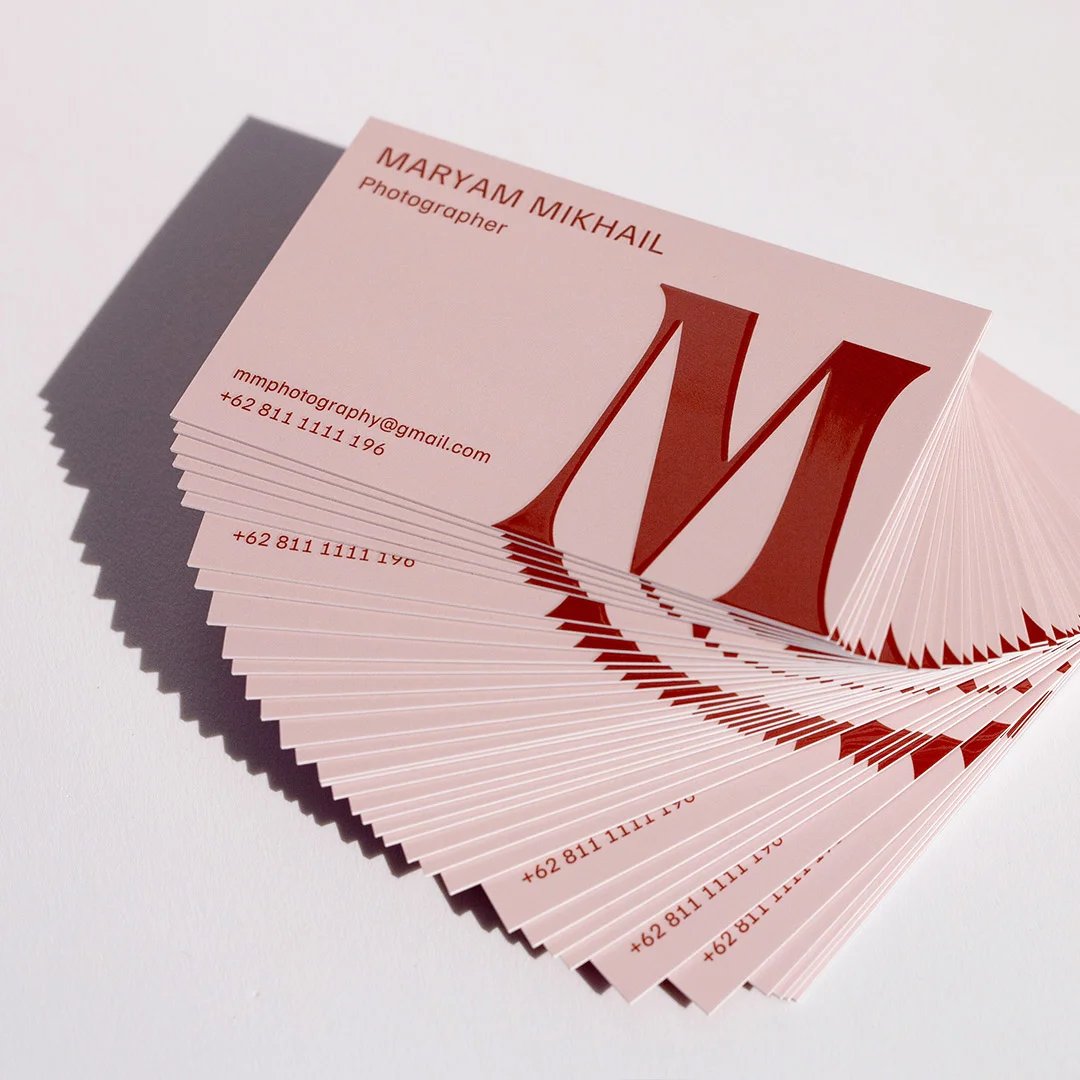
Architects, designers, photographers, and art directors are the natural home of minimalist business card design. In these fields, the card is itself a portfolio piece, an argument for your visual sensibility before a single word of conversation happens.
Creative minimal cards often push the concept further: oversized margins, the name printed small and low on the card, a single mark or symbol in place of a logo, or a completely blank reverse with one line of embossed contact detail. The constraint becomes the creative brief.
For creative professionals, a raised foil or spot UV element is almost always worth including. It communicates craft and intention, qualities that are directly on-brand.
Corporate and professional services
Lawyers, accountants, financial advisers, and management consultants benefit from minimalist cards because they communicate the same values the client is paying for: clarity, precision, and no wasted effort.
In professional services, the minimal card signals that the person handing it over understands the value of economy. A card that cuts straight to name, firm, and contact detail says: I know your time is valuable, and so is mine.
Dark stock with white ink is an increasingly popular approach in this sector: a navy or charcoal base with light-weight white typography creates a formal, confident look that holds up in any context from a boardroom to a networking event.
Health, wellness, and lifestyle
Psychologists, physiotherapists, naturopaths, personal trainers, and wellness coaches benefit from minimalist design for a different reason: it creates a sense of calm.
For this group, warm neutral palettes work particularly well: soft off-whites, warm creams, sage greens, or dusty rose with a single brand-colour accent. Typography should be approachable without being informal: a refined sans-serif or a humanist typeface reads as credible and warm at the same time.
The back of the card is often a missed opportunity in this category. A single line of philosophy, a carefully selected quote, or a simple pattern in a muted tone can complete the experience without compromising the minimal front.
Common Mistakes That Undermine Minimalist Business Card Design
The following errors are common enough that they are worth naming directly. Each one is a symptom of the same underlying problem: using minimalism as a style rather than a discipline.
- Treating white space as unfinished design: the most common mistake. Empty areas feel intentional when margins are generous and consistent. They feel like mistakes when they are the result of elements that got removed but the layout was not recalibrated.
- Using a thin card stock: a minimal design on a lightweight card feels cheap, and cheapness reads as insecurity. If you are going minimal, go heavy. 350gsm is a comfortable minimum; 400-600gsm is better.
- Choosing a font because it looks modern, not because it matches the brand: geometric sans-serifs are popular for good reason, but they do not fit every brand voice. A financial planner with warm, long-term-relationship-focused positioning may communicate better with a refined serif than a tech-influenced geometric. Match the type to the tone, not the trend.
- Printing a minimal design on gloss stock: a reflective gloss finish fights with minimal layouts. The light shifts and distracts from the typography. Matte is almost always the right base.
- Minimal layout, non-minimal back: a very clean front and a busy reverse creates visual dissonance. If the front is minimal, the back should extend that logic: a single repeated mark, one quote, a solid colour, or nothing at all.
- Confusing minimal with blank: a card with your name in size 10pt in the centre of a white card is not minimal, it is empty. Minimalism requires careful proportions, considered hierarchy, and deliberate spacing. A card with nothing interesting happening is just a missed opportunity.
Ordering Your Minimalist Business Cards in Australia
Paperlust Print Shop produces business cards from its Melbourne studio, with 24-hour production on standard cards and flat foil cards. All orders include free overnight Startrack shipping within Australia.
For minimalist designs, the most relevant print options are:
- Standard Business Cards: from $0.28 per card on premium matte stock. The most versatile base for a minimal design.
- Spot UV Business Cards: from $0.14 per card. Add a single gloss accent to a matte base for tactile contrast.
- Raised Foil Business Cards: from $0.24 per card. Dimensional foil for logos and marks on a clean card face.
Upload your design or work with a Paperlust designer to bring a minimalist concept to life. All orders include a designer proof within 1-2 business days, with two rounds of edits at no extra cost.
Frequently Asked Questions
What information should a minimalist business card include?
A minimalist business card should include your full name, job title, one primary contact method (usually a mobile number or email address), and your website URL. Everything else is optional. Many minimal cards include only a name, a role, and a web address, letting the website handle detailed contact information.
What card stock is best for a minimalist design?
Matte stock is the standard choice for minimalist business cards because it is non-reflective and lets typography read clearly. The weight should be 350gsm or heavier, thin cards undercut the premium quality signal that minimalist design creates. For special accents, a matte base combined with spot UV or raised foil in one element is the classic minimal treatment.
How much white space should a minimalist business card have?
A useful guideline is that text and graphic elements should occupy no more than 50-60 per cent of the card face, leaving the remainder as intentional white space. Margins of at least 5-6mm on all sides create the breathing room that makes minimal layouts feel considered rather than incomplete.
Can minimalist business cards work for creative professionals?
Minimalist cards are particularly well suited to creative professionals because the card itself demonstrates design sensibility. An architect, designer, or photographer handing over a clean, well-weighted minimal card is making a silent argument for their visual judgement. Print finishes like raised foil or spot UV add craft and intention to the object without compromising the minimal aesthetic.
What typefaces work best for minimalist business card design?
The safest approach is one typeface in two weights: heavier for your name, lighter for supporting information. Geometric sans-serifs (Futura, Montserrat) read as modern; refined serifs (Garamond, Freight) read as considered and premium. Avoid script or display fonts unless they are your core brand typeface, and limit decorative elements to one.
About Paperlust Print Shop
Paperlust Print Shop is an Australian printing business producing premium business cards, stationery, and marketing materials from a Melbourne studio. Founded in 2014, the business works with independent designers and in-house print specialists to deliver cards printed to a high standard, with 24-hour production on standard and flat foil cards and free overnight Startrack shipping on all Australian orders. Every order includes a designer proof within 1-2 business days and a 100% happiness guarantee.