
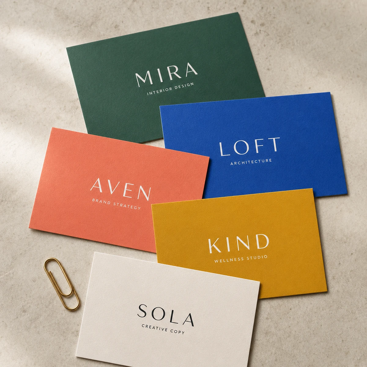
If you have ever sent a file to print and been puzzled when the final cards came back looking nothing like what you saw on screen, you are not alone. Colour reproduction is one of the most misunderstood parts of the print process, and the confusion usually comes down to three letters: PMS. This guide explains what Pantone spot colours actually are, where CMYK falls short, and how to make a confident decision for your next print project.
Before diving in, if you are still getting your head around RGB versus CMYK colour modes and how to set up a print-ready file, the CMYK and RGB print-ready artwork guide covers that groundwork. This post assumes you already understand the basics of CMYK and goes deeper on the spot colour question.
At a glance
Pantone vs CMYK: the essentials
- CMYK mixes four inks (cyan, magenta, yellow, black) on press to create most colours; it is the standard for full-colour digital and offset printing.
- Pantone (PMS) spot colour is a single pre-mixed ink assigned a unique code, applied as its own layer; it gives exact, repeatable colour not dependent on CMYK mixing.
- Over 50% of Pantone colours fall outside the CMYK gamut, meaning CMYK can only approximate them, sometimes with a noticeable shift.
- Spot colour printing requires a separate printing plate per colour and is only available via offset lithography or screen printing, not standard digital presses.
- Most everyday print jobs, including business cards, flyers, and posters, print beautifully in CMYK with good colour management.
- When exact brand colour fidelity is non-negotiable, supply a Pantone reference code and speak to your printer about the closest achievable CMYK match or whether offset spot printing is available for your job.
What is a Pantone (PMS) Spot Colour?
Pantone colours belong to the Pantone Matching System (PMS), a standardised colour language used across printing, paint, fabric, and plastics. Each colour has a unique code, for example PMS 286 C (a rich medium blue) or PMS 032 C (a vivid red). The “C” suffix means coated stock; “U” means uncoated. The same PMS number on coated versus uncoated paper will look noticeably different because the paper absorbs ink differently.
The key characteristic is that a Pantone ink is mixed before it hits the press. A printer orders or mixes the specific ink to formula, loads it as a dedicated ink station, and applies it as a single solid layer. The result is a colour that is independent of any CMYK mixing ratios, highly consistent from run to run, and reproducible by any printer in the world who holds the same Pantone formula.
The term “spot colour” and “Pantone colour” are often used interchangeably in everyday conversation, but they are slightly different things. A spot colour is any single pre-mixed non-standard ink used as its own print layer. Pantone is the dominant standardised system for specifying those inks. In practice, when a designer or brand manager says “use the Pantone”, they mean: apply this exact pre-mixed ink, not a CMYK simulation of it.
How CMYK Colour Works (and Where it Runs Out of Room)
CMYK printing builds every colour from four transparent inks printed in tiny halftone dots, layered over each other. The percentages of each ink create the final perceived colour. A solid navy, for instance, might be built from C:100 M:80 Y:0 K:20. Under a loupe you would see the individual dot pattern; at reading distance the eye mixes them into a smooth, solid-looking colour.
The problem is gamut. The CMYK gamut is the full range of colours that can be created by mixing those four inks. It is substantial, but it has hard limits:
- Vivid oranges and reds. Pure red (R:255 G:0 B:0 in RGB) sits outside the standard CMYK gamut. The closest CMYK equivalent, typically around C:0 M:100 Y:100 K:0, produces a slightly muted, orange-tinged red. For most everyday uses, this is fine. For a brand whose logo is a specific bright red, it can be a real problem.
- Bright blues and purples. Certain deep violets and electric blues, especially in the Pantone 2728 C and Reflex Blue C range, cannot be faithfully rendered with CMYK mixing. The result often appears duller or more grey.
- Fluorescent and neon colours. These are almost entirely outside the CMYK gamut. A lime-yellow neon that glows on screen will print as a flat yellow-green.
- Metallic effects. Metallic gold, silver, and chrome are physically impossible with transparent CMYK inks. They require either a dedicated metallic Pantone ink, foil stamping, or a hot-foil process. For sticker work, foil + CMYK stickers solve this by combining a real metallic foil layer with full colour CMYK print in one product.
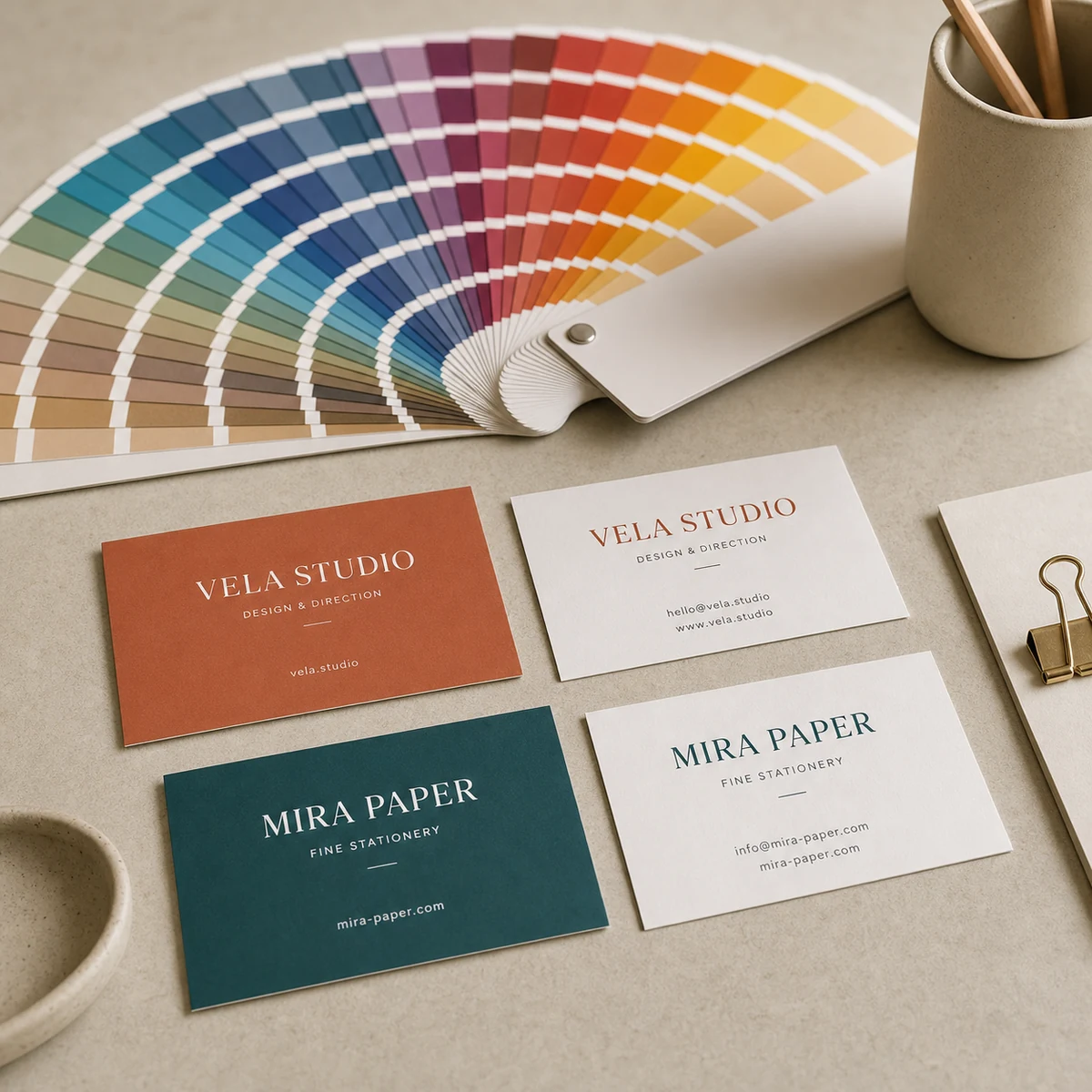
A useful reality check: open a Pantone Bridge book (a physical swatch reference that shows the Pantone solid alongside the nearest CMYK equivalent) and you can see side by side how closely CMYK tracks each Pantone colour. For some, the match is excellent. For others, the CMYK version is visibly different.
When You Genuinely Need a Spot Colour
The following situations are where a true Pantone spot colour justifies the additional cost and complexity.
Strict brand colour consistency across multiple print runs
If your organisation has a registered brand colour, for example a specific shade of teal that must look identical on business cards printed in Melbourne, signage printed in Brisbane, and promotional merchandise printed offshore, a Pantone code is your single source of truth. Any printer anywhere who can run spot inks will produce the same result. CMYK, by contrast, can drift between presses, calibration states, and ink batches. For a one-off short run, the drift may be invisible. Across dozens of print suppliers over several years, it compounds.
Metallic and fluorescent colours outside the CMYK gamut
If your design calls for gold, silver, rose gold, fluorescent pink, or neon green as a true printing effect (not a visual approximation), spot ink is the only way to achieve it with a printing plate. Note that digital alternatives exist: foil stamping and hot-stamp processes add metallic layers separately, and some digital presses offer a fifth imaging station for metallic toner effects. These are different production methods but address the same problem: standard CMYK cannot produce reflective or fluorescent effects.
Single or two-colour jobs at high volume
If you are printing a very large run (say, 50,000 letterhead sheets) in only one or two colours, running a single Pantone ink can be cheaper than running the full CMYK set-up, and you get more even ink coverage across large solid fields. CMYK on offset can show slight dot gain on large flat areas; a single spot colour sits cleaner.
Premium packaging and uncoated stocks
Metallic and fluorescent Pantone inks behave differently on coated versus uncoated paper. Uncoated stock absorbs more ink, which softens both the vibrancy of fluorescent colours and the shimmer of metallics. This is worth testing with a physical proof when the output is critical, because screen previews will not show this effect.
The Cost and Complexity Trade-Off
Spot colour printing costs more than CMYK process printing for most runs, and the reasons are structural.
Each spot colour requires its own printing plate. On a traditional offset press, the press must be cleaned between colour stations to prevent contamination. Set-up time increases. For a two-colour Pantone job, you are paying for two full plate exposures, two press washes, and two press runs. The break-even versus CMYK varies by volume: at very high quantities (tens of thousands of units), the per-unit cost difference shrinks; at short runs (under 500), spot colour often costs significantly more per unit.
Spot colour printing is also only available on offset lithographic and screen printing equipment. Standard digital inkjet and toner presses, including most short-run business card and flyer printers, run CMYK only. This means spot colour printing typically carries longer turnaround times and higher minimum quantities than digital CMYK printing.
A practical note on where spot colour fits in the Australian print market: most small-to-medium print runs (business cards, flyers, brochures, posters up to a few thousand copies) are produced on digital CMYK presses. Offset lithography with spot inks becomes more common for packaging, large commercial print runs, and specialist brand or promotional items.
How to Specify a Pantone Colour in Your Artwork
If you are supplying artwork for a job where Pantone accuracy matters, here is the standard workflow.
In Adobe Illustrator or InDesign
Create a new colour swatch and set the colour type to “Spot Colour.” Name it with the exact Pantone code, for example “PMS 286 C”. Fill or stroke your artwork with this swatch. When you export to PDF, spot colour channels are preserved in the output file, and a print-savvy operator can verify the spot colour separation before plating.
In PDF output
Choose a PDF/X export standard (PDF/X-4 is recommended for offset work). The PDF will contain a separate ink channel for each spot colour. Your printer can preflight the file to confirm the spot separations are present before producing plates.
When supplying to a digital press
Here is where it gets important: if you are supplying a file with Pantone spot swatches to a digital CMYK printer, those spot channels must be converted to CMYK at some point in the workflow. Some printers do this automatically using a profile. Others will ask you to convert and supply CMYK. The conversion quality depends on the colour management profile used. Supplying the Pantone code as a reference (alongside the CMYK conversion) lets the printer verify their output matches the intended colour as closely as their equipment allows.
A practical tip: most design software and Pantone reference guides list the nearest CMYK breakdown alongside each Pantone code. Use this as your baseline, but always request a physical proof for brand-critical colours before signing off a large run.
When CMYK is Perfectly Fine
Spot colour printing is not always necessary, and for the majority of print jobs it is not the right choice. CMYK process printing is an excellent match for:
- Photographic images. Photographs contain thousands of colour gradations that only CMYK (or RGB-to-CMYK converted) can render. Spot colour cannot reproduce photographic content.
- Full-colour design with multiple colours. If your design uses six or more colours, running individual spot plates for each is impractical and uneconomical. CMYK handles this at scale.
- Short runs where colour consistency across batches is not critical. A run of 250 flyers for a local event does not need spot-colour precision.
- Designs with colours within the CMYK gamut. Not every brand colour is outside the CMYK range. Many corporate blues, greens, and neutrals reproduce reliably in CMYK with good press calibration.
The honest test: convert your brand colour to its Pantone equivalent in your design software, then compare the Pantone Bridge CMYK value side by side with the Pantone solid swatch in print. If the difference is barely perceptible, CMYK will serve you well. If the difference is visible and matters to your brand, that is the case for spot.
Pantone Colour Matching at Paperlust Print Shop
Paperlust Print Shop prints on professional digital presses, which run CMYK process colour. This means your designs will reproduce to a high standard across a wide range of colours, including all photographic content, multi-colour designs, and most brand colours.
For standard business cards, flyers, and other print products, CMYK digital printing is the production method. True Pantone spot-plate printing (a separate ink station and press plate per Pantone colour) is not a standard offering on our digital presses.
If you have a specific brand colour requirement and are concerned about CMYK accuracy, the best steps are:
- Supply your artwork with the Pantone reference code noted in the file or in your order notes.
- Convert the Pantone colour to CMYK using the standard Pantone-to-CMYK bridge values and supply that conversion in your file.
- Request a physical proof before committing to a large run. This lets you assess the CMYK match against your Pantone reference under real print conditions.
- Contact our team if you have questions about what is achievable for your specific brand colour. We confirm the achievable match against your supplied Pantone reference at proof stage.
For premium finishes such as metallic effects on business cards, we offer foil stamping options that achieve a genuine metallic result. These are separate from CMYK and from traditional Pantone spot inks but address the same underlying need: a colour or effect that standard process printing cannot deliver.
Frequently Asked Questions
What is the difference between Pantone and CMYK?
CMYK printing creates colours by mixing four transparent inks (cyan, magenta, yellow, black) in varying percentages. Pantone (PMS) colours are pre-mixed inks assigned a unique code; each Pantone colour is a single ready-made ink applied as its own separate layer. The critical difference is that Pantone colours are independent of CMYK mixing ratios, which makes them more consistent and allows them to include colours that fall outside the CMYK gamut entirely.
Can CMYK match any Pantone colour?
No. Over half of all Pantone colours fall at least partially outside the CMYK gamut, meaning CMYK can only produce an approximation. For many colours the match is very close and visually acceptable. For vivid reds, electric blues, neon colours, and all metallic shades, the CMYK approximation can be noticeably different from the true Pantone ink. Pantone Bridge books and reference guides show the CMYK nearest equivalent side by side with the Pantone solid so you can judge the gap before printing.
Does Paperlust Print Shop offer true Pantone spot colour printing?
Our standard products are produced on professional digital CMYK presses, which do not run spot colour plates. If you need a specific Pantone match, supply the Pantone reference code with your artwork and we can confirm the closest achievable CMYK match at proof stage. For metallic effects, we offer foil stamping options on business cards that produce a genuine metallic result outside the standard CMYK process.
How do I specify a Pantone colour in my artwork file?
In Adobe Illustrator or InDesign, create a swatch set to “Spot Colour” type and name it with the exact Pantone code (for example, PMS 286 C). Export using PDF/X standards so the spot channel is preserved in the output file. If supplying to a digital CMYK printer, also include the recommended CMYK breakdown from the Pantone guide so the printer can convert accurately. Always request a proof for brand-critical colours.
When should I choose spot colour over CMYK?
Choose spot colour when: your brand colour is outside the CMYK gamut and must match exactly across multiple print runs and suppliers; your design requires a metallic or fluorescent effect that CMYK cannot physically reproduce; you are printing a very large run in one or two solid colours where even ink coverage and inter-run consistency are critical. For most short-to-medium digital print runs, including business cards, flyers, and posters, high-quality CMYK delivers excellent results.
What is the coated versus uncoated distinction in Pantone codes?
The “C” suffix (for example, PMS 286 C) indicates the colour is specified for coated (gloss or satin) paper. The “U” suffix indicates uncoated paper. The same Pantone number on coated versus uncoated stock looks different because uncoated paper absorbs more ink, which softens vibrancy and reduces the shimmer of metallic colours. Always use the correct suffix for the stock your job is printing on, and check both in the physical Pantone swatch book if colour accuracy is critical.