Uploading a file and getting a rejection email is frustrating. Uploading a file, getting it printed, then seeing washed-out colours or white sliver edges is worse. Both problems come from the same root cause: artwork that was built for a screen, not for a press.
This guide covers every checkpoint between “finished design” and “approved print-ready file.” Work through it once, turn it into your studio checklist, and rejections should stop.
At a glance
- Screens use RGB; printers use CMYK. Always convert before export.
- Standard resolution: 300 DPI at final print size (150 DPI minimum for large format over A1).
- Bleed: 3mm on all sides for most products. Safe zone: 3-5mm inside the trim.
- Embed or outline all fonts before exporting.
- Export as PDF/X-4 (or PDF/X-1a as a fallback) for the most reliable colour handling.
- Common rejection triggers: RGB file, low-res image, missing bleed, live (unoutlined) fonts.
CMYK vs RGB: Why Your Screen Lies to You
RGB (red, green, blue) is an additive colour system. Screens emit light, and mixing red, green, and blue light at full intensity produces white. It has a wide gamut, which means it can display vivid neons, electric blues, and deep purples that look spectacular on your monitor.
CMYK (cyan, magenta, yellow, black) is a subtractive system. Ink absorbs light, and layering four process inks on white paper produces colour by subtraction. The printable gamut is smaller than RGB. Colours that sit outside that gamut get mapped to the nearest available ink mix, which is where the shifts happen.
The practical consequence is that bright oranges, vivid greens, and electric purples almost always shift when converted late. The shift is not a printing error. It is physics. Converting early, while you still have control over which CMYK values carry your intent, is how you manage it.
The CMYK vs RGB comparison
| Property | RGB | CMYK |
|---|---|---|
| Where it is used | Screens, digital display | Commercial and digital printing |
| Colour mixing | Additive (light) | Subtractive (ink on paper) |
| Gamut size | Wide | Narrower, especially for vivid hues |
| Channels | Red 0-255, Green 0-255, Blue 0-255 | Cyan 0-100%, Magenta 0-100%, Yellow 0-100%, Black 0-100% |
| What happens if you submit RGB | Printer auto-converts, colours may shift | Not applicable |
| Black | R0 G0 B0 (technically correct) | Use rich black (C60 M40 Y40 K100) for large fills; K100 only for small text |
| Best for print | No | Yes |
When to convert
Convert your working document to CMYK as early as possible, ideally when you start the file. If you are working from a client-supplied RGB logo, convert it and do a soft-proof before you build the rest of the artwork around it. Discovering a logo shift after five hours of layout work is not a good afternoon.
If your software only works in RGB (some web-focused tools), convert the exported file immediately after export and do a visual check before submitting.
Resolution and DPI: What the Numbers Actually Mean
DPI stands for dots per inch. Higher DPI means more ink dots per inch of printed area, which means sharper detail. The issue is that resolution is tied to physical size. A 300 DPI image at 10x10cm becomes a 75 DPI image if you scale it to 40x40cm.
The rules:
- Standard print (flyers, business cards, posters to A1): 300 DPI at final print size.
- Large format (posters larger than A1, banners, corflute signs): 150 DPI is acceptable at final print size. Most large-format viewing happens from a distance, so pixel density requirements drop.
- Line art and logos as rasters: 600 DPI or higher, because jagged vector-style edges are visible at 300 DPI on fine lines.
The reliable way to check is to open your image in any editing app and read the image size at 100% zoom. If it looks sharp at actual print dimensions, it will print sharp. If it looks soft or pixelated, the source image is too low-res and resizing it up in software will not recover lost data.

Resolution quick-reference by product
| Product | Recommended DPI | Notes |
|---|---|---|
| Business cards | 300 DPI | Fine text benefits from 600 DPI for logo art |
| Flyers (DL to A3) | 300 DPI | Photos must be 300 DPI at placed size |
| Posters (A3 to A1) | 300 DPI | Check placed photo sizes individually |
| Posters (A0 and above) | 150 DPI | Viewed from distance; lower DPI acceptable |
| Corflute signs | 100-150 DPI | Outdoor viewing at 1m+ distance |
| Pull-up banners | 100-150 DPI | Large format, distance viewing |
| Stickers | 300 DPI | Small detail areas may need 600 DPI |
| Labels | 300 DPI | Fine text and barcodes may need higher |
Bleed and Safe Margins: The Zones That Prevent White Edges
When a sheet is cut after printing, the cut is never perfectly on the line. There is a small tolerance, typically 1-2mm, in either direction. Bleed handles this by extending the background art beyond the trim line so that if the cut goes slightly short, there is no white gap at the edge.
Safe margins handle the opposite risk: if the cut goes slightly long, critical text or logos should not be clipped.
The three zones
Bleed zone: Extend all background art, colour fills, and images that touch an edge by 3mm beyond the final trim size on every side. If your flyer finishes at A5 (148 x 210mm), your document including bleed should be 154 x 216mm.
Trim line: The intended finished size. This is where the cutter aims.
Safe zone (also called the live area): Keep all text, logos, and important imagery at least 3-5mm inside the trim line. For most standard products, 3mm is the minimum; 5mm is safer for important elements.
Bleed by product type (standard AU print specifications)
| Product | Bleed each side | Safe zone inside trim |
|---|---|---|
| Business cards | 3mm | 3mm |
| Flyers (DL-A3) | 3mm | 3mm |
| Posters (A4-A1) | 3mm | 5mm |
| Labels | 3mm | 3mm |
| Corflute signs | 5mm | 5mm |
| Pull-up banners | 10-15mm | 20mm (varies by manufacturer) |
| Sticker die-cut | 2mm outside die line | 2mm inside die line |
One note on stickers and die-cut products: the bleed area and safe zone are measured from the die-cut line, not from a document edge. Most printers supply a template. Download and use the template; do not approximate.
Fonts: Outline or Embed Before You Send
Fonts are licenced software. If your printer does not have the same font installed, the file either substitutes a fallback font (which changes your layout) or throws an error. Both outcomes are bad.
There are two solutions:
Outline the fonts. Converting text to outlines removes the dependency on the font being installed. The text becomes vector shapes that look identical on every system. The downside is that outlined text is no longer editable, so outline as a final step on a copy of your working file.
In Illustrator: Select all, then Type > Create Outlines. In Affinity Publisher: use Document > Convert to Curves. In InDesign: the standard approach is to embed fonts via the PDF export, which achieves the same result.
Embed the fonts in the PDF. Most PDF export workflows with “include all fonts” checked handle this automatically. PDF/X-1a requires embedding; PDF/X-4 also requires embedding. If your export settings are set to a PDF/X standard, the fonts should be embedded by default.
Check the result: in Acrobat Reader, go to File > Properties > Fonts tab. Every font listed should show “Embedded” or “Embedded Subset”. If any show “Type 1” without “Embedded”, the font is not embedded.
PDF/X Export Settings: Getting the File Right
PDF is the universal file format for professional print. Not all PDFs are equal. The /X variants are ISO standards that specify what must be included in a print-ready file.
| PDF Standard | What it does | When to use |
|---|---|---|
| PDF/X-1a | CMYK and spot colours only, fonts fully embedded, no RGB or transparency allowed | Older print workflows; wide compatibility |
| PDF/X-3 | Allows ICC colour management and some transparency | Less common; good for colour-managed workflows |
| PDF/X-4 | Allows transparency and layers; CMYK or colour-managed; modern standard | Best for current print workflows; preferred for most suppliers |
| Standard PDF (not /X) | No restrictions; colours and fonts may not be correctly set | Acceptable only if confirmed with your printer |
For most Australian printers, PDF/X-4 is the safe default. If the upload portal specifies PDF/X-1a, use that. When in doubt, ask before uploading.
Key export checklist for PDF:
- Output: CMYK (no RGB conversion left to chance)
- Resolution: 300 DPI for raster images
- Colour profile: ISO Coated v2 (for coated stock) or GRACoL 2013 (for uncoated) are standard; confirm with your printer if unsure
- Fonts: embedded or outlined
- Bleed: set to 3mm (or match product spec)
- Crop marks: include if required (most printers specify)
- Overprint: check black text is set to overprint, not knock-out, on coloured backgrounds

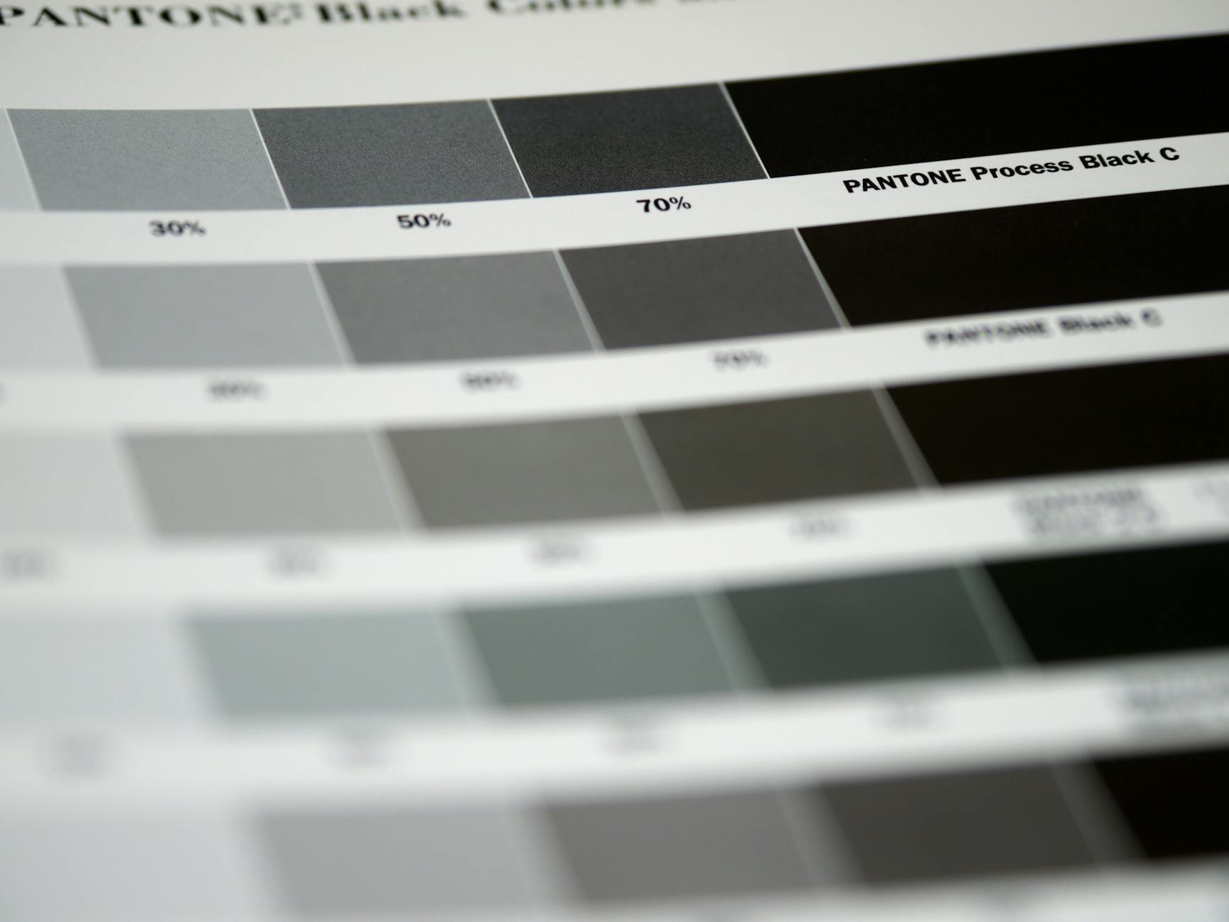
Colour Profiles and Rich Black
Two points that trip up even experienced designers:
Colour profiles. When you work in CMYK, you are working within a specific colour profile that defines the CMYK gamut for a particular ink/paper combination. The most common profiles for AU commercial printing are ISO Coated v2 (for gloss/coated stock) and GRACoL 2013 Coated (for uncoated). Using a profile that does not match the press produces a shift between your proof and the final print. If your printer supplies a profile, use it.
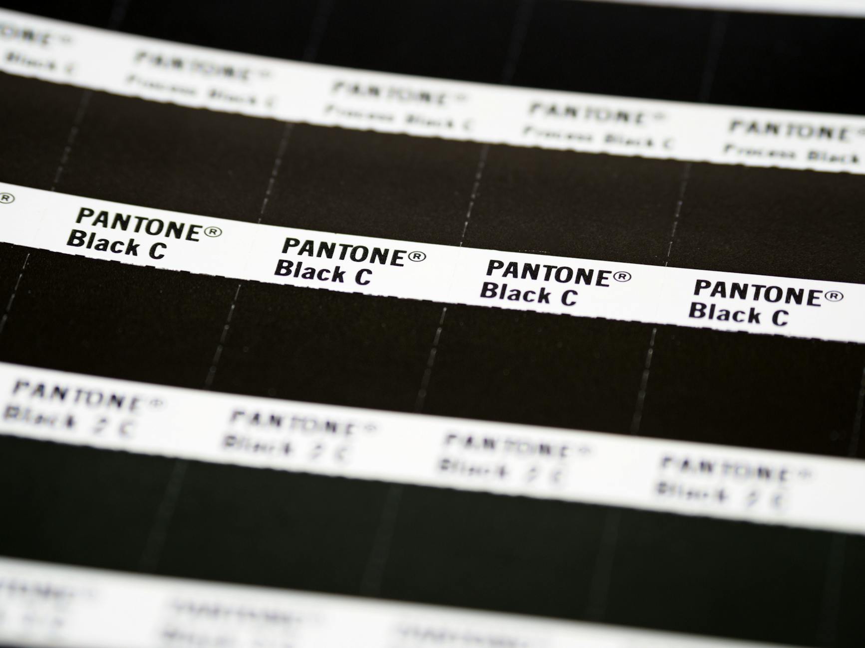
Rich black vs pure black. Pure black (K100 only) can look grey or slightly washed on large fills because the ink coverage is thin. Rich black, typically C60 M40 Y40 K100, produces a denser, more saturated black for large areas. However, rich black on small text or fine lines causes registration issues and blurry edges. The rule:
- Small text and fine lines: K100 only
- Large fills, backgrounds, and headlines at 24pt or above: rich black (C60 M40 Y40 K100)
Common Rejection Reasons: The Full List
Most file rejections fall into a short list of preventable problems.
| Rejection reason | How to fix |
|---|---|
| RGB colour mode | Convert document to CMYK before export |
| Low resolution (under 300 DPI) | Replace low-res images with 300 DPI at final size |
| Missing bleed | Extend background art 3mm beyond trim on all sides |
| Text/logos in bleed or outside safe zone | Move all important elements 3mm+ inside trim |
| Live (unoutlined) fonts not embedded | Outline text or confirm fonts are embedded in PDF |
| Incorrect file format | Export as PDF/X-4 or PDF/X-1a |
| Transparency not flattened (for PDF/X-1a) | Flatten transparency in export settings |
| Spot colours not converted | Convert Pantone/spot colours to CMYK unless printer confirms spot support |
| Images linked but not embedded | Embed all images before export (not “link to file”) |
| Incorrect document size | Match document dimensions to product spec including bleed |
| Raster logo at low DPI | Replace with vector (.ai, .eps, .svg) version |
Quick Spec Pointers by Product
You do not need to memorise everything above for every product. Here is where to focus per product type.
Flyers and brochures: CMYK, 300 DPI, 3mm bleed each side, 3mm safe zone. DL, A6, A5, A4, A3 are the standard AU sizes. See the flyer printing guide for size and paper stock specifics, and order via the Paperlust Print Shop flyers page.
Posters (A3 to A0 and above): CMYK, 300 DPI for A2 and below, 150 DPI for A1 and above. Bleed 3mm for standard sizes; check template for oversized. Read the poster design guide for layout and resolution specifics, and order via the posters page.
Business cards: CMYK, 300 DPI, 3mm bleed, 3mm safe zone. Standard AU size is 90 x 55mm. Rich black for large colour fills. Order via standard business cards.
Stickers and labels: CMYK, 300 DPI, bleed and safe zone measured from die-cut line (use the supplied template). Vector art is strongly preferred for clean edges.
Large format (corflute, banners, signs): 100-150 DPI at final print size. CMYK. Bleed 5-15mm depending on product (always check the spec sheet). These are viewed from distance so resolution requirements are lower.
Software Notes: Canva, Illustrator, Affinity
Adobe Illustrator and InDesign: Native CMYK document support. Set colour mode on document creation. Export using Preset > PDF/X-4 or build a custom preset with the settings above. These are the most reliable tools for print-ready output.
Affinity Publisher and Affinity Designer: Excellent print-ready output. Set document colour space to CMYK on creation. Export as PDF/X-4 from File > Export. Affinity handles ICC profiles well and is a strong cost-effective alternative to Adobe.
Canva: Works natively in RGB. The paid “Print” export option converts to CMYK on download, but colour shift risk is higher than working in a native CMYK environment. For important print jobs, download the highest-quality PDF from Canva and then convert and verify in a dedicated CMYK tool before uploading. Canva is fine for simple, colour-tolerant projects; less suitable for colour-critical work.
Frequently Asked Questions
What happens if I upload an RGB file?
Most printers, including automated print portals, will auto-convert RGB to CMYK during preflighting. The conversion uses a standard algorithm that maps out-of-gamut colours to their nearest printable equivalent. For simple designs with flat brand colours, the shift is minimal. For photography, bright neons, or colour-critical brand work, the auto-conversion can shift hues noticeably. Converting yourself gives you control over how the shift is handled.
My design looks great on screen. Why does the print look different?
Screen brightness, contrast, and the RGB colour space make most designs look more vivid on screen than they will on paper. Calibrate your monitor if possible, and use soft-proofing (Photoshop > View > Proof Colours; Illustrator > View > Proof Colours) with your target CMYK profile to simulate how the print will look before you send the file.
How do I know if my images are 300 DPI?
In Photoshop, go to Image > Image Size with “Resample” unchecked and enter your final print dimensions. The DPI field will show the true resolution at that size. In Illustrator or InDesign, right-click an image and select “Edit original” to open it in Photoshop. Alternatively, right-click the file in Finder/Explorer, choose Properties/Get Info, and look at the image dimensions. Divide pixels by inches to get DPI.
Do I need to outline fonts if I am exporting as PDF?
Not necessarily. PDF/X-1a and PDF/X-4 both require fonts to be embedded, and most export workflows handle this automatically with the right settings. However, outlining is a belt-and-suspenders approach that eliminates any risk of font issues entirely. The downside is that outlined text cannot be edited, so always keep the working file with live fonts.
What is the difference between PDF/X-1a and PDF/X-4?
PDF/X-1a is an older standard that prohibits RGB, transparency, and ICC profiles. It forces everything into CMYK. PDF/X-4 is more modern and allows managed colour and transparency layers, which modern RIP (raster image processor) software handles correctly. PDF/X-4 is generally preferred for current workflows. Use PDF/X-1a only if your printer specifically requests it.
My logo is black. Should I use K100 or rich black?
Depends on the size. For small logos, fine text, and anything with sharp edges or thin strokes, use K100 only. Rich black (C60 M40 Y40 K100) on fine lines causes registration blur where the four ink plates sit very slightly offset from each other, making edges look fuzzy. Save rich black for large background fills and oversized display text.
What is the safe zone and why does it matter?
The safe zone is the area 3-5mm inside the trim line. Anything outside this zone risks being clipped when the sheet is cut. Cutters are accurate but not perfect, and a tolerance of 1-2mm in either direction is standard. Keeping logos, important text, and faces inside the safe zone ensures they are never clipped.
Can I submit a JPEG or PNG instead of a PDF?
Most print suppliers accept high-resolution JPEGs (flatten layers, save at maximum quality, check the colour mode is CMYK). PNG is generally not recommended for print because it is designed for screen use and defaults to RGB. If a JPEG is submitted, the printer’s preflight software will check resolution and colour mode. PDF is preferred because it bundles colour settings, bleed marks, and fonts in one file, reducing the chance of any element being misconfigured.
Get Your Print Jobs Right the First Time
Setting up artwork correctly is a one-time learning curve. Once the CMYK, 300 DPI, 3mm bleed, and PDF/X-4 habits are built in, files go through without rejections.
Paperlust Print Shop provides print specifications and templates for every product to make this easier. Start with flyers for everyday marketing collateral, posters for large-format event and retail display, or business cards for professional identity pieces. Each product page includes the specs your file needs to meet.