
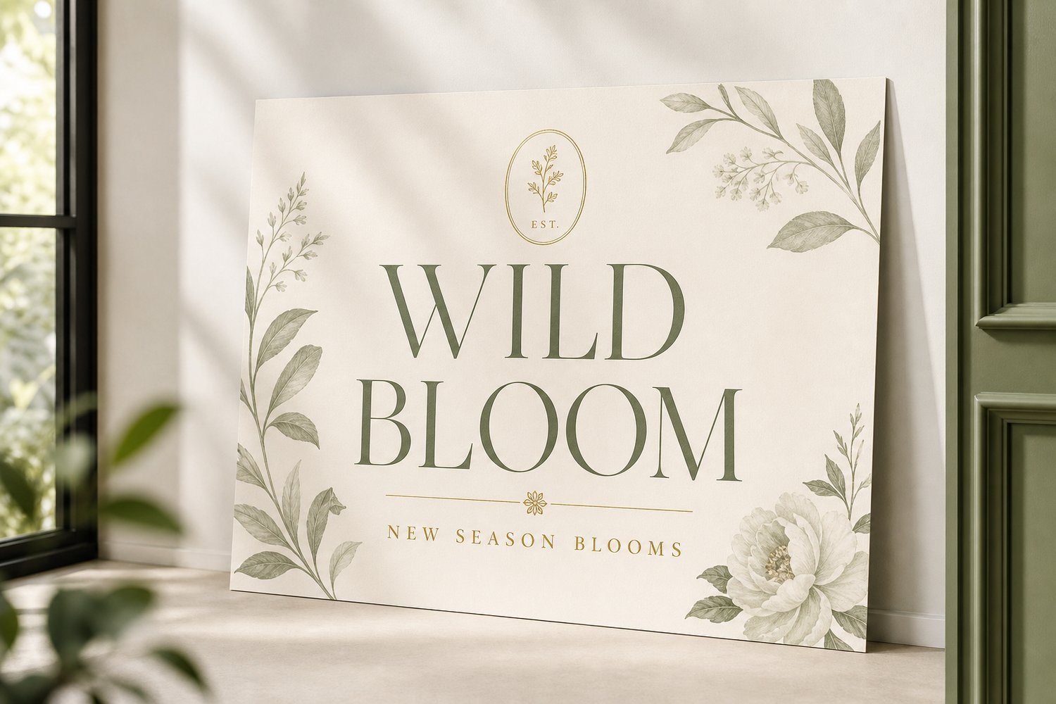
Getting a poster printed is straightforward. Getting it to print exactly the way you imagined it, with crisp text, accurate colours and clean edges, requires setting up your artwork correctly before you send the file. This guide covers every technical step: resolution, bleed, colour mode, fonts, file formats and the small details that make the difference between a stunning result and a reprint.
Whether you are designing an event poster, a retail display, a real estate board or a corporate announcement, the same rules apply across A1, A2 and A3 formats.
CHEAT SHEET
- Set your canvas to the final print size with 3mm bleed added to all four edges before you start designing.
- Use CMYK colour mode from the beginning. Converting from RGB at the end causes colour shifts.
- For A3 posters use 150-300 DPI minimum. For A1 and A2, 100 DPI at the final size is acceptable because of viewing distance.
- Export as PDF (preferred), then outline all fonts and embed all linked images before saving.
Why Print Specs Matter Before You Start
The most common reason a poster does not look right when printed is that the artwork was set up for screens, not for print. Screens display light; printers deposit ink. The two systems handle colour, resolution and edges differently.
Setting up your file correctly at the start takes about two minutes. Fixing a file after it has been designed to the wrong specs, or managing a reprint after artwork issues are caught post-submission, can take much longer.
Paperlust Print Shop prints posters on 200gsm synthetic stock. This material is moisture-resistant and holds sharp detail well, which means good artwork genuinely looks good. Poorly prepared artwork, however, cannot be rescued in production.
Canvas Size and Bleed: Set This First
Before you place a single element, set your artboard or canvas to the correct size with bleed included.
Standard A-Series Poster Dimensions
| Format | Print size | With 3mm bleed |
|---|---|---|
| A3 | 297 x 420mm | 303 x 426mm |
| A2 | 420 x 594mm | 426 x 600mm |
| A1 | 594 x 841mm | 600 x 847mm |
What Bleed Does
Bleed is a strip of artwork that extends beyond the final cut line. When a printer trims a poster to its finished size, the blade never cuts exactly on the line. Even a fraction of a millimetre of variation can leave a white gap at the edge if background colour or imagery stops exactly at the trim line.
Add 3mm bleed on all four sides. Any colour, gradient, pattern or image that touches the edge of your design must extend into the bleed area. Elements you want to keep away from the edge should sit at least 5mm inside the trim line, often called the “safe zone.”
Crop marks are the thin lines that tell the printer where to cut. Add them automatically when exporting your PDF, or include them in your artwork file if you are submitting a raster format.
Resolution: How Much Detail Your File Needs
Resolution is measured in DPI (dots per inch) and describes how many ink droplets are packed into each inch of print. More dots means finer detail and smoother gradients.
Resolution Requirements by Size
| Poster size | Minimum DPI | Recommended DPI | Notes |
|---|---|---|---|
| A3 (297x420mm) | 150 DPI | 300 DPI | Viewed close up; higher detail visible |
| A2 (420x594mm) | 100 DPI | 150-200 DPI | Balance file size with sharpness |
| A1 (594x841mm) | 100 DPI | 100-150 DPI | Viewed from distance; 100 DPI sufficient |
The Viewing Distance Rule
Resolution requirements decrease as poster size increases, because larger posters are viewed from further away. An A3 poster on a notice board is read from 50-80cm. An A1 event poster on a wall is read from 1-2 metres. At that distance, the human eye cannot resolve the individual dots of a 100 DPI print.
This is why a 100 DPI A1 poster looks sharp in context but the same 100 DPI A3 poster looks slightly soft when held in your hand.
For photography and complex artwork: if your design includes photos, check the resolution of the source images. A smartphone photo taken at full resolution is typically 12-48 megapixels and will print sharp at A3. Dragging and dropping a compressed JPEG from a website, often 72 DPI at screen size, will produce a visibly blurry print.
Vector artwork is resolution-independent. Logos, icons, illustrations and text created in vector format (Adobe Illustrator, Inkscape, Affinity Designer) can be scaled to any size without losing sharpness. Use vector artwork wherever possible for typographic elements and logos.
Colour Mode: CMYK vs RGB
This is the single most common file-prep mistake, and it causes the biggest visible difference at print.
How Each Mode Works
RGB (Red, Green, Blue) is the colour model used by screens. It works by mixing light. The colour palette is large and includes very vivid, saturated colours.
CMYK (Cyan, Magenta, Yellow, Black) is the colour model used by offset and digital printers. It works by laying down ink on paper. The colour gamut is smaller than RGB, and some bright screen colours, particularly vivid blues, electric greens and neon colours, cannot be reproduced accurately in print.
Why You Must Work in CMYK
When a CMYK press receives an RGB file, the software converts it automatically. Automatic conversion rarely produces the result a designer expects. Blues can shift purple. Vivid orange can become muted. The conversion algorithm does its best, but it cannot recover colours that are outside the CMYK gamut.
Start your document in CMYK. In Adobe Photoshop, set the document colour mode to CMYK before you begin. In Adobe Illustrator or InDesign, set the document colour profile to CMYK when creating a new document. If you are using Canva or a browser-based tool, export to PDF and check that the PDF is tagged as CMYK.
Black text: use 100K (100% black ink only) for body text on a white background. Using rich black (C:60 M:40 Y:40 K:100) on small text can cause slight misregistration and blurry edges. Reserve rich black for large headline text and solid background panels.
If you are working in Photoshop with photos: flatten your image and convert to CMYK via Image > Mode > CMYK Colour before saving. Compare the result to your screen version and adjust any colours that have shifted.
Typography: Fonts and Text Preparation
Typography is often where poster files fail quality checks at the print stage.
Outline Your Fonts
When you submit a file, the printer’s RIP software must render every font in your design. If the font is not embedded in the file or not installed on the production machine, the software substitutes a default font. The result is broken layouts and incorrect typefaces.
Outline all fonts before exporting. Outlining converts text to vector shapes, which have no font dependency.
In Adobe Illustrator: Select All > Type > Create Outlines. In Adobe InDesign: Export to PDF with the option to embed all fonts (the default setting in a print PDF export). In Affinity Publisher: Export > PDF > embed fonts.
After outlining, you cannot edit the text as text. Work from a saved backup of your editable version before outlining for the final export.
Minimum Text Size
Text smaller than 6pt can become illegible at print, particularly in reverse (white text on a dark background) where ink spread can close up fine letterforms. For reverse text, 8pt or larger is safer.
Do not use very thin font weights for small body text. Ultra-light and hairline weights at small sizes often disappear or appear broken in CMYK print. Stick to regular or medium weights for body copy.
File Formats: What to Submit
The file format affects how accurately the printer reproduces your design.
| Format | Recommended for | Notes |
|---|---|---|
| All poster artwork | Best format. Preserves vectors, embeds fonts, supports CMYK. Preferred by Paperlust Print Shop. | |
| SVG | Vector-only artwork | Good for simple vector designs. Cannot contain embedded raster images well. |
| Adobe Illustrator (.ai) | Vector artwork with raster links | Accepted. Ensure all linked images are embedded. |
| EPS | Legacy vector files | Accepted. Less flexible than PDF for complex layouts. |
| PNG | Photographic or raster designs | Accepted. Use 300 DPI (A3) or 150 DPI (A1/A2) at final size. Set to CMYK if your software supports it. |
PDF is the preferred format because it packages all elements, fonts and images into a single portable file. When exporting your PDF, use a print-quality preset: PDF/X-1a or PDF/X-4 if your software offers it. These presets enforce CMYK, embed all fonts, and discard screen-only features like RGB colour spaces and transparency that can cause unexpected results.
When you submit your file to Paperlust Print Shop posters, a design proof is prepared and sent for your approval before printing begins. This proof stage is your opportunity to catch any colour, layout or resolution issues before the job goes to press.
Images and Artwork: Embedding and Linking
In Adobe Illustrator and InDesign, placed images can be linked (the file references an external image on your drive) or embedded (the image is included inside the document). If you send a linked file without the linked images, the printer receives a low-resolution preview instead of the full image.
Embed all placed images before saving your final file. In Illustrator, open the Links panel and use Embed Image for any linked assets. In InDesign, linked images are packaged automatically when you export to PDF.
If your design includes raster photography alongside vector artwork, ensure the photos are CMYK and at the correct DPI before placing them. Upscaling a low-resolution image inside your design software does not add resolution; it just makes the same pixels bigger.
Pre-Flight Checklist Before You Submit
Run through this checklist before uploading your file.
Artwork setup
- Canvas is set to the correct poster size with 3mm bleed on all four sides
- Crop marks are included or set to export automatically
- All background colours and images extend fully into the bleed zone
- Important content and text sit at least 5mm inside the trim line
Colour
- Document is in CMYK colour mode
- No RGB colour profiles embedded
- Black text on white background uses 100K only
- Vivid or neon colours reviewed against CMYK gamut
Resolution
- All raster images are 150-300 DPI at A3 final size, or 100+ DPI at A1/A2 final size
- No images have been scaled up beyond their native resolution
- Vector elements (logos, icons, text outlines) confirmed as true vectors
Text
- All fonts outlined or fully embedded
- Minimum 6pt text size for filled text; 8pt for reverse/knockout text
- No text sits within the 5mm safe zone margin
File format
- Exported as PDF (preferred), SVG, AI, EPS, or PNG
- All linked images embedded
- File saved with print-quality settings
Need to print your poster in Australia? Paperlust Print Shop prints on 200gsm synthetic stock in A1, A2 and A3, with a design proof sent before production begins.
For related formats, the Poster Printing Australia: Sizes, Paper Stocks and Costs Explained guide covers stock selection and pricing, and A0 to A4 Poster Sizes Explained: Which to Use and When walks through which A-series size suits different display contexts.
If you need banners alongside your posters, the same CMYK and bleed principles apply to retractable and vinyl banners.
Frequently Asked Questions
What resolution should I use for an A1 poster?
For an A1 poster (594x841mm), a minimum of 100 DPI at the final print size is sufficient. A1 posters are typically viewed from a distance of 1-2 metres, and at that viewing distance the human eye cannot resolve finer detail. If your design includes close-up photography or fine detail that viewers will inspect at arm’s length, 150 DPI gives a comfortable margin. Avoid upscaling low-resolution images in your software; this does not add real resolution and will produce a blurry print.
Why do my colours look different on screen compared to the printed poster?
Screen colours are produced by RGB light, which has a much wider colour gamut than the CMYK inks a printer uses. When a design built in RGB is converted to CMYK, saturated colours, particularly bright blues, vivid greens and neons, shift toward duller equivalents. The fix is to work in CMYK mode from the beginning of your design. If you have an existing RGB design, convert to CMYK and review every colour block, adjusting anything that has shifted beyond your intent. The printed result will then match what you see in your CMYK-mode design software.
How do I add bleed to my poster in Canva?
Canva supports bleed for print. When creating your design, go to File > Page setup, enter your poster dimensions and enable the bleed option (Canva adds 3mm bleed automatically when you use a print-ready template or select “Add bleed” in the download settings). Download as a PDF for print to get a file with bleed and crop marks included. If you are entering a custom size manually, add 6mm to both the width and height (3mm per side) to set up the canvas with bleed included.
Do I need to include crop marks in my file?
Crop marks are recommended but not mandatory if you submit a PDF with the correct bleed included. Most PDF export settings, including Illustrator’s “Marks and Bleeds” panel and InDesign’s print-export options, allow you to add crop marks automatically on export without embedding them permanently in your artwork. If you are submitting a PNG or raster file, add crop marks inside the document so the printer can see where to cut.
What happens if I submit an RGB file by mistake?
The printer’s software will convert it to CMYK automatically. In many cases the result is close to acceptable, but saturated colours and blues are likely to shift. If colour accuracy matters for your job, it is worth resubmitting a CMYK file. Paperlust Print Shop includes a design proof before printing, so you will see the proof and can request a revision or resubmit a corrected file before the job goes to press.
Can I use a Canva, Google Slides or PowerPoint file for a poster?
Yes, with an important caveat: export from these applications to PDF rather than submitting the native file. Google Slides and PowerPoint are RGB applications designed for screen display. Export to PDF, then verify the export settings include CMYK colour if your application supports it. For best results with colour-critical designs, use CMYK-native software such as Adobe Illustrator, InDesign, or Affinity Designer. For simple typographic posters and announcements where exact colour matching is less critical, a Canva PDF export is generally reliable.