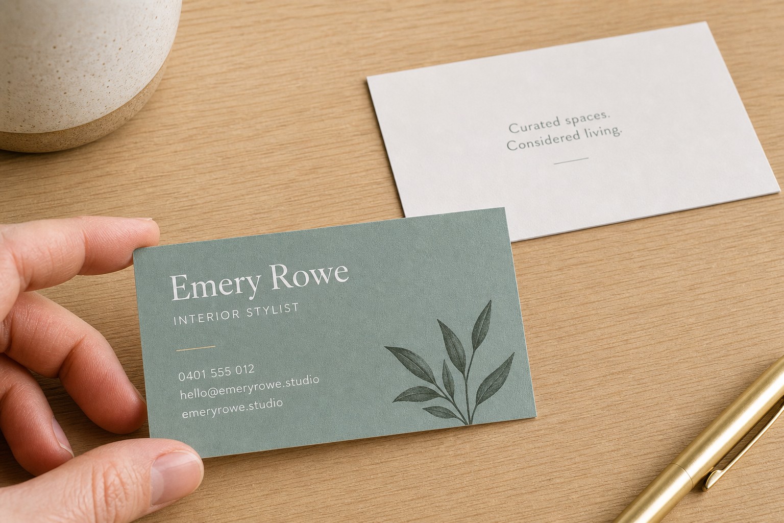
For a standard 90 x 55mm business card, use at least 9pt for your name and 7pt for contact details. Nothing should fall below 6pt. Below that threshold, type stops being reliable in commercial print production, and the reasons are physical rather than aesthetic.
Most design guides treat font size as a matter of taste. This one treats it as a matter of production. We print business cards every day, and we see the same problems repeat: type that looked fine on screen fills in on an uncoated stock, or breaks apart under a loupe after trimming.
- Name: 9-11pt recommended, 8pt minimum
- Job title: 7-9pt recommended, 6.5pt minimum
- Company name: 8-10pt recommended, 7pt minimum
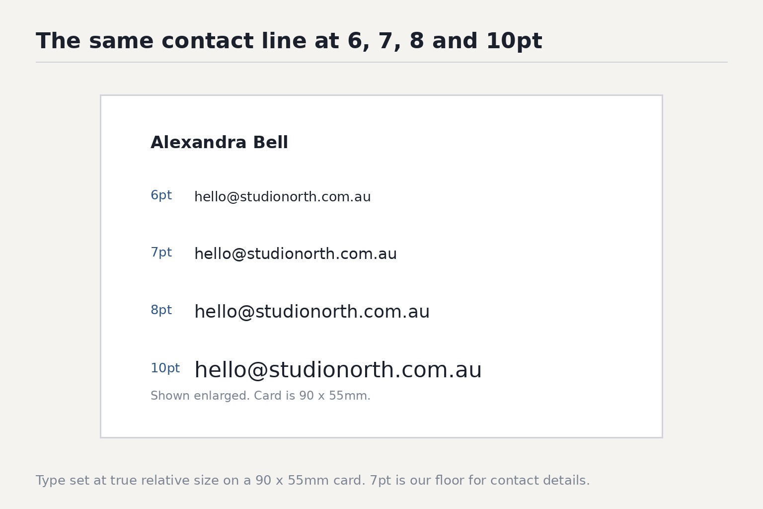
- Phone and email: 7-8pt recommended, 6pt minimum
- Address: 6.5-7.5pt recommended, 6pt minimum
- Fine print or legal text: 5.5-6pt recommended, 5pt absolute minimum
- Reversed type (light text on dark): add 1 to 1.5pt to every figure above
- Uncoated stocks (Linen or Cotton): add 0.5 to 1pt to every figure above
The hierarchy: recommended point sizes for every element
A business card is a small information hierarchy: name, role, brand, then the practical details a recipient needs to act on. Point sizes should reflect that priority.
| Element | Recommended | Hard minimum |
|---|---|---|
| Name | 9-11pt | 8pt |
| Job title | 7-9pt | 6.5pt |
| Company name | 8-10pt | 7pt |
| Phone number | 7-8pt | 6pt |
| Email address | 7-8pt | 6pt |
| Postal address | 6.5-7.5pt | 6pt |
| Fine print / legal | 5.5-6pt | 5pt |
These numbers assume a standard commercial weight typeface (Regular or Medium) printed on a coated stock such as Matte or Artboard. Fine print at 5pt is genuinely at the edge of what most commercial print processes can render reliably. If you can avoid going below 6pt for anything the recipient needs to read, you should.
The hard floor and why it exists
Below 6pt, type becomes unreliable for three connected reasons.
Ink spread. In digital and offset lithography, ink dots have a physical diameter. Very fine strokes, the thin parts of a serif, the interior of a small counter such as the hole in an “e” or “a,” are narrow enough that adjacent ink dots begin to merge. The result is filled-in type: text that looks correct in the proof and muddy in print. This is not a proof error. It is physics.
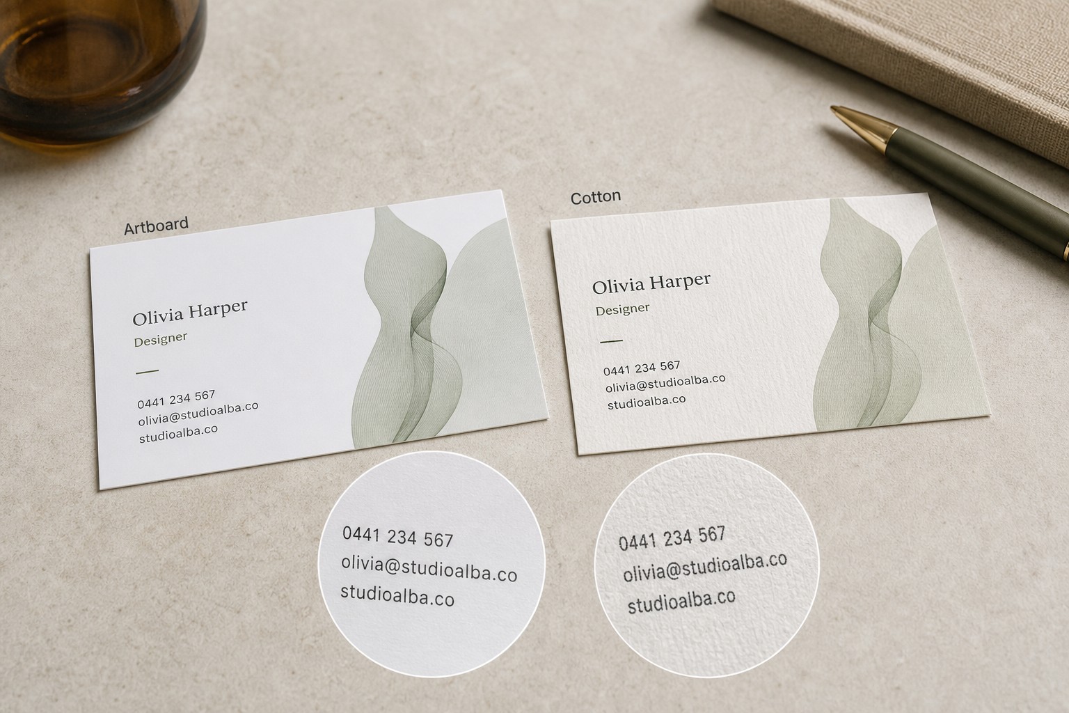
Stock absorbency. Uncoated papers absorb ink differently from coated ones. On a coated stock such as Artboard, the ink sits on the surface and dries quickly with defined edges. On an uncoated stock such as Linen or Cotton, ink is drawn into the fibres of the paper. That lateral spread is small in absolute terms, but at 6pt or below it is large relative to the stroke width of any reasonably proportioned typeface.
Trim tolerance. Guillotine cutting has a tolerance of roughly plus or minus 0.5mm across a commercial print run. At 6pt, 0.5mm of positional shift clips the descenders of letters on the bottom line. At 5pt, that same shift can remove entire character features. The standard safe margin on a 90 x 55mm card is 3mm from every edge. Text pushed closer than 3mm to the trim is at risk from cutting alone, regardless of point size.
The practical result of all three factors: 6pt is the hard floor for any text a recipient is expected to read. Fine print that exists purely for compliance can go to 5pt, but treat that as an absolute limit, not a starting point.
How your paper stock changes the answer
Paper stock is the single biggest variable in small-text legibility. The five paper options available for our standard business cards behave quite differently at small sizes.
Artboard with Velvet Laminate carries a soft-touch matte coating over a coated artboard base after printing. It softens fine serifs and hairlines slightly, but legibility is unaffected at 7pt and above. For type size, treat it like the other coated stocks: Matte and Metallic.
Matte is also a coated stock with similar surface characteristics to Artboard. Fine text performs well on Matte.
Metallic has a coated base. The reflective surface can make very small type harder to read at certain angles due to glare, but the actual print quality of fine strokes is comparable to Artboard. Keep small text away from highly reflective background areas.
Linen is an uncoated textured stock. The woven texture adds visual interest, but it creates two problems for small type: the surface tooth diffuses ink spread, and the texture itself can break up hairlines and fine strokes at smaller sizes. Add 0.5 to 1pt to every minimum in the table above. If your contact details are at 7pt on a coated stock, move them to 8pt on Linen.
Cotton is similarly uncoated, with a soft fibrous surface. It absorbs ink more aggressively than Linen, which means ink spread is slightly more pronounced. Apply the same uplift as Linen: add 0.5 to 1pt across the board, and keep fine print at 7pt minimum rather than 6pt.
Typeface choice at small sizes
Point size is only part of the equation. Two typefaces at the same nominal point size can read completely differently in print, for three reasons.
X-height matters more than point size. X-height is the height of a lowercase letter relative to the cap height. A typeface with a tall x-height (such as Helvetica or Gill Sans) has more ink mass in each lowercase character at any given point size, which means better legibility in small print. A typeface with a low x-height (many classical serifs) forces you to use a larger point size to achieve the same apparent size. Compare at print rather than on screen.
Light and Thin weights fail first. Light and Thin variants of any typeface have stroke widths that are often below 0.3mm at small point sizes. That is at or below the resolution threshold of most commercial digital presses. Use Regular or Medium weights for anything below 9pt. Reserve Light for display text, name or company name at 10pt and above, where the stroke width is physically large enough to hold detail.
Condensed faces lose legibility faster than the point size suggests. Condensed and Compressed variants squeeze the letter spacing and reduce the white space inside counters (the enclosed spaces in letters such as “e”, “a”, and “o”). At small sizes, those counters fill in before the size floor is reached. At 7pt and below, prefer a normal-width face.
Reversed type: light text on a dark background
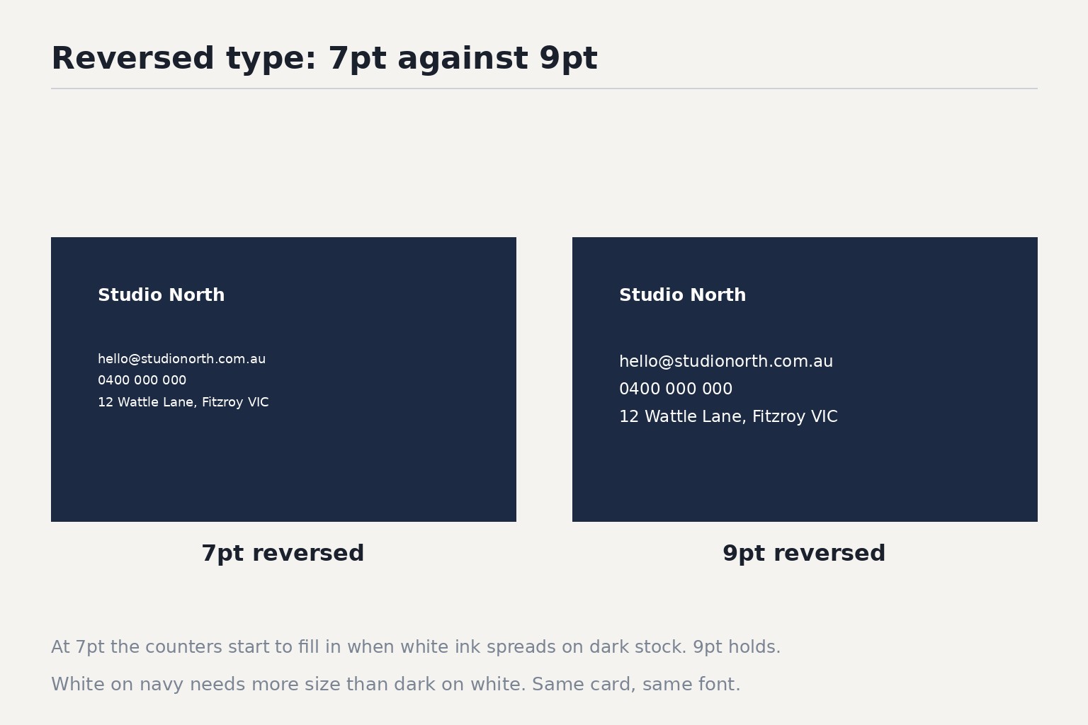
Reversed type, white or pale text on a dark or coloured background, requires larger point sizes than positive type for two reasons.
First, the eye perceives light text on dark backgrounds as slightly smaller than the same text at the same size rendered dark on light. The optical difference is measurable. You need approximately 1 to 1.5pt more to match the apparent size.
Second, dark backgrounds in commercial print are often built from multiple ink channels (for example, a dark navy built from cyan, magenta, yellow, and black). Ink registration across four channels has tolerances. Fine strokes in reversed type can lose part of their edge definition at the join between channels, making hairlines and thin serifs fuzzy in ways that are invisible at full size and noticeable under a loupe. Use Regular or Medium weight typefaces for reversed type; never use Light or Thin.
The practical rule: take every minimum in the table above and add 1 to 1.5pt for any element that is reversed out of a dark or medium background.
Safe area: type near the trim edge is a separate problem
A 90 x 55mm business card is cut from a larger sheet. The cut is accurate but not perfect. Australian standard bleed is 3mm beyond the trim line on every edge. Your safe area, the zone where all important content must sit, is 3mm in from every trim edge.
That gives you a live content area of 84mm x 49mm. Text outside that boundary is at risk of being clipped, regardless of point size.
This concern is separate from legibility. Text at 10pt placed 1mm from the trim edge is large and readable but will be clipped on some cards in the run. Text at 7pt placed 4mm from the trim edge is at the legibility floor but is safely inside the boundary and will survive cutting. Both problems are real; they have different causes and different fixes.
Keep your text grid inside the 84 x 49mm safe zone. If your design has text elements running close to the edge for stylistic effect, move them inward, or accept that a portion of cards in the run will show clipping.
Pre-flight checklist before uploading
Before submitting your artwork for your custom business cards, run through every item below.
Legibility checks
- Name is 9pt or above (8pt absolute minimum)
- All contact details are 7pt or above (8pt on Linen or Cotton)
- Fine print is 6pt or above (7pt on Linen or Cotton)
- Reversed type has an additional 1 to 1.5pt added to every size above
Typeface checks
- No Light or Thin weights used below 9pt
- No condensed or compressed faces used below 8pt
- Typefaces embedded in the file, or converted to outlines
Safe area checks
- All text sits inside the 84mm x 49mm safe zone
- No text is within 3mm of any edge
- Artwork canvas is set to 96mm x 61mm to include bleed
Stock-specific checks
- Ordering on Linen or Cotton: minimums increased by 0.5 to 1pt across all elements
- Reversed type on any stock: minimums increased by 1 to 1.5pt
Frequently Asked Questions
What is the minimum font size for a business card in Australia?
The absolute minimum is 6pt for text a recipient needs to read. Fine print can go to 5pt at a stretch. For contact details, phone, email, and address, use 7pt as your working floor, and 8pt on uncoated stocks such as Linen or Cotton.
What font size should I use for my name on a business card?
9 to 11pt for a standard 90 x 55mm card. Your name is the highest-priority element and should be the largest item on the card after any wordmark or logo. 8pt is the minimum if space is genuinely constrained.
What is the standard business card size in Australia?
The standard is 90mm x 55mm for a rectangular card. Rounded corner, oval, circle, and custom shapes are also available within a similar footprint.
Does the paper stock affect how small I can set my type?
Yes, significantly. Coated stocks such as Artboard and Matte hold fine type well. Uncoated stocks such as Linen and Cotton absorb ink and cause lateral spread at small sizes. Add 0.5 to 1pt to your minimums when ordering on an uncoated stock.
Why does reversed type need to be larger than normal type?
Two reasons: the eye perceives reversed type as slightly smaller at the same point size, and dark backgrounds built from multiple ink channels have registration tolerances that can fuzz thin strokes. Use 1 to 1.5pt larger for reversed text, and avoid Light or Thin weights.
Can I use 7pt font size for contact details?
Yes, on a coated stock such as Artboard, Matte, or Metallic. On Linen or Cotton, increase to 8pt. If the type is reversed out of a dark background, increase further to 8 to 8.5pt.
What safe margin should I leave around text on a business card?
3mm from every edge. The live content area on a 90 x 55mm card is 84mm x 49mm. Text outside that zone risks being clipped in the cutting process.
What typeface weights work best at small sizes on a business card?
Regular and Medium. Light and Thin weights have stroke widths that approach or fall below the resolution threshold of commercial presses at small point sizes and fill in or break apart in print. Reserve lightweight variants for display text at 10pt and above.