Most business cards sit in landscape. Portrait cards, the ones you hold like a phone screen, account for fewer than 5% of cards exchanged at networking events, which is precisely what makes them interesting. If you are considering a vertical layout, the decision goes deeper than personal taste: it is about whether the format reinforces your brand identity, suits your industry, and holds up through production. This guide walks through when vertical business cards earn their place, when they create the wrong impression, and how to design them so the format feels purposeful rather than accidental.
- Vertical business cards use the same 90 x 55 mm AU standard dimensions, rotated to portrait (55 mm wide, 90 mm tall).
- Best fit: photographers, designers, fashion, hospitality, architecture, and personal brands built on visual identity.
- Portrait orientation creates a natural top-to-bottom reading hierarchy with more vertical room for a bold name or image.
- Key limitation: portrait cards typically do not fit standard landscape card holders or rack dispensers.
- Premium finishes including spot UV, raised foil, and duplex board amplify the format’s impact.
- Artwork file setup: 61 mm wide x 96 mm tall at 300 DPI (includes 3 mm bleed on all sides).
What Actually Makes a Vertical Business Card Different
Portrait vs landscape: the core layout difference
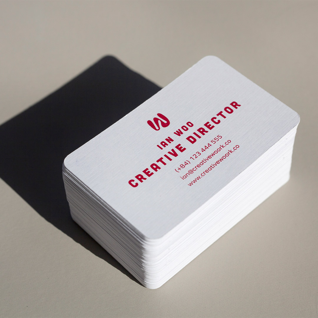
A vertical business card is a standard-sized card printed in portrait orientation. In Australia, the standard business card measures 90 x 55 mm. Flip that to portrait and you have a card that is 55 mm wide and 90 mm tall, the same physical dimensions, held a different way. There is no additional cost to print in portrait, no special stock required, and no structural reason to avoid it. The entire distinction is visual and psychological.
Landscape cards read left to right, which mirrors how English text flows and how most card holders are designed. Portrait cards read top to bottom, which mirrors how you hold a phone or a portrait photograph. That vertical reading direction shapes how information is arranged on the card and how the recipient perceives your brand the moment they take it.
Why the format carries a signal
Horizontal business cards are associated with conventional professional sectors: finance, law, real estate, corporate consulting. These industries value reliability, and a landscape card quietly reinforces those qualities. A vertical card signals that the person behind it is not constrained by convention. Whether that signal works in your favour depends entirely on context, a creative agency benefits from it; a tax accountant may not.
Industries and Contexts Where Vertical Cards Work Best
Creative and visual fields
Vertical business cards tend to perform best when the brand handing them out already operates in a visual or experiential field. Industries where portrait orientation is a natural fit include:
- Photography and videography: vertical proportion echoes the portrait format of photos, and the tall card leaves room for a signature image or stylised name treatment.
- Graphic design and branding: designers often use their card as proof of layout confidence. A well-executed vertical card demonstrates exactly that.
- Fashion, beauty, and wellness: portrait proportions align with the visual language of editorial imagery and product photography across these fields.
- Hospitality, cafes, and restaurants: small-run vertical cards can double as tasting notes or loyalty prompts in a format that feels deliberate rather than generic.
- Architecture and interior design: the vertical axis suits cropped project imagery or narrow typographic compositions.
- Freelancers and personal brands: when your name is the business, a vertical layout gives that name room to sit large, confident, and unmissable.
Networking situations that reward standing out
If you regularly hand cards to people who collect dozens of them at conferences or trade events, being the one vertical card in a stack of horizontal ones works in your favour. The card gets noticed when someone rifles through what they collected. That second glance is not guaranteed to convert, content still matters, but the format earns you the look.
At smaller, relationship-driven events, a vertical card can open a brief conversation about design choices. For anyone in a creative or brand-focused field, that is not a distraction, it is an opportunity to demonstrate exactly the kind of thinking clients are paying for.
When to Stay Horizontal Instead
Breaking the format rule only makes sense when the deviation reinforces your brand. There are situations where vertical cards create friction rather than interest.
Traditional professional contexts
Clients in banking, legal services, accounting, medical, and corporate procurement tend to associate visual convention with professionalism. A portrait card in these contexts can read as eccentric rather than considered. If your clients are making high-stakes decisions and trust is the primary currency, a clean horizontal card with quality stock and a subtle finish will serve you better than an orientation experiment.
Physical compatibility issues
Standard desktop card holders, wallet inserts, and acrylic lobby dispensers are built for landscape cards. A portrait card will not sit flat in most of these, it will slide around or fall out of a landscape wallet slot. If your clients typically file cards in physical holders at corporate offices or reception desks, a portrait card may end up discarded simply because it does not fit anywhere sensible.
This is not a reason to avoid vertical cards entirely. It is a reason to consider your target audience carefully before committing to the format for a large print run.
Design Principles for Portrait-Format Business Cards
Working with the top-to-bottom reading flow
Portrait cards follow a natural reading hierarchy from top to bottom. The most reliable approach is to place your name or brand name at the top in the largest type, followed by your role or title, then contact details at the bottom. This mirrors the reading experience of a page or screen and feels intuitive once you commit to it.
Resist the temptation to simply rotate a landscape layout. Content designed for a wide format rarely translates well to a tall one, text that fitted on a single line across 90 mm will wrap awkwardly across 55 mm. Redesign the layout from scratch using a portrait canvas.
Typography sizing and line length
The narrower 55 mm width means you have less horizontal space to work with. Long job titles, multi-word business names, and lengthy website URLs create line-wrap problems fast. Before finalising, check every text element at actual print size, what looks fine at screen zoom can become illegible at card scale.
As a general rule, keep supporting details (phone, email, website) in the 8-10 pt range, and allow your primary name or business name to sit larger at 14-18 pt for a bold single-line treatment. Use margins of at least 5 mm from each edge so content sits inside the safe area.
Logo and visual element placement
A vertical card gives you the full height of the card as a graphic column. A logo at the top with contact details at the bottom, separated by generous vertical white space, can look exceptional on premium stock. Alternatively, a full-bleed image or textured background in the top third of the card creates an instant visual anchor, while the bottom third carries contact information on a clean ground.
If your logo is landscape-oriented (wider than it is tall), test it carefully in portrait. A wide logo forced into a narrow column can look cramped. In these cases, consider using a logomark or monogram variant rather than the full lockup.
Print Finishes That Suit the Vertical Format
Because vertical cards already invite a second look, they pair naturally with premium finishes that reward close inspection. The following options are available through Paperlust Print Shop.
Spot UV for contrast and texture
Spot UV applies a high-gloss coating to selected areas of the card while the rest stays matte. On a portrait card, this works particularly well when the gloss treatment follows a vertical design element, a name, a ruled line, a logo, that reinforces the orientation. The textural contrast is subtle at arm’s length but immediately noticeable when held. Spot UV business cards at Paperlust Print Shop start from $0.14 per card.
Raised foil for metallic relief
Raised foil adds a metallic finish and a tactile elevated element, the combined effect is more demanding than flat foil alone. On a portrait card, a raised foil name treatment at the top creates an immediate focal point that draws the eye first and the fingertip second. Raised foil business cards start from $0.24 per card and carry a longer production lead time than digital or standard print methods.
Duplex board for edge colour and depth
Duplex cards are produced by laminating two sheets of card stock together, often in contrasting colours, creating a visible coloured edge, a third design surface at no extra design effort. On a vertical card, the coloured edge running along the tall sides of the card creates a framing effect that looks intentional and premium. Duplex business cards start from $2.27 per card, reflecting the additional material and production complexity.
Standard stock for clean, minimal impact
Not every vertical card needs a premium finish. A well-considered portrait layout on quality standard card stock can be just as striking as an over-produced card. Standard business cards at Paperlust Print Shop start from $0.28 per card, with 24-hour production available for orders that need a fast turnaround.
Common Mistakes When Designing Vertical Business Cards
Packing in too much information
The narrower width of a portrait card makes overcrowding immediately visible. If your landscape card already carried five lines of contact detail, a QR code, a tagline, and a social handle, a vertical layout will not fix that, it will make it worse. A portrait card rewards reduction: work out the minimum information the card needs to do its job. Name, one contact channel, and a clearly stated role is often enough. Let the design carry the personality.
Rotating a landscape layout instead of redesigning
Rotating a landscape artwork file by 90 degrees is not vertical card design. The proportions change fundamentally. Text wraps differently, white space distributes differently, and alignment that worked across 90 mm rarely translates to 55 mm. Start with a fresh portrait canvas (61 mm wide x 96 mm tall including bleed) and build the layout deliberately for the format.
Using the format without brand alignment
Vertical cards can look self-conscious when the rest of a brand identity is conventional. If your website, social presence, and signage are all built around a traditional horizontal aesthetic, a portrait business card creates a visual inconsistency rather than a statement. The format works when it extends your brand direction, not when it contradicts it.
File Setup and Ordering in Australia
Correct artwork dimensions
For printing in Australia, set your vertical business card artwork to the following specifications:
- Finished size: 55 mm wide x 90 mm tall
- Artwork with 3 mm bleed: 61 mm wide x 96 mm tall
- Resolution: 300 DPI minimum
- Colour mode: CMYK for digital print; check requirements for foil and specialty finishes
- Safe zone: keep all text and logos at least 3-5 mm inside the trim edge
Ordering at Paperlust Print Shop
Paperlust Print Shop accepts custom artwork uploads across all business card product types. Upload your portrait-orientation file at the correct bleed dimensions and select your preferred print finish. If a designer is preparing your files, confirm they are supplying artwork at 61 x 96 mm with 3 mm bleed and content inside the safe area. Orders using standard stock, flat foil, or coloured paper qualify for 24-hour production. Specialty finishes including spot UV, raised foil, Scodix, and duplex require additional production time, allow extra days for these when planning for an event or launch deadline.
Paperlust Print Shop is an Australian specialty print business offering business cards, stickers, labels, signage, and marketing materials with professional-grade print quality. With premium finishes including duplex, raised foil, spot UV, and Scodix available alongside fast digital production, the Print Shop combines finish variety with free overnight Startrack delivery on every Australian order. All products are printed and dispatched from Australia.