A business card with a blank reverse is wasted real estate. Double-sided business cards give you twice the canvas to communicate your brand, share what matters, and leave a stronger impression after the handshake. The challenge is not whether to use both sides – it is knowing how to use them well so each side earns its place.
This guide covers the design decisions that separate a cluttered two-sided card from one that genuinely works harder for your business. Whether you are ordering your first print run or refreshing an existing design, these tips apply across standard, foil, and premium stock options alike.
Double-Sided Business Card Design: Quick Reference
- AU standard size: 90 x 55 mm – keep this consistent across both sides
- Bleed: 3mm on all edges; safe zone 3mm inside the trim line
- Resolution: 300 DPI minimum at final print size; CMYK colour mode
- Front side: Name, title, primary contact method, logo – essentials only
- Back side: One clear job – QR code, services list, or bold brand moment
- Consistency rule: Same colour palette and typefaces across both sides
- Finish options: Spot UV, raised foil, flat foil – choose one hero finish
- File format: High-res PDF with bleeds and embedded fonts, one page per side
Why Both Sides Deserve a Design Brief
The case for double-sided printing comes down to a simple question: what do you want the person holding your card to do next? A front-only card answers who you are. A double-sided card answers who you are and what to do with that information.
Research into how business cards are used shows that cards get two moments of attention: a quick glance when received, and a second look when revisited later. That second look – when someone rediscovers the card in their wallet or on their desk – is your best opportunity to prompt action. A bare white back offers nothing in that moment. A purposeful design prompts a scan, a call, or a visit to your site.
What the reverse side can do for your business
For service businesses, the reverse is an ideal location for a short services summary or speciality list. For retail and hospitality, a loyalty offer or first-visit discount gives people a concrete reason to hold onto the card. For creatives and consultants, a bold brand colour block or portfolio QR code reinforces the impression made in person.
The key is giving the back a specific job before you open a design file. Back-of-card decisions made in isolation tend to produce cluttered, unfocused results. Decide on the purpose first, then design to serve that purpose.
When a single-sided card is the better choice
Double-sided printing earns its place when the reverse has clear intent. If you are designing the back simply to fill space, a single-sided card with a standout finish – spot UV or raised foil on premium stock, for example – will do more for your brand. The goal is intentional use of both surfaces, not using them because they are available.
Designing the Front: Lead with the Essentials
The front of your business card has one job: introduce you clearly and memorably. This is not the place for your full service catalogue, ABN, or social handle collection. Restraint on the front is what gives the reverse room to breathe and feel purposeful.
What belongs on every front side
Every front should carry your name (set prominently), your title or business category, your primary contact method (mobile number or email), and your logo or wordmark. A website URL is optional if you plan to include a QR code on the back – listing both is redundant and adds visual noise where none is needed.
A physical address is only necessary if foot traffic to your location is part of the customer relationship. For most service businesses, listing your suburb or city is enough to establish presence without committing to a full street address. That decision frees up meaningful space on the front side.
Hierarchy at 90 x 55 mm
At standard Australian business card dimensions, hierarchy matters more than creativity. Your name should be the largest text element after the logo. Your title sits at approximately 70 percent of the name size. Contact details are the smallest text, typically 7-8pt. Running smaller than 7pt risks legibility issues on coated, linen, or textured stocks.
Keep margins generous: at least 5-6 mm from all edges, beyond the 3 mm safe zone minimum. Cards that feel spacious read as premium. Cards crammed to the edges feel low-budget regardless of the finish selected.
Designing the Back: Give It One Clear Job
The most common mistake with double-sided cards is treating the back as a second front. Each side should have a distinct purpose. If the front introduces you, the back should prompt action or deepen the brand impression.
QR codes as digital bridges
A QR code on the reverse is the most versatile use of the back side for most businesses. Link it to something specific: a booking page, online portfolio, product catalogue, or a contact-save link (vCard format). Generic homepage links underperform because they ask recipients to do further work once they land. The more targeted the destination, the more useful the scan.
Always pair the QR code with a short label that explains the action, such as “Book a free consult” or “View our portfolio.” A bare QR code creates hesitation. A labelled one creates curiosity and completes the prompt. Size the code to at least 25 x 25 mm on the printed card to ensure reliable scanning across a range of devices and lighting conditions. Test from the final print file before submitting your order.
Services summary and short credibility signals
For trade businesses, specialists, and consultants, a short bullet list on the reverse communicates scope without requiring a website visit. Keep it to three to five points and use plain, specific language. “Residential electrical, commercial fit-outs, Level 2 ASP work” performs better than “Full electrical solutions for all needs.”
A single testimonial snippet can also work well here – one attributed line with a star rating if relevant. A business card is not the right format for long-form social proof, but one credibility signal placed strategically can shift how the card is received and stored.
Brand extension with colour and texture
For design-forward brands and creative businesses, the reverse can be a pure brand moment. A full-bleed brand colour, a pattern from your visual identity, or a single strong typographic treatment can transform a functional card into something worth keeping. This approach works particularly well with a contrasting front: a white or light neutral front paired with a deep navy, forest green, or terracotta reverse creates a reveal effect when the card is turned over for the first time.
Making Both Sides Work Together
The front and back of a double-sided card are two parts of a single conversation. They should feel designed as a pair rather than as two separate items that happen to share a physical object.
Colour consistency across sides
Use the same palette on both sides. If your front uses navy and gold, the reverse should pull from that same set. Introducing new colours on the back creates visual inconsistency and signals that the design was not considered as a whole. The reverse can be bolder or more minimal than the front – a full-bleed brand colour on the back against a white front creates strong contrast – but the colour story must remain coherent.
Typography across both sides
Use the same typefaces across front and back. If you use a serif for your name on the front, use it for any headline element on the reverse. Switching typeface families between sides creates the impression of two different brands. You can vary weight across sides – bold on the front, light on the back, for example – but keep the family consistent throughout.
The one duplication to avoid
Never repeat contact information across both sides. If your email address appears on the front, it does not need to be on the back. Repetition wastes the space the reverse is there to fill and signals a lack of design intent. Every element on the back should be either new information or a new way to engage with information already established on the front.
Print Finish Options That Elevate the Reverse
The finish you choose has a significant effect on how the back of the card is perceived. For double-sided cards, the reverse is where a carefully chosen finish can create real contrast, tactile interest, and a lasting physical impression.
Spot UV for selective gloss
Spot UV applies a high-gloss coating to specific elements while leaving the surrounding area with a matte finish. On the reverse, this is ideal for a logo, QR code, or a decorative element within a colour block. The contrast between coated and uncoated areas creates a subtle tactile quality that encourages handling and makes the design feel considered.
Spot UV is available from $0.14 per card at Paperlust Print Shop. Note that spot UV requires a longer production run than standard cards, so allow for additional lead time if you are working to a specific date.
Raised foil for a dimensional, tactile impression
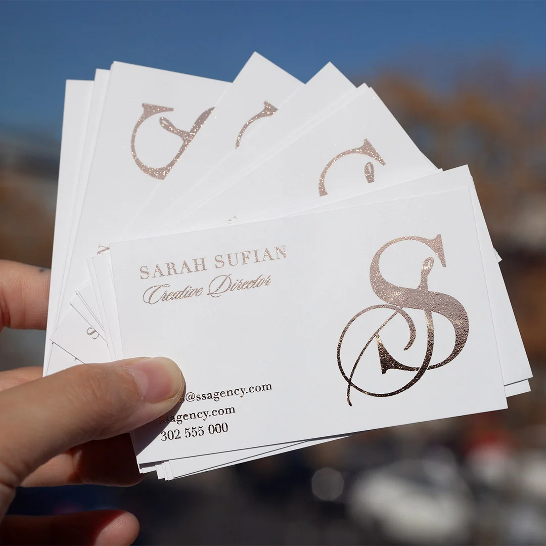
Raised foil adds a metallic sheen and a dimensional, tactile quality to any element it covers. Applied to the reverse on a logo, monogram, or a single standout line of text, it creates a card that feels genuinely premium in the hand. Raised foil is available in gold, silver, rose gold, and several specialty colours from $0.24 per card inc GST.
Like spot UV, raised foil requires longer production lead time than standard or flat foil cards. If your order has a deadline, confirm lead times at checkout and order accordingly.
Flat foil for mirror-bright impact with fast turnaround
Flat foil delivers a mirror-bright metallic finish without the dimensional element of raised foil. It is the fastest foil option, with 24-hour production available, and works well applied to either side of a card. A flat foil reverse on a matte white front creates a striking contrast that reads as premium without requiring specialty lead time. Flat foil business cards start from $1.52 per card inc GST.
File Setup: Getting the Technical Details Right
A strong design can be undermined by poor file preparation. These are the technical requirements to check before submitting a double-sided print job to any Australian printer.
Bleed, safe zones, and trim dimensions
The standard Australian business card is 90 x 55 mm. Your design file should include 3 mm of bleed on all four edges of each side, making the total canvas 96 x 61 mm per side. Any background colour or pattern that extends to the card edge must reach the full bleed line – anything short of that risks a thin white hairline edge appearing after cutting.
All text and logos should sit within the safe zone: 3 mm inside the trim line, or 6 mm from the edge of the bleed canvas. This accounts for natural variation in the guillotine cutting process. Elements sitting too close to the trim risk being cut into, which is most visible on clean typographic treatments and fine-line logos.
Resolution, colour mode, and file format
All artwork and embedded images should be at 300 DPI minimum at final print size. Files below this will appear soft or pixelated in print, particularly on premium and textured stocks. Build your files in CMYK colour mode from the start. RGB files are converted by the print process, which commonly produces unexpected colour shifts – particularly with deep navies, rich reds, and dark greens. Converting late produces different results than building in CMYK throughout.
Supply your print-ready file as a high-resolution PDF with bleeds included and fonts embedded or outlined. Submit front and back as separate pages within a single PDF document. If your software supports trim marks, include them – this speeds up the pre-press check and reduces the chance of a correction request before your job goes to print.
About Paperlust Print Shop
Paperlust Print Shop is an Australian business printing service based in Melbourne, offering a full range of business card finishes including standard digital print, spot UV, raised foil, flat foil, duplex, and coloured paper stocks. All orders include free overnight Startrack delivery within Australia and are backed by a 100% happiness guarantee. Print Shop works with small businesses, creative studios, and trade operators across Australia with a focus on quality output and fast turnaround times.
Frequently Asked Questions
What is the standard business card size in Australia?
The standard Australian business card size is 90 x 55 mm. This is consistent across most local and international print providers. Always supply your design file with 3 mm bleed on all edges and keep critical elements within the 3 mm safe zone inside the trim line.
Does double-sided printing cost more?
Yes, printing on both sides adds a cost compared to single-sided, though the difference is generally modest relative to the total order cost. The premium reflects the additional press pass and any finish applied to the reverse. For most businesses, the value of using the extra space to prompt an action far outweighs the cost difference.
What should I put on the back of a business card?
The back works best when it has one clear purpose. Common effective options include a QR code linking to a booking page or portfolio, a short list of three to five services, a full-bleed brand colour with your logo, or a loyalty offer. Avoid duplicating contact information already on the front – use the reverse to add something new.
Can the front and back have different finishes?
Yes. A popular combination is a matte front with a spot UV or foil element on the reverse. This creates tactile contrast and draws attention to the back when someone first handles the card. Confirm available finish combinations with your print provider before ordering, as not all finishes are compatible with all stocks.
How large should a QR code be on a business card?
Size your QR code to at least 25 x 25 mm on the finished card to ensure reliable scanning across different devices and lighting conditions. Use a high-contrast combination – dark code on a light background works best. Avoid placing spot UV gloss directly over the QR code, as the gloss can reduce scan reliability under certain lighting. Always test from the final print file before submitting your order.