For consultants, a business card carries more weight than it does for almost any other professional. In a sector built on trust, credibility, and first impressions, the moment you hand over your card is a silent pitch – the quality, feel, and design communicating your standards before you have said a word. Whether you are an independent management consultant, a financial advisor, or an executive coach, the right card can open doors; the wrong one can quietly close them.
This guide covers everything you need to choose and print consultant business cards that genuinely reflect your expertise: from stock and finish decisions to layout hierarchy, AU print specifications, and finish recommendations matched to your consulting niche.
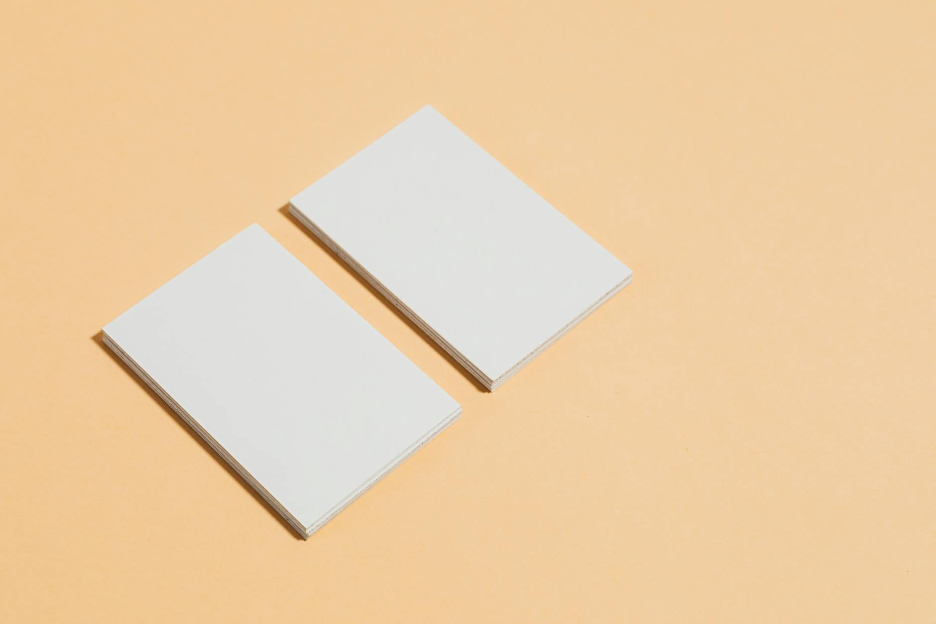
- Standard AU size: 85 x 55mm (landscape)
- Recommended stock weight: 400-600 GSM for a premium, substantial feel
- Key finishes for consultants: Spot UV (contemporary premium), raised foil (authority and prestige), soft-touch matte (approachable premium)
- Essential information: Full name, specific title/niche, direct mobile, professional domain email, website or LinkedIn QR code
- Proof turnaround: 1-2 business days
- What to leave off: Generic titles, personal email addresses, unnecessary social handles, outdated fax numbers
Why Business Cards Still Matter for Consultants
The psychology of the physical handover
Digital networking tools are everywhere, but the physical exchange of a business card triggers something that a LinkedIn connection request cannot: a tactile, memorable moment. Research into embodied cognition shows that people associate physical weight and texture with competence and value. A flimsy, lightweight card communicates something unintended. A well-designed card on premium stock – with a finish that invites a second look – creates a cognitive anchor that keeps you front of mind long after the meeting ends.
For consultants, this matters because the sales cycle is long. A prospect who meets you at a conference may not need your services for months. Your card is the artefact that survives until that moment arrives, sitting in a wallet, a cardholder, or pinned to a pinboard as a reminder to follow up.
When digital networking is not enough
Consultants who rely solely on digital channels miss a significant portion of relationship-driven referrals. Senior decision-makers – the people who hire consultants at the organisational level – often prefer in-person interactions, particularly in sectors like finance, law, construction, and government. In these environments, not having a physical card signals a lack of preparation. Having an outstanding one signals the opposite.
The card also functions as a physical commitment device. When someone pockets your card at an event, they are more likely to follow up than if they simply added you on LinkedIn, where you become one of hundreds of connections competing for attention in a scrolling feed.
What to Include on a Consultant’s Business Card
The most common mistake consultants make is either overcrowding their card with information or being too vague about what they actually do. Both undermine the card’s primary function: making it easy for the right person to contact you for the right reason.
Name, title, and niche clarity
Your name should be the dominant element on the front of the card. Below it, your title needs to be specific enough to communicate your value proposition immediately. “Consultant” alone is too vague. “Organisational Change Consultant” or “Financial Risk Advisor” is immediately actionable for a prospective client scanning a stack of cards after an event.
If you hold a credential that is meaningful to your target clients – CPA, AICD, PMP, or similar – include it alongside your name or title. Do not list every qualification you hold. Choose the one that resonates most with the clients you want to attract, and let the rest of your professional presence fill in the detail.
Contact details that convert
Include a direct mobile number (not a receptionist line), a professional email address on your own domain (not Gmail or Hotmail), and your website URL. A QR code linking to your LinkedIn profile or a specific landing page is increasingly standard among consultants and adds practical value without cluttering the design.
If your practice is geographically focused, include your city or region. It signals local expertise and community connection without requiring a full street address, which can feel overly formal or raise security concerns for sole operators.
What to leave off
Remove anything that dilutes the core message. Fax numbers are redundant. Multiple social handles for platforms your clients do not use add visual noise without value. A tagline can work if it is specific and compelling – for example, “Cash flow strategy for ASX-listed SMEs” – but avoid generic marketing language like “Solutions-focused” or “Your trusted partner.” If a phrase could appear on any consultant’s card in any sector, cut it.
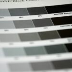
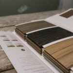
Stock and Finish Choices That Signal Expertise
This is where consultant business cards either earn their keep or undermine everything else about your brand. Stock and finish are felt before they are seen, and the impression formed in the first second of handling shapes how the rest of your information is received.
Standard business cards: when they work
A standard business card on quality 350-400 GSM stock with a clean design remains appropriate in consulting contexts where simplicity and restraint are culturally valued – technology consulting, academic advisory roles, or government sector engagements. The key is ensuring the card is printed on genuinely thick stock with sharp colour registration. Low-quality standard cards communicate budget constraints, and budget constraints are not the first association you want a potential client to form about you.
Spot UV for strategic emphasis
Spot UV applies a high-gloss resin coating to selected areas of the card – most commonly the logo, your name, or a key visual element. On a matte base stock, this creates a striking tactile contrast that invites repeat handling. Spot UV business cards work particularly well for consultants who want to appear innovative and contemporary without leaning into overt ostentation. Management consultants, strategy advisers, and marketing consultants often find this finish the sweet spot between authority and approachability – premium without being showy.
Raised foil for authority and prestige
Raised foil adds a dimensional, textured metallic element to your card. Gold, silver, rose gold, and copper are the most common choices for professional use. The combination of visual metallic shine and physical texture creates an immediate association with premium positioning. Raised foil business cards are the natural choice for consultants in sectors where prestige signals carry real commercial weight: financial services, executive search, luxury real estate advisory, and senior management consulting. The card does not just introduce you – it quietly makes an argument for your fee.
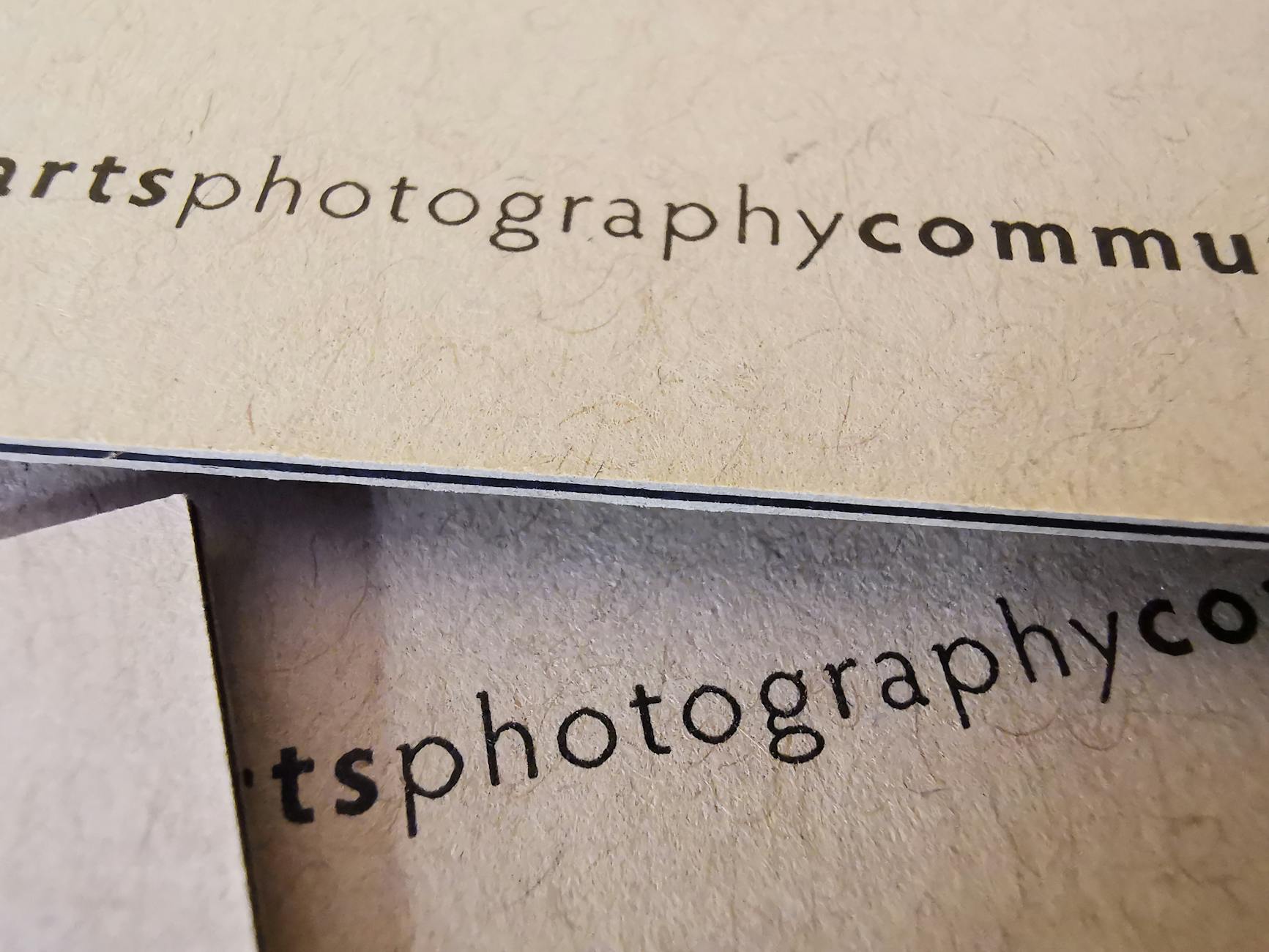
Design Principles That Signal Expertise
Whitespace and layout hierarchy
Crowded card designs try to fill every millimetre of available space. Expert card design does the opposite: whitespace signals confidence. When a card is not crowded, it communicates that the holder is established enough not to need to list every service and credential in small print.
Use a clear hierarchy: your name largest, your title secondary, your contact details tertiary. The eye should move naturally from most to least important without hunting for information. If a reader has to squint or scan to find your email address, the layout has failed its primary job.
Typography choices that project authority
Serif typefaces – Garamond, Playfair Display, Baskerville – carry associations with established institutions and long-standing expertise. They suit legal, financial, and management consulting particularly well. Sans-serif typefaces – Helvetica, Neue Haas Grotesk, GT Walsheim – signal modernity and clarity, appropriate for technology, innovation, and marketing consultants.
Mixed-type approaches (one serif, one sans) can work effectively when executed with discipline. Avoid decorative script fonts for the primary name treatment; they reduce legibility at small sizes and often undermine the authority the rest of the design is working to project.
Colour palettes for professional trust
Navy, charcoal, forest green, and deep burgundy consistently perform well in professional consulting contexts. These tones carry cultural associations with stability, establishment, and trustworthiness. Black on white (or reversed, white on black) remains perennially effective for its clarity and sophistication.
Bright, high-saturation palettes can work for consultants in creative industries – brand strategy, design thinking, creative direction – but require confident design execution to read as intentional rather than informal. When in doubt, a neutral background with a single well-chosen accent colour is the safer bet.
Consultant Type Matching Guide
Different consulting niches carry different professional expectations. Use the table below as a starting point for matching your card’s stock, finish, and design tone to the clients you are trying to impress.
| Consultant Type | Recommended Stock | Recommended Finish | Design Tone |
|---|---|---|---|
| Management / Strategy | 450 GSM+ | Spot UV or matte soft-touch | Clean, restrained, serif or modern sans |
| Financial Advisor | 500-600 GSM | Raised foil (gold or silver) | Dark base, prestige palette, minimal copy |
| Technology / IT | 400-450 GSM | Spot UV or clean matte | Modern sans-serif, structured grid, QR code |
| Marketing / Brand | 400-500 GSM | Spot UV or soft-touch matte | On-brand palette, bold typographic treatment |
| Executive / Leadership Coach | 500 GSM+ | Raised foil or soft-touch matte | Warm neutrals, approachable yet premium |
| HR / People and Culture | 400-450 GSM | Matte or spot UV | Inviting palette, approachable typeface |

AU Print Specifications for Consultant Business Cards
Standard sizes and stock weights
The standard Australian business card size is 85 x 55mm landscape. Portrait orientation (55 x 85mm) is less conventional but can be a deliberate differentiating choice for consultants in creative or design-adjacent fields. Square formats (55 x 55mm or 60 x 60mm) are growing in use among innovation and technology consultants who want a distinctive format.
For consultant use, 400 GSM is the minimum recommended stock weight. It provides the rigidity that communicates permanence and intentionality. The 450-600 GSM range is preferred for premium positioning. Duplex cards – two layers bonded together – can reach 600 GSM or above and allow for a contrasting mid-layer colour, visible only at the card edge, adding a discreet premium detail that rewards close handling.
File setup and proof timeline
All print files should include a 3mm bleed on all sides, with critical content (text and logos) kept at least 3mm inside the trim edge. Files should be in CMYK colour mode with a minimum resolution of 300 DPI. If using a full-bleed dark background, extend the background colour fully into the bleed area to avoid white slivers at the trim line after cutting.
Proof turnaround is 1-2 business days. Review your digital proof carefully before approving: check that your name is spelled correctly, the phone number is accurate, and the QR code destination is live and resolving correctly.
Frequently Asked Questions
What is the standard business card size in Australia?
The standard Australian business card size is 85 x 55mm landscape. This matches the ISO CR80 card format and fits standard card holders and wallets.
What GSM should a consultant’s business card be?
A minimum of 400 GSM is recommended for consultant cards to convey substance and quality. Premium positioning typically calls for 450-600 GSM stock, where the added thickness is immediately perceptible when the card is handled.
What finish is best for consultant business cards?
Spot UV offers a contemporary premium feel appropriate for most consulting niches. Raised foil is the choice when authority and prestige are the priority, particularly in financial services and senior management consulting.
Should I put a QR code on my consultant business card?
Yes, if it links to a specific and useful destination such as your LinkedIn profile, a booking page, or a tailored landing page. Ensure the QR code is large enough to scan reliably (minimum 25 x 25mm on the printed card) and test it before approving the final proof.
How many business cards should a consultant order?
Most consultants order 250-500 at a time. If you attend regular networking events or work across multiple sectors, 500-1,000 cards reduces reprint frequency and brings the per-card unit cost down considerably.
Can I use both sides of a consultant business card?
Yes, and the back is a useful asset when used well. Common back-of-card content includes a brief value proposition, a short list of core services, a QR code, or a clean version of your logo. Avoid cramming in every service you offer – the back should reinforce your positioning, not list everything on your website.
About Paperlust Print Shop
Paperlust Print Shop is an Australian-based premium print service specialising in business cards, stationery, and marketing materials for professionals and businesses across every sector. Every order is produced on quality-certified stock with proofs delivered in 1-2 business days and express shipping available Australia-wide. From clean standard cards through to raised foil and spot UV finishes, all options are available online with no minimum order requirements.