
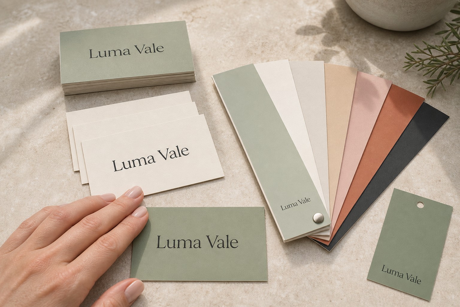
Getting brand colours right in print is one of the more frustrating parts of running a business. A logo colour that looks sharp on screen can come out noticeably different once printed, leaving you with business cards that don’t match your flyers, or a brand blue that reads more purple under office lighting.
The root cause is almost always a mismatch between colour systems. Designers work in RGB on screen. Printers use CMYK. Pantone provides a standardised reference that bridges the gap, but only if you know how to use it.
This guide explains how each colour system works, when Pantone matching matters most, and how to specify brand colours so every print job hits the same target.
Cheat sheet
- RGB is for screens only; always convert files to CMYK before submitting for print
- CMYK (Cyan, Magenta, Yellow, Black) is the standard model for digital and commercial printing
- Pantone/PMS is a standardised spot colour library with over 1,800 named colours, used to anchor brand colour references
- Supply your Pantone number alongside CMYK values in every print brief so the printer has a consistent target
- Coated (C) and uncoated (U) Pantone swatches look different; match the suffix to your paper stock
- Digital printing simulates Pantone colours via CMYK, which is a close match but not identical to true spot colour
- Request a physical proof before a large run if brand colour accuracy is critical
The Three Colour Systems Every Brand Owner Should Know
RGB (Red, Green, Blue) is the colour system of light and screens. RGB produces a wide, vivid range that print cannot fully reproduce. Submitting an RGB file for printing is one of the most common causes of unexpected colour shifts after a job comes off the press.
CMYK (Cyan, Magenta, Yellow, Key/Black) is the standard model for commercial printing. Printers combine percentages of four inks to reproduce colour on paper. CMYK has a narrower gamut than RGB, and very bright blues, neons, and certain purples are the hardest colours to reproduce accurately.
Pantone (PMS – Pantone Matching System) is a standardised colour library, not a printing method. Each Pantone colour has a unique number and suffix, for example Pantone 286 C for a specific medium blue. In offset printing, that number refers to a pre-mixed ink applied directly, producing a consistent result regardless of the press. In digital printing, which is what most commercial print-on-demand services use, the printer simulates the Pantone reference by mixing CMYK values as closely as possible.
That distinction matters for brands. If colour consistency across vendors and products is non-negotiable, a Pantone reference is the most reliable anchor you can give any printer, even when the output is CMYK digital.
Why Screen Colours and Printed Colours Always Differ
Screens emit light; print reflects it. Your monitor produces colour by mixing light. A printed page reproduces colour by reflecting ambient light off ink on paper. These are physically different processes, and the results look different even when the underlying colour values are the same.
Monitors are not standardised. Unless your display is professionally calibrated to a standard like sRGB, the colours you see are unique to your device. A warm coral on your laptop may appear more orange on a desktop or cooler on a phone. No print job is produced to match your uncalibrated display.
Paper stock changes how colour reads. A matte card absorbs ink, producing a slightly softer and more muted result. A coated or laminated card reflects more light, making the same colour appear more vivid. A metallic stock introduces its own reflective quality. The same CMYK values will look noticeably different across these surfaces, which is why colour proofing before a large run is worthwhile.
When Pantone Matching Matters Most
Not every print job requires Pantone precision. For photography-heavy materials or any design with gradients, CMYK digital printing is the right and only practical choice. Pantone spot colour is designed for flat, solid fields of colour, not photographic reproduction.
Pantone precision matters in these situations:
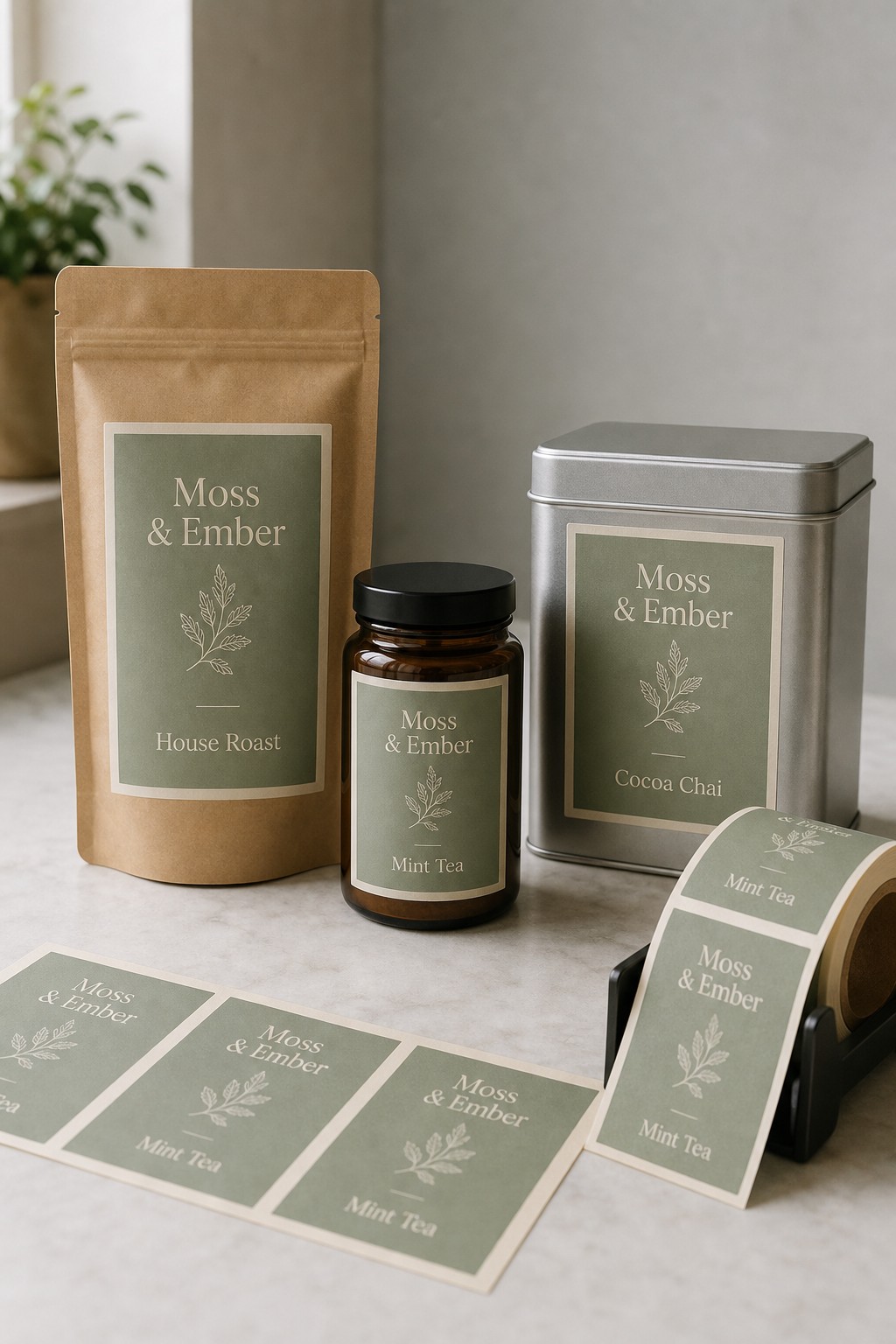
Logo and brand mark reproduction. Your logo colour is a brand asset, not just a CMYK value. If your brand blue is Pantone 286 C, specifying that number gives every printer a consistent target. Without it, different vendors will each mix slightly different CMYK approximations, and over time your business cards, signage, and packaging will drift apart visually.
Multi-product brand consistency. If you are ordering standard business cards, flyers, and foil stickers at different times or in separate runs, the same Pantone reference gives every job the same colour benchmark. Some variation across different paper stocks is normal, but a consistent colour reference keeps that variation tight.
Brand materials viewed side by side. Business cards next to a brochure on a desk will be compared directly. If the blue reads noticeably differently on each piece, it undermines the professional presentation of the brand.
When CMYK is sufficient. If your brand palette uses common print-friendly colours (mid-range blues, greens, warm tones), CMYK digital printing will get close. The gap only becomes visible at the edges of the CMYK gamut or when matching across multiple vendors over time.
How to Specify Brand Colours for Accurate Print
Convert to CMYK before submitting. Do this in your design software before exporting your print-ready file. Confirm the colour profile is CMYK, not RGB or sRGB.
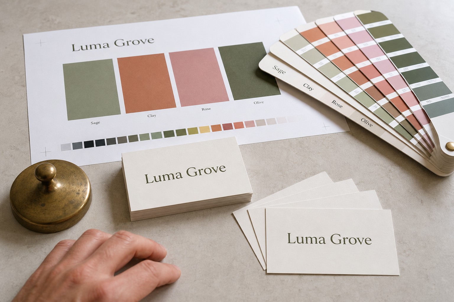
Include Pantone references in your brief. Note your Pantone number in your print brief and supply your CMYK breakdown alongside it. This gives the printer two reference points and reduces interpretation errors when the file changes hands.
Match your Pantone suffix to your paper stock. The C (coated) and U (uncoated) suffixes are not interchangeable. The same Pantone hue has different ink formulations for each surface type. Match the suffix to your intended stock or you will preview against the wrong reference.
Request a physical proof for critical colour jobs. A digital proof is reliable for layout and text, but screen colour is not a reliable guide to printed colour. A physical printed proof is the last safeguard before approving the full run.
Consistent Colour Across Multiple Print Products
One of the trickiest aspects of brand management is keeping colour consistent when the same assets are printed on different products with different stocks and finishes.
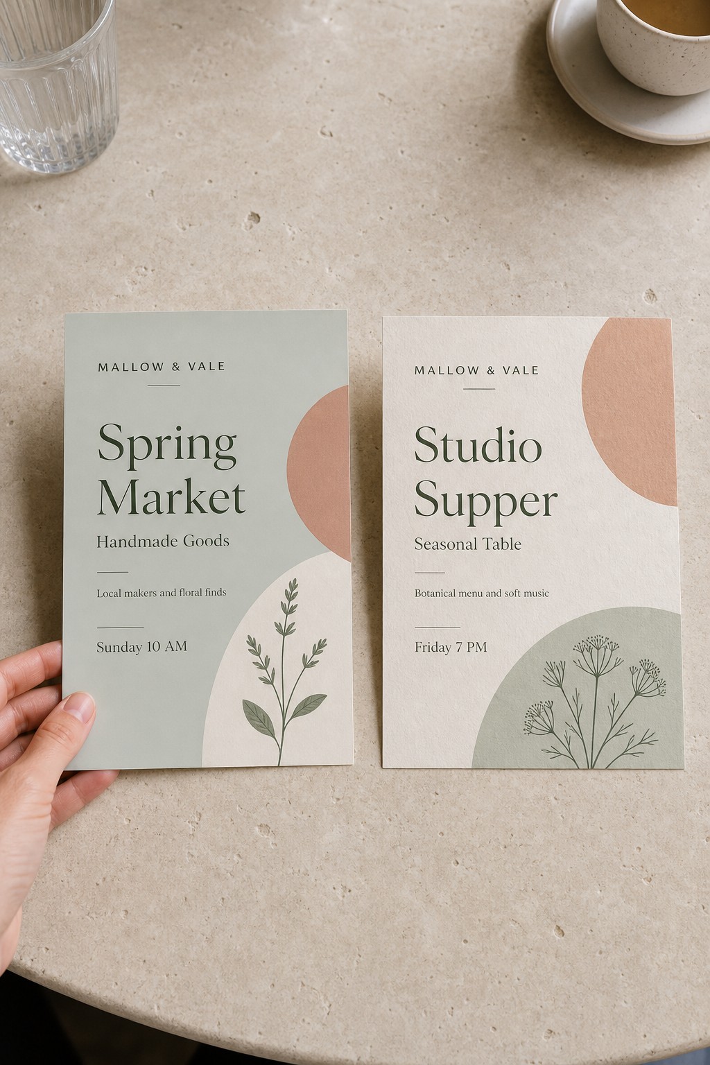
Expect some substrate-driven variation and plan for it. A brand navy on a matte business card will look slightly different to the same navy on a velvet-laminate card or a coated gloss flyer. This is not a print error; it is the physical difference between paper surfaces and how they absorb and reflect ink.
What you can control is the target. If every print job is submitted with the same Pantone reference and correctly converted CMYK values, the variation across substrates will be minimal and perceptually consistent.
For any cross-product colour brief, include:
- The Pantone reference with the correct C or U suffix for the stock
- The CMYK breakdown from your approved master file
- A note on which elements are brand-critical versus supporting
Frequently Asked Questions
Can I specify a Pantone colour for my print order at Paperlust Print Shop?
Yes. Paperlust Print Shop uses digital printing, which simulates Pantone colours via CMYK rather than true spot colour offset printing. For most brand colours the simulation is accurate and consistent, particularly mid-range blues, greens, warm tones, and neutrals. Include your Pantone number and CMYK breakdown in your brief and our team will use both as the colour target.
What is the difference between a Pantone C and Pantone U colour?
The C suffix stands for coated paper; U stands for uncoated paper. The same Pantone hue has different ink formulations for each surface type because coated and uncoated stocks absorb ink differently, changing how the colour reads once dry. Always reference the swatch that matches your chosen paper stock.
Why do my printed materials look different to my screen design?
There are three likely causes: the file was submitted in RGB rather than CMYK; your monitor is not calibrated to a print colour standard; or you are comparing a backlit screen with a reflected-light print, which are physically different. Converting to CMYK before submission and reviewing a physical proof are the two most effective fixes.
How do I keep my brand colour consistent across different print products?
Use the same Pantone reference number and CMYK values for every print job, and include both in every brief. Expect some variation across different paper stocks, but a consistent colour reference keeps that variation within a tight, perceptually matched range.
Does the paper stock I choose affect how my brand colour looks?
Yes, significantly. Matte card produces a slightly softer, more muted result. Gloss or coated card reflects more light, making the same colour appear more vivid. Velvet laminate, artboard, and metallic stock each have different surface properties that alter the appearance of printed colour. When ordering across multiple products, use one approved proof as your colour reference point.
Is a digital proof enough to approve brand colour accuracy?
A digital proof is reliable for layout, typography, and image placement, but not for colour. Your screen displays colour differently to a printed surface. For any job where brand colour accuracy is critical, request a physical printed proof before approving the full run.