Setting up artwork for a custom mailer box is different from designing anything flat. You are not producing a poster or a label. You are designing a three-dimensional object from a two-dimensional template, and the way that template folds into a box changes what is visible, what gets distorted, and what disappears inside a glue seam.
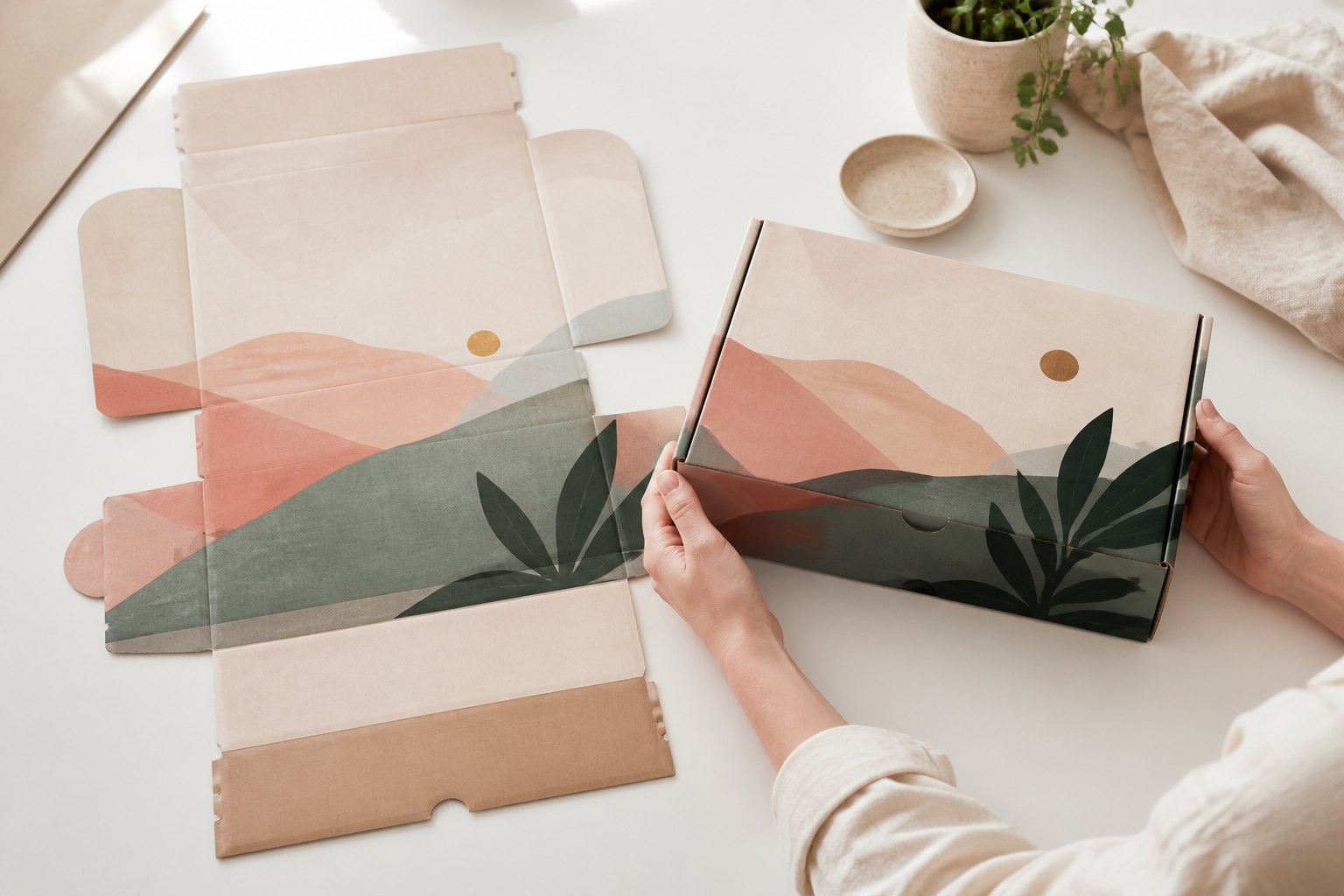
The template a packaging supplier provides is called a dieline: a scaled drawing of the entire box blank, showing every panel, every fold and every cut on a single flat sheet. Getting your artwork right means understanding what each line on that template is telling you, and knowing the specific rules for your print type, whether that is full-colour CMYK or spot-colour kraft.
The short version
- A dieline shows every panel, fold, cut and glue tab on a flat sheet. Download the template for your exact box size before you design anything.
- Place the dieline on the top layer of your file. Build all artwork on separate layers below it. Never design on the dieline itself.
- 3mm bleed: extend every background colour and image to the outer bleed line on all panels and flaps, not just the outer perimeter of the template.
- Keep logos, text and barcodes at least 5mm inside every fold or crease line, and clear of all glue tabs.
- Full-colour files: CMYK colour mode, 300 DPI at print size, all fonts outlined, all images embedded. Save as PDF, SVG or Adobe Illustrator.
- Kraft files: vector artwork only. Design in one or two spot colours and account for how each colour reads over natural brown board.
Reading your dieline: lines, the flat template and the 3D box
Most dielines use a three-colour or three-style convention to distinguish line types, though the exact colours vary between suppliers. The table below is the reference; the explanations that follow cover what each element means for your artwork.
| Dieline element | What it is | Design rule |
|---|---|---|
| Cut line | Outer perimeter; board is cut through here | Extend all artwork 3mm past this line (bleed zone) |
| Fold/crease line | Board is scored, not cut; becomes box corners and edges | Keep critical content at least 5mm clear of every fold line |
| Glue tab | Structural flap bonded inside the box during assembly | No deliberate artwork here; it will be hidden or peel |
| Tuck flap | Closing mechanism; tucks through the front opening to seal | Outside face is visible; treat it as a brand surface |
| Safe zone | Inner boundary inside cut and fold lines | All logos, text, barcodes and legal copy must sit inside this |
The thing that surprises first-time packaging designers is how different the assembled box looks from the flat dieline. A mailer box dieline typically unfolds into a cross or T-shape, with the base panel at the centre, side walls folding up from two edges, the lid folding over from another edge, and the tuck flap extending from the far side. Before you place a single element, print a reduced-size copy of the dieline on paper and fold it up by hand. Identify each surface in the assembled box: the front face, the two side panels, the back, the base and the interior lid. Each of those is a distinct design space.
A common mistake is to treat the flat dieline as a continuous canvas and flow a design across panel boundaries. The result looks connected on screen and fractured in the real world, because adjacent panels sit at 90 degrees once assembled. Continuous wrap designs are achievable, but they require careful compensation for the fold angle rather than a simple extension of artwork across the template boundary.
Which panels are visible during unboxing
Your box goes through several distinct moments from dispatch to opening, and each is a different design opportunity.
The front panel is seen first when the recipient picks up the parcel. It is the most important single surface and the right place for your primary logo or brand visual. Side panels are visible during handling; wordmarks and repeat patterns work well here. The interior of the lid and base come into view the moment the box is opened, when anticipation is highest. If you are printing inside the box, which is available on request, that interior panel is where a thank-you note or care message lands with the most impact.
If you are not printing inside, the inner liner is natural, unbleached board. Factor this into your design before you commit to the exterior artwork; some brands treat the natural interior as part of the aesthetic, while others add a layer of printed tissue paper or an insert card to compensate.
The tuck flap also deserves attention. Customers who open the box carefully see both the outside and the inside of the flap as they remove it. A simple wordmark on the inside of the flap adds a considered finishing detail to the opening experience.
Bleed: why 3mm applies to every edge
Bleed is the strip of artwork that extends beyond the cut line. Its purpose is to absorb any small variation in the die-cutting process so no raw, unprinted board edge shows on the finished box. Even a 0.5mm shift in the cut becomes a visible white stripe if the artwork stops exactly at the cut line.
For corrugated packaging, 3mm bleed on all sides is the standard. This applies to every edge of every panel and every flap in your dieline, not only the outer perimeter of the template. If you extend your background colour to the outer edge of the blank and stop there, the interior flaps will still have white edges on the finished box.
A practical check: zoom into each flap and each panel edge and confirm that your background colour or image reaches the 3mm bleed line on all four sides of each individual piece, including the small glue tabs. The bleed zone is cut away during manufacture; do not extend important content into it expecting it to be visible.
Safe margins and fold distortion
Corrugated board compresses along a crease. The fold pinches both sides of the score line and slightly displaces the surface at the edge. Artwork placed too close to a fold can shift a few millimetres, appear to fracture across a crease, or show a visible ridge where the board was compressed.
Keep every logo, word, barcode and element with a hard graphic edge at least 5mm inside each cut or fold line. If a solid colour block or an image edge falls within 5mm of a crease, extend it to full bleed rather than stopping short. A clean bleed reads better than a narrow gap next to a fold.
Treat 5mm as a conservative working rule rather than a fixed specification. The only margin that is binding is the one marked on the dieline your supplier sends you, so build to that template. Our own file review checks your artwork against the dieline before anything goes to press, and we flag any element sitting too close to a crease on the digital proof.
Glue tab areas need separate consideration. Once assembled, a glue tab sits inside the seam with adhesive between it and the adjacent board. Background colour running into a glue tab area causes no problems; a deliberate element placed there and expected to be seen will either be hidden or lift with the glue over time.
Full-colour file setup: colour mode and resolution
Full-colour mailer boxes print CMYK edge to edge on a smooth white liner. The white liner is what makes sharp reproduction of photography, fine logotypes and saturated brand colours possible. Setting your file to CMYK from the start prevents colour shifts during pre-press conversion.
Colour mode. Set the document to CMYK before you place the first element. RGB-to-CMYK conversion by pre-press software can shift saturated greens, oranges and blues in ways that are difficult to predict, and the difference between RGB and CMYK green is large enough to be clearly visible in print.
Resolution. Raster images must be at 300 DPI at the actual print size. A 72 DPI web image placed into a full-panel background will print with visible softness. Scale up the source image before placing it rather than resizing inside the design file.
Vectors and fonts. Logos, wordmarks and flat-colour shapes should be vector wherever possible. Outline all fonts before exporting. Outlining converts each character to a vector shape, removing any dependency on the font being installed at the printer’s end; an unoutlined font can be silently substituted by pre-press software.
Images. Embed all placed images. A linked image missing from the file package arrives at the printer as a blank panel.
To compare sizes, quantities and production timelines for full-colour corrugated printing, visit our custom full-colour mailer boxes page, where a live calculator updates the per-box price as you select a size and quantity.
Designing for kraft: spot colour on brown board
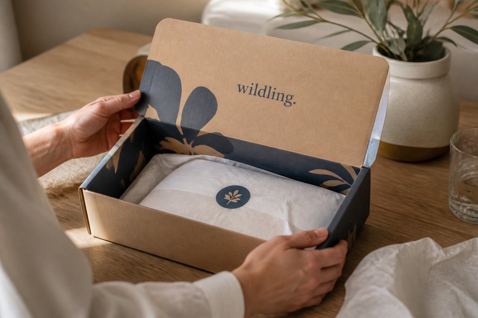
Kraft mailer boxes require a different approach from full colour. The substrate is natural, unbleached brown corrugated board, and you are printing one or two spot colours onto that brown ground using flexographic printing. Every ink colour you print will be seen against the warm, mid-brown tone of the board. There is no white liner underneath.
A deep charcoal or navy logo reads with strong contrast on brown. A bright orange picks up a warm undertone. A pale cream or white appears warmer and softer than on a white-lined box because the board’s natural colour is showing through. Pastels, photographs, complex gradients and very fine type all lose definition on natural brown board. The artwork types that succeed here are the same types that succeed with any single-colour or two-colour process: strong logos, bold wordmarks, clean geometric shapes, and line art with enough visual weight that the brown ground reads as part of the design.
Because flexographic printing uses a raised plate to transfer ink to the board, your artwork must be fully vector. If your brand logo exists only as a JPEG or PNG, it will need to be redrawn as vector artwork before a print plate can be made. Design services are available to handle that redraw.
| Requirement | Full-Colour | Kraft |
|---|---|---|
| Colour mode | CMYK | Spot colour (1 to 2 colours) |
| Artwork type | Vector or raster (300 DPI minimum for raster) | Vector only; no raster images |
| Substrate | CMYK on smooth white liner | Spot colour on natural brown board |
| Bleed | 3mm on all edges | 3mm on all edges |
| Fonts | Outline all fonts before export | Outline all fonts before export |
| Images | Embed all placed images | Vector only; no placed raster images |
| File format | PDF, SVG or Adobe Illustrator | PDF, SVG or Adobe Illustrator |
Pre-flight checklist
Work through this list before sending your file to any packaging printer. These are the most common sources of file rejections and production delays, and every item can be caught at your desk.
- Confirm the document colour mode is CMYK (full-colour) or that spot colours are correctly specified (kraft).
- Set the document canvas to the exact dimensions of the dieline template, including the bleed zone outside the cut lines.
- Extend all background colours, patterns and images to the 3mm bleed line on every panel, flap and glue tab.
- Place the dieline on the top layer of your file and lock it so it remains visible above all artwork.
- Check that no logo, word, barcode or critical graphic element falls within 5mm of any cut, fold or crease line.
- Check that no deliberate artwork sits inside glue tab areas.
- Outline all fonts and confirm no live text remains in the file.
- Embed all placed images; do not rely on linked image files without checking that is how your printer expects to receive packaged files.
- For raster elements, confirm resolution is 300 DPI at print size.
- For kraft artwork, confirm every element is fully vector and uses no more than two spot colours.
- Save the file as PDF, SVG or Adobe Illustrator format.
- Review the file at 100% scale to check panel balance, bleed coverage and legibility of the smallest text before sending.
File review, digital proof and design services
Every file submitted to Paperlust is reviewed at no charge before it goes to press. The review checks for the issues covered in this guide: bleed coverage, safe margins, colour mode, font outlining and image embedding. If the file has a problem, you will hear about it before production starts.
After the file review, a digital proof is prepared and emailed to you. The proof shows your artwork laid out on the dieline so you can check each panel in context. Nothing is printed until you approve the proof.
If your file needs more than a minor correction, design services are available. The team can adjust an existing file, build a new design from a brief, or redraw a logo that is not suitable for print as supplied.
For a broader look at how packaging choices affect your print budget, the packaging on a budget guide covers the full picture. If you are at the quoting stage, the article on what a supplier needs to quote you has the information checklist to pull together. Once your boxes arrive, the guide to packing the finished box covers assembly and fulfilment.
To see sizes, quantities and lead times for spot-colour flexo printing on natural board, visit our kraft mailer boxes page.
Frequently asked questions
What is a dieline for a mailer box?
A dieline is a flat template showing every panel, fold, cut and glue tab of a mailer box in two dimensions. It tells you where the box will be cut and creased during manufacturing, which areas will be hidden inside glue seams, and how large each printable surface is. You use it as a locked guide layer in your design file so your artwork aligns precisely with the finished structure.
What bleed do I need for a mailer box?
Use 3mm bleed on all sides of every panel and every flap, including glue tabs. This is the standard for corrugated packaging and applies to both full-colour and kraft print. Bleed ensures that a small variation in the die-cutting process does not leave a raw, unprinted board edge on the finished box.
Why does kraft packaging require vector artwork?
Kraft mailer boxes are printed by flexography, which uses a raised plate to transfer ink to the board. This process reproduces solid areas and clean edges accurately but cannot handle the continuous tones or photographic gradients that raster artwork contains. Vector artwork describes shapes as mathematical outlines rather than pixel grids, which translates accurately to a flexo plate. JPEGs and PNGs do not.
What file format should I use for packaging artwork?
Supply your artwork as a PDF, SVG or Adobe Illustrator file. For full-colour boxes, set the file to CMYK colour mode. For kraft boxes, supply fully vector artwork in no more than two spot colours. In either case, outline all fonts and embed all placed images before exporting.
How far from fold lines should my artwork sit?
Keep all logos, text, barcodes and critical graphic elements at least 5mm inside every fold and crease line. Corrugated board compresses slightly along a crease, which can cause artwork placed too close to shift, distort or appear partially on the wrong panel when the box is assembled. A 5mm margin eliminates these issues for standard corrugated packaging.