For a creative agency, handing over a business card is not just an exchange of contact details. It is a live demonstration of your craft: the materials you choose, the printing techniques you specify, and the design decisions you make under strict space constraints all tell a prospective client what kind of creative partner you are. A poorly printed card on thin stock undercuts even the most polished portfolio pitch. These 15 creative agency business card designs show what is possible when you treat a 90 x 55 mm card as a miniature brief.
15 Creative Agency Business Card Designs at a Glance
- Gold flat foil on black matte stock
- Holographic foil for digital and motion studios
- Spot foil accent on uncoated cream
- Rose gold foil on blush card
- Silver foil with bold oversized typography
- Duplex layered cards with coloured core
- Scodix raised spot for typographic studios
- Soft-touch matte with spot UV logo hit
- Vibrant coloured paper in brand palette
- Extra-thick uncoated stock with natural feel
- Full-bleed double-sided portfolio card
- White-on-white blind deboss
- Custom die-cut to brand silhouette
- Single-colour on natural stock
- QR code as the primary graphic element
Why Creative Agencies Need Business Cards That Work Harder
Your card is a portfolio sample before you open your mouth
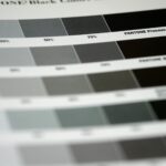
Clients who hire creative agencies are, by definition, visually literate. When a potential client picks up your card at a networking event or after a pitch meeting, they are evaluating print quality, material selection, and design restraint in the same breath. A card printed on 400 gsm uncoated stock with a flat foil logo communicates that you understand premium production. A card printed on the same 350 gsm stock as a local takeaway menu communicates the opposite.
This is why the most successful creative agencies treat their cards as they would any client brief: with a defined objective, a considered execution, and a specified print finish. The card should do one job exceptionally well rather than attempt everything at once.
What clients read into your card before you speak
There is a well-documented hierarchy of business card signals. Thickness communicates investment. Finish communicates taste. Typography communicates attention to detail. Colour choice communicates brand discipline. For a creative agency, each of these signals must align with the kind of work you want to attract. A branding studio targeting luxury retail clients needs a card that reads as premium and restrained. A generative design studio targeting tech startups might opt for something minimal with a tactile twist. The card is the brief made physical.
Designs 1 to 5: Foil and Metallic Finishes That Command Attention
Foil business cards remain the most reliably impressive option for creative professionals. The contrast between a matte or uncoated substrate and a reflective foil surface creates a visual hierarchy that no CMYK print can replicate. These five designs cover the range from maximalist to restrained.
Gold foil on a deep matte black base is the business card equivalent of a black-tie dress code. The contrast is absolute, the hierarchy is immediate, and the production quality is unmistakable. Best executed with a single typeface and a logo mark, letting the foil carry the weight. Works especially well for luxury branding studios, high-end interior design agencies, and fashion consultancies. Print at 400 gsm for maximum substance in the hand.
Holographic foil shifts through the spectrum as the card moves in the light, making it a natural fit for motion graphics studios, digital product agencies, and UX-focused practices. Unlike static gold or silver, holographic foil communicates dynamism and technical ambition. The key is restraint: apply the foil to a single element, such as a wordmark, a geometric shape, or a bold initial, and keep the rest of the card clean. Competing with the foil defeats the purpose.
For studios that want a foil detail without the high-contrast drama of design 1, spot foil on an uncoated natural or cream stock offers a softer, editorial result. The warm paper tone mutes the foil slightly, creating a more considered impression. This approach suits brand consultancies, design strategists, and agencies whose work skews toward print and editorial. Pair with a serif typeface and generous white space for best results.
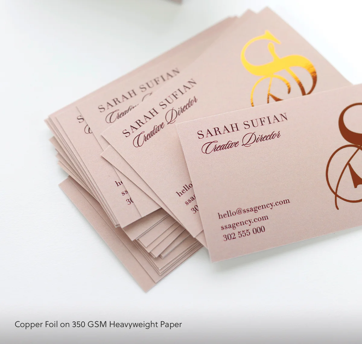
Rose gold has moved beyond a trend into a durable brand palette staple for boutique creative studios, lifestyle branding agencies, and wedding industry suppliers. When foil colour and stock colour sit in the same tonal family, the result is sophisticated and cohesive rather than merely decorative. Keep the typography minimal and use the card’s reverse for a single bold colour block to add depth. Paperlust Print Shop’s flat foil business cards are produced with precise foil registration that handles delicate letterforms at this scale.
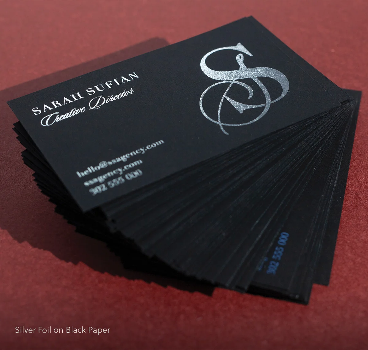
Silver foil on a cool dark grey or off-white stock reads as architectural and confident. The design approach here inverts the usual logic: instead of small refined details, use oversized typography that fills the card face. A single word, a monogram, or a large initial in silver foil creates an immediately arresting impression. This works well for industrial design studios, architecture practices, and branding agencies with a strong modernist sensibility.
Order flat foil business cards for your creative studio
Designs 6 to 10: Tactile Finishes Clients Cannot Stop Touching
Not every standout card relies on visual contrast. Some of the most effective creative agency business cards work through touch: the resistance of a soft-touch coating, the raised texture of a Scodix finish, or the visible paper core of a duplex card. These designs invite handling, which means they get passed around, examined, and remembered.
Duplex business cards are made by laminating two sheets of card together, creating a visible coloured edge when the card is viewed side-on. This edge detail is subtle but unmistakable to anyone familiar with premium print production: it signals that the designer specified a custom paper combination rather than ordering from a standard sheet. For a creative agency, the edge colour can mirror a brand palette colour, creating a cohesive and considered detail that rewards close inspection. Paperlust’s duplex business cards are available with a range of core colour options.
Scodix is a digital UV printing process that deposits a raised, gloss polymer coating with exceptional precision. Unlike traditional spot UV, Scodix can achieve a significantly higher relief and finer detail, making it ideal for studios that want a tactile design element with sharp typographic resolution. A Scodix hit on the studio name, a pattern element, or a geometric logo mark creates a card that communicates craft without relying on colour. Paperlust’s Scodix business cards are printed on a 400 gsm stock with a specialist UV coating run.
Soft-touch laminate gives a card a velvety, almost rubberised surface that is immediately distinctive in the hand. Adding a spot UV varnish hit to a single element, such as the logo, a geometric mark, or an initial letter, creates a compelling contrast: the matte surface absorbs light while the spot UV element reflects it, making the design legible by touch as much as by sight. This combination is versatile enough to work across studio types, from digital product agencies to graphic design practices. Explore spot UV business cards as your starting point for this finish.
Not every standout finish requires a specialty process. Coloured paper business cards printed to match a specific brand palette colour are frequently more memorable than a white card with a complex finish, simply because they are visually distinctive at a distance. A deep cobalt, a saturated terracotta, or a forest green card stock immediately identifies the creative practice it belongs to. Use white or light ink for typographic legibility, and consider a single uncoated stock for a direct, high-impact result.
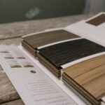
Thickness is the most immediate tactile signal of quality. A card printed on 600 gsm or heavier uncoated stock communicates investment and permanence before the recipient reads a single word. For studios whose brand values align with craft, sustainability, or artisan production, an extra-thick uncoated card in natural white or warm cream is a deliberate and credible choice. The absence of a specialty finish becomes the statement: quality of material, not decoration, is the point.
Designs 11 to 15: Conceptual Cards That Get Kept, Not Discarded
The best creative agency business cards are kept because they are useful, beautiful, or unusual enough to resist the recycling bin. These five designs go beyond standard print finishes to make a structural or conceptual statement.
For studios with a strong body of visual work, the reverse of a business card is a portfolio sample. A full-bleed image from a flagship project, printed in high-fidelity CMYK on a coated stock, turns the card into a physical case study. The front carries contact details; the reverse carries evidence. When a potential client passes the card to a colleague, the image travels with it. Print on at least 400 gsm to prevent show-through and protect the image quality.
Blind deboss uses a metal die to press an impression into the card stock without any ink or foil, creating a recessed design that is visible only in raking light or by touch. On a bright white or off-white card, a blind deboss treatment of a logo mark or geometric pattern creates a card that appears almost blank at first glance, then reveals its detail on closer inspection. The restraint is the message. This design suits minimalist branding studios, architecture practices, and consultancies whose aesthetic is refined and undecorated.
A die-cut card is cut to a custom shape rather than the standard rectangle. For a creative agency, this shape can be derived directly from the brand: a studio that works in the food industry might cut to a fork silhouette; an agency whose logo includes an architectural arch might use that form as the card’s profile. The die-cut communicates that the studio has thought beyond convention, which is precisely what creative agency clients want to believe about their partners.
A single carefully chosen ink colour on a natural, textured stock can outperform a complex multi-element design by communicating confidence and restraint. A deep hunter green, a burnt sienna, or an inky navy on a natural white uncoated stock reads as editorial and considered. This approach is most effective when the typography is bold and the layout is generous: there is nowhere to hide on a single-colour card, so every spacing decision and type choice is visible.
Most QR code business cards treat the code as a footer utility. Design 15 inverts this: the QR code is the dominant visual element, sized to fill a significant portion of the card face and styled to match the brand palette. This approach is most effective when the code resolves to a curated, mobile-first portfolio URL or a brief video introduction rather than a generic website homepage. For digital-first studios, tech consultancies, and UX practices, leading with the QR code as the primary graphic is an honest statement of where the agency lives and how it works.
Matching Your Finish to Your Agency’s Brand Voice
The 15 designs above span a wide range of production approaches and price points. Choosing among them is a design decision as much as a budget decision. The following framework narrows the field based on brand voice.
Bold and maximalist studios
Agencies whose work tends toward bold colour, complex layouts, and expressive typography should look at foil finishes, Scodix raised treatments, and duplex cards with contrasting core colours. The card should reflect the same visual ambition as the portfolio. A flat foil design on a 400 gsm black stock, or a Scodix-hit card with an all-over pattern treatment, suits studios that want to make an unapologetic first impression.
Minimal and refined studios
Agencies working in luxury, editorial, or architecture-adjacent sectors should favour uncoated stocks, blind deboss treatments, or single-colour typographic designs. The card should reward slow inspection rather than immediate impact. A white-on-white blind deboss or an extra-thick uncoated card with a single-colour print at generous scale communicates the same sensibility as a well-designed monograph: nothing superfluous, everything intentional. Consider raised foil business cards for a refined texture that reads as luxurious without veering into pure decoration.
Digital-first and tech-forward studios
Digital product agencies, UX studios, and technology consultancies often struggle with business cards because their work does not translate easily to paper. The solution is to use the card as a gateway rather than a destination. A QR code resolving to a curated, mobile-first portfolio, combined with a minimal print design on a soft-touch or spot UV stock, communicates exactly the right blend of physical and digital sensibility. The card exists to generate a URL visit, not to carry the entire brand story.
Ordering Creative Business Cards in Australia
Paper weights, stock options, and minimum quantities
Australian creative agencies typically order business cards in runs of 250, 500, or 1,000. At Paperlust Print Shop, specialty finish runs start from 50 cards, making short test runs practical before committing to a full order. Paper weights for premium creative cards start at 350 gsm for standard finishes and go up to 600 gsm for duplex or extra-thick options. The table below summarises the key finish options and their relative positioning.
| Finish | Best For | Stock Weight | Key Characteristic |
|---|---|---|---|
| Flat Foil | Luxury branding, fashion, hospitality studios | 400 gsm | Precise foil registration on matte or uncoated base |
| Raised Foil | Agencies wanting sheen and tactile relief | 400 gsm | Foil with a raised surface texture |
| Spot UV | Modern studios, versatile brand voices | 350-400 gsm | Gloss varnish contrast on a matte base |
| Scodix | Typographic, detail-driven studios | 400 gsm | High-relief UV polymer, fine detail resolution |
| Duplex | Studios with a strong colour identity | 550-600 gsm | Visible coloured core on card edge |
| Standard | Cost-effective, high-volume runs | 350-400 gsm | Full CMYK, range of stocks and finishes |
File setup: bleeds, safe zones, and colour profiles
For a standard 90 x 55 mm Australian business card, supply artwork at 96 x 61 mm (including a 3 mm bleed on all sides) with a 3 mm safe zone inside the trim line for all critical content. Use CMYK colour mode for process-printed cards. If your design includes foil, Scodix, or spot UV, supply a separate layer or file indicating the exact coverage area for the specialty finish. Use 100% black (K channel only) on the specialty layer to avoid CMYK contamination. All artwork should be supplied at a minimum of 300 DPI. Paperlust Print Shop’s artwork templates are available from each product page, and the production team checks every file before it goes to press.
Frequently Asked Questions
What makes a business card stand out for a creative agency?
The most effective creative agency business cards combine a distinctive print finish, such as foil, Scodix, duplex, or spot UV, with a layout that reflects the studio’s design sensibility. The goal is a card that communicates the agency’s aesthetic and production knowledge before the recipient reads the contact details. Thickness, material choice, and finish specificity all contribute to this impression.
How much do premium business cards cost in Australia?
Premium creative business cards in Australia typically range from $0.40 to $2.00 per card depending on the finish, stock weight, and print run. Flat foil, duplex, and Scodix cards are at the higher end of this range; spot UV and soft-touch cards sit in the mid-range. Ordering in quantities of 500 or more brings the per-card cost down significantly for most specialty finishes.
Can I order different designs on each card in a single run?
Yes. Variable data printing allows you to produce different names, job titles, and contact details on each card within a single print run, which is useful for creative agencies whose team members each require a personalised card. Some studios also use variable artwork to produce a set of cards where the design changes across the run, turning a single order into a small collection of unique pieces.
What is the minimum order quantity for specialty finish business cards?
At Paperlust Print Shop, minimum order quantities for specialty business cards start from 50 cards for most finishes, including foil, Scodix, spot UV, and duplex. This makes it practical to produce a small run for testing or a pilot team before committing to a larger quantity.
What file format should I supply for foil or Scodix business cards?
Supply a print-ready PDF at 300 DPI with 3 mm bleed and crop marks. For foil or Scodix cards, include a separate spot colour layer or overlay file that indicates the exact areas to receive the specialty finish. Use 100% black (K channel only) on the specialty layer to avoid any CMYK contamination. Paperlust’s artwork specification guides are available from each product page.
About Paperlust Print Shop
Paperlust Print Shop is an Australian specialty print producer working with creative agencies, independent studios, and businesses across the country. The Print Shop offers a curated range of premium business card finishes including flat foil, raised foil, Scodix, duplex, and spot UV, all produced to commercial print standards with in-house prepress file checking. Orders are printed and dispatched from Australia, with options for standard and express delivery nationwide.