A logo that looked crisp on screen comes back from the proofing round with a note about hairlines or a gradient that cannot hold on a one-colour plate. If you are preparing letterpress artwork for a business card, that note almost always points back to the file, not the press.
Foil stamping artwork follows a different set of rules again. A letterpress plate, a foil die and an emboss die are cut from the shapes in your file, so the artwork has to describe edges and solids the press can reproduce. That changes what belongs on the page.
This guide covers why pressed finishes need vector shapes, how to set up letterpress, foil and embossed foil files, how to name a PMS colour, what the proof round checks, and the mistakes that slow approval most often.
The short version
- Supply vector artwork with fonts converted to outlines.
- Use one PMS colour for letterpress, and one foil colour for foil stamped cards.
- Build foil areas as a solid black foil mask in 100% K, positioned exactly over the artwork.
- On embossed foil cards, one mask covers both the foil and the emboss.
- Keep lines and text above the commonly cited minimums for each finish.
- The proof checks the file before anything is pressed.
Why pressed cards need different artwork
Pressed finishes do not print the way a digital card does. The letterpress plate or foil and emboss die is made from the artwork, so the file defines the shapes the tooling will carry. A photograph, a gradient or a soft shadow cannot be turned into hard tooling. The press can only make a solid impression or a solid foil mark in the places your file gives it.
Large solid ink areas can also print unevenly on uncoated stock, and that limits how much coverage a single plate can hold. That is why the minimum line and text figures in this guide are commonly cited trade figures, not published Paperlust specifications. Paperlust does not publish separate artwork limits for these cards. The proof is where your file is checked and any issue is flagged, with no cap on proof rounds.
| What to check | Letterpress | Foil stamped | Embossed foil |
|---|---|---|---|
| Artwork type | Vector artwork with fonts outlined | Vector artwork with fonts outlined | Vector artwork with fonts outlined |
| Colour | One PMS colour, named separately | One foil colour per card | One foil colour, combined with the emboss |
| Separate layer or mask | Solid black plate artwork | Foil areas as a 100% K foil mask | One mask for foil and emboss |
| Fine detail | Commonly cited: 0.5pt lines minimum | Commonly cited: 1pt stroke, 10pt text minimum | Commonly cited: keep clear gaps, avoid isolated detail |
| What the proof confirms | Plate shapes and ink coverage | Foil mask position and registration | Foil and emboss alignment in the combined die |
Letterpress artwork setup
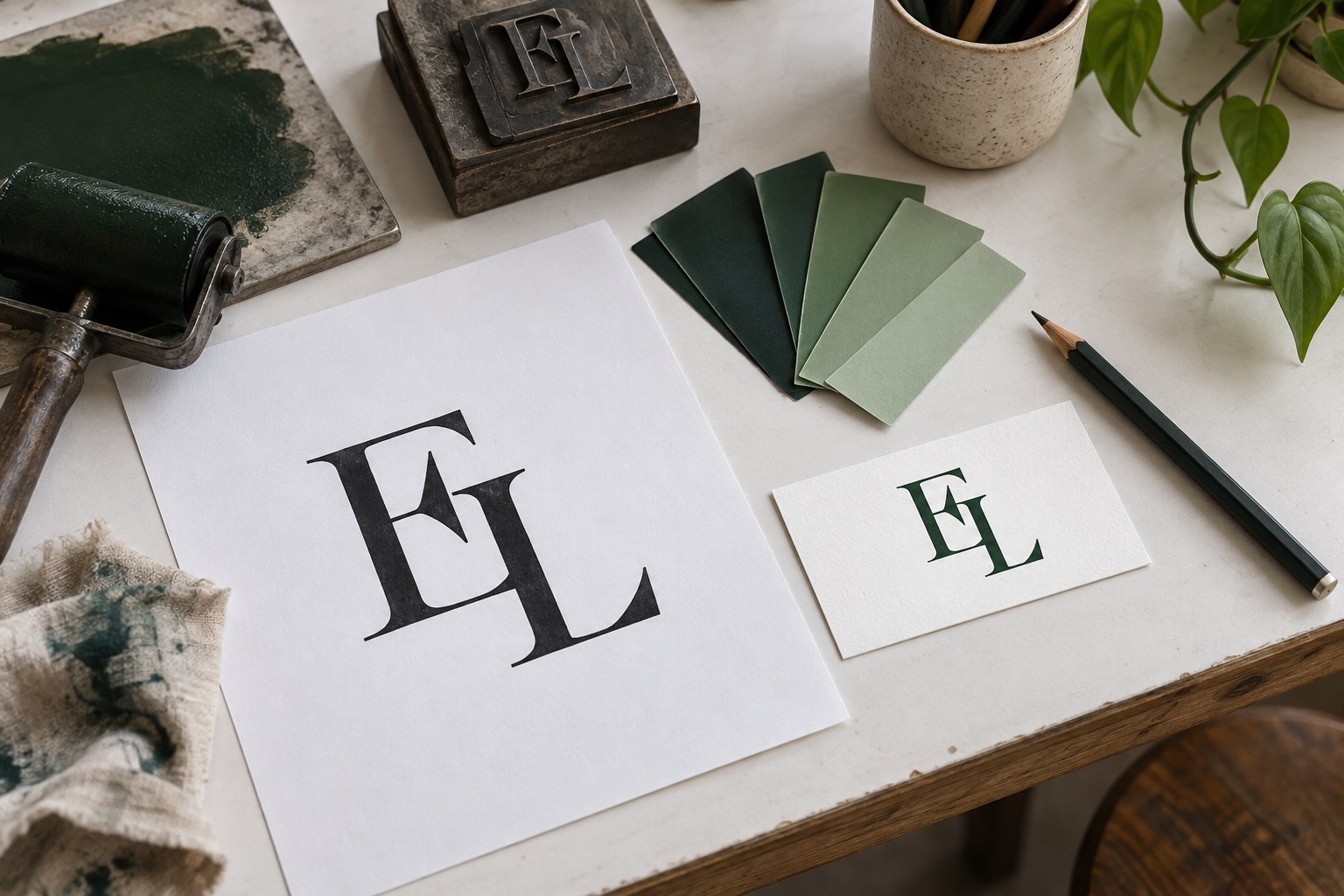
Letterpress cards carry one PMS colour on the front, pressed into white 300gsm Wild Cotton so the marks sit recessed. That means the artwork has to be a solid single-colour drawing. Supply vector artwork with fonts converted to outlines. Do not send a live font file, and do not build the card from a placed JPG.
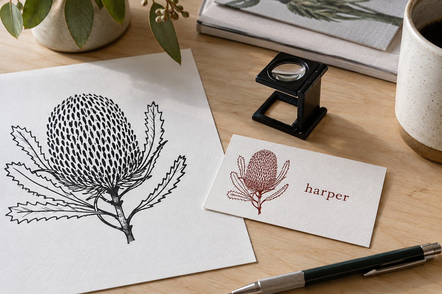
Single-colour plate artwork is commonly supplied in solid black, or 100% K, with the ink colour specified separately by its PMS reference. The black in the file is not the ink you will see; it is the shape of the plate. Keep the artwork clean and solid. Australian letterpress suppliers commonly ask for lines of at least 0.5pt. Finer hairlines may not hold on the plate, and a line that disappears from the plate cannot be reinstated on press.
Photographs and gradients are not possible on a single letterpress plate. Tints and soft shadows cannot be turned into a solid tool mark. Large solid ink areas can also print unevenly on uncoated stock, so a design built on heavy coverage may proof with patchy areas rather than a flat field of colour. Dark ink on light stock gives the clearest result, because letterpress inks are fairly translucent.
When you order letterpress business cards, treat the file as the plate drawing rather than the finished card face. The broader letterpress guide covers the process in more depth, but the file rule stays the same: solid shapes, named colour, no raster texture.
Foil stamping artwork setup
Foil stamped cards carry one foil colour per card. A die presses metallic foil into the board, and the foil can only go where the die is made. On a foil-only card, the foil shapes are the design itself, and the foil mask is kept as a clean separate layer so its position is exact.
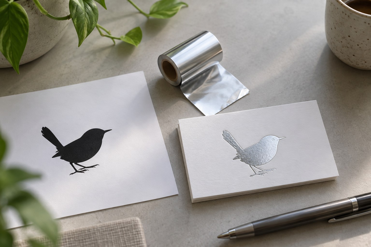
The foil mask is commonly supplied as solid vector shapes in 100% K, placed in exactly the same position as the matching artwork. Build it as a separate layer or overlay file so the proofing team can see the foil boundaries on their own. Do not use a transparent grey shape, a tint, or a soft edge. Foil cannot reproduce gradients, tints or soft edges. Every foil edge will be a hard die line.
Foil artwork guides commonly cite a minimum stroke of 1pt and a minimum text size of 10pt. Very fine foil strokes can tear or skip when the die strikes the board, and small text in foil can close up and become hard to read. These are trade minimums, not published Paperlust requirements, and the proof confirms what your file can hold.
Keep the job to one foil colour per card when you order foil stamped business cards. Gold, silver, rose gold and copper are the listed options, and other foil colours are available on request.
Embossed foil artwork setup
Embossed foil cards use one combined die that applies foil and emboss in a single press hit. That means the foil sits raised in exact register, and the emboss cannot be separated from the foil. There is no second die and no second placement step.
For this finish, one mask defines the foiled area and its raised shape together. If you put foil in one place and hope for a blind emboss elsewhere, the setup cannot be built that way. Bold shapes and clear open spacing suit an embossing die. Isolated fine detail and very tight gaps are fragile.
When you order embossed foil business cards, compile the mask with the full foiled and embossed artwork as one solid form. If a thin outline surrounds a logo, make sure it has enough clearance to survive as part of a combined die rather than as a hairline detail.
Choosing and naming a PMS colour
For letterpress, the ink colour is named separately from the black plate file. Use Pantone Solid Uncoated references, marked with a U, for ink on uncoated board. Colour reads differently on uncoated stock than on coated stock, and a coated reference will not describe the same result you get on cotton board.
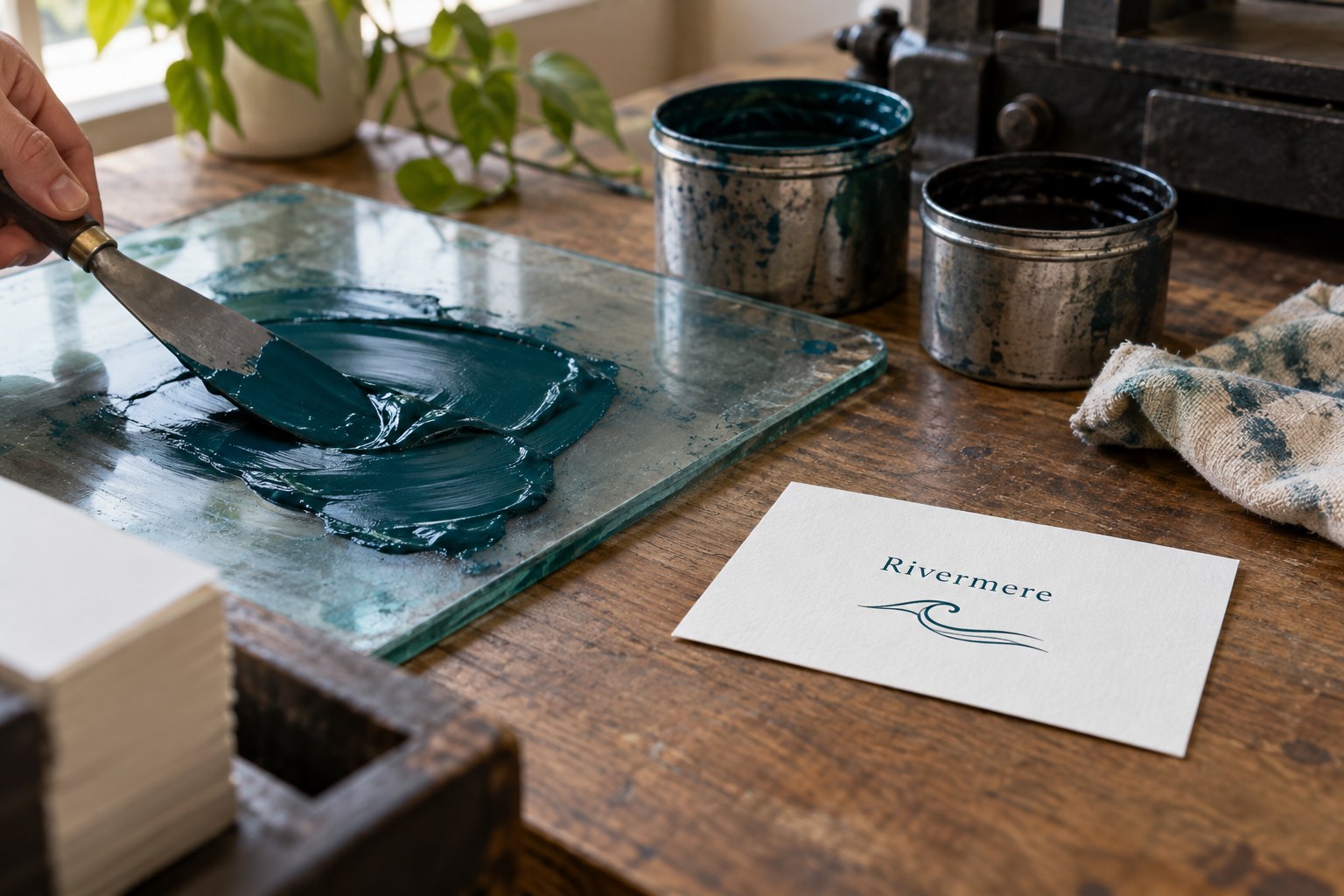
Letterpress inks are fairly translucent, so dark ink on light stock gives the clearest result. A light PMS ink pressed into white cotton can shift, fade back, or look uneven, while a dark ink holds its recessed mark more cleanly. This is a practical limit of the finish, not a screen issue.
Choose the colour from a printed swatch rather than a screen. Colour reads differently on uncoated stock than on coated stock, so when you specify a spot colour, the printed swatch is the reference point. A printed colour matching swatch shows the actual ink on paper, so you are matching paper to paper, not screen to paper.
What the proof round does
Paperlust’s general artwork guidance on its business card pages asks for PDF, SVG or Adobe Illustrator files where possible, with 3mm bleed and crop marks added, fonts outlined, images embedded, and foil, Scodix or raised foil work supplied as a separate spot colour layer or overlay file. The bleed provides the extra area needed when the card is trimmed to size, and a separate layer lets the proofing team check the pressed areas on their own.
For the pressed cards, the proof is the checkpoint. It is where your file is checked for hairlines, missing outlines, gradient fills, mask placement, and any detail that might not survive the plate or die. These cards are made to order, which is why the approved proof locks the job. There is no maximum number of proof rounds, and nothing goes to press until the design is approved.
The minimum line and text figures in this guide are commonly cited trade figures, not published Paperlust specifications. Because there is no cap on proof rounds, the proof can flag any issue and the file can be adjusted before production. The 18 to 23 working days from design approval, including delivery to an Australian address, start only once the design is approved. A clean file shortens that wait by avoiding repeated rounds.
Artwork mistakes that slow approval
Most proofing delays come from the same handful of artwork habits. Hairlines below the commonly cited minimums often disappear on the plate. Live fonts fail because the file needs vector artwork with the type converted to outlines. Raster images placed into a foil mask leave soft edges the die cannot follow. Gradients or tints on a one-colour job cannot be separated into a solid plate.
Asking for a second ink colour on a one-colour letterpress card is another common misstep. Letterpress and foil stamped cards carry one colour, so two PMS references on the front cannot both press. Fine internal detail in an emboss shape can also break, tear, or fill in when the combined die forms the raised area.
Exports are the final hurdle. Design tools, including Canva, can export PDFs carrying transparency, gradients or soft shadows even when they looked flat on screen. These need removing or flattening for one-colour pressed work. Open the exported PDF, turn off layers, and check that the solid black areas really are solid black and the foil mask really is a single hard shape.
Frequently asked questions
Can a letterpress card be designed in Canva?
The design tool matters less than the exported file. Pressed finishes need vector artwork with fonts converted to outlines, and the proof confirms whether the file carries clean solid shapes. If the export includes transparency, gradients or soft shadows, those need removing or flattening before the plate can be made.
Do foil areas need a separate file or layer?
Yes. Foil areas are commonly supplied as a foil mask in a separate spot colour layer or overlay file. The mask should be solid vector shapes in 100% K, placed in exactly the same position as the matching artwork. That separation lets the proofing team check the foil boundaries without guessing.
Which Pantone Uncoated colour should I choose for letterpress?
Choose a Pantone Solid Uncoated reference, marked with a U, from a printed swatch. Letterpress cards carry one PMS colour on the front, and dark ink on light stock gives the clearest result because letterpress inks are fairly translucent. The swatch shows how the uncoated cotton board changes the ink, which a screen cannot.
What is the minimum text size for foil stamping?
Foil artwork guides commonly cite a minimum text size of 10pt, along with a minimum stroke of 1pt. These figures are common trade guidance rather than a published Paperlust limit, and the proof confirms what your file can hold. Small foil text can close up and lose legibility when the die strikes the board.
Can the foil and the emboss sit in different places on embossed foil cards?
No. Embossed foil cards use one combined die that applies foil and emboss in a single press hit, so the foil sits raised in exact register. There is no way to place the foil separately from the emboss, and the embossed areas are the foiled areas. One mask defines both.
What happens if a logo has very fine detail?
Very fine detail is the most common point of failure. Hairlines below the commonly cited 0.5pt minimum may not hold on a letterpress plate, and for foil the figure is commonly 1pt for strokes and 10pt for text. Isolated fine detail can also be fragile in an embossing die. The proof round flags the risk before anything is pressed.