
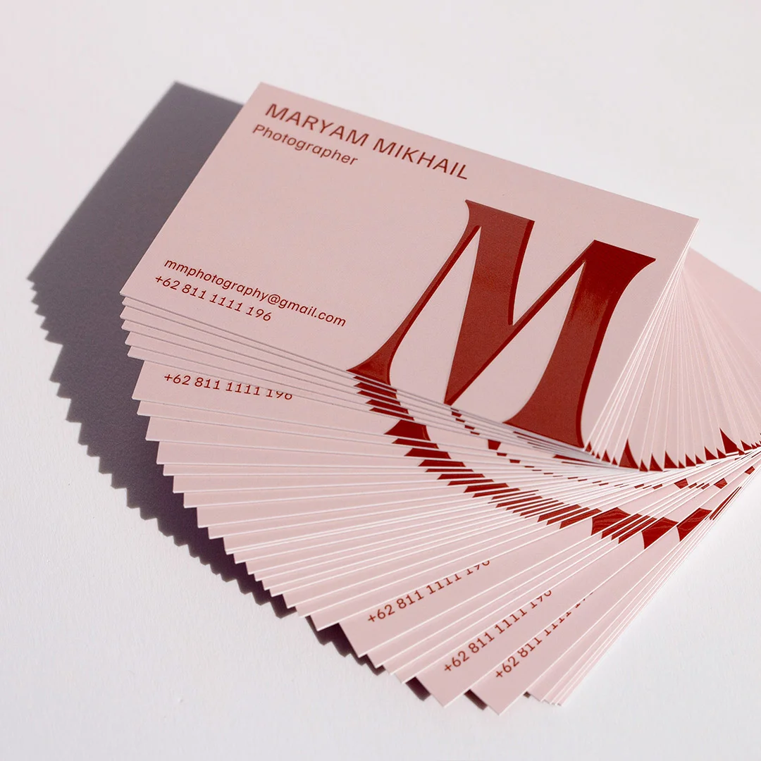
Every photographer in Australia hands out a card at some point: after a wedding ceremony debrief with the venue coordinator, across the expo booth at a bridal fair, to the interior stylist you want to collaborate with, or slipped into the thank-you envelope after a newborn session. That card is a physical extension of the same visual judgement clients hire you for. A flimsy, under-designed card undermines your portfolio before anyone opens your website. A well-chosen card on the right paper stock, finished to match your aesthetic, signals that you bring the same attention to your own brand as you bring to a client’s shoot.
This guide covers everything an Australian working photographer needs to know about business card design, paper selection, finish options, file preparation, and ordering: from the right stock for full-bleed portrait printing to how raised foil reads in a fine-art context, what information hierarchy gets commercial clients calling you back, and what your ABN obligation means when handing cards to corporate buyers.
Photographer business cards: quick reference by niche
| Photography niche | Recommended design direction | Paper stock | Best finish |
|---|---|---|---|
| Wedding | Full-bleed romantic image or foil logotype on cream | 350gsm matte uncoated | Raised foil or flat foil on name/logo |
| Portrait | Full-bleed headshot front, white contact on reverse | 350gsm matte uncoated | Spot UV image highlight, matte reverse |
| Commercial / brand | Minimalist logo front, full contact reverse | 350gsm matte or coated silk | Flat foil on logo mark |
| Real estate photography | Property image front, name and regions on reverse | 350gsm standard | Standard matte or spot UV accent |
| Food / beverage | Full-bleed hero dish image, brand colour reverse | 350gsm coated silk | Spot UV on image zone |
| Sports / event | Bold action image, high-contrast type | 350gsm coated | Standard matte or gloss |
| Family / newborn | Soft full-bleed image, warm tones | 350gsm matte uncoated | Soft-touch matte, no gloss |
| Fashion / beauty | Vertical editorial image, minimal type | Duplex or coated silk | Raised foil or spot UV |
| Fine art / editorial | Minimal gallery-label format, name prominent | Duplex or textured | Flat foil or raised foil on name only |
Why photographer business cards are a different brief entirely
Photographer cards carry more brand weight per square centimetre than almost any other professional category. A solicitor’s card needs to convey credibility; a tradie’s card needs to convey reliability; a photographer’s card needs to convey aesthetic sensibility, technical precision, and commercial professionalism simultaneously. That is a harder brief, and it shows in how quickly a poorly made card undermines an otherwise strong pitch.
Image fidelity stakes
For most professions, the business card is a contact delivery mechanism. For photographers, it doubles as a miniature sample print. A wedding photographer handing a card to a bride at a consultation is implicitly saying: this is how I approach print quality. If the card arrives on thin stock with muddy colour reproduction and cropped-out shadows, the inference is direct.
The technical difference lies in dot gain: how much ink spreads into the paper fibres on contact. Uncoated stock absorbs ink, which slightly softens shadow detail and warms colour temperature – an effect that flatters portrait and fine-art images but can reduce the crispness of architectural or product photography. Coated stock keeps ink on the surface for sharper detail and more vivid colour – ideal for commercial, food, and real estate work. Neither is universally better. What matters is that you have made the choice deliberately based on your genre and editing style, not accepted a default.
Paper weight as a brand signal
The physical weight of a business card is processed as a proxy for quality before the recipient reads a single word. A 200gsm card flexes in the hand and is likely forgotten by end of day. A 350gsm matte card has a substantiality that registers as premium without a word of copy. Duplex business cards bonded to double thickness take that signal further still: when a venue coordinator or commercial art director feels the card’s weight after a post-shoot debrief, the impression is tangible before they turn it over.
Australian photographers working in competitive urban markets – Melbourne’s inner-north creative scene, Sydney’s north shore portrait corridor, Brisbane’s growing commercial photography sector – operate in environments where clients meet multiple photographers in a week. Physical brand signals carry outsized differentiation weight at the point of first impression.
Finish as portfolio extension
A matte uncoated card for a fine-art photographer signals restraint and tactile quality. A spot-UV card for a commercial portrait photographer shows controlled application of premium finishing. A raised foil logotype card for a wedding photographer suggests the same commitment to detail found in the invitation suites at the receptions you shoot. The finish is not decoration – it is brand communication.
For photographers working across multiple niches, consider a consistent brand architecture rather than two entirely different cards. The broader principles are covered in the business card design guide; the sections below apply them specifically to photographer contexts.
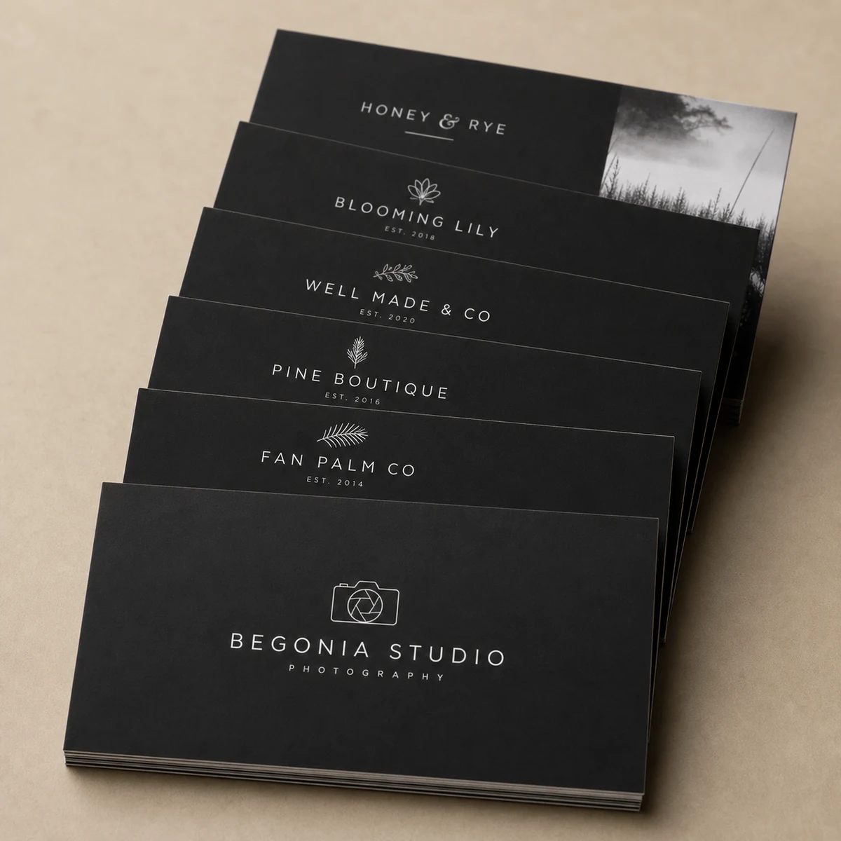
12 photographer business card design directions
Most photographer cards fall into one of the following design directions. Each has a specific use case, and the strongest choices match both the genre and the typical handoff context.
1. Full-bleed portrait front, clean contact reverse
A portfolio-calibre image fills the entire card front with no margin, no border, no competing type. Name and contact appear on the reverse in white or light type over a dark-zone background, or in a single clean typeface on white. This direction works for portrait, wedding, newborn, and family photographers whose strongest asset is the image itself. The card functions as a micro-print of your best work. Printing on 350gsm standard business cards delivers the colour accuracy and edge sharpness this format demands.
2. Minimalist logo-only front
The photographer’s logotype or monogram sits centred on a clean white or bone stock, with contact detail on the reverse in a single colour. This direction suits brand-led photographers who have invested in a strong identity mark. Paired with raised foil business cards, the logo gains metallic presence without adding visual clutter. Well suited to commercial, fashion, and fine-art photographers.
3. Framed-edge gallery style
A thin single or double rule frames a centred image or logotype on white, giving the card a gallery-label feel. Contact detail sits below the frame in a complementary serif or mono typeface. This direction works exceptionally well for fine-art and editorial photographers and pairs well with a cream or natural white uncoated stock.
4. Double-sided dual portfolio image
Different portfolio images on each side, with micro-printed contact in a lower corner. Used by commercial and editorial photographers to show range: a food image on one side, a portrait on the other. The card becomes a conversation starter, and the recipient often shows it to others to discuss the photography. Requires careful image selection so both sides feel cohesive, not mismatched.
5. Embossed typography on cream or bone
Name and niche in raised or debossed letterforms on cream, warm white, or cotton-textured stock. No photography at all – maximum tactile premium. This direction suits fine-art photographers, wedding photographers with a heritage aesthetic, and any photographer who wants the physical card experience to do the heavy lifting. The card’s message is: my attention to detail extends to how I represent myself.
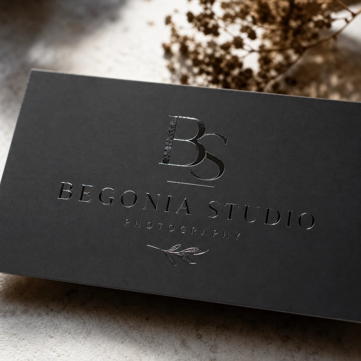
6. Foil-stamp signature logo
The photographer’s signature mark or monogram in flat or raised metallic foil on a premium paper. Particularly suited to wedding, portrait, and fine-art photographers. The foil reads as premium without requiring an image. A flat foil business card in gold or rose gold on a white or cream stock is among the most consistently effective choices across wedding and portrait niches.
7. Kraft stock with spot-UV image highlight
A single portfolio image gets selective spot-UV gloss on a kraft or textured brown card. The tactile contrast – glossy image against textured matte kraft – makes the image area visually prominent without a white background. The rest of the card remains natural and uncoated. Well suited to outdoor lifestyle, family, and rustic-aesthetic wedding photographers.
8. Vertical format, full-bleed portrait orientation
A portrait-orientation card (55mm wide, 84mm tall rather than the standard 84mm x 55mm landscape) with full-bleed photography. Well suited to portrait and wedding photographers whose strongest images are vertical. The tall format stands out in a wallet or card holder and feels distinctly photographic rather than corporate.
9. Tonal palette match
Card stock colour – sage, blush, slate, charcoal, cream – is selected to mirror the photographer’s editing palette. A fine-art lifestyle photographer using warm golden-hour presets chooses a cream or dusty-peach uncoated stock; a commercial photographer with a desaturated high-contrast style might prefer a clean white gloss. Coloured paper business cards offer a range of stock tones that let the card itself signal your colour story before the image is read.
10. Duplex sandwich with coloured core
Two thick stocks bonded together, often with a contrasting colour visible at the card edge. Adds physical weight and sensory impact. When a photographer hands a duplex card to a venue coordinator, the card’s weight alone communicates premium positioning. The coloured core edge – a stripe of red, black, or sage visible when the card is held from above – is a small detail that recipients notice and comment on.
11. Dark stock with light type and moody image
Full dark stock – black, deep navy, slate grey – with white or metallic type and a moody low-key image. Well suited to wedding photographers with a dark romantic aesthetic, fine-art portraiture, and newborn photographers who work with dramatic shadow and light. The card reads as consistent with the editing style clients see in your portfolio.
12. QR-forward portfolio card
Minimal front text: name and niche only, with a prominently placed QR code linking directly to the portfolio, Linktree, or Instagram grid. Suited to social-first photographers building audience, or those who rotate portfolio work frequently and want the card to feel evergreen. Note: QR codes require sufficient contrast to scan – keep the QR code area in a flat matte zone and avoid placing it on a glossy or foil-treated surface.
Business card recommendations by photography niche
The right card for a wedding photographer and the right card for a sports photographer solve different problems. This section maps each AU photography niche to the design, stock, and finish choices that suit the handoff context, client expectations, and typical order volumes.
| Niche | Typical handoff context | Design approach | Recommended product |
|---|---|---|---|
| Wedding | Venue coordinator vendor lists, bridal expos, first consultations | Premium finish essential – left with coordinators alongside florists, caterers, celebrants | Raised foil on logo, 350gsm matte |
| Portrait | Post-session thank-you packs, gym / studio reception desks | Full-bleed headshot or lifestyle image; skin-tone accuracy critical | 350gsm matte with spot UV image highlight |
| Commercial / brand | Agency introductions, procurement packets, networking events | Logo-forward; ABN prominent for B2B; clean and corporate-adjacent | Flat foil on logo, coated silk |
| Real estate photography | Agency office introductions, property management referral packs | Architecture or property image; turnaround speed and region coverage prominent | 350gsm standard; high quantities (250+) |
| Food / beverage | Hospitality venue pitches, food media introductions | Hero dish image – colour accuracy for food tones important; avoid over-saturation | Coated silk 350gsm, spot UV on image |
| Sports / event | Club and association contacts, event vendor booths | Action image, bold type, clear turnaround promise | 350gsm standard; 50-100 quantity per event |
| Family / newborn / maternity | Hospital gift-shop referral packs, mum-group word of mouth | Warm full-bleed image; soft, tactile stock reinforces emotional register | 350gsm matte uncoated, no gloss finish |
| Fashion / beauty | Agency casting calls, designer studio introductions | Editorial vertical image; high aesthetic expectations from recipients | Duplex or coated silk, raised foil or spot UV |
| Fine art / editorial | Gallery openings, art fair booths, editorial submissions | Minimal, gallery-label restraint; the card’s physical quality is the message | Duplex or textured, flat foil or raised foil on name |
AIPP accreditation and professional credentials
Members of the Australian Institute of Professional Photography (AIPP) often include their accreditation tier on their business card: “AIPP Accredited Photographer” or the relevant grade (Associate, Accredited, Master, Grand Master). If you have earned AIPP accreditation, this belongs on your card – it communicates peer-reviewed professional standing to clients who recognise the credential, particularly in the wedding and portrait markets where clients actively research photographer qualifications. Keep the credential in smaller type beneath your niche descriptor rather than at equivalent prominence to your name.
Full-Bleed Photo Business Cards, Printed on 350gsm Stock
Upload your portfolio image and get full-colour, full-bleed printing on premium 350gsm stock. Matte and uncoated options available. From $0.08 per card inc. GST, with free overnight Startrack delivery across Australia.
Paper stock and image-print fidelity
Paper stock choice is the single most important technical decision for a photographer’s business card. The same image file will reproduce differently on every stock type, and understanding why lets you specify confidently rather than ordering a sample and hoping for the best.
Uncoated matte stock
Uncoated stock has no surface coating, so ink absorbs directly into the paper fibres. This creates slight dot gain: fine shadow detail softens marginally, and colour temperature shifts slightly warm. The effect is not a defect – it is the same quality that makes gallery-print matte paper feel different from a magazine page. For portrait, wedding, newborn, and fine-art photography, the warmth and softness of matte uncoated paper can actually flatter the image in the same way a warm preset does. Skin tones in particular respond well to matte stock. The tactile surface also photographs and scans well, and carries a natural, premium feel in the hand.
Coated silk stock
Coated silk has a smooth, slightly sheen surface that keeps ink on top of the substrate rather than absorbing it. The result is sharper edge definition, more vivid colour, and greater shadow depth. For commercial, food, architectural, and real estate photography where precision and vibrancy matter more than warmth, coated silk at 350gsm delivers the most accurate reproduction of a well-prepared CMYK file. The slight sheen is not the high gloss of a magazine cover – it reads as professional and neutral rather than flashy.
Coated gloss stock
High-gloss stock produces maximum colour saturation and contrast but can oversaturate warm tones. For photographers who work in bold colour – fashion, lifestyle, sports – gloss can make images pop. For portrait and wedding work, exercise caution: the same gloss that makes a product pack photograph look arresting can make skin tones read as overly processed. If in doubt, order a business card sample pack before committing to a full run.
Duplex (double-thickness) stock
Duplex business cards bond two separate stocks together, typically with a contrasting colour layer visible at the card edge. The result is a card roughly twice the thickness of a standard business card. The image reproduction quality matches the top stock choice, but the physical weight and edge-flash detail elevate the perceived premium of the card dramatically. Duplex is the right choice for photographers who hand cards to clients at gallery openings, award ceremonies, or high-end venue vendor introductions where the physical impression of the card needs to match the premium positioning of the service.
| Stock type | Colour reproduction | Skin tones | Best photography genres |
|---|---|---|---|
| Uncoated matte, 350gsm | Good warmth; slight dot-gain in shadows | Excellent – natural and warm | Portrait, wedding, newborn, fine art |
| Coated silk, 350gsm | Accurate; sharp edge detail | Good – neutral rendering | Commercial, food, real estate, sports |
| Coated gloss, 350gsm | Maximum vibrancy and contrast | Can oversaturate – test first | Fashion, lifestyle, bold-colour commercial |
| Duplex (double-thickness) | Matches top stock | Matches top stock choice | Premium across all genres; gallery and high-end events |
| Coloured paper (cream, kraft) | Tinted base affects all colours | Warm tones on cream; best for type-only or spot-colour designs | Wedding (cream), outdoor lifestyle (kraft) |
Finish guide: flat foil, raised foil, spot UV, Scodix, and standard matte
Finish choice determines how the card feels to handle and which elements draw the eye first. For photographer cards, the finish should reinforce the genre-specific aesthetic rather than override it. A fine-art photographer with a raised-foil logo communicates precision; the same card with full-surface gloss laminate would contradict their restrained aesthetic entirely.
Standard matte
Standard matte is the baseline and an excellent choice in its own right. It is non-reflective, tactile, and lets the card image or type do the work without finish interference. QR codes and small text scan and read well on matte surfaces. Most photographer card designs that rely on a strong full-bleed image are best served by matte, which keeps the image the dominant element rather than competing with surface gloss.
Spot UV
Spot UV business cards apply a high-gloss UV resin to selected areas of the card only, leaving the rest of the surface matte. For photographer cards, this is a powerful tool: the spot-UV zone can highlight the portfolio image while the contact area remains flat and readable. The tactile contrast between the glossy image and the matte reverse creates a distinctive sensory experience that prompts recipients to look at the card twice. From $0.14 per card inc. GST at volume. Production time is longer than standard – allow additional days beyond the standard lead time.
Flat foil
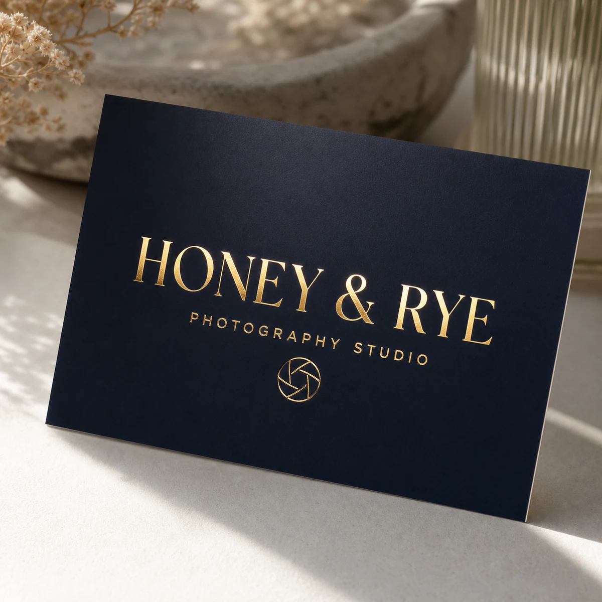
Flat foil business cards bond a thin metallic foil layer to selected type or graphic areas. The result is a mirror-bright metallic finish with no raised texture. For photographer cards, flat foil works best on the logotype or name rather than on photographic areas – foil and photographic half-tones compete visually and neither wins. Gold, silver, rose gold, and copper are the most popular choices for portrait and wedding photographers. The flat foil catches light and creates presence without the weight of a raised surface.
Raised foil
Raised foil combines metallic foil with a slight tactile lift, creating a finish that is both visually and physically prominent. For photographer cards, raised foil is most effective on the logo or monogram of a wedding or portrait photographer whose branding emphasises handcrafted quality. The question of whether raised foil is “too much” for a fine-art photographer depends on scale and placement: a discreet raised-foil monogram on a minimal card reads as considered and premium; a heavily foiled card with multiple foil elements reads as overworked. One element, well placed. That is the rule. Raised foil business cards start from $0.24 per card inc. GST. Allow additional production days – these are not available on the standard 24-hour turnaround.
Scodix raised gloss
Scodix business cards apply a digitally controlled raised polymer to specific areas, creating a tactile embossed effect in clear gloss rather than metallic foil. For commercial and editorial photographers, Scodix can highlight a graphic element or logotype without the metallic overtones of foil – useful when the brand palette is neutral or dark and metallic gold would look out of place. From $0.20 per card inc. GST.
| Finish | Applied to | Portfolio style match | QR code compatible? | 24hr production? |
|---|---|---|---|---|
| Standard matte | Full surface | Universal | Yes – excellent | Yes |
| Spot UV | Selected zones only | Portrait, commercial, fashion | Yes – keep QR in matte zone | No |
| Flat foil | Logo, name, type only | Wedding, portrait, commercial | Yes – keep QR in non-foil zone | Yes |
| Raised foil | Logo, monogram only | Wedding, fine art, fashion | Yes – keep QR in flat zone | No |
| Scodix raised gloss | Graphic elements, logo | Commercial, editorial | Yes – keep QR in flat zone | No |
For a deeper look at foil options across the full range, the foil business cards guide covers when each finish makes sense and what to expect in production.
Full-bleed photo cards: file preparation and colour management
A full-bleed photo business card is only as good as the file supplied to the printer. Substandard file preparation is the most common reason photographer cards come back looking different from expected – not the printer, not the press, and not the paper. Getting file prep right once means every subsequent reprint matches.
Image resolution
The minimum resolution for business card printing is 300 DPI (dots per inch) at the final print size. For an 84mm x 55mm card, this means your image must be at least 992 x 650 pixels at 300 DPI. In practice, most professional cameras produce RAW files at 20-50 megapixels, which is far more than enough – the risk is exporting at a reduced resolution for web use and accidentally submitting that file for print. Always export print files from the original full-resolution RAW or master TIFF, not from a web-compressed JPEG.
Bleed and safe zone
Bleed is the extension of your image beyond the trim edge, allowing for small variations in cutting during production. Standard bleed for AU business cards is 3mm on all four sides. For an 84mm x 55mm card, your artboard should be 90mm x 61mm to include the full 3mm bleed on all sides. The safe zone for critical content – name, contact details, logo – is 3mm inside the trim on all sides, meaning your text elements should sit within a 78mm x 49mm live area. Anything between the live area and the trim edge risks being partially cut. Background image and colour should extend to the full bleed boundary.
Colour profile conversion: from Lightroom to CMYK
Lightroom exports in RGB colour space (typically sRGB or Adobe RGB). Commercial print presses use CMYK. If you submit an RGB file, the print workflow converts it automatically – and the result is not always what you expect, particularly in saturated colours and deep shadows. For the most predictable outcome, convert to CMYK before submitting.
- From Lightroom, export as a high-resolution TIFF in Adobe RGB (16-bit)
- Open the TIFF in Photoshop and convert the colour mode to CMYK (Image > Mode > CMYK Color). Select the colour profile specified by your printer – typically ISO Coated v2 or a comparable AU commercial printing profile
- Check shadow detail and skin tones after conversion – CMYK has a narrower gamut than RGB, so very saturated blues and greens may shift. Adjust in CMYK rather than back in Lightroom
- Export the final file as PDF/X-1a, which embeds all fonts and colour profile information and is the preferred format for most commercial printers
When full-bleed beats logo-plus-contact
Full-bleed photography wins when the photographer’s strongest differentiator is visual – which is most of the time. The card that shows a fraction of your best image will always generate more conversation than the card that shows only your logo. The exception is when you photograph across multiple genres and cannot represent all of them in a single image. In that case, a logo-forward card with a concise niche descriptor (“Commercial and portrait photography”) reads more clearly than a single image that represents only one of your specialisations.
Card sizes and formats for Australian photographers
The standard Australian business card is 90mm x 55mm, close to the international ISO credit card standard of 85.6mm x 54mm. Most print runs default to this landscape format, and most wallets and card holders are designed to accommodate it. For photographers, this standard is a baseline, not a constraint.
Standard landscape (84mm x 55mm / 90mm x 55mm)
The default format. Works for all 12 design directions described above. The most efficient to produce, the most wallet-compatible, and the easiest for recipients to store and retrieve. For photographers who hand cards to venue coordinators, estate agents, or commercial clients who file cards for future reference, standard landscape is the practical choice.
Square format
Square cards (typically 60mm x 60mm or 65mm x 65mm) stand out in a wallet stack and have a gallery-catalogue feel that suits fine-art and portrait photographers. They are slightly more expensive to produce due to non-standard cutting, and they do not fit standard card holders – which is either a disadvantage or an intentional differentiation, depending on your perspective.
Vertical portrait orientation
Rotating the standard card to portrait orientation (55mm wide, 84mm tall) is particularly effective for photographers whose hero images are verticals. A full-bleed portrait-format image on a vertical card creates a cohesive visual experience. The format also reads as non-corporate, which suits wedding, fine-art, and lifestyle photographers.
Mini or slim accent cards
Mini cards (approximately 60mm x 40mm) and slim cards (85mm x 30mm) are sometimes used as accents in portfolio packaging, thank-you note accompaniments, or product packaging inserts rather than as standalone networking cards. If you deliver printed portraits in a folio or box, a slim branded card inside adds a professional detail without competing with the work itself.
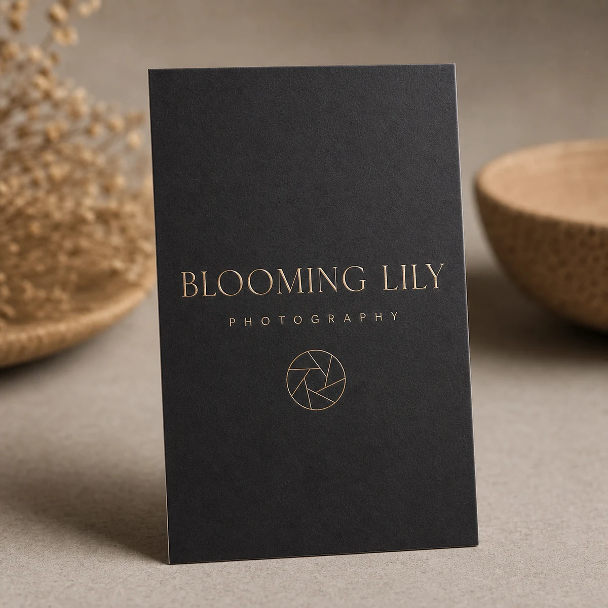
What information to include on your photographer business card
Photographer cards often carry too much information or the wrong hierarchy. The goal of the card is to prompt a specific next action – usually visiting a portfolio website or making a call. Every element on the card should serve that goal or be removed.
Required elements
- Name: Your name or studio name. If your trading name is different from your legal name, use the trading name. Make it the most prominent typographic element on the contact side.
- Niche descriptor: A concise one-line description: “Wedding photographer”, “Commercial and brand photographer”, “Portrait and family photography”. Not a tagline – a description. Clients use it to know whether to keep the card.
- Portfolio or website URL: The single most important contact element. Clients make their first decision based on what they see at your URL, not on what you said at the event.
- Email address: Direct email rather than a contact form. Commercial clients particularly prefer email for initial enquiries and quote requests.
- Phone number: Mobile preferred. A direct mobile number communicates accessibility and responsiveness.
- Instagram handle (if active portfolio): For photographers who maintain an active, well-curated Instagram, the handle is a legitimate portfolio pointer. Include only if your grid represents your current work accurately.
ABN: when to include it
As an Australian sole trader photographer, you are legally required to include your ABN on tax invoices issued to other businesses for services over $82.50 (GST-inclusive). Your business card is not a tax invoice, so ABN inclusion is technically optional. However, commercial clients – advertising agencies, property developers, corporate communications teams – often maintain supplier ABN records before engaging a contractor. Including your ABN on the card removes a step in that onboarding process and signals that you operate as a legitimate business entity, not a cash-in-hand operator. Portrait and newborn photographers working primarily with private clients can leave it off; commercial, corporate, and real estate photographers benefit from including it.
What to omit
- Taglines: “Capturing your story” and “Moments that matter” communicate nothing and date quickly. Your niche descriptor does more work with fewer words.
- Multiple phone numbers or email addresses: One of each. Multiple contacts create decision paralysis.
- Physical address: Unless you operate a studio with a fixed public address and want clients to walk in, a street address adds clutter and communicates nothing useful.
- List of all services: The card is not a brochure. One niche descriptor plus the portfolio URL covers the full range without crowding the layout.
Production specs, pricing, and lead times in Australia
Understanding what to expect from a quality AU print supplier helps you plan reprints, manage kit-bag stock levels, and brief your designer on file requirements upfront.
File specifications
- Preferred format: PDF/X-1a (fonts embedded, colour profile embedded, no transparency)
- Colour mode: CMYK
- Resolution: 300 DPI at final print size
- Bleed: 3mm on all sides (total artboard 90mm x 61mm for a standard 84mm x 55mm card)
- Safe zone: 3mm inside trim on all sides
- File size: No upper limit for print files – do not compress for web
Production lead times
Standard business cards, flat foil, and coloured paper business cards are available on a 24-hour production turnaround – useful when you need cards before an event with short notice. Spot UV, raised foil, Scodix, and duplex cards require additional processing time beyond the standard lead time; allow extra days when ordering these finishes and do not plan last-minute orders for events if ordering premium-finish cards. All orders include free overnight Startrack delivery across Australia once dispatched.
Quantities and pricing
Most working photographers order in the 50-250 range per print run. The economics favour slightly higher quantities: the per-card cost drops at 250 compared to 50, and the marginal cost of carrying a small stock is low compared to reordering frequently. Real estate photographers who do bulk drops with agency offices often order 500 at a time. Portrait, wedding, and fine-art photographers who hand cards personally at 50-100 events or sessions per year typically find 100-250 per run suits their pace.
Indicative pricing (AUD, inc. GST, from standard quantities):
- Standard business cards: from $0.08 per card – the most cost-effective option for high-volume handoff contexts like real estate agency drops or expo booths
- Spot UV business cards: from $0.14 per card – available at a lower entry per-card rate at volume; premium finish without premium pricing at scale
- Scodix business cards: from $0.20 per card
- Raised foil business cards: from $0.24 per card
- Flat foil business cards: from $0.18 per card – foil finish commands a premium; suited to photographers who order smaller quantities for high-touch handoff rather than mass distribution
- Duplex business cards: from $2.27 per card – the premium tier for gallery openings and premium client introductions; order 50-100 for targeted use rather than 500 for general distribution
For photographers unsure which stock and finish to commit to, a business card sample pack lets you assess paper weight, colour reproduction, and finish quality before placing a full order.
Raised Foil Business Cards for Photographers
Metallic raised foil on logo or name, printed on premium stock. Available in gold, rose gold, silver, copper, and more. From $0.24 per card inc. GST, with free overnight Startrack delivery across Australia.
Where and how to use your business cards
The most common mistake photographers make with business cards is not the design – it is ordering 100 cards and handing out 12 in two years. A card that sits in a box does not generate bookings. Strategic placement, not aggressive distribution, is what converts cards into clients.
Wedding industry vendor introductions
The wedding industry in Australia runs on referral networks. Venue coordinators at Merivale venues in Sydney, Mornington Peninsula wineries, and Byron Bay hinterland properties maintain internal vendor lists they share with enquiring couples. Getting your card onto those lists – and keeping it there with consistent quality work – is one of the most reliable pipelines for wedding photographers. Leave cards at venue coordinator offices after each booking or shoot, and follow up with a personal note when you want to be added to a preferred supplier list. A premium-finish card distinguishes you from photographers who hand out generic stock-photo-looking cards from online budget printers.
Portrait and family studio follow-up packs
Including a card in every post-session thank-you envelope or digital gallery delivery email encourages referral sharing. When a happy portrait client shows a friend the prints and the friend asks “who took these?”, the card is already in the envelope alongside the prints. Business cards included in mailed portrait delivery boxes should be premium-finish versions – they are handled carefully and kept rather than pocketed and forgotten.
Real estate agency supplier packs
Real estate photographers servicing agencies in high-turnover markets – Sydney’s northern beaches, Melbourne’s inner east, Brisbane’s south side – benefit from leaving packs of 5-10 cards with property management reception desks for new agents being onboarded. Agencies cycle through new sales staff regularly, and each new agent needs to build their own supplier list. A well-designed card that clearly shows turnaround time, region coverage, and includes ABN accelerates the commercial onboarding conversation.
Photography conferences and industry events
The AIPP’s Australian Professional Photography Awards, the Photography Show events, and various local camera club and workshop series all involve photographer-to-photographer networking. In these contexts, the card’s role changes: it is less about client acquisition and more about industry credibility. A duplex or raised-foil card at an APPA event communicates that you take your own brand as seriously as your subjects.
Gallery openings and exhibition events
For fine-art and editorial photographers who exhibit, the gallery opening is the highest-value card distribution context. Attendees at openings are engaged, attentive, and already interested in the work. A minimal, gallery-label-style card that matches the exhibition’s aesthetic and is left at the guest book table or given to gallery contacts will be kept and referenced. This is the context where duplex and foil-finish cards earn their premium cost per card most clearly.
Kit bag standard
A working photographer should carry cards in every kit bag, every time, without exception. After a wedding ceremony when the venue manager asks if you are available for next year’s season, or after a commercial shoot when the art director asks if you cover different formats – the card needs to be immediately to hand. A custom business card holder that protects the cards from the dust and minor moisture of a day’s shooting is worth the small investment.
Six photographer business card mistakes to avoid
These are the most common errors that appear in photographer card orders. They are avoidable with preparation and are worth checking against the design checklist at the end of this section before placing an order.
For a broader view of what goes wrong across all card types, the guide to common business card mistakes covers the full list.
1. Over-designing the back
The back of a full-bleed photo card is prime real estate. Most photographers who receive a heavily designed back card first look at the front image, then flip it over hoping to find contact detail cleanly presented. Finding instead a busy collage of three more images, a testimonial quote, a list of services, a tagline, and a social media grid makes the card harder to use, not more impressive. Name, niche, URL, email, phone. That is all the back needs.
2. Dated taglines
“Capturing life’s moments” and “Your story, beautifully told” have appeared on photographer cards since approximately 2010. They communicate nothing that the niche descriptor does not already say, and they signal a lack of brand thinking. If you cannot articulate why your version of portrait photography is different from anyone else’s, do not try to do it in four words on a business card. Use the space for your niche and URL instead.
3. Low-resolution image supplied for print
The most technically avoidable mistake. A web-optimised JPEG at 72 DPI exported from Lightroom for an Instagram post will print soft and pixellated at business card size. Always supply images at 300 DPI minimum at the final print dimensions. Export from your original RAW file or full-resolution master TIFF for every print file submission.
4. QR code in a spot-UV or foil zone
QR codes require sufficient tonal contrast to scan reliably. Applying spot-UV gloss or metallic foil over a QR code disrupts the contrast between the dark modules and the light background, causing scan failures. Always place QR codes in a flat matte zone on the card. Test the QR code at print size (typically 15-20mm square minimum) with your phone before submitting the final file.
5. Contact hierarchy confusion
The most common layout error is a card where the business name is in 8pt, the niche is missing, and a decorative flourish is the largest visual element. The hierarchy should be: name at largest type size, niche descriptor at secondary size, then URL, email, phone at readable but subordinate sizes. The first thing a recipient should understand in under two seconds is who you are and what you photograph.
6. Ordering 50 when you need 200
Reordering too frequently costs more than ordering correctly the first time. The per-card cost for a run of 50 is typically higher than for a run of 200, and reordering interrupts workflow. For standard matte cards used in regular networking contexts, order 200-250 at a time. Reserve the 50-unit quantities for experimental designs or seasonal variations you want to test before committing to a full run.
Pre-submission design checklist
Run this checklist against your final design file before submitting to print.
- Image resolution is 300 DPI minimum at print dimensions
- Artboard includes 3mm bleed on all four sides
- All critical content (name, URL, contact) is within the 3mm safe zone inside trim
- File exported as PDF/X-1a with colour profile embedded
- CMYK colour mode (not RGB) for photographic or full-colour designs
- Skin tones and shadow areas checked after CMYK conversion
- QR code (if used) is in a flat matte zone, minimum 15mm square, tested with phone scan
- Font size for contact details is minimum 7pt for readability at print size
- Foil or spot-UV zones defined in a separate spot colour layer in the file
- Logo supplied as vector (not raster) if used without photographic background
- Niche descriptor is present and clear
- ABN included if card is used in commercial/B2B contexts
- Back of card has no more than five information elements
- Card design proofed at 100% scale on screen and printed on a home printer at actual size to check hierarchy and legibility
Browse the Full Range of Custom Business Cards
Standard, spot UV, raised foil, Scodix, duplex, flat foil, and coloured paper – every finish available in one place. Free overnight Startrack delivery across Australia on every order.
Frequently asked questions
What paper stock prints my wedding portraits most accurately on a business card?
A 350gsm matte uncoated stock delivers the most natural, true-to-tone reproduction for portrait and wedding photography. Uncoated stock absorbs ink with slight warmth, which flatters skin tones and reduces the clinical edge that high-gloss can introduce. Coated silk at 350gsm is the second choice if you want slightly sharper shadow detail with neutral colour rendering. Avoid high-gloss stock for portrait work as it tends to oversaturate warm skin tones.
Is raised foil too much for a fine-art photographer?
Raised foil is not inherently too much for fine-art photographers – the question is placement and scale. A discreet raised-foil monogram or name on a minimal, gallery-label-style card reads as considered and premium. A card with multiple heavily foiled elements reads as overworked and contradicts the restrained aesthetic most fine-art photographers cultivate. The rule: one foil element, well placed. If the card design requires more than one foil zone to feel complete, reconsider the layout before adding finish.
Can I order 100 cards or is there a minimum order quantity?
Yes, 100 cards is a standard order quantity. Minimum order quantities vary by product: standard business cards and flat foil are available from a 50-card minimum, while other premium finishes may require higher minimum orders. Check the product page for the specific finish you are ordering. For photographers who want to test a design before committing to a full run, a business card sample pack lets you assess stock and finish options at low cost before ordering.
What is the lead time for spot-UV business cards in Australia?
Spot-UV business cards require additional production time beyond the standard 24-hour turnaround available for standard and flat foil cards. Allow extra processing days when ordering spot UV, raised foil, Scodix, or duplex cards. Once dispatched, free overnight Startrack delivery reaches most Australian metro addresses the following business day. For event-critical orders, confirm the expected production window at time of order placement rather than assuming standard lead times apply.
Do you offer double-sided full-bleed photo printing?
Yes. Double-sided printing with full-bleed photography on both sides is available on standard business cards. This works well for commercial and editorial photographers who want to show two different portfolio images, or for any photographer who wants a full-bleed image on the front and a solid colour or tonal background on the reverse for the contact side. Supply two separate artboard files – front and back – each with the correct 3mm bleed.
Will my Instagram QR code be readable on a matte card?
Yes – matte cards are generally the best surface for QR code readability. The flat, non-reflective surface provides consistent contrast between the dark QR modules and the light background without the glare that can interfere with scanning on high-gloss surfaces. Print the QR code at a minimum of 15mm x 15mm to ensure reliable scanning. If using a spot-UV or foil finish elsewhere on the card, keep the QR code in the untreated matte zone – applying any finish over the QR code disrupts the contrast needed for scanning.
Can I supply my own Pantone colour for my logo?
Pantone matching is available for some print methods but not for all digital print runs. Digital printing (the most common method for short-run business cards) reproduces colour through CMYK rather than Pantone spot inks, so exact Pantone matching cannot be guaranteed on a standard digital print run. For logos with precise brand colour requirements, convert the Pantone value to its closest CMYK equivalent using the Pantone website or the colour library in your design software, then check the CMYK output carefully before submitting. For offset or specialty print methods where Pantone spot inks are available, confirm Pantone options directly with the print supplier.
How do I prepare a CMYK file from my Lightroom export?
Lightroom exports in RGB (sRGB or Adobe RGB). To prepare a print-ready CMYK file: export a high-resolution TIFF from Lightroom in Adobe RGB at 300 DPI; open the TIFF in Photoshop; go to Image > Mode > CMYK Color and select the CMYK profile specified by your printer; check the result carefully, particularly skin tones and any saturated colours, which may shift in the RGB-to-CMYK conversion; adjust as needed in CMYK mode; then save or export as PDF/X-1a for submission. Do not re-open the exported PDF/X-1a in Lightroom or convert back to RGB – keep the file in its final CMYK state from Photoshop through to submission.
What resolution does my image need to be for business card printing?
300 DPI at the final print dimensions is the minimum for sharp, professional-quality results. For a standard 84mm x 55mm business card with 3mm bleed (giving a total artboard of 90mm x 61mm), this means your image must be at least 1063 x 720 pixels at 300 DPI. In practice, any image exported from a modern DSLR or mirrorless camera at full resolution will far exceed this requirement. The risk is in exporting a web-compressed or reduced-resolution file for the print submission – always work from the original full-resolution master file.
Should I include my ABN on my business card as a sole trader photographer?
It depends on your client mix. If you primarily photograph commercial clients – advertising agencies, property developers, corporate communications, hospitality groups – including your ABN on the card streamlines their supplier onboarding process and signals that you operate as a registered business entity. Commercial clients in Australia are required to collect ABNs from contractors for withholding tax purposes, and having it on your card removes a follow-up step. If you photograph primarily private portrait, family, and wedding clients who are not businesses, the ABN is optional on the card and the space may be better used for your portfolio URL.
What card size works best for a vertical portrait layout?
Rotating the standard 84mm x 55mm card to portrait orientation (55mm wide x 84mm tall) works well for vertical portfolio images. The vertical format feels distinctly photographic rather than corporate, stands out in a wallet stack, and suits the natural proportions of portrait and wedding photography’s typical vertical compositions. Note that vertical cards do not fit standard horizontal card holders, which can be either a practical disadvantage or an intentional differentiation signal depending on context.
Is a 350gsm business card suitable for full-bleed photography?
Yes – 350gsm is the standard weight for premium business card printing in Australia and is well suited to full-bleed photography. The stock is thick enough to provide a premium feel without being so heavy that it feels unusual, and it holds print quality across both matte uncoated and coated surface options. For photographers who want to push further into the premium tier, duplex cards bond two 350gsm stocks together for a significantly heavier result that makes a strong physical impression on first contact.