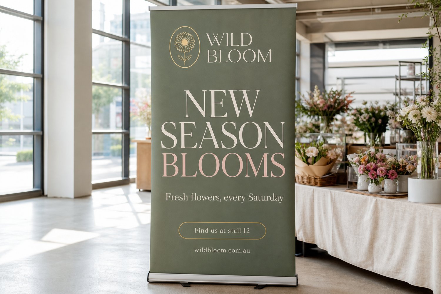
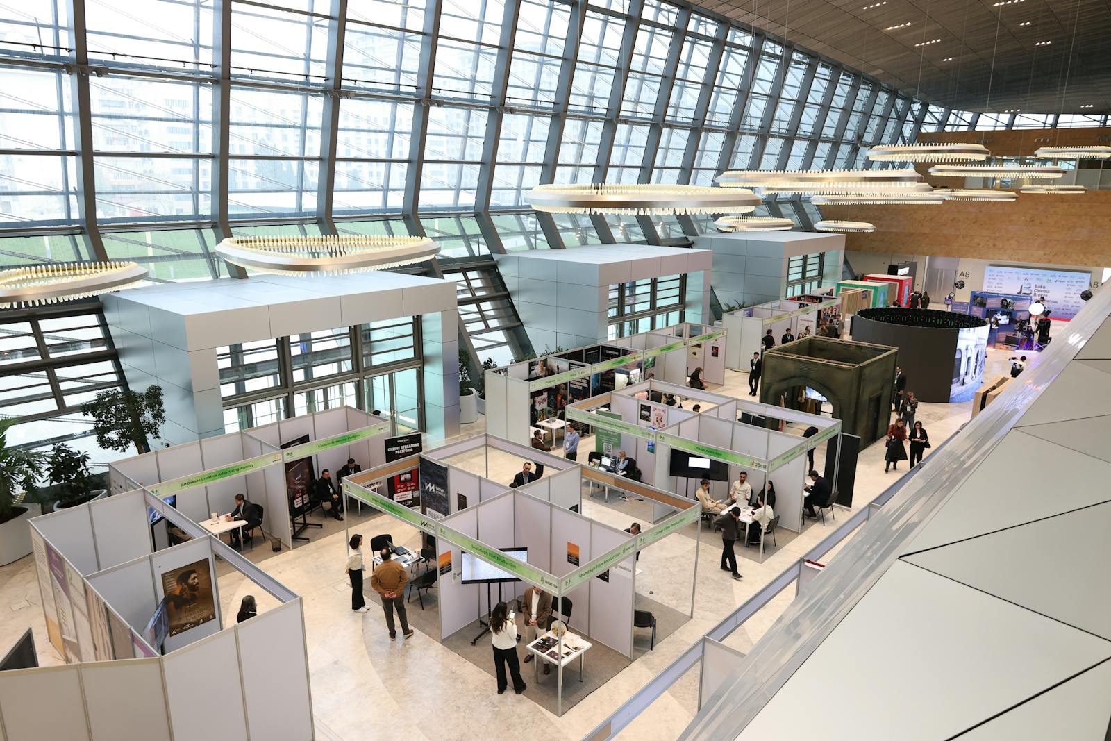
Trade shows give you seconds to make an impression. Attendees scan dozens of booths at once, and if your banner does not communicate your core message before they reach the next aisle, you have already lost them. The difference between a banner people stop for and one they walk past almost always comes down to design fundamentals: type size, contrast, hierarchy, and knowing exactly where the retractable mechanism will eat your artwork. The same rules hold for every piece on the trade show displays page. Keep the pull up banner by the table carrying the key message, and use the media wall as the wide backdrop behind the stand.
This guide covers everything a designer or business owner needs to produce a banner that reads clearly from 5 metres, prints cleanly at large format, and arrives ready to set up in under a minute.
CHEAT SHEET
- The 10x rule: for every 10 metres of viewing distance, your headline type needs at least 25mm of cap height. At 5 metres, that means headlines roughly 60pt or taller.
- Use no more than two typefaces and three type sizes; hierarchy collapses when everything competes.
- Contrast ratio between text and background should be at least 4.5:1 (pure black on white is 21:1); aim closer to 10:1 or above for outdoor and exhibition lighting.
- Keep all critical content above the 300mm safe-zone line at the base of a retractable banner: that zone is swallowed by the cassette.
Why Viewing Distance Is the Starting Point for Every Design Decision
Before choosing colours or layout, establish your primary viewing distance. At a typical exhibition stand, the aisle is roughly 3 to 5 metres wide. Your banner headline must be legible from the far edge of that aisle (often 5 metres). A busy hall with overhead lighting and competing signage pushes that requirement further.
The industry rule is straightforward: 1 mm of cap height for every 2 to 3 metres of viewing distance when using a high-contrast sans-serif typeface in good lighting. In a noisier visual environment (dark halls, low-contrast booths competing on either side), double that minimum.
| Viewing Distance | Minimum Headline Cap Height | Approximate Typeset Size |
|---|---|---|
| 1 m (tabletop) | 8 mm | 28 pt |
| 2 m (across a small table) | 16 mm | 56 pt |
| 3 m (edge of a standard booth) | 22 mm | 76 pt |
| 5 m (across a trade show aisle) | 34 mm | 120 pt |
| 8 m (large open-plan expo) | 54 mm | 188 pt |
| 10 m (outdoor event / stadium) | 68 mm | 240 pt |
Body copy, sub-headlines, and website URLs should be set 40 to 60 per cent smaller than the headline and are not expected to be legible from the far end of the aisle. They are read by visitors who have already stopped. Do not cram them in at display size; they exist to reward people who are already engaged.
The Three-Second Hierarchy Rule
A trade show banner is not a brochure. Visitors should be able to absorb your message in three seconds. That means a strict visual hierarchy with no more than three layers of information.
Layer 1: Your core promise (read from 5 metres)
One line. Five to seven words at most. This is your value proposition or the problem you solve, not your company name alone. “Custom Print in 2 Days” outperforms “Smith & Co. Print Solutions” because it answers the visitor’s unspoken question: why should I stop?
Set this in your heaviest weight and largest size. Position it in the top third of the banner where it clears eye level when the banner is standing at full height.
Layer 2: Your brand identifier (read from 2-3 metres)
Your logo and company name. By convention these sit in the top section, above or alongside the headline. Many designers make the mistake of starting with the logo at maximum size. This compresses the headline and weakens the most important message. The logo should be prominent but secondary.
Layer 3: Supporting detail (read from within arm’s reach)
Bullet points, social handles, a QR code, tagline, or contact details. Keep this layer in the lower-centre zone, above the safe zone for retractable banners. Use a type size you would see in a printed DL brochure: roughly 10 to 14 mm cap height.
Font Selection for Large-Format Print
Sans-serif typefaces are the standard for banner work because their open counters and consistent stroke widths hold legibility at distance and in degraded lighting. At 5 metres, the fine serifs on a transitional typeface like Times or Garamond blur into the stroke, reducing contrast.
Practical recommendations:
- Headline: Any geometric or humanist sans-serif with a Bold or Black weight. Futura Heavy, Montserrat ExtraBold, Inter Bold, and Helvetica Neue Heavy are all strong choices.
- Sub-headline / body: A lighter weight of the same family, or a complementary neutral (e.g., Roboto Regular as a sub-headline to Montserrat ExtraBold headline). Avoid mixing two display typefaces.
- Avoid: Thin weights (stroke width collapses at distance), condensed faces set at small sizes, and anything with decorative flourishes at body-copy scale.
Script and decorative typefaces can appear in one-word accents at headline size. They fail immediately at sub-headline scale.
Colour and Contrast: What the Science Says
High contrast is the single biggest lever on legibility at distance. The Web Content Accessibility Guidelines specify a 4.5:1 contrast ratio for standard text. This is a minimum for screen reading under controlled conditions. For exhibition environments with variable overhead lighting and competing visual noise, treat 7:1 to 12:1 as your working target.
Colour combinations that work at 5 metres:
- White or light warm grey on deep navy, black, or charcoal
- Black or near-black on white, cream, or pale yellow
- White on a saturated brand colour (dark green, burgundy, forest teal) provided the colour is dark enough to hit 7:1 contrast
Colour combinations to avoid:
- Red text on dark green, or green on red: near-invisible for colour-blind viewers (roughly 8 per cent of males)
- Yellow text on white or pale backgrounds: poor contrast in bright lighting
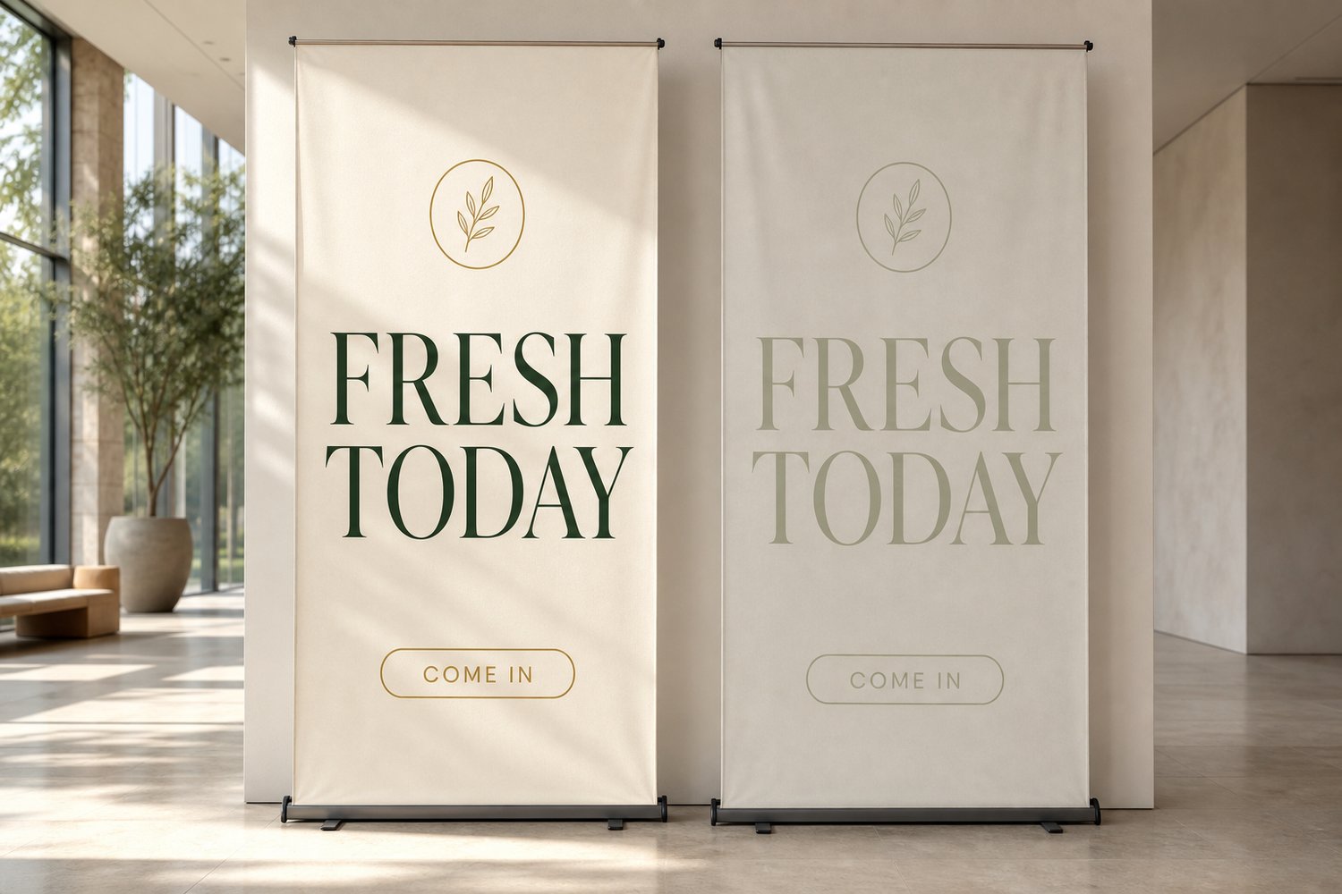
- Pastel on pastel: looks refined in stationery but illegible in large-format print from 5 metres
- Busy photographic backgrounds behind text without an overlay or scrim
A practical test: open your artwork in greyscale. If the text reads clearly in greyscale at 5 metres, it will read clearly in colour.
Safe Zones and Retractable Banner Mechanics
A retractable (pull-up) banner uses a spring-loaded cassette base. When retracted, the bottom 300 to 400 mm of the print panel rolls into the cassette and is never visible on the stand. When extended, the panel clips to the top of an extending pole.
This creates two critical safe zones:
Bottom safe zone (retractable banners): Keep all artwork and text content above the bottom 300 mm of the panel. Anything in the bottom 150 mm is almost certainly hidden by the cassette base when displayed. The Paperlust premium pull up banners include an aluminium roller base and extending support pole, allow 300 mm as a non-printing safe zone at the base.
Top attachment zone: Allow 20 to 30 mm at the very top for the pole attachment clip. Logos or text placed in the top 25 mm risk distortion or obstruction from the hardware.
Edge bleed: Print-ready files for banners require 3 mm of bleed on all edges. This means your background colour or image must extend 3 mm beyond the trim line on each side. Text and logos should sit at least 20 mm inside the trim line (well inside bleed) to account for any minor shift during finishing.
File Preparation for Large-Format Print
Large-format banners have strict file preparation rules for colour mode and image quality.
Resolution
The premium pull up banners require 300 dpi or higher at final output size. Vinyl banners require a minimum of 300 dpi at final print size.
The most common file preparation error is supplying an image at 72 dpi (screen resolution) then scaling it up. A 72 dpi image resampled to 300 dpi will appear blurry in print. Always start with a high-resolution source file, or use vector artwork wherever possible.
Colour mode
Work in CMYK from the start of your design. Banners are printed with four-colour process inks. If you design in RGB and convert at export, certain saturated reds and blues shift noticeably, especially electric blue (RGB 0, 0, 255) which prints as a muted navy in CMYK.
If your brand uses Pantone spot colours, translate them to their CMYK equivalents and review printed proofs before a large run.
File format and fonts
Submit files as print-ready PDF, or for vinyl banners, PDF, SVG, Adobe Illustrator, or EPS. Convert all text to outlines or embed all fonts before exporting. This prevents substitution of fonts if the production system does not have your typeface installed. Missing font substitution is the leading cause of misaligned text and broken headlines in large-format print.
Dos and Don’ts Checklist
| Design choice | Do | Don’t |
|---|---|---|
| Headline size | Set at 120 pt or above for 5m viewing | Set below 70 pt for primary message |
| Number of fonts | Use 2 at most | Mix 3 or more typefaces |
| Contrast | Target 7:1 or above | Use pastels on pastels or red on green |
| Text placement | Keep content 20 mm inside trim, above 300 mm base safe zone | Place logos or headlines near edges or in base zone |
| Background imagery | Use a darkened overlay behind text on photo backgrounds | Use busy photographic backgrounds with no contrast layer |
| File resolution | 300 dpi minimum at final size for retractable and vinyl | Scale up 72 dpi screen images |
| Colour mode | Set up file in CMYK from the start | Design in RGB and convert at export |
| Fonts | Convert to outlines before export | Submit without outlining or embedding |
| Bleed | Extend background 3 mm beyond trim on all edges | Supply artwork at exactly trim size with no bleed |
| Copy volume | 10 to 25 words total for display-distance content | Fill the banner with paragraph-length copy |
Outdoor and Wind-Exposed Events
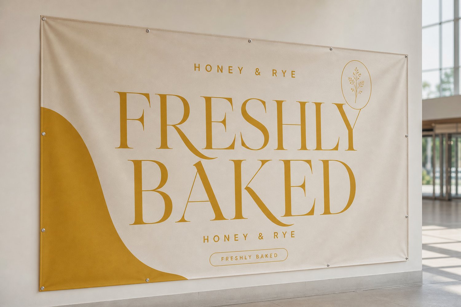
For outdoor expos, markets, and events where banners are exposed to wind, the material choice changes the design slightly. A solid vinyl banner catches wind and can topple a lightweight stand. A mesh banner is printed on 300 gsm perforated PVC that allows wind to pass through, dramatically reducing sail load. The perforation is visible up close but does not materially affect legibility at 5 metres.
For mesh banner design, increase the contrast of text and key elements slightly above what you would use for vinyl, the perforation reduces the effective ink density, which softens the printed image compared to solid substrate. Bold weights and high-contrast colour combinations compensate for this.
Frequently Asked Questions
What is the minimum font size for a banner read from 5 metres?
For a headline read from 5 metres in average exhibition lighting, aim for a cap height of at least 34 mm, which is approximately 120 pt. This is the minimum, push to 140 to 160 pt if your background and foreground colours have lower contrast or if the venue has uneven or dim overhead lighting.
Should I use a template from my design software or start from scratch?
Starting from the exact print dimensions (for example, 850 x 2100 mm for a standard retractable banner) is better than scaling a template designed for a different size. Templates can carry incorrect resolution settings or placeholder images at 72 dpi. Set up your artboard at the correct mm dimensions, set colour mode to CMYK, and build from there.
Can I include a QR code on a trade show banner?
Yes, but place it within arm’s reach range, not at aisle distance. A QR code needs to be at least 25 x 25 mm to scan reliably from a phone at 300 mm distance. At 5 metres, a QR code cannot be scanned regardless of size, it is a pull-close element for visitors who approach the stand. Place it in the lower-centre zone above the safe zone base line.
What is the bleed requirement for Paperlust banners?
Both retractable pull-up banners and vinyl banners require 3 mm of bleed on all edges. Extend background colours and images 3 mm beyond the trim line. Text and logos should sit at least 20 mm inside the trim line to avoid being cut or obscured by the banner cassette hardware.
How many words should a trade show banner carry?
Aim for 10 to 25 words of display-distance content. This typically means a headline of 5 to 7 words, a sub-headline of 3 to 5 words, and your brand name. Supporting detail (website, contact, bullet points) sits in the lower zone and is read at close range, these can carry more words but should still be concise. Copy-heavy banners are ignored; the brain categorises them as “too hard to read” before the eyes fully resolve the text.
What is the turnaround time for printed banners?
Production time varies by product. Retractable pull-up banners dispatch within 2 to 5 business days of artwork approval. Vinyl banners take 4 to 5 working days to produce after proof approval, and mesh banners take 2 to 3 working days. Both include a digital proof stage before printing begins. Plan at least 7 to 10 business days from artwork submission to arrival if you are ordering ahead of an event, to allow buffer for any proof revisions.
For more on stand options and how the hardware shapes your design constraints, see Pull-Up Banner Sizes and Specs: The Complete Setup Guide and Retractable vs X-Banner vs Telescopic Stands: Which to Choose.