When a guest picks up your menu, the first impression is tactile and visual before a word is read. Standard digital print does the job for casual venues, but metallic foil and white-ink finishes signal something different: care, craft, and a price point that delivers on its promise. This guide compares the two premium finish paths available for professional menu printing, helps you decide which suits your venue, and covers the practical details of stock selection, sizing, and artwork preparation.
CHEAT SHEET
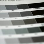
- Foil menus use real metallic foil applied to logos, headings, or decorative elements on a full-colour printed base, available in gold, rose gold, silver, copper, and holographic.
- White-ink menus print white ink directly onto dark or coloured stock (black, navy, forest green, burgundy, seedling green), creating high contrast without any metallic sheen.
- Foil suits venues that want warm, glamorous, classic luxury signalling; white ink suits venues aiming for moody, contemporary, or botanical atmosphere.
- Both are available in DL, A5, A4, and A3 formats through Paperlust Print Shop.
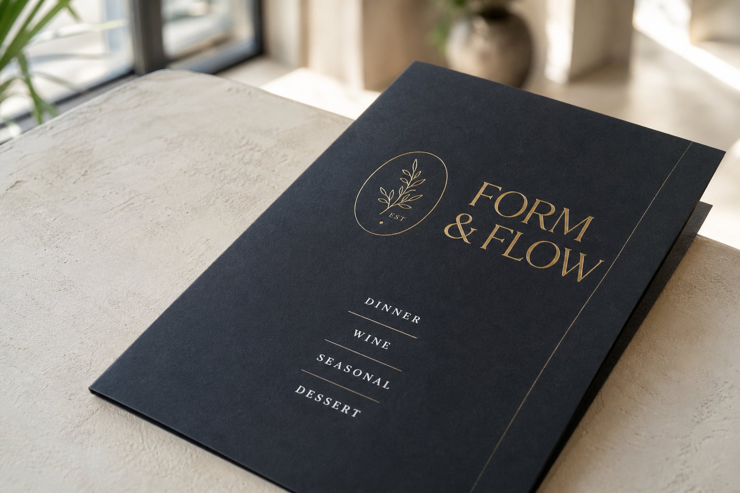
What Is Foil Printing on Menus?
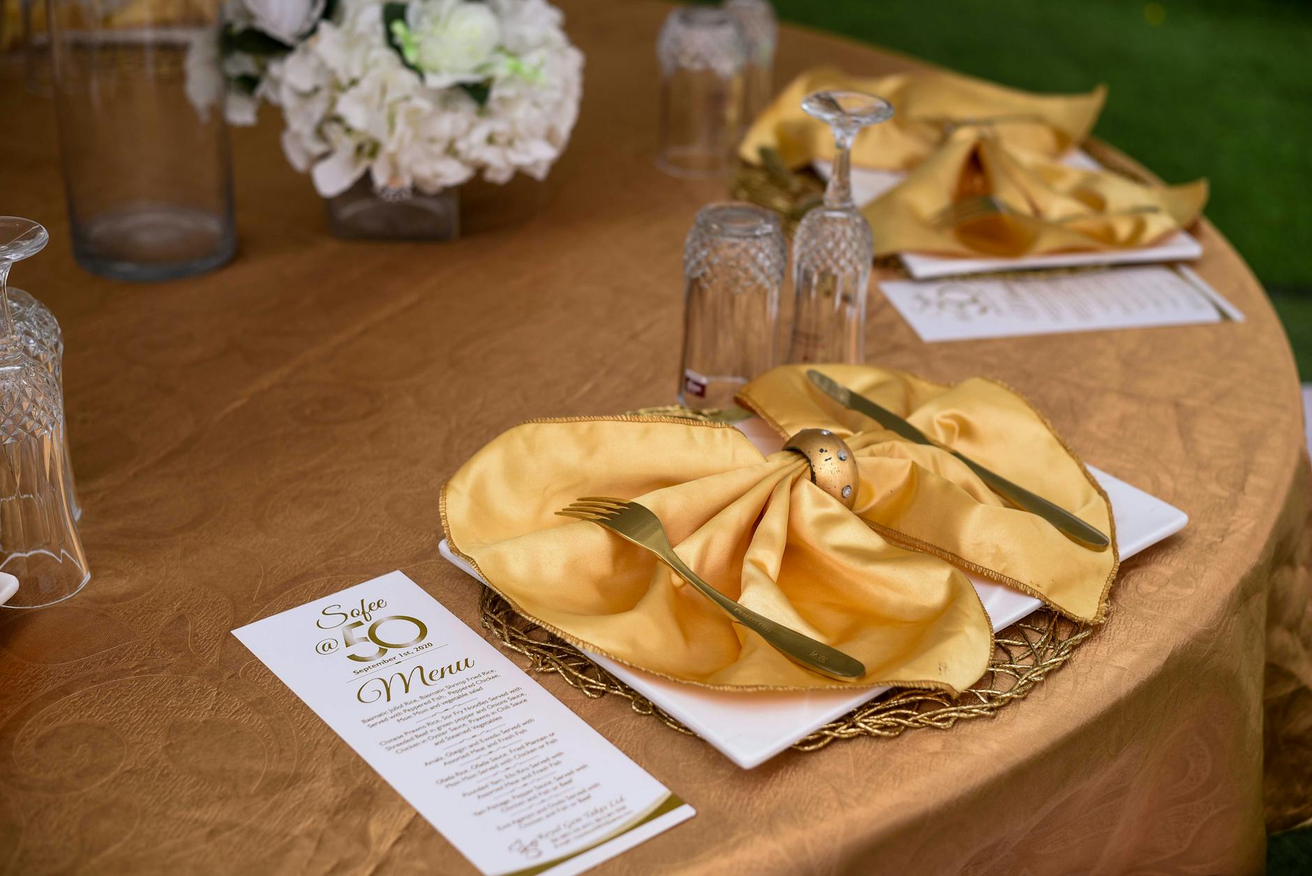
Foil printing bonds a thin layer of metallic film to specific areas of a printed sheet using heat and pressure. The result is a mirror-bright, reflective surface on your chosen design elements, whether that is your restaurant name in the header, a decorative rule beneath the chef’s name, or a small illustrative motif that runs through the design system.
The process used here is flat foil, which means the foil sits flush with the paper surface rather than creating a raised or embossed effect. This keeps costs lower than traditional die-stamp foiling while still delivering a convincing metallic finish that photographs well and feels intentional in the hand.
Available foil colours include:
- Gold – warm, classic, suits traditional fine dining and French bistro aesthetics
- Rose gold – softer, romantic, popular in contemporary wine bars and function venues
- Silver – cool and precise, suited to modern European or Japanese-influenced kitchens
- Copper – earthy, industrial-warm, strong in wine cellars, craft bars, and farm-to-table concepts
- Holographic – spectral, shifts colour with viewing angle, a design choice for creative venues and pop-ups
Full-colour printing is included on both sides of every order, so foil accents sit on top of a fully realised design rather than replacing colour with metal.
What Is White-Ink Menu Printing?
White ink is a fifth colour applied during the printing process. On standard white stock, white ink would be invisible. Its value appears when you print on dark or coloured paper, where white ink creates crisp, high-contrast type and line work that colour inks cannot achieve without muddying.
Paperlust’s white-ink menus are printed on coloured stocks including black, navy, forest green, burgundy, and seedling green. The finish is natural and unlaminated, which means the texture of the stock stays visible and tactile, an intentional part of the aesthetic.
White-ink printing suits:
- Wine bars and cellar doors where deep, moody tones reinforce the product
- Botanical restaurants where forest green stock reads as an extension of the dining environment
- High-concept tasting menus where the physical menu object is part of the experience
- Venues with a strong typographic identity where the design lives in letterforms rather than photography
White ink printing includes content on both sides, and score lines can be added for folded formats (assembly required by the venue).
Foil vs White-Ink Menus: Side-by-Side Comparison
| Factor | Foil Menus | White-Ink Menus |
|---|---|---|
| Base stock colour | White (300gsm matte or 120gsm matte) | Dark/coloured (black, navy, green, burgundy, seedling green) |
| Finish effect | Mirror-bright metallic on selected elements | Crisp white type/line on dark ground, natural surface |
| Colour options | Gold, rose gold, silver, copper, holographic | White ink only (stock colour is the palette) |
| Surface lamination | Available (required when foil overlaps printed areas) | Unlaminated natural finish |
| Starting price | From $7.68 inc. GST | From $2.93 inc. GST |
| Best for | Traditional fine dining, event menus, anniversary dinners | Wine bars, tasting menus, contemporary venues, botanical themes |
| Sizes | DL, A5, A4, A3 | DL, A5, A4, A3 |
| Production after proof approval | Additional steps required; check product page for current lead time | 2-5 working days |
| Durability note | Laminate upgrade available for wipe-resistance | Unlaminated; not rated for repeated wiping |
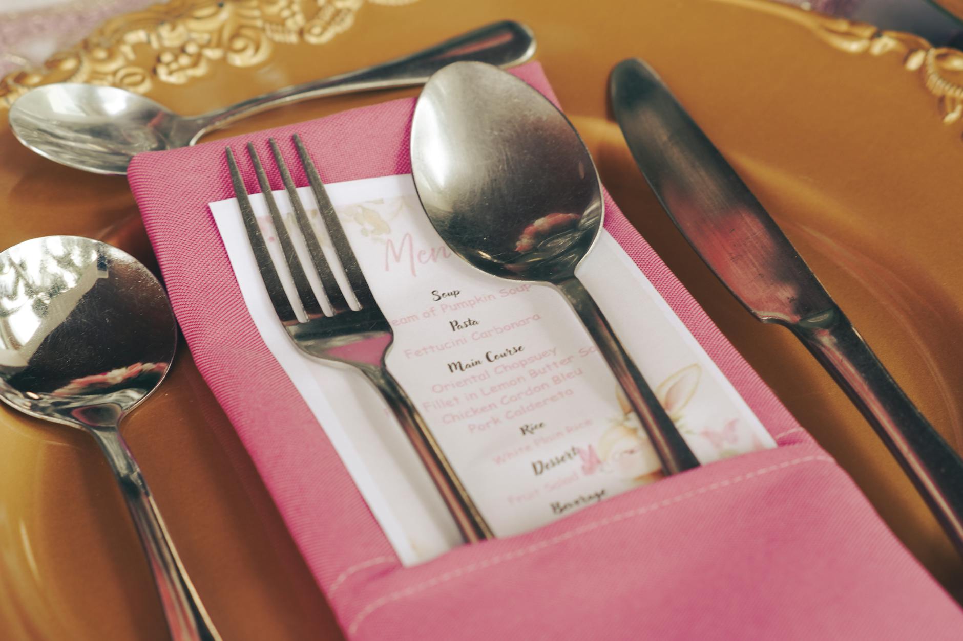
Choosing Your Size: DL, A5, A4, or A3?
Both foil and white-ink menus are available in four sizes, matching the standard format conventions used in Australian hospitality.
DL (99 x 210mm)
The slimline format sits naturally in a glass, leans upright on a table without a stand, and works well for wine lists, cocktail menus, and specials inserts. The narrow column forces clean typographic hierarchy, which actually suits foil treatment well, as a single foil-stamped heading line reads very clearly.
A5 (148 x 210mm)
The compact table menu format. Works as a two-sided single sheet or folds to a DL for a 4-page booklet feel. Common for dessert menus, set menus, and compact degustation listings where the choice is curated rather than exhaustive.
A4 (210 x 297mm)
The most common dining menu format. Enough room for two or three sections across a single side. Foil treatment on an A4 has the most visual impact because the foil area is proportionally larger and the guest’s eye has more room to travel. White ink on A4 black stock creates a striking object that feels deliberately art-directed.
A3 (297 x 420mm)
Shared menus, function packages, and entrance boards. A3 is a statement size. Foil on an A3 at the entrance to a private dining room or function space makes a strong first impression. White ink on A3 works well for venues using the menu as a design feature in its own right.
Stock Pairings: Getting the Material Right
Foil menu stocks
Foil menus are printed on either 300gsm matte or 120gsm matte (with matte laminate, required when foil overlaps printed areas). The 300gsm weight has the reassuring weight and rigidity of a luxury menu. It resists curl and holds its shape across a long service.
The 120gsm option with laminate is suited for menus that are replaced frequently, folded formats, or insert cards within a leather or bound holder where the physical weight of multiple 300gsm sheets would be impractical.
White-ink menu stocks
White-ink menus are printed on coloured stocks chosen from black, navy, forest green, burgundy, and seedling green. Custom colour stocks may be available on request.
The coloured stock is unlaminated, which preserves the texture and tactile quality that makes these menus distinctive. This means they are less suited to high-contact environments where menus are handled continuously across multiple sittings without reprinting. For venues that want a dark-stock look with more durability, a standard menu on 300gsm matte with a matte laminate is a practical middle ground.
Artwork Setup for Premium Menu Printing
Getting the artwork file right is the step most venues under-invest in. Both foil and white-ink menus require careful file preparation.
For foil menus
Setting up foil elements
- Place all foil elements on a dedicated layer named clearly (e.g., “FOIL”)
- Foil areas must be 100% K (solid black) on that layer, with all other layers hidden when exporting
- Keep foil elements at least 3mm away from trim edges
- Foil does not hold ultra-fine detail below approximately 0.5pt line weight, so avoid hairline rules in foil layers
File specifications
- Supply artwork as PDF, SVG, or Adobe Illustrator (.ai)
- 3mm bleed on all sides
- Crop marks included
- All fonts outlined (vectorised)
- Images embedded, not linked
For white-ink menus
Designing for white on dark
- White ink prints as a spot colour; design software should have white elements set to a named spot colour (not overprint)
- Fine serif type at small sizes can lose definition on some coloured stocks; test with a physical proof before committing to a large print run
- Gradient effects in white ink are achievable but should be tested; solid white tends to be the most reliable approach
File specifications match foil: PDF/SVG/AI, 3mm bleed, outlined fonts, embedded art, dieline in 100% magenta spot on a top layer for folded formats.
Both products include a digital design proof before production begins.
When to Use Each Finish: Venue-by-Venue Guide
Not every premium venue is the same, and the right finish is the one that reinforces your brand rather than simply signalling luxury generically.
Traditional fine dining (European, French, Japanese): Gold or silver foil on 300gsm matte. The classic material pairing. Understated in design, explicit in quality.
Contemporary wine bar or cellar door: White ink on navy or forest green. The dark stock echoes the product; the white ink keeps the typography clean and readable under low light.
Event and function venues: Rose gold foil on A4 or A3 for gala dinners, weddings, and anniversary events. Foil prints photograph well at tables, which matters when event photography is part of the client’s investment.
Tasting menu restaurants: White ink on black. No colour distracts from the text. The menu becomes a design object. Works especially well when the menu is printed specifically for each service with the date included, and treated as a keepsake.
Craft cocktail bar or whisky bar: Copper foil on 300gsm matte or white ink on burgundy. Both materials feel at home in a venue where provenance and craft are the story.
Casual-fine hybrid (share plate, brunch fine dining): Consider holographic foil as a point of difference, or white ink on seedling green for a venue that leans into produce-led, market-driven identity.
For venues that rotate menus frequently, a mix of standard digital printing for the daily menu insert and a premium cover card using foil or white ink creates a practical and cost-effective approach.
Frequently Asked Questions
Can I have full-colour printing combined with foil on the same menu?
Yes. Full-colour printing is included on both sides of every foil menu order. The foil is applied as an additional layer on top of or alongside the colour printing. On the 120gsm matte stock with laminate, foil can be applied over printed areas; the laminate is required in these cases to ensure adhesion.
What is the minimum order quantity for foil and white-ink menus?
Minimum order quantities are flexible across both products. Check the product pages for current quantity tiers and pricing, as these vary by format and size. Both products are available in small runs suited to restaurant use rather than large-volume wholesale-only quantities.
How long does production take?
White-ink menus are produced in 2-5 working days after your design proof is approved. Foil menus involve additional production steps and lead times vary; check the foil menus product page for current production timelines. Australian delivery via Startrack Express (1-2 business days metro) or AusPost Standard (2-5 business days metro) depending on your location.
Are white-ink menus suitable for busy restaurants with high table turnover?
White-ink menus have an unlaminated natural finish, which means they are not rated for repeated wipe-down between sittings. They are best suited for fine dining venues with lower table turnover where menus are handled with care, or for special event menus that are used once or a small number of times. For high-contact environments, a 300gsm matte standard menu with matte laminate is more durable.
What file format should I supply for foil menus?
Preferred formats are PDF, SVG, or Adobe Illustrator (.ai). Foil elements must be on a separate layer as 100% solid black. Include 3mm bleed and crop marks, outline all fonts, and embed all images. A digital proof is provided before printing begins so you can verify the foil placement before committing to the full run.
Can the same design be printed in both foil and white-ink versions for comparison?
Yes, but the two products use different stocks and processes, so the design files will need to be adapted for each. A foil menu design built on white stock will need to be reconfigured for white ink on dark stock (inverting colour values and setting white elements as a spot colour). Requesting a physical proof for each version before a large run is recommended.
For venues that prioritise durability alongside visual impact, see Restaurant Menu Printing Australia: Paper, Lamination and Durability for a full breakdown of lamination options and stock durability ratings. For high-frequency daily formats, Cafe and Takeaway Menu Printing: Formats Built for Daily Use covers the practical considerations for menus that are handled continuously through a busy service.