At a Glance
2026 business card design rewards tactile premium upgrades (edge painting, duplex stocks, spot UV) over digital gimmicks — but only when print quality keeps pace with the upgrade.
Off-square shapes feel modern; NFC/QR additions work as enhancements not replacements; skip low-contrast minimalism that sacrifices scan readability and gimmick shapes that don’t sit in a wallet.
- Edge painting and duplex stocks signal premium without any visible ink upgrade — the most ROI-efficient finish move.
- Spot UV gloss against matte laminate is the highest-impact tactile finish for the price point.
- Off-square shapes (rounded, mini, square) feel modern — but only when the print quality keeps pace.
- Digital-first cards (NFC chips, scannable QR) work as additions to a great-design card, never as replacements for one.
- Skip: gimmicky shapes that don’t sit in a wallet, low-contrast minimalism that loses scan readability.
Trends vs Gimmicks (And How to Tell the Difference)
Every year, design blogs scream about “revolutionary” business card trends.
Want a battle-tested premium finish?
Foil, spot UV and embossing all on standard 350 gsm uncoated stock — no MOQ jumps, no setup fees.
Holographic everything! NFC chips! Edible cards! (Okay, we made that last one up. Probably.)
The problem: Most trends are just noise. They look cool in a Behance showcase but bomb in real-world networking.
We’ve printed business cards for thousands of Australian businesses in 2026. We’ve seen what gets kept, what gets tossed, and what actually generates follow-ups.
This isn’t a trend forecast. It’s a trend report card.
We’re breaking down 2026’s biggest business card design movements and telling you which ones are worth your money and which ones are just Instagram bait.
The Trends Worth Following (Battle-Tested Winners)
✅ Trend #1: Tactile Minimalism (Less Design, More Feel)
What it is:
Stripping back visual elements to near-zero and letting material quality do the talking. Think ultra-thick cardstock (450gsm+), subtle textures (linen, kraft, recycled), and massive whitespace.
Why it works:
In a world of visual overload, restraint = sophistication. When your card has almost nothing on it except your name and one contact method, every element gets noticed.
The key: The feel of the card becomes the design. Heavy stock, soft-touch coating, or letterpress texture creates a sensory experience that cheap, busy cards can’t match.
Real example:
Architect in Melbourne. Card = name + mobile + website. That’s it. 450gsm matte black cardstock with white ink. Zero decoration. Clients always comment on it. “This feels expensive.”
Who should try it:
- Professional services (lawyers, accountants, consultants)
- Luxury brands
- Minimalist-aligned businesses
- Anyone in a conservative industry who wants premium without flash
How to do it right:
- Cardstock: 400gsm minimum (450gsm ideal)
- Whitespace: 50%+ of the card should be empty
- Typography: One font, two weights maximum
- Color palette: Monochrome or two colors max
- Finish: Matte soft-touch or uncoated premium stock
Cost: +30-50% vs standard (worth it)
Verdict: ⭐⭐⭐⭐⭐ (Universal winner, never goes out of style)
✅ Trend #2: Motif Repeats (Tactile Brand Patterns)
What it is:
Instead of a logo, your card features a repeating pattern derived from your brand or industry. Think tiny coffee beans for a café, hexagons for a tech company, or leaf textures for a sustainability brand.
Often combined with embossing or debossing so you can feel the pattern.
Why it works:
Patterns create visual texture without clutter. They’re memorable, on-brand, and tactile (when embossed). Plus, they work beautifully as backgrounds without overwhelming the text.
Real example:
Boutique coffee roaster in Sydney. Card covered in debossed coffee bean pattern (tone-on-tone, so it’s subtle). Back has roasting tips. Customers keep it as a reference card.
Who should try it:
- Hospitality (cafés, restaurants, bars)
- Eco/sustainability brands
- Boutique retail
- Anyone with a strong visual brand identity
How to do it right:
- Pattern source: Derived from your product, service, or brand values (not random)
- Subtlety: Tone-on-tone or low-contrast (background, not hero)
- Embossing: Optional but elevates the effect dramatically
- Text hierarchy: Pattern should never compete with your name/contact
Cost: +40-60% if embossed, +10-20% if just printed
Verdict: ⭐⭐⭐⭐ (Strong for the right brand, can feel gimmicky if forced)
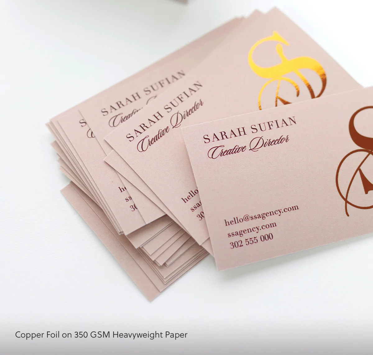
Trend #3: Industrial/Metallic Finishes (Brushed, Matte, Bold)
What it is:
Metallic foils, but muted. Think brushed gold, matte copper, or gunmetal grey – not shiny disco-ball gold.
Paired with industrial aesthetics: bold sans-serif fonts, geometric layouts, and dark cardstock (charcoal, navy, black).
Why it works:
Metallics signal quality and innovation without feeling flashy. Matte metallics are sophisticated in a way that glossy gold isn’t.
This trend works especially well for tech, creative agencies, and modern brands that want edge without being loud.
Real example:
UX design agency. Black matte cardstock + matte silver foil logo. Feels modern, premium, and tech-forward. Handed out at a startup event – 80% retention rate (people kept it).
Who should try it:
- Tech companies
- Creative agencies
- Modern professional services
- Anyone positioning as “innovative” or “cutting-edge”
How to do it right:
- Foil choice: Matte or brushed metallics (avoid high-gloss)
- Cardstock: Dark (black, charcoal, navy) for max contrast
- Typography: Bold, modern sans-serif (Helvetica, Futura, Gotham)
- Restraint: Foil on logo/name only, not entire card
Cost: +40-60% for foil
Verdict: ⭐⭐⭐⭐⭐ (Perfect for modern/tech brands, timeless when done right)
✅ Trend #4: QR Codes (But Done Intelligently)
What it is:
QR codes are back, but only when they serve a clear, valuable purpose.
Not: “Scan to visit my website” (they can type the URL).
Yes: “Scan to see my portfolio,” “Scan to book a free call,” “Scan for our menu.”
Why it works:
QR codes remove friction. One scan vs typing a URL = higher conversion.
The psychology: If the QR code promises immediate value (portfolio, booking, discount), people scan. If it’s just a lazy link to your homepage, they don’t.
Real example:
Wedding photographer. QR code on back of card labeled “See Our Recent Weddings.” Scans to a Vimeo portfolio highlight reel. Conversion rate to booking inquiry: 40% of scans. Insane.
Who should try it:
- Portfolio-based businesses (designers, photographers, videographers)
- Service businesses with booking systems (consultants, coaches, agencies)
- Restaurants (menu, loyalty program)
- Anyone with a compelling visual or interactive destination
How to do it right:
- Label clearly: “Scan for [specific benefit]”
- Destination matters: Make it worth scanning (not just your homepage)
- Placement: Back of card (front is too busy)
- Design: Integrate into layout, don’t just slap it on
Cost: $0 (just design real estate)
Verdict: ⭐⭐⭐⭐ (High ROI when destination is valuable, pointless otherwise)
✅ Trend #5: Vertical Orientation (Breaking the Mold)
What it is:
Portrait layout instead of landscape. Same 90×55mm dimensions, just rotated.
Why it works:
Novelty. 95% of business cards are horizontal. Vertical cards stand out in a stack.
Also: More space for hierarchy. Your name can be huge without cramping the layout.
Real example:
Interior designer. Vertical card with massive name at top, thin contact details at bottom, and whitespace in between. Stands out on every desk. Conversion: “I always notice your card first.”
Who should try it:
- Creative industries (designers, photographers, agencies)
- Personal brands (speakers, coaches, consultants)
- Anyone in a visually-driven field
How to do it right:
- Hierarchy: Name at top (large), contact at bottom (small)
- Whitespace: Let the vertical space breathe
- Typography: Works best with modern sans-serif or bold serif fonts
- Don’t force it: Only go vertical if it enhances your design, not just for novelty
Cost: Same as standard (just rotated)
Verdict: ⭐⭐⭐⭐ (Great for standing out, but won’t fit standard cardholders – trade-off)
The Trends to Approach with Caution (Context-Dependent)
⚠️ Trend #6: Holographic/Iridescent Foils (Bold But Risky)
What it is:
Foil that shifts colors under light – rainbow, oil-slick, or pearlescent effects.
Why it’s risky:
It’s LOUD. Holographic foils scream for attention, which works for some brands and tanks for others.
If you’re a creative agency, event planner, or youth brand, holographic can signal energy and creativity.
If you’re a lawyer, accountant, or corporate consultant, it’ll feel wildly out of place.
Real example (success):
DJ/event company. Holographic foil logo on black cardstock. Handed out at music festivals. Perfect fit – the card matches the brand vibe.
Real example (failure):
Financial advisor tried holographic foil to “stand out.” Clients found it unprofessional and flashy. Reordered with matte gold instead.
Who should try it:
- Entertainment/events
- Creative agencies (if brand is experimental)
- Youth-focused brands
- Fashion/beauty
Who should avoid it:
- Conservative industries (finance, law, corporate)
- Anyone positioning as “trustworthy” or “serious”
Verdict: ⭐⭐⭐ (Amazing in the right context, disastrous in the wrong one)
Trend #7: Die-Cut Custom Shapes (Memorable But Impractical)
What it is:
Cards cut into custom shapes: a camera for a photographer, a wrench for a handyman, a wine glass for a sommelier.
Why it’s risky:
Memorability vs practicality. Custom shapes are unforgettable – but they don’t fit in wallets, cardholders, or standard filing systems.
People might love your card but have nowhere to store it, so it gets tossed.
Real example (success):
Pet groomer. Card shaped like a dog bone. Clients love it, post it on Instagram, keep it on the fridge. Works because the audience (pet owners) values cute over professional.
Real example (failure):
Architect designed a card shaped like a house. Clients couldn’t fit it in their wallet, so they left it on their desk… and it got buried under papers. Never followed up.
Who should try it:
- Businesses where novelty > professionalism (pet services, kids’ brands, quirky cafés)
- When the card will be displayed (fridge magnet alternative)
Who should avoid it:
- Corporate/professional environments
- Anyone whose clients carry cards in wallets
Verdict: ⭐⭐⭐ (Fun and memorable, but practicality issues limit effectiveness)
The Trends to Skip (Gimmicks That Don’t Convert)
❌ Trend #8: NFC Chips (Cool Tech, Zero Adoption)
What it is:
Embedding an NFC chip in your card so people can tap it with their phone to load your contact info.
Why it fails:
Friction. Most people don’t know what NFC is, don’t have it enabled, or don’t trust random cards to interact with their phone.
QR codes do the same thing with zero setup. NFC is a solution looking for a problem.
Cost: +$2-5 per card (absurd)
Verdict: ❌ (Gimmick. Save your money.)
Trend #9: Transparent/Frosted Plastic Cards (Novelty Without Purpose)
What it is:
Clear plastic business cards that you can see through.
Why it fails:
They look cool in photos. In person, they’re hard to read (especially if there’s text on both sides) and feel impersonal (like a hotel key card).
Also: expensive and not eco-friendly.
Real example:
Tech startup ordered transparent cards to look “futuristic.” Feedback: “Looks like a credit card, feels gimmicky.” They switched to matte black + silver foil and got better responses.
Verdict: ❌ (Instagram bait, not practical)
❌ Trend #10: Overly Complicated Foldable Cards
What it is:
Business cards that fold out into mini-brochures.
Why it fails:
Complexity = friction. People want a card that fits in their wallet and has your contact info. They don’t want to unfold origami.
Also: expensive to print and often feels gimmicky.
Verdict: ❌ (Just use a standard card + QR to a digital brochure)
How to Choose Trends for Your Brand
Not every trend fits every business. Here’s how to decide:
1. Match Trend to Industry
| Industry | Best Trends | Avoid |
|---|---|---|
| Tech/Startups | Industrial metallics, QR codes, vertical | Holographic, die-cut |
| Creative Agencies | Motif repeats, holographic, vertical | Overly minimal |
| Professional Services | Tactile minimalism, matte metallics, spot UV | Holographic, plastic, die-cut |
| Hospitality | Motif repeats, QR codes (menu) | NFC, overly minimal |
| Luxury Brands | Tactile minimalism, matte metallics, thick stock | Transparent plastic, die-cut |
2. Prioritize Functionality Over Novelty
Ask: Does this trend help people remember me AND contact me?
- Vertical orientation: Yes (stands out, still functional)
- Die-cut shape: Maybe (memorable but hard to store)
- NFC chip: No (cool tech, low adoption)
3. Test Before Committing
Order 100-250 cards with the trend applied. Hand them out. Track:
- Do people comment on the card?
- Do they keep it or toss it?
- Does it lead to follow-ups?
If yes to 2/3, scale up. If no, revert to classic.
The 2026 Trend Scorecard (At a Glance)
| Trend | Rating | Best For | Cost | ROI |
|---|---|---|---|---|
| Tactile Minimalism | ⭐⭐⭐⭐⭐ | Professional services, luxury | +30 – 50% | High |
| Motif Repeats | ⭐⭐⭐⭐ | Hospitality, eco brands | +10 – 60% | Medium-High |
| Industrial Metallics | ⭐⭐⭐⭐⭐ | Tech, creative, modern | +40 – 60% | High |
| QR Codes (Smart) | ⭐⭐⭐⭐ | Portfolios, bookings, menus | $0 | High (if valuable) |
| Vertical Orientation | ⭐⭐⭐⭐ | Creatives, personal brands | $0 | Medium-High |
| Holographic Foils | ⭐⭐⭐ | Events, creative, youth | +50 – 80% | Medium (context-dependent) |
| Die-Cut Shapes | ⭐⭐⭐ | Novelty brands, pet services | +60 – 100% | Low-Medium |
| NFC Chips | ❌ | Nobody | +$2 – 5/card | None |
| Transparent Plastic | ❌ | Nobody | +80 – 120% | Low |
| Foldable Cards | ❌ | Nobody | +100 – 150% | Low |
What to Do Next (Your Trend Strategy)
1. Identify your industry + brand positioning
2. Pick 1-2 trends that align (don’t mix 5 trends on one card)
3. Design with restraint (trends should enhance, not dominate)
4. Order a test batch (100-250 cards)
5. Get feedback (hand them out, ask people what they think)
6. Scale up or pivot based on response
Need help choosing? We offer free trend consultations – tell us about your business and audience, and we’ll recommend which 2026 trends fit your brand (and which to avoid). Get a free consultation →
Final Thoughts: Trends Are Tools, Not Rules
The best business card isn’t the trendiest one. It’s the one that:
- 1. Matches your brand positioning
- 2. Gets kept (not tossed)
- 3. Leads to follow-ups
Some trends help you achieve that. Others just make your card look like everyone else trying to be different.
Choose strategically. Not because it’s trending.
And remember: A classic, well-executed design beats a trendy, poorly-executed one every time.
Related Articles:
- How to Design Business Cards That Actually Get Kept
- Premium Business Card Finishes Explained (Foil, UV, Emboss)
- 7 Business Card Mistakes Killing Your First Impression
Trend tested and approved?
Order 100–500 in your chosen finish — standard 5-day turnaround, ships Australia-wide.
Frequently Asked Questions
What’s the single biggest business card design trend in 2026?
The standout shift in 2026 is tactile finishes over visual gimmicks. Soft-touch laminate, spot UV contrast, and thick duplex stocks are driving decisions because they create a physical experience that digital alternatives can’t replicate. Cards that feel premium in hand generate longer hold time and stronger recall. The move away from standard gloss stock toward textured, layered, or foil-finished options signals that people understand the card itself is part of the brand message, not just a vehicle for contact details.
Are specialty cards worth it compared to standard business cards?
It depends on what you’re trying to achieve. Standard cards start from $0.28/card inc GST with 24-hour production – they’re fast, cost-effective, and work well for high-volume distribution. Specialty options like flat foil (from $1.52/card) or duplex cards (from $2.27/card) make sense when the card itself needs to do selling work – premium service providers, creative professionals, or situations where the first impression carries significant weight. If you hand out cards constantly, standard is practical. If you hand out 50 cards a year to high-value contacts, the upgrade pays for itself. Browse our custom business cards to compare standard and specialty options side by side.
How much does business card design actually affect first impressions?
Research consistently shows that physical materials influence perceived credibility. A poorly printed card on thin stock signals that a business cuts corners – even subconsciously. A well-designed card on quality stock does the opposite. The effect is strongest in professional services, hospitality, and creative industries where aesthetic judgment is part of what clients are buying. In trades or volume-focused businesses, the impact is smaller. The rule of thumb: your card should match or slightly exceed the quality expectations of your industry.
Do QR codes on business cards actually get used?
Yes, but their effectiveness depends on placement and purpose. QR codes work best when they lead somewhere worth going – a portfolio, a booking page, a product demo, or a personalized landing page. Generic QR codes pointing to a home page rarely justify the space. Keep the code large enough to scan reliably (at least 2 cm square) and always test it before printing. Cards with QR codes also tend to be kept longer because they carry digital utility. Pair with a short URL or clear label so people know what they’re scanning before they scan it.
Which business card stock is trending most in 2026?
Thick stocks – particularly duplex and triple-layer options – are trending strongly. The appeal is the physical weight and edge color that comes from layering different colored stocks together. Soft-touch matte laminate is also popular as a base finish because it creates contrast for spot UV highlights. On the specialty side, flat foil cards are increasingly mainstream as prices have become more accessible. The direction overall is toward cards that feel substantial and have at least one tactile or visual detail that makes them memorable. Explore business cards and foil business cards for current options.