Your business card has one job: survive the first 10 seconds in someone’s hand, then find its way to a wallet or desk drawer rather than the nearest bin. Most cards fail that test within minutes. This guide covers how to design business cards in 2026 that actually earn a place in someone’s pocket – covering the psychology of keeper cards, the print finishes that trigger curiosity, and the layout decisions that make a name memorable long after a handshake.
How to design business cards that get kept
- Card stock of 350gsm or heavier is immediately perceived as more premium – it is the single biggest keeper signal
- Spot UV (gloss pattern on matte base) increases handling time and recall through tactile contrast
- Limit contact details to 5-7 elements – every extra item reduces the visual weight of the rest
- White space signals confidence; crowded layouts signal uncertainty
- The back of the card is prime real estate – a QR code, single strong image, or brief service statement drives action
- Standard AU business card size is 90mm x 55mm
Why Most Business Cards End Up in the Bin
Most business cards fail before a single word is read. They fail in the hand. When someone accepts a card, their fingers form an immediate verdict: this feels cheap, or this feels worth keeping. That verdict arrives in under three seconds and is driven almost entirely by physical weight and surface texture.
The 3-second keep-or-toss decision
Research in tactile cognition consistently shows that heavier objects are perceived as higher value. A 400gsm card feels like a business that takes itself seriously. An 85gsm card feels like a flyer. This is not irrational – it is an accurate signal. A business willing to invest in quality print materials is signalling something real about how they approach their work.
The formula for surviving those first three seconds: weight that surprises (300gsm minimum, 400gsm-plus for premium positioning), a surface that invites touch (soft-touch laminate, uncoated textured stock, or a Spot UV finish that creates contrast between surfaces), and edges that are clean and square.
What signals quality before a word is read
Before your name registers, four physical cues have already been assessed: weight, surface texture, edge quality, and overall dimensions. Cards that flex when held feel cheap. Cards with rough or uneven edges suggest poor production quality. Cards in non-standard sizes create a moment of confusion before they create curiosity.
For most AU businesses, the standard 90mm x 55mm format is the right starting point. It fits wallets, card holders, and filing systems. Deviating from standard size only earns its premium if the rest of the card can back it up.
Card Stock and Finish – The First Keeper Signal
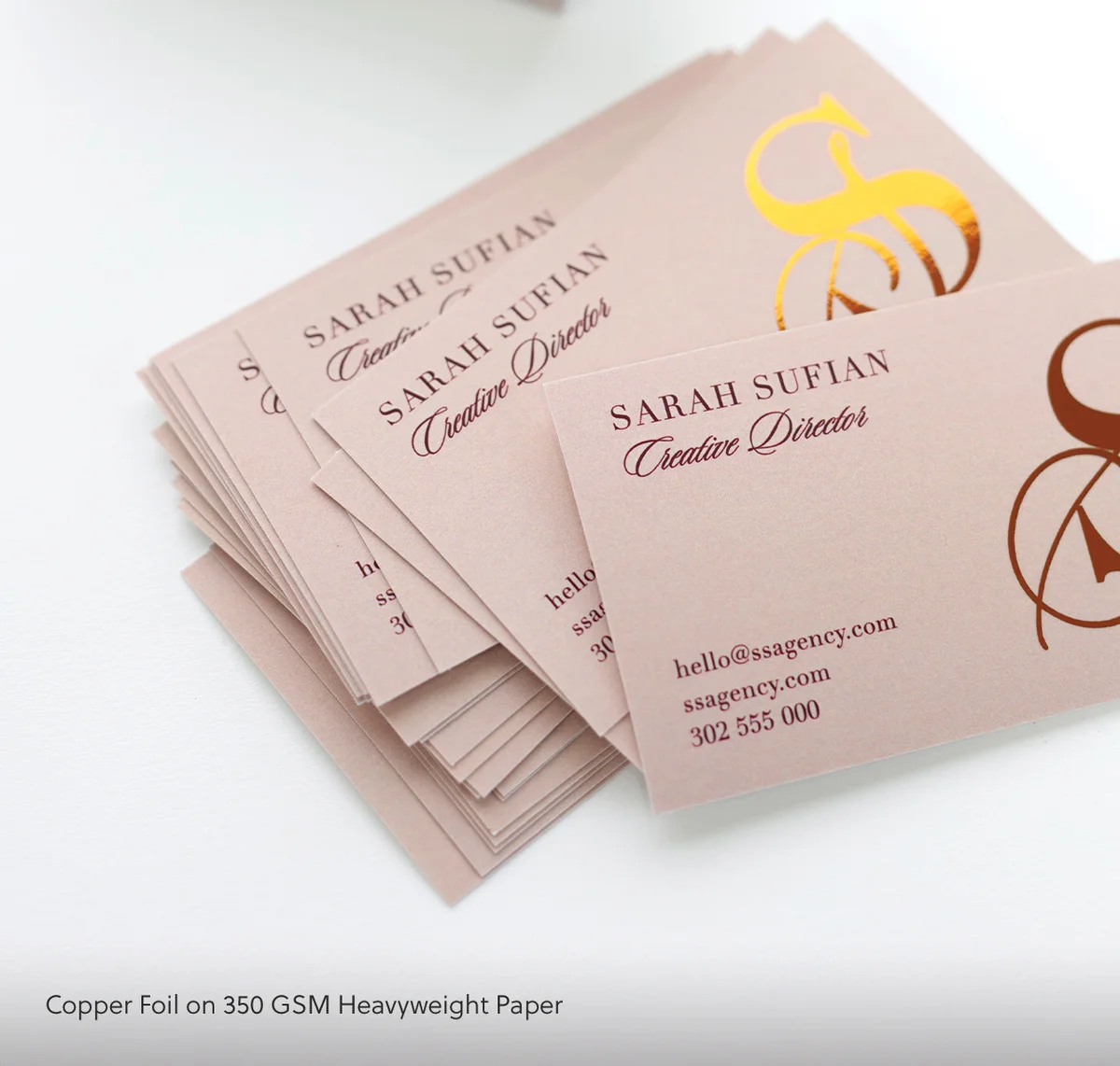
Print finish is where most cards either establish or destroy credibility. The options available through quality Australian print shops cover everything from budget-friendly digital print to prestige foil finishes – and each choice communicates something specific about the brand behind the card.
Thickness and weight
Standard business cards in Australia are often printed on 300-350gsm stock. Moving to 400gsm or heavier places the card in a noticeably different tier – the difference is immediately apparent when someone picks it up. For businesses where first impression is a differentiator (professional services, creative industries, real estate, consulting), the step from standard to heavy stock is one of the highest-return design decisions available.
For the highest-end tactile result, cotton stock options deliver a thick, subtly textured feel that stands apart from anything printed on standard coated card.
Matte, soft-touch, and gloss
Gloss laminate was the default finish for many years. It has a brightness that photographs well and protects the surface, but it has become associated with budget print runs – most cheap online card services default to gloss. Matte and soft-touch laminates now read as more considered.
Soft-touch laminate is a velvety, matte coating that is almost impossible to put down once picked up. It suppresses fingerprints, draws the eye in slowly, and creates the kind of tactile pause that leads someone to actually read the card rather than pocket it immediately. Uncoated stock (particularly textured or linen finishes) achieves a similar result with a more natural, craft-forward feel.
When Spot UV earns its price
Spot UV is a selective gloss coating applied over specific design elements on a matte base. A matte card with a gloss logo, a shiny brand name, or a subtle pattern that only reveals itself in raking light – these create the cards that get passed around a table during a meeting.
The tactile contrast between the matte field and the gloss accent drives repeated handling. Handling is exposure. Exposure is recall. Spot UV is most cost-effective at runs of 250 cards or more, but for businesses at that volume, it is among the most effective keeper-card upgrades available.
Paperlust Print Shop’s Spot UV business cards are printed on premium matte stock with precise spot coating – the combination of soft matte base and selective gloss accent is one of the most effective keeper-card finishes available.
In the United States, order spot UV business cards for US delivery on 450 GSM artboard with a velvet laminate. Minimum order is 250 cards.
If stock and finish send the first keeper signal, the fastest way to see that signal executed is to compare the finish decisions across twelve designs of luxury business cards.
Layout and Visual Hierarchy That Holds Attention
Even the most beautiful card stock becomes noise if the layout is unclear. Business card design is a reduction exercise – every element competes for the same 9,900 square millimetres of real estate. The goal is to make the most important information impossible to miss in under five seconds.
The single most important element
Before opening any design software, decide what the single most important piece of information on this card is. For most professionals, it is their name. For businesses where the company brand carries more weight than the individual, it is the logo. For service businesses built around a specific offer, it might be a three-word description of what they do.
Whatever it is, make it visually dominant. Not slightly larger – noticeably larger. The hierarchy should be legible even when the card is viewed from arm’s length. If two elements are competing for visual dominance, reduce the weight of the less important one until the hierarchy is clear.
Typography at small scale
Business cards demand type that performs at small sizes. Decorative fonts, ultra-thin stroke weights, and all-caps serif headings all tend to lose legibility below 8pt. The safe zone for body information (phone, email, website) is 8-9pt in a regular-weight, legible typeface. Names and roles can go larger (11-14pt) to support the hierarchy.
Test by printing a draft at actual size before committing to a full run. What looks sharp on a 27-inch monitor can become a blur on a 90mm card held at reading distance.
White space is not wasted space
A common instinct in business card design is to fill every corner. The counter-instinct – the one that leads to keeper cards – is restraint. A card with generous margins and breathing room around each element signals confidence. It says: this brand does not need to shout every message at once.
Tight, packed layouts signal anxiety. Spacious layouts signal authority.
Practical rule: if the margins on any side are less than 10-15mm, something needs to be cut. And something always can be cut.
What to Include (and What to Cut)
The most common business card mistake is treating the card as a condensed CV rather than a first touchpoint. The purpose of a business card is not to convey every detail about the business – it is to make someone want to continue the conversation.
The essential elements
A business card needs, at minimum:
- Name (first and last)
- Title or role (clear, jargon-free)
- Company name or trading name
- One phone number (mobile preferred for AU contacts)
- One email address
- Website URL (without “https://www” if space is tight)
- Optional: physical address (relevant for retail, hospitality, professional offices)
That is seven elements, maximum eight with an address. A logo is separate and should be treated as a design element rather than an information item.
The ruthless edit
Remove the second phone number. Remove the LinkedIn URL if the website already links to LinkedIn. Remove the tagline if it does not add meaning (most taglines do not add meaning). Remove the ABN unless the card is being used specifically for invoicing contexts.
Every element removed creates space for the elements that remain to breathe. And breathing room is a keeper-card signal.
Colour, Contrast, and Print Method
Colour is the first element registered visually – before text, before logo, before anything specific is decoded. For keeper cards, colour choices need to balance memorability with appropriateness for the industry and target audience.
Colour psychology in B2B contexts
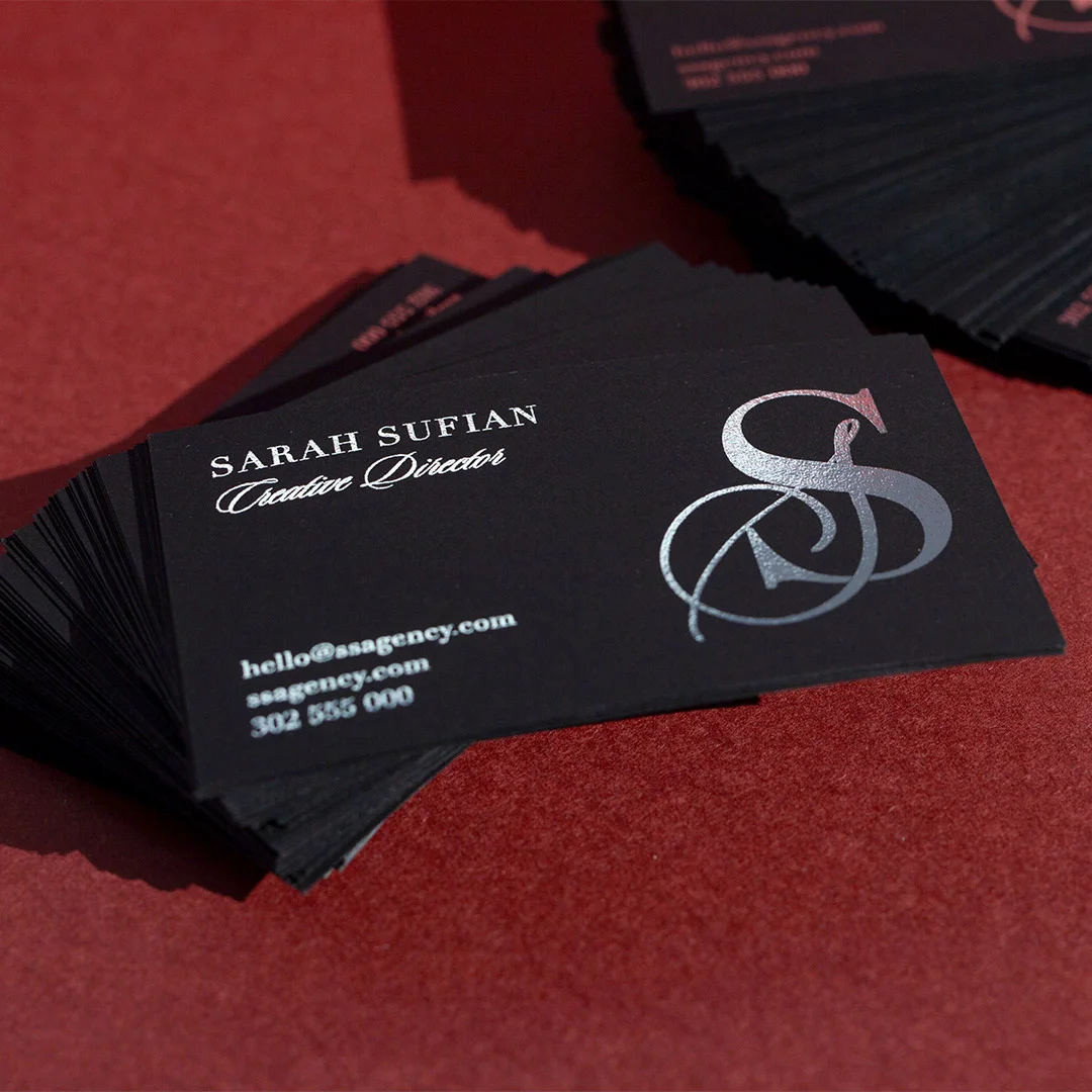
Dark base colours (navy, charcoal, deep green, black) project authority and confidence. They also allow for strong contrast – a white name on a navy base reads clearly from across a table. Warm neutrals (cream, sand, warm grey) project approachability and are strong choices for creative professionals, hospitality, and lifestyle businesses.
Bright accent colours – a single pop of brand colour in the logo or as an underline element – can increase memorability without overwhelming. The caution: if the accent colour matches every other player in the industry, it adds noise rather than distinction.
When foil makes sense
Foil is not decoration – it is a statement. A foil logo or foil name communicates that the brand takes quality seriously. It works best as a focal point applied to one or two elements, not as a wholesale replacement for standard print.
Flat foil is available in gold, rose gold, silver, copper, and holographic finishes, and can be produced without a custom die at lower minimum quantities than traditional foil stamp. For small AU businesses wanting the premium foil look without a large upfront commitment, flat foil is the most practical entry point.
Flat foil business cards from Paperlust Print Shop are available in gold, rose gold, silver, copper, and holographic finishes – printed on quality stock in runs from 50 cards.
Brand consistency across your suite
A business card should not be an isolated design exercise. The card, your email signature, your website header, and any printed materials you produce should feel like they come from the same visual world. Consistent use of typeface, colour palette, and spacing creates brand recognition that allows a small business to compete visually with much larger operators.
Design Details That Drive Follow-Up
A card that gets kept is a win. A card that drives follow-up action is a business result. These two goals are not identical – keeper cards need quality; follow-up cards need a clear next step.
QR codes as digital bridges
QR codes on business cards have moved from novelty to convention in AU B2B contexts. Used well, they replace a long URL with a direct link to a specific landing page, a digital portfolio, a booking form, or a digital contact card. Used carelessly, they lead to a generic homepage and add visual clutter without adding value.
If you include a QR code, link it to a destination that is relevant to the context in which the card is handed out. Someone you met at an industry event should land on a portfolio page or a specific services overview – not the same homepage they could find with a 10-second Google search.
The back-of-card strategy
Most business cards are single-sided or have a plain back. This is a missed opportunity. The back of the card faces upward when the card rests on a desk, and creates a second exposure moment each time the card is picked up and flipped.
Effective back-of-card approaches:
- A single strong image that represents what the business does
- A memorable brand statement – one line, built around a genuine insight
- A brief service list in clean typographic treatment
- A QR code, sized large enough to scan comfortably
Resist the urge to repeat the front-side information on the back.
One handwritten note space
The highest keeper-rate move that costs nothing to design: leave a slightly larger margin or a deliberate blank panel on one side of the card. When handing the card over, write something on it immediately – the product name you discussed, a specific date, a reference to your conversation. A card with a handwritten note on it is not a card that goes in the bin.
Standard business cards from Paperlust Print Shop are available in a range of stocks including uncoated matte options that accept pen ink cleanly – a practical choice for anyone who makes a habit of personalising cards at the point of exchange.
In the United States, standard business cards for US delivery come in 300 GSM Matte, 300 GSM Linen, 300 GSM Cotton, 300 GSM Metallic, or 450 GSM Artboard with Velvet Laminate.
Common Design Mistakes That Kill Keeper Rate
Raster logos at wrong resolution. A pixelated logo at print scale destroys credibility instantly. Supply artwork as vector (AI, EPS, SVG) or as a high-resolution PNG at 300dpi at print size.
Too many fonts. Two typefaces maximum: one for headings (name, company), one for body information. More than two creates visual noise at business card dimensions.
Centred layout by default. Centred text feels generic and weakens visual hierarchy. Left-aligned layouts read faster and feel more contemporary for most industries.
Colour inconsistency between screen and print. CMYK and RGB colour models produce different results. Design in CMYK from the outset, or convert and check proofs carefully before approving a print run.
Social handles instead of a website URL. A website outlasts any social platform. Include the website; social handles are optional additions, not substitutes.
No proof review. Even a single typo in a phone number or email address renders 250 cards useless. Always review a digital proof at 100% view before approving production.
About Paperlust Print Shop
Paperlust Print Shop (printshop.paperlust.co) is an Australian print specialist based in Melbourne, producing for businesses across the country. Business card options include standard digital print, flat foil, raised foil, Spot UV, Scodix, duplex, and coloured paper finishes – covering the full range from everyday professional cards to prestige client-facing stock. All orders include a free digital proof, and live chat support is available for specifications questions. Every order is backed by a 100% satisfaction guarantee.
Frequently Asked Questions
What is the standard business card size in Australia?
Standard business cards in Australia measure 90mm x 55mm. This is the dominant format and fits most card holders and wallets. Some businesses choose a 55mm square card for a distinctive look, but 90mm x 55mm is the most practical choice for everyday use.
What card stock weight should I use for business cards?
300gsm is the minimum for a professional feel. 350-400gsm is the AU sweet spot for most businesses – noticeably heavier than budget print stock without the cost premium of ultra-heavy card. For client-facing professional services, 400gsm or heavier with a soft-touch or uncoated finish creates an outstanding first impression.
What is Spot UV and is it worth the extra cost?
Spot UV is a selective gloss coating applied to specific design elements on a matte-finish card – typically a logo or brand name. The contrast between the matte base and the gloss accent creates a tactile effect that encourages handling and improves recall. It is most cost-effective for print runs of 250 cards or more and is one of the highest-return finish upgrades for businesses that hand cards out regularly.
How many contact details should a business card include?
Five to seven elements is the standard range: name, title, company name, phone number, email address, website URL, and optionally a physical address. Every additional element reduces the visual weight of the others, so the ruthless edit almost always improves the overall card design.
Should I include a QR code on my business card?
Yes, if the QR code links to a genuinely useful destination such as a portfolio, booking page, or digital vCard. No, if it links to a generic homepage or social profile the recipient could find independently. QR codes are most effective when the linked destination is purpose-built for the networking context in which the card is exchanged.