Sticker design in 2026 is bifurcating sharply. On one side: clean, minimal, brand-first design with matte finishes and restrained colour palettes. On the other: maximalist, high-detail illustration with bold colour and retro influences.
Both are performing well in different contexts. The mistake is picking a trend without understanding which context you’re in.
Print stickers that match the 2026 look
From minimalist die-cuts to foil-finish statement pieces — we print every trend covered below in production-grade materials.
At a Glance
Sticker design trends shaping 2026: the four trends moving units in 2026 are warm-retro typography (70s/80s revival), hand-drawn organic illustration, holographic + chrome finishes for shelf appeal, and earth-tone palettes (terracotta, sage, mustard).
How to choose: match trend to brand maturity — established brands lean into one trend tightly; new brands combine two for differentiation.
- Highest-converting in 2026 e-commerce: warm-retro typography on cream or kraft stock
- Best for premium shelf appeal: holographic or chrome foil on dark backgrounds
- Best for sustainable / artisan brands: hand-drawn illustration on uncoated stock
- Best for Gen Z social-share moment: earth-tone palettes + bold sans typography
What’s Trending in 2026
Retro and vintage illustration
The strongest trend across product stickers, event merchandise, and packaging is vintage illustration. Detailed linework, muted earth tone palettes, and the visual language of vintage posters, seed packets, and botanical prints.
This works because it communicates craft, quality, and authenticity. Brands in food, beverage, beauty, and homewares are adopting vintage illustration faster than any other category.
What makes it succeed: the illustration needs to be genuinely well-executed. Half-hearted retro looks worse than a clean modern logo. If you’re going this direction, invest in the illustration properly — it’s the entire value of the design.
Text-as-design stickers
Bold typographic stickers with minimal or no illustration. The entire sticker IS the lettering. Phrases, single words, URL-style text, and monogram-style treatments.
Works especially well for brands with a strong verbal identity — a distinct tagline, brand voice, or verbal trademark. Also works for brands targeting design-conscious buyers who appreciate the reference to graphic design culture.
Best executed in condensed bold typefaces with generous tracking. The typographic sticker that looks effortless is almost always the result of careful kerning.
Minimal brand marks
The counter-trend to maximalism. Clean logomarks in a single colour, generous white space, no decoration. These work when the logo itself is strong enough to carry a sticker alone.
They look sharp in small sizes, on minimalist packaging, and alongside other complex stickers where contrast creates visual interest. In a sea of illustrated stickers, a perfectly executed minimal mark can stand out more than another detailed illustration.
Botanical and nature motifs
Leaves, stems, botanicals, and natural forms continue to perform. Driven partly by sustainability positioning and partly by genuine aesthetic preference. Works across food, beverage, wellness, cosmetics, and homewares.
The 2026 iteration leans earthier than the millennial pink-and-gold botanical trend of the previous decade. Olive, ochre, rust, and deep green palettes dominate. The illustrative style is more rustic and hand-drawn, less polished and digital.
Abstract and fluid shapes
Organic abstract shapes — blobs, fluid outlines, asymmetric forms — as the primary design element. Less detailed than illustration but more visually dynamic than a simple logo.
Works well for creative studios, youth brands, and tech companies trying to humanise their brand expression. The abstract shape communicates: “we’re not corporate, we’re human, we’re a bit playful.”
What’s Not Working
Generic iridescence. Holographic and iridescent effects are everywhere, which means they’re no longer differentiating. Unless your brand specifically suits the effect — cosmetics, youth brands, creative studios — holographic in 2026 reads as a default choice rather than a design decision. The trend peaked.
| 2026 trend | Best industry fit | Best finish | Best stock |
|---|---|---|---|
| Warm-retro typography | Coffee, beauty, lifestyle | Matte | Kraft or cream uncoated |
| Hand-drawn organic illustration | Skincare, wellness, food | Matte | Uncoated white |
| Holographic + chrome | Beverages, beauty, tech accessories | Holographic foil | White vinyl |
| Earth-tone palettes | Sustainable, fashion, wellness | Matte | Uncoated cream |
| Maximalist colour-block | Children’s brands, snacks, art | Gloss | White vinyl |
| Minimalist mono-line | Premium DTC, home goods | Matte | White or transparent vinyl |
Overloaded complexity. High-detail designs that compete with themselves. Too many elements, too many colours, no clear hierarchy. This peaked in the indie sticker market around 2024 and has retreated.
Literal product depictions. A sticker that shows exactly what the product looks like, with no design interpretation. These feel like catalogue images rather than brand expressions. They’re functional, not interesting.
Generic “fun” design. Stickers with stars, confetti, rainbow gradients, and generic celebration motifs that have no connection to the brand. These read as filler.
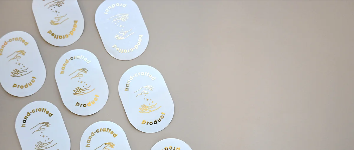
Want a foil-finish statement sticker?
Foil stickers add metallic gold, silver, rose gold, or holographic effects — the highest-impact finish for premium product launches and limited drops.
Format and Finish Trends
Matte is winning over gloss for premium brands. The matte finish signals restraint and quality. Gloss is high-energy and playful but reads as less sophisticated in contexts where the buyer has an established aesthetic sensibility.
Die-cut shapes continue to grow as a share of sticker orders. The custom silhouette has become an expected quality signal for brands serious about their sticker program. Die-cut stickers are no longer a premium novelty — they’re the expected format for well-made brand stickers.
Sticker sheets as branded products are growing in the direct-to-consumer space. Brands are treating sticker sheets as an actual product SKU — priced, packaged, and sold — not just a giveaway. The “merch sticker sheet” category is genuinely growing.
Clear vinyl is finding more use beyond cosmetics — tech accessories, glassware, and premium food products are all adopting the floating-design look that clear stickers enable.
How to Choose Which Trends to Apply
The useful question isn’t “which trend is hot” — it’s “which trend aligns with what my brand actually communicates.”
- Vintage illustration suits: craft, quality, authenticity, local production, artisan values
- Typographic stickers suit: verbal brands, design-conscious audiences, confident positioning
- Minimal marks suit: modern, restrained, premium-positioned brands
- Abstract shapes suit: creative, human, expressive brand personalities
- Botanical motifs suit: natural, wellness, food, sustainability-oriented brands
Choosing a trend that contradicts your brand positioning creates confusion, not interest. The best sticker design reinforces what people already feel about your brand.
Browse the full custom stickers range and die-cut stickers to bring your 2026 design direction to print. Get in touch if you’d like advice on which format and finish best suits your brief.
More Trends Defining 2026
Die-cut character stickers
Character stickers – mascots, illustrated figures, brand personalities cut to their exact outline – are a significant trend for brands with expressive visual identities. The character becomes a collectible: something with independent value that people want to display because it’s genuinely appealing, not just because it’s a brand mark.
This format is especially effective for food and beverage brands (a smiling fruit character for a juice brand), gaming and entertainment (character-first design that the audience already knows), and any brand with an established visual mascot that hasn’t yet made it onto a sticker.
Holographic and specialty finishes
Holographic stickers have moved from novelty to credible design choice. The key is restraint: full holographic backing with a single clean design performs better than complex illustrations on holographic – the material does the visual work, and the design needs to let it. For limited editions and collectibles especially, a holographic circle sticker at 50-60mm has a perceived value well above its production cost.
Specialty finishes are also making inroads: matte-over-gloss combinations (a matte design element on a gloss background, or vice versa), spot UV accents that create tactile contrast, and soft-touch laminate that makes the sticker feel as considered as it looks. These finishes are increasingly accessible at smaller quantities as production technology improves.
Eco-aligned minimalism
The third strong trend is sustainability-positioned minimalism: uncoated paper stock, kraft-colored backgrounds, simple single-color designs. This aesthetic is more than just “looking eco” – it’s a sincere design choice for brands whose values are explicitly aligned with sustainability.
For food, beverage, beauty, and home brands building around environmental credentials, an uncoated paper sticker with a one or two-color design communicates the brand position without words. The material IS the message. This trend pairs naturally with minimal packaging, limited color palettes, and typography that references craft printing traditions.
Want to print on-trend stickers for 2026?
Order custom stickers in matte, gloss, holographic, or foil — 24–48hr turnaround, free design proof, and full-colour Pantone-matched printing.
Which Trends Have Staying Power
Design trends bifurcate into two categories: those that reflect enduring cultural values, and those that are purely aesthetic cycles.
Retro and vintage illustration sits in the first category. It’s not a trend so much as a perennial that peaks and recedes – rooted in a persistent consumer appetite for craft, authenticity, and the visual language of things made with care. Brands that adopt it seriously, not as a surface treatment, will benefit from it for years.
Text-as-design stickers follow a similar logic. Strong typography has never gone out of fashion in design culture. The specific styles (condensed sans, bold serif, handlettering) cycle in and out, but a sticker that IS the words – where the lettering IS the design – is a format that holds up.
Holographic novelty is more cyclical. It will peak and soften. Brands that use it as a considered design choice (limited runs, specific contexts where the shimmer adds meaning) will get more lasting value than those that apply it broadly.
Matching Finish to Design Trend
The finish you choose should reinforce the design direction, not contradict it.
Vintage and retro illustration: Matte laminate. The absence of gloss supports the hand-printed, pre-digital aesthetic. Gloss on a vintage illustration looks incongruous – like a museum piece in a plastic frame.
Text-as-design: Either works, but matte generally reads better for typographic precision. The fine details in kerning and letterform read more crisply on matte than through a reflective gloss layer. Exception: bold, single-word stickers in high-contrast colors that benefit from the vibrancy gloss adds.
Minimal brand marks: Matte is consistent with the restraint the design is communicating. Clear vinyl with matte finish is an elevated option for minimal marks – the design floats on the surface without any background rectangle.
Character stickers: Gloss brings color-heavy illustrations to life. If the character has bold palette choices and expressive color, gloss is the right frame. If the character uses a muted, considered palette, matte maintains the integrity of those color decisions.
How to Brief a Designer for 2026 Sticker Trends
The brief you give a designer determines how much of the trend potential actually translates into the final sticker. A weak brief produces generic trend-adjacent work. A sharp brief produces something that’s distinctly yours within a trend context.
Three things that make a brief sharp:
Show references that are specific, not aspirational. “I want something vintage” is too broad. “I want something that looks like a 1940s seed packet illustration – this specific color palette, this level of detail, these kinds of border elements” gives the designer something to work from. Collect 5-10 reference images and explain specifically what you like about each one.
State the constraint clearly. If the sticker must work at 60mm wide, that’s a design constraint. If the design must include a logo lockup, that’s a constraint. If it must read at arm’s length without squinting, that’s a constraint. Designers produce better work when constraints are explicit rather than discovered in feedback.
Define what “success” looks like. Will this sticker go on laptops at a tech conference? On packaging for a skincare brand? Given away at a food market? The end context determines whether the design is working. A brief that includes the end use gives the designer the lens they need to make the right calls.
Before You Brief a 2026-Trend Sticker
- Pick one dominant trend per design — combining more than two dilutes impact
- Match finish to trend (matte for warm-retro and earth-tone, gloss for maximalist)
- Use Pantone references not RGB for trend palettes — colour drift kills the effect
- Test trend longevity — confirm trend has 12+ months of momentum before bulk-printing
- Order 100-unit test run before scaling to verify finish + colour match in print
Ready to test a trend with your brand?
Our holographic stickers deliver instant shelf appeal — perfect for limited editions, premium packaging, or seasonal product launches.
Frequently Asked Questions
What sticker design style is most popular with small businesses in 2026?
Two approaches are performing strongly for small businesses in 2026. For brands with craft, artisan, or quality positioning: vintage and retro illustration – detailed linework, muted earth tones, the visual language of handmade goods. For brands with a minimal, design-led aesthetic: clean typographic stickers with a single strong brand mark or tagline. Both have in common that the design has genuine visual value beyond the logo – it’s something people actually want to display, not just accept because it was free.
How do I brief a designer for a sticker that fits 2026 trends?
Be specific about references rather than naming the trend. Collect 5-10 reference images that show exactly the aesthetic you’re aiming for and explain what specifically works in each. Add explicit constraints: the size the sticker will be used at, the surfaces it will go on, any mandatory elements (logo, URL, specific colors). End with the use context – where and how will this sticker be used and seen? A designer with this information will produce something distinctly yours rather than generically trend-adjacent.
Are holographic stickers still on trend for 2026?
Holographic stickers have moved from novelty to considered design choice. They’re strongest for limited editions, collectibles, and premium product contexts where the shimmer reinforces a sense of specialness. Overuse undermines the effect – holographic works when it means something in context (a limited run, a premium tier, a collector item) rather than as a default finish on standard brand stickers. For 2026, the brands using holographic most effectively are using it selectively, not broadly.
What finish should I choose for a vintage illustration sticker?
Matte laminate is strongly preferred for vintage and retro illustration stickers. The non-reflective surface supports the hand-printed, pre-digital aesthetic that vintage illustration is evoking – gloss laminate creates a plastic, mass-produced quality that directly contradicts the craft narrative the design is building. Matte also renders fine linework and detailed illustration more crisply, which is especially relevant for designs with botanical, typographic, or intricate decorative elements. Uncoated paper stock (no laminate) is an option for brands positioning strongly around sustainability and authenticity.
Should a small business follow design trends for their stickers?
Follow trends that align with your brand values – don’t chase trends that contradict them. The vintage illustration trend is a good fit for artisan food, craft beverage, handmade goods, and heritage brands; it would look incongruous on a tech SaaS sticker. Minimal typography works for design-forward and professional services brands; it underserves expressive, personality-led brands. The question isn’t “what’s trending” but “which trending direction fits what we’re actually communicating.” When trend and brand align, the sticker does more work.
Ready to print on-trend stickers?
Upload your artwork, pick a finish, and we’ll handle production. Most sticker orders ship within 5 business days.