Most business cards get filed in a pocket and forgotten. The person who received them nods politely, drops the card into a bag, and three months later it surfaces during a cleanout before being put in the bin. That’s the fate of a card that does nothing to justify its own existence.
Foil business cards work differently. A card with heat-pressed metallic foil catches light in a way that ink alone never will, and the moment someone picks it up, the finish signals something a standard card cannot: that the person who ordered it cares about details. That perception is worth something, but only if the upgrade actually fits your business, your audience, and how your cards get used.
This guide covers the full picture. What foil stamping actually involves (and why metallic ink is not the same thing), which finishes and paper options are available at Paperlust Print Shop, when the ROI makes sense and when it clearly doesn’t, and the design and file setup rules that determine whether a foil card looks extraordinary or expensive for no reason.
At a Glance
Foil business cards earn their premium when the foil is real metallic stamping, not printed gold ink — and when it’s restricted to logo and name accents, never body fills.
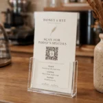
Australian standard 90mm × 55mm, 350gsm minimum so the foil sits cleanly without dimpling. Worth the upgrade for legal, real estate, jewellery, and premium-service handovers; skip for high-volume event handouts where speed and scale beat tactile feel.
- Foil = real metallic stamping, not printed gold ink — hot-foil press onto premium stock.
- 90mm × 55mm Australian standard; 350gsm minimum so the foil sits cleanly without dimpling.
- Use foil where it earns attention — logo, name, one accent. Never for body text or large fills.
- Worth it for legal, real estate, jewellery, premium services where tactile premium matters at the handover.
- Skip foil when speed and scale matter more than feel — e.g. event handouts, networking volume cards.
What Foil Stamping Actually Is
The term “foil printing” gets used loosely, and that looseness causes real problems when people order and don’t get what they expected. Foil stamping, digital foil, metallic ink, and raised foil are four different processes with four different results. Understanding which one you’re ordering matters before you commit to a print run.
Settled on foil for your card?
Browse our full luxury foil business card range — gold, rose gold, silver, copper, holographic. From 100 cards.
The heat-press process explained
Flat foil stamping works by applying a thin metallic film to the card surface using a combination of heat and pressure. A heated press transfers the foil from a carrier sheet directly onto the substrate, bonding it permanently. The result is a mirror-bright metallic finish with crisp edges and no visible texture within the foil itself: it sits flush with the card surface and catches light cleanly.
Paperlust Print Shop’s flat foil process eliminates the custom die that traditional hot-stamp foiling requires. Traditional hot stamping involves etching a bespoke metal die to match your design exactly, which adds both significant setup cost and lead time before a single card is produced. Flat foil delivers the same high-reflectivity mirror finish without that overhead, which is why Flat Foil Business Cards are available from a minimum of 100 cards rather than the 500-plus quantities that traditional die-based methods typically demand.
Flat foil vs raised foil: what changes
Raised foil takes the process further. Where flat foil sits flush with the card surface, raised foil creates a three-dimensional effect with the foil element slightly elevated above the substrate, a tactile quality you can feel when you run a finger across the card.
The two products serve different purposes. Flat Foil Business Cards are the faster, more flexible option: five foil colours, multiple paper stocks, minimum order from 100 cards. Raised Foil Business Cards deliver a more pronounced premium effect, printed on 450gsm artboard with velvet laminate, with a minimum order of 250 cards and a longer production window. Neither is universally better. The choice depends on the finish your brand calls for and whether the tactile dimension matters for your specific context.
| Feature | Flat Foil | Raised Foil | Standard |
|---|---|---|---|
| Foil finish | Mirror-bright, flush | Mirror-bright, elevated | None |
| Tactile effect | Flat | Three-dimensional | Flat |
| Minimum order | 100 cards | 250 cards | 100 cards |
| From (inc GST) | $1.52/card | $0.24/card | $0.28/card |
| Fast production | 48-hour available | 7-10 working days | 24-hour available |
| Foil colours | Gold, silver, rose gold, copper, holographic | Gold, silver, rose gold | n/a |
Why metallic ink is not the same thing
Metallic ink is a separate product category that frequently gets confused with foil. Where foil is a physical film heat-transferred onto the card surface, metallic ink incorporates metal particles (typically aluminium flakes) into a standard ink formulation, which is then printed like any other colour in the process.
The result is categorically different. Metallic ink produces a shimmer rather than a mirror finish: it reflects light diffusely rather than producing the sharp, high-contrast shine that characterises genuine foil. Many budget printers substitute metallic ink where a client expects foil because the setup is simpler and cheaper. At Paperlust Print Shop, Flat Foil Business Cards use genuine heat-pressed foil film throughout (not metallic ink), which means the reflective quality is in a different category from an ink-based alternative.

Foil Finishes and Paper Options at Paperlust Print Shop
The foil colour you choose, and the paper stock it sits on, determines the character of the finished card more than almost any other single decision. Get the pairing right and the card reads as intentional. Get it wrong and even technically perfect foil application looks inconsistent.
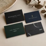
Foil colour options: five finishes, one statement
Flat Foil Business Cards are available in five foil colours:
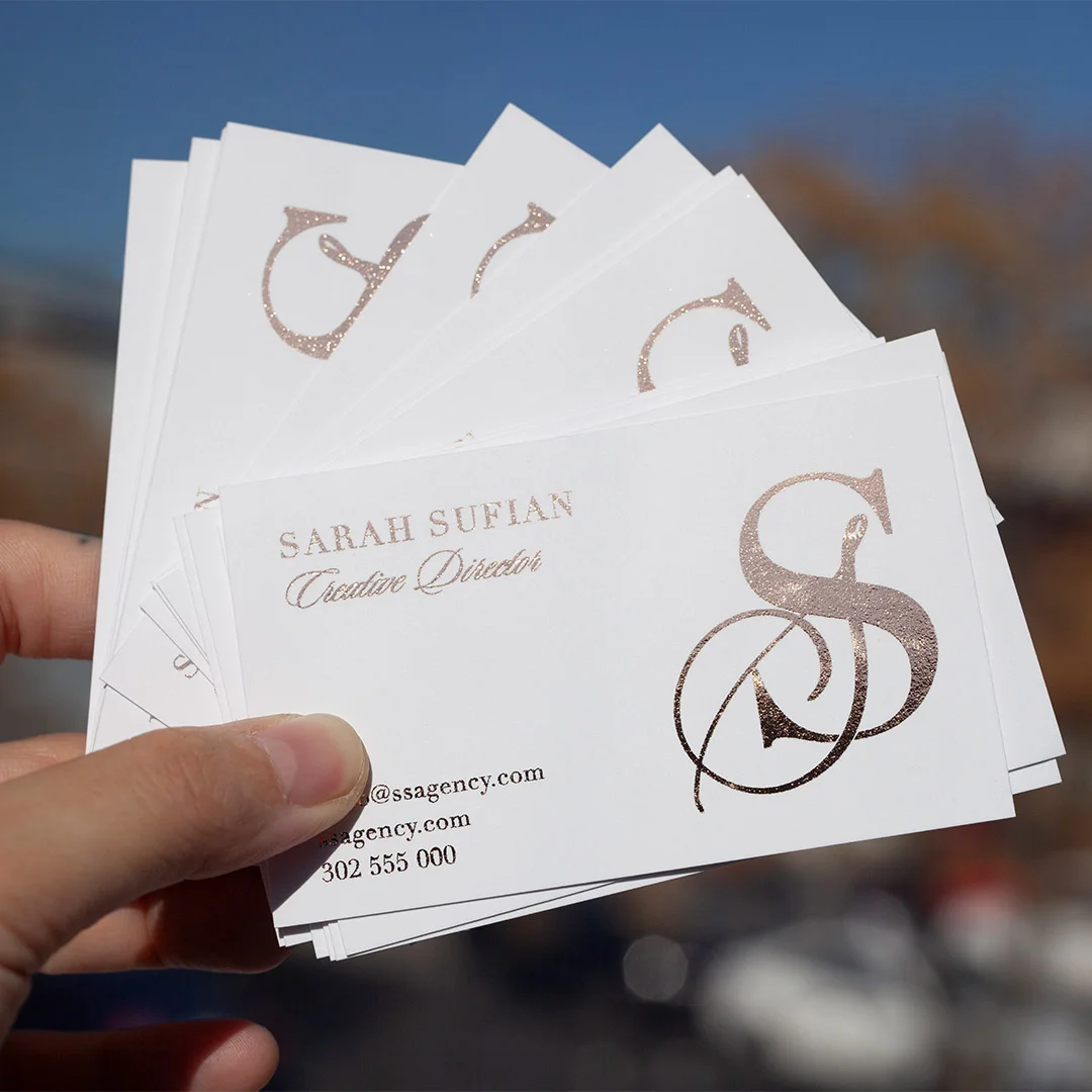
- Gold: the most commercially versatile of the range; reads as premium across industries from finance to luxury retail and creative services
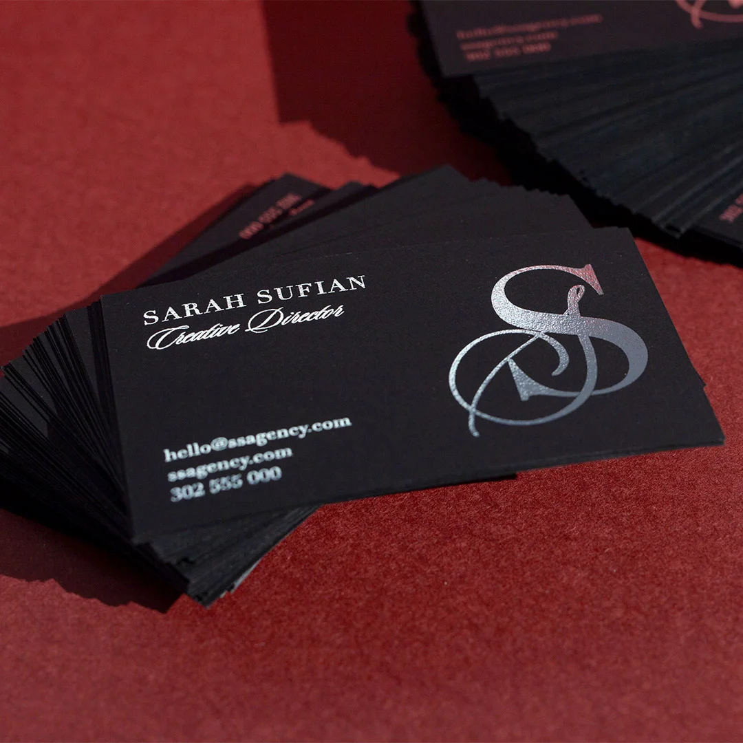
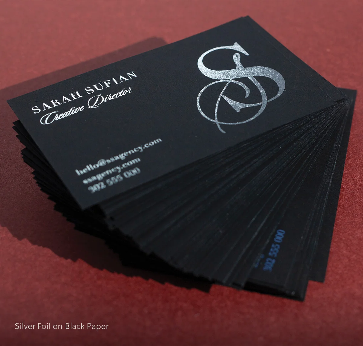
- Silver: cooler and more contemporary; works well with minimalist branding and tech-adjacent or healthcare sectors
- Rose gold: warm metallic with strong brand associations in beauty, wellness, and creative fields; distinctive without being loud
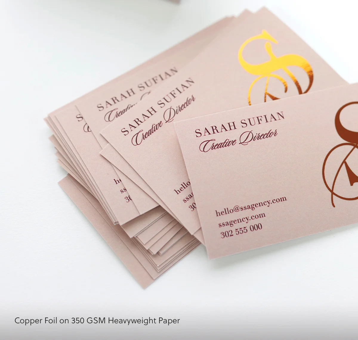
- Copper: earthy and distinctive; pairs particularly well with navy and dark green paper stocks for a premium-without-precious character
- Holographic: prismatic, shifts colour with viewing angle; the strongest visual impact of the range, best reserved for brands with an expressive or bold visual identity
Raised Foil Business Cards are available in gold, silver, and rose gold only.
Paper stocks that work with foil
Flat foil is available across five paper options, each producing a different character in the finished card:
- Matte: clean, non-reflective base that lets foil elements stand out without background visual noise
- Premium: 380gsm smooth stock with a consistent surface that holds foil edges cleanly across the full print area
- Heavyweight: the thickest standard option; the additional card weight reinforces the premium tactile experience beyond the foil finish alone
- Navy: deep-coloured base stock; gold, silver, and holographic foil on navy are proven pairings for high-end brand positioning
- Black: maximum-contrast base for foil impact; silver and holographic perform particularly well against black
Shapes and sizes
Standard flat foil cards are 90mm x 55mm (the Australian standard business card size). Rounded corner, circle (60mm x 60mm), oval (90mm x 50mm), and custom shape options are all available within the same flat foil product range.
When Foil Business Cards Are Worth the Investment
Flat Foil Business Cards cost more per unit than Standard Business Cards: from $1.52 per card versus from $0.28 per card at minimum quantities. Whether that premium earns its keep depends entirely on how the card works in context.
Professions and industries where foil earns its cost
Some industries carry expectations around collateral quality that a standard card won’t meet. In those markets, a foil card isn’t an upgrade so much as a baseline expectation:
- Real estate agents handling prestige properties, where the card is a proxy for the quality of property you’re representing. A thin standard card handed to a buyer at a high-value inspection undermines the positioning before a word is spoken.
- Creative agencies and graphic designers, where the card is a miniature portfolio piece. It signals what you consider acceptable quality before a prospective client has opened any document you’ve prepared.
- Luxury service providers (jewellers, interior designers, hospitality consultants, bespoke tailors) where the physical collateral is part of the brand experience rather than a transaction record.
- Personal branding and executive positioning, where an individual is cultivating a high-value professional identity in a competitive field.
- Event industry professionals (wedding photographers, planners, florists, stylists) who regularly hand cards to clients making significant purchasing decisions where trust is established in the first minutes of contact.
- Financial services and wealth management, where clients associate material quality with attention to detail and with trustworthiness over time.
The business case: perceived value vs unit cost
The maths on a foil upgrade are relatively straightforward. At 100 cards (the minimum for flat foil) the cost difference versus standard cards is a meaningful per-unit premium but a modest absolute business expense.
The real question isn’t whether $1.52 per card is expensive. The question is whether a card that gets kept (because it creates a strong enough first impression to justify keeping) delivers a better return than a cheaper card that gets discarded. For businesses where a single converted contact represents thousands of dollars in lifetime value, the total cost of a foil print run is negligible.
Cards that look and feel premium get kept. People hold onto objects they perceive as worth holding onto, and the decision to keep or discard a business card is made within the first few seconds of receiving it. Foil is one of the most reliable mechanisms for passing that test.
When Foil Business Cards Are Not Worth It
Not every situation calls for foil, and ordering 500 foil cards for a use case that doesn’t justify them is a straightforward misallocation of budget. The business cards range covers options from $0.14 per card. When foil is the wrong tool, these are worth knowing.
High-volume networking and bulk handouts
If you’re attending trade expos and distributing 200 cards per event, the per-unit cost of foil accumulates quickly, and many of those cards will go to contacts where premium brand positioning isn’t the primary driver of whether they follow up. For high-volume networking scenarios where quantity matters more than impression quality per contact, Standard Business Cards on a quality paper stock can perform well without the foil overhead.
A useful heuristic: if you’re replacing card stock more than twice a year because you keep running out, foil is probably the wrong format for your primary handout card. Consider using standard cards for volume distribution and reserving a smaller foil run for select high-value contacts.
Fast-turnover and short-shelf-life use cases
Job titles change. Phone numbers change. Addresses change. If your card information has a realistic shelf life of six months before it’s out of date, the case for a premium foil run weakens considerably. Foil cards are best suited to businesses and individuals where the card content is stable for at least 12-18 months and represents a considered, ongoing brand identity.
Similarly, environments where cards are scanned immediately into a contact management system and the physical card discarded reduce the value of finish quality regardless of the tier. If the card’s primary function is to be photographed and filed digitally, the finish doesn’t affect the outcome.

Design Principles for Foil Cards
Foil on a poorly designed card is still a poorly designed card. The finish amplifies whatever is on the card: strong design looks more exceptional; weak design looks expensive and wrong simultaneously. The business card design guide covers the broader principles that apply across all premium formats. Below are the considerations specific to foil.
Use negative space: foil needs room to read
Foil is a focal point by nature. When applied to multiple design elements simultaneously (logo, name, tagline, and a decorative border) the card becomes visually competitive and the foil stops reading as a deliberate highlight. It becomes noise.
Best practice: limit foil to one or two design elements per card. Most commonly, this means the logo mark in foil with all other elements in CMYK or reversed out (white or stock colour). The contrast between the foil element and the non-foil surroundings is what makes the foil element work. Remove the contrast and you remove the effect.
Foil-safe typography and minimum stroke weight
Fine typography and hairline rules fail with foil. The physics of the heat-transfer process mean that very fine strokes (serifs under 5pt, hairline rules, text below 8pt) can lose definition or fail to transfer cleanly across the full run.
For any text treated with foil: minimum 10pt size, and choose typefaces with visible stroke weight rather than ultra-light or thin-weight variants. For any lines or outline elements in the foil layer: minimum 3mm stroke width. If your logo is going to foil, check that no element falls below these thresholds at 90mm x 55mm scale before setting up your artwork.
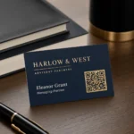
Contrast: matching foil colour to paper stock
The combinations that work best follow a simple principle: the foil colour and the stock colour need enough contrast to register as separate elements. Gold on white reads well. Gold on cream reads softly and can lose definition in certain lighting. Silver on white produces a subtle result. Silver on black is dramatic.
High-performing pairings worth considering:
- Gold on black or navy: maximum contrast, high-end register
- Holographic on white or pale grey: the colour shift reads most vividly on light backgrounds
- Rose gold on matte white or warm grey: warm without competing
- Copper on navy or dark green: earthy and distinctive
- Silver on black: sharp, contemporary, minimal
What fails with fine foil elements
Decorative patterns with very fine line work, icons under 10mm in diameter, and gradients within the foil area all present production problems. Foil cannot reproduce gradients: the film is either transferred or not transferred, with no variation in reflectivity within the foil zone. Gradient artwork applied to the foil layer produces a hard edge rather than a fade, which is rarely what the designer intended.
Small text converted to foil is also a common failure point. If a name or tagline in the foil layer is under 8pt, the fine strokes of the letterforms can fill in or fail to transfer, resulting in illegible foil text that reads as a metallic smear rather than type. For broader design principles across all premium card formats, the business card design guide covers the full picture.
How to Choose Between Foil and Standard for Your Business Card
The decision usually comes down to four factors. Walk through them in order — the answer is usually obvious by question two or three.
- Where is the card going? — Boardroom, gala, real estate listing, premium retail → foil pays for itself. Casual networking, freelance, trades → standard reads as confident.
- What’s the unit budget? — Foil typically adds $1.20–$2.50 per card vs standard at this volume range. If your card budget is <$1.50/card, prioritise paper weight (350+ gsm) over foil.
- Is the brand quiet or loud? — Quiet luxury brands (architects, financial advisors, modern weddings) lean foil-on-uncoated for restraint. Loud-and-bold brands (events, fashion, hospitality) lean foil + colour for energy.
- Will the card be touched repeatedly? — Foil shows fingerprints faster on coated stocks. If the card is going wallet-to-wallet daily, choose uncoated paper or a matte laminate finish to keep it pristine.
Default rule of thumb: if you’re networking at industry events 1–2x per month and the card is part of a deliberate first-impression play, foil is worth it. If you hand out 50+ cards a week as a routine, save the budget for thicker stock.
Artwork Specs and File Setup for Foil Cards
Foil jobs require file preparation that standard digital print jobs don’t. Getting this right before you submit prevents delays and ensures the foil elements register accurately where you’ve placed them.
Dimensions and bleed
Set up your document at 90mm x 55mm with a 3mm bleed on all four edges (giving a total document size of 96mm x 61mm before cutting). Keep all critical content (text, logos, and key design elements) at least 3mm inside the trim line to avoid any element being clipped during cutting. This 3mm safe zone applies on all four sides.
For rounded corner cards, maintain the same bleed setup and ensure no foil elements extend into the corner radius area unless you intend the foil to carry through the corner.
Setting up your foil layer
The foil area must be set up as a separate layer or spot colour in your artwork file. Do not mix foil elements and CMYK elements in the same layer. The foil zone should be output as a solid black (100% K) on its own separation, clearly labelled (for example, “FOIL” or “SPOT-FOIL”) so production can identify it without ambiguity.
All text within the foil layer must have fonts outlined before export. Do not include registration marks or crop marks in the foil layer: these belong in the main CMYK layer if requested, not in the foil separation.
File formats and submission
Paperlust Print Shop accepts PDF, SVG, and Adobe Illustrator (.ai) files. For foil artwork, PDF is the most reliable submission format: export as PDF/X-1a or PDF/X-4 from Illustrator or InDesign with fonts embedded or outlined and all links resolved.
For a two-layer job (foil face plus a CMYK-printed reverse) label all files clearly. If submitting as a single file with multiple layers, use unambiguous layer names. If submitting as separate files, note which is the foil face and which is the reverse in your submission notes. Place your order at Flat Foil Business Cards and the production team will review your artwork before the job goes to press.
Want a sample first?
Order a sample pack — touch the foils, see the paper, then commit. Free for AU customers.
Frequently Asked Questions
What is the minimum order for foil business cards?
Flat Foil Business Cards have a minimum order of 100 cards. Raised Foil Business Cards require a minimum of 250 cards due to the additional production process involved. Both products are available in larger quantities with per-unit cost decreasing at higher volumes.
How long does production take?
Flat Foil Business Cards are available with 48-hour fast production, subject to order volume and complexity. Standard production is 7-10 working days after proof approval. A proof is typically delivered within 1-2 business days of placing your order, and two rounds of revisions are included at no extra cost.
Can foil be applied to both sides of the card?
Foil is applied to one side only. Both faces of the card can be printed: a foil-treated front and a CMYK-printed reverse is a common configuration. If you want a premium finish element on both sides, a combination of flat foil on the front and a finish such as Spot UV on the reverse is one approach worth discussing with the production team at the time of ordering.
What file format should I submit?
PDF, SVG, and Adobe Illustrator (.ai) files are all accepted. For foil artwork, PDF with outlined fonts and embedded images is the most reliable format. The foil layer must be set up as a separate spot colour layer, clearly labelled, and not mixed with your CMYK design elements.
Can you match my brand Pantone colour for the foil?
Foil is available in five standard colours: gold, silver, rose gold, copper, and holographic. Foil is not a Pantone-matchable medium: the foil film colours are fixed specifications, and custom foil colours are not available at this product tier. If your brand colour is close to one of the five available foil colours, the standard approach is to match your CMYK print elements to complement the foil rather than attempting to match the foil to a Pantone.
Does foil wear off over time?
Foil finishes are durable under normal handling and storage conditions. Paperlust’s foil suppliers indicate that properly applied heat-pressed foil maintains its finish through the typical lifecycle of a business card. The finish is more susceptible to edge scuffing if cards are stored loose in pockets without a card holder: this is true of any premium-finish card, not just foil. Storing cards in a cardholder or case eliminates the risk.