Most business cards land in a drawer and stay there for exactly one week before being thrown away. Not because the person handing them out was forgettable, but because the card itself gave people no reason to keep it. A thin, gloss-laminated rectangle with Times New Roman in 9pt doesn’t say “professional.” It says “I printed 500 and handed them out hoping for the best.”
In 2026, the bar for a card that actually earns a spot on someone’s desk has gone up. People receive fewer physical cards overall, which means the ones they do receive get scrutinised more. A card that looks and feels premium gets kept. A card that looks like a default template gets recycled. The difference between those two outcomes is almost entirely in design and print decisions you make before the job goes to press.
This guide covers the five core principles that separate a kept card from a discarded one, the paper stocks and finishing options that do the heavy lifting, the setup mistakes that ruin otherwise good designs before they even print, and everything you need to know about sizing, bleed, and file prep. Whether you’re ordering for the first time or rethinking a card that hasn’t been working for you, this is the full picture.
At a Glance
Five business card non-negotiables — size, resolution, colour mode, bleed, stock — separate cards that get kept from cards that get binned within the week.
Standard 90mm × 55mm at 300+ DPI in CMYK, with 3mm bleed and 350gsm+ stock. Once those fundamentals are right, finishes (matte laminate, spot UV, flat foil, raised foil, Scodix, duplex) decide the tactile statement — not the other way around.
- Size: Standard 90mm × 55mm — verified with your printer before going custom.
- Resolution: 300 DPI minimum; 350 DPI preferred for fine details and foil.
- Colour mode: CMYK, not RGB — convert before sending files.
- Bleed: 3mm on all four edges; keep all text and logos 3mm inside the trim line.
- Stock: 350gsm+ for a card that feels substantial in the hand.
- Finishes worth considering: matte laminate, spot UV, flat foil, raised foil, Scodix, duplex.
- Both sides matter: a blank back is wasted real estate.
The 5 Principles of a Business Card That Gets Kept
Principle 1: Clarity over cleverness
The most common design mistake is treating a business card like a small brochure. There is not enough space, and people will not spend enough time with it, for anything beyond the essentials. Your card needs to communicate one thing instantly: who you are and how to reach you.
Print cards your network will actually keep
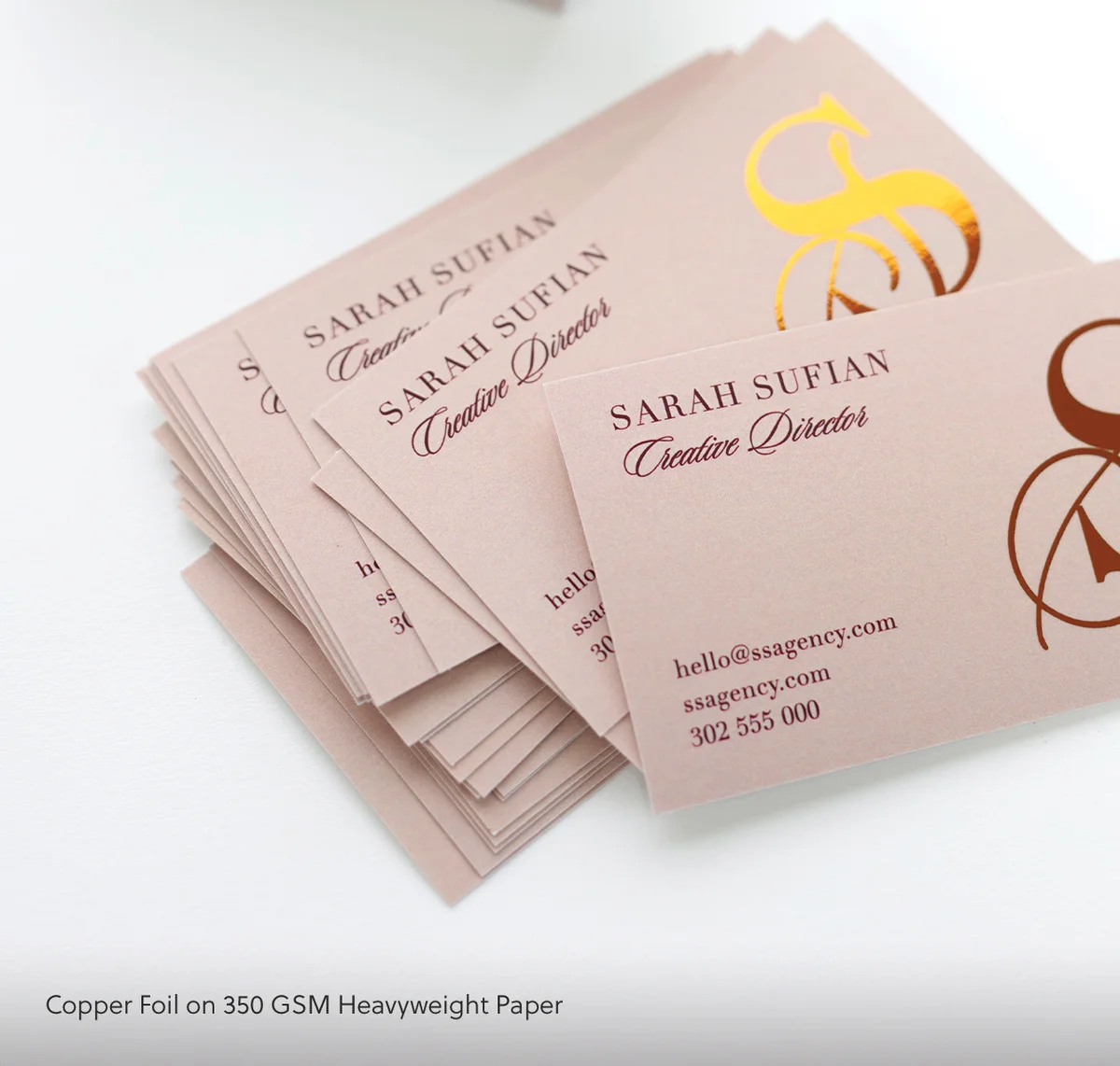
350 gsm uncoated stock as standard, premium 400 gsm and luxury finishes (foil, spot UV, embossing) all available in the same range.
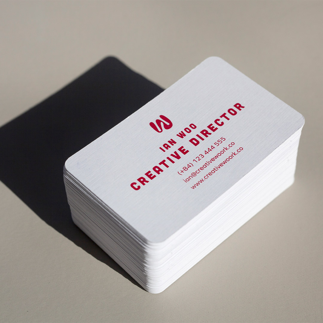
What belongs on a business card: your name, your title or role, your company name, one primary contact method (email is almost always the right choice), your website, and your logo. That is the full list. Physical addresses belong on cards only if your location is a selling point, such as a retail store or a studio people visit. Fax numbers have no place in 2026. Social media icons are worth including only if you actively use those platforms for professional purposes – and even then, pick one or two, not six.
When in doubt, run the five-second test: show the card to someone unfamiliar with your business for five seconds, then ask them what you do and how to contact you. If they can’t answer both questions, there is too much on the card. Remove elements until those two things become immediately obvious, then stop. White space is not wasted space. It is the visual equivalent of a confident pause – it tells the reader that the information you’ve included was chosen intentionally.
If you’re unsure where to start, Paperlust’s standard business card range includes clean template foundations built with correct proportions and safe zones already set up.
Principle 2: Tactile quality speaks before you do
When someone picks up your card, they form an impression before they read a single word. That impression comes from the weight of the card and the texture of the surface. A flimsy card signals a low-budget operation. A card printed on 400gsm stock with a matte soft-touch finish signals the opposite – even before your name registers.
This is why paper stock selection is arguably more important than any design choice. A mediocre layout on beautiful thick stock will outperform a well-designed layout on thin paper every time. The physical object is part of the message. For most professionals, a minimum of 350gsm is the floor. For anyone in a creative field, luxury industry, or premium service category, go heavier.
Textured finishes add another layer of sensory impact. A soft-touch matte laminate invites people to hold the card longer. Spot UV creates a contrast between matte and high-gloss areas that gives the eye (and the fingertip) something to explore. Raised finishes like Scodix business cards or raised foil business cards create a three-dimensional quality that standard print simply cannot replicate. These aren’t decorative extras – they are functional signals that your brand invests in quality.
Principle 3: Intentional use of colour and space
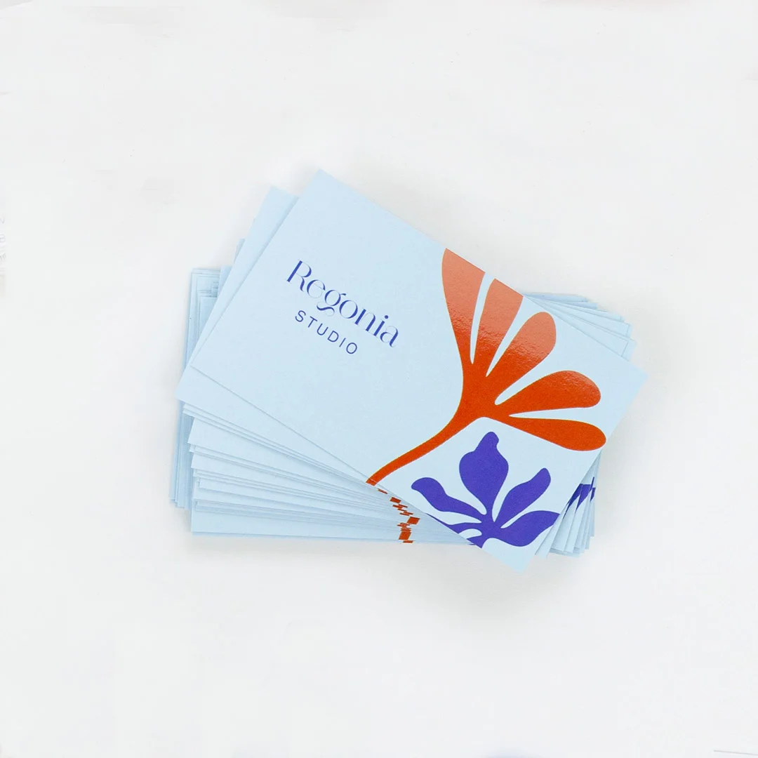
Colour does two jobs on a business card: it reinforces brand recognition, and it creates visual hierarchy. Both jobs require restraint. A card using four different colours across the front pulls the eye in too many directions at once. A card using one or two colours, applied deliberately, directs attention exactly where you want it.
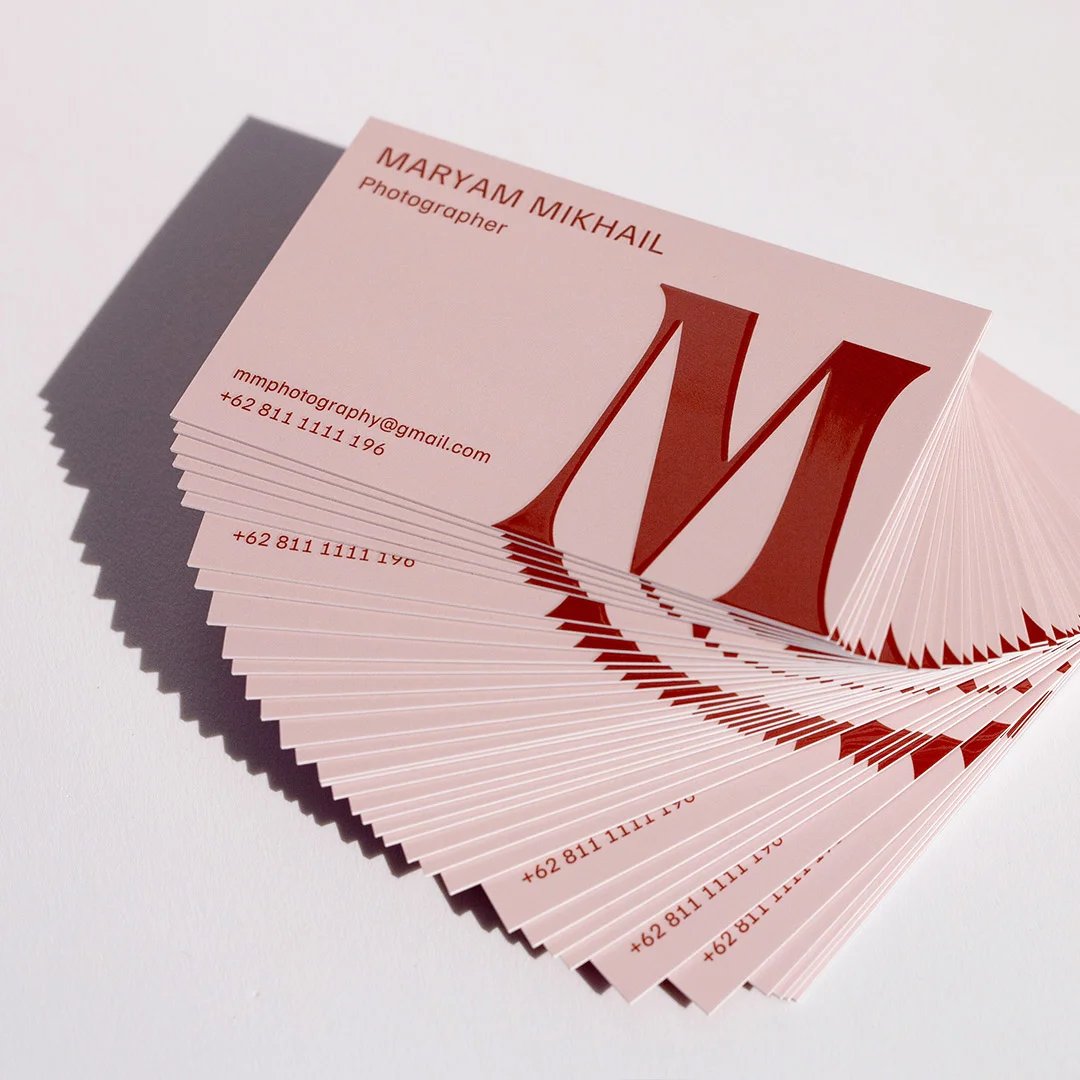
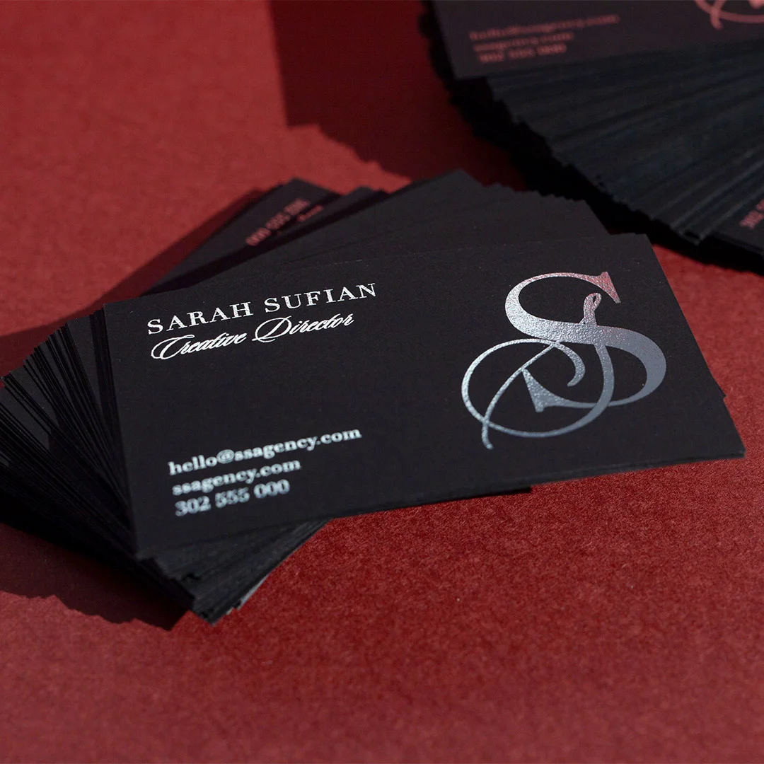
The most effective approach is to use your primary brand colour for one or two anchor elements – your name, a logo mark, or a geometric accent – and let neutral space do the rest of the work. Dark-background cards are a strong trend in 2026, particularly when paired with foil or light ink, because they create immediate contrast and stand out in a stack of white cards. If you’re considering a dark card, flat foil business cards make the pairing particularly effective, as the metallic elements catch light against a dark background in a way that’s almost impossible to ignore.
One rule worth memorising: if you wouldn’t put it on a billboard, don’t put it on a business card. Business card design benefits from the same thinking that drives outdoor advertising – maximum impact with minimum complexity.
Principle 4: Use the back side
A single-sided business card leaves half your real estate blank. In a competitive environment where every impression matters, that is a missed opportunity. The back of your card can carry a short tagline, a QR code linking to your portfolio or booking page, a services summary, a social handle, or even a piece of artwork that makes the card visually memorable.
The key is giving the back a single, focused purpose. Decide what you want the recipient to do after picking up your card – visit your website, follow you, book a call – and use the back to drive that one action. A QR code that goes to a well-designed landing page is more useful than a long URL that no one will type. A bold visual or brand pattern on the back turns the card into something people show other people, which extends its reach well beyond the original exchange.
For inspiration on how back-side design pairs with finish options, see our guide to business card design trends in 2026.
Principle 5: Consistency with your digital presence
A business card that looks nothing like your website, your social profiles, or your email signature creates friction. People who receive your card and then look you up online expect a consistent visual experience. If your card uses a different colour palette, different typography, or a logo variant that doesn’t match your website, it erodes confidence rather than building it.
Before finalising your card design, open your website and your most active social profile side by side with your card mockup. Your primary font, brand colours, and logo should be immediately recognisable as the same brand. This consistency is particularly important for premium custom formats, where the card itself becomes a strong visual statement – the design needs to earn that premium format with equally strong brand alignment.
Paperstock, Finish, and Printing Method – What Actually Makes a Card Feel Premium
Choosing a finish is where most people either make or break their business card. The right finish amplifies a good design. The wrong one can look cheap even on an otherwise well-constructed layout. Here’s what each main option delivers:
Matte finish
Matte is the most versatile finish and works for almost every industry. It has a flat, non-reflective surface that photographs well, reads as modern and sophisticated, and pairs with almost any colour palette. Soft-touch matte laminate takes this further – the velvety surface is tactilely distinct from standard matte and creates a lasting impression. Standard business cards with matte finish are ideal for creatives, consultants, and any brand positioning itself as refined rather than flashy.
Foil options – flat foil, raised foil, and Scodix
Foil comes in several forms, and the differences matter. Flat foil applies a mirror-bright metallic layer to specific areas of the card without any physical dimension – the result is a high-contrast metallic accent that is clean, contemporary, and highly legible. Flat foil business cards in gold, silver, rose gold, and copper are consistently in demand because they work across industries, from finance to hospitality to design studios.
Raised foil and Scodix go a step further, adding physical texture and dimension to the foil elements. Run a finger across a Scodix card and you feel the raised areas before you see them. This tactile quality is particularly effective for logos, monograms, and key typography – the elements you most want a recipient to notice and remember. Production times for Scodix and raised foil are longer than standard options, so plan accordingly when ordering for an event or deadline.
For a deep dive on foil-specific options and when each format is the right choice, see our complete guide to foil business cards.
Spot UV
Spot UV business cards apply a high-gloss varnish to selected areas of an otherwise matte card. The contrast between the matte base and the gloss accent creates a visual and tactile richness that photographs beautifully and stands out immediately in a stack of cards. Common applications include logo highlights, watermark-style patterns on the back, and name/title emphasis on the front. The effect is subtle in some lighting and dramatic in others – exactly the kind of card that earns a second look.
Duplex and coloured paper cards
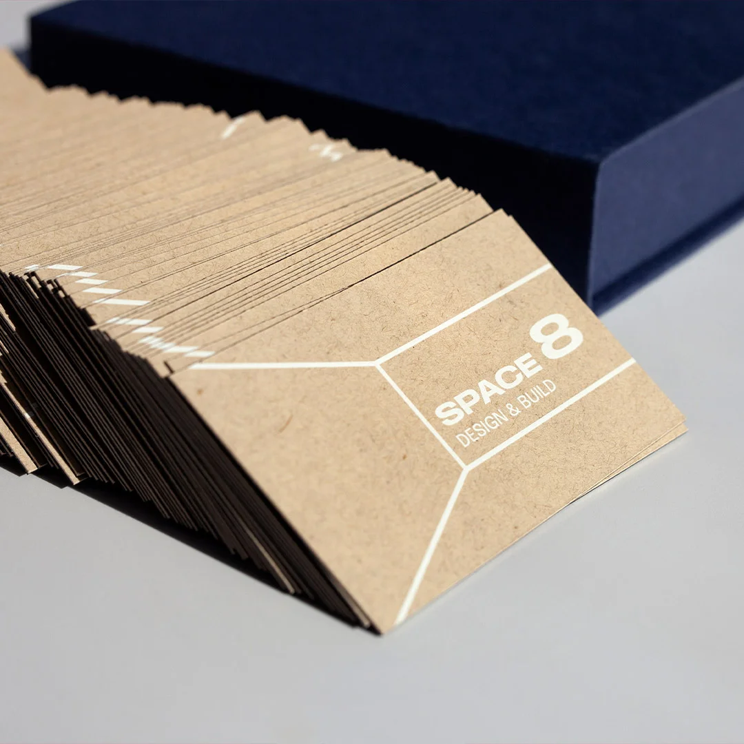
Duplex business cards are made by bonding two pieces of stock together, often with a contrasting coloured core visible along the edge. The edge colour becomes a design element, visible only when the card is held from the side – a detail that rewards close examination and creates a premium feel that’s hard to replicate with single-ply stock. Combined weight typically reaches 600gsm or more, which gives duplex cards a weight and substance that standard single-ply simply cannot match.
Coloured paper business cards offer a different route to distinctiveness. Instead of adding finishes on top of white or cream stock, the stock itself carries the brand colour throughout, giving the card a consistent tone on every edge and surface. This is a strong choice for brands with a clear signature colour, where the paper acting as a continuous brand canvas reinforces recognition more effectively than a printed background on white stock.
How to Choose the Right Stock and Finish for Your Brand
The card you hand over is doing two jobs at once: communicating your role and signalling the brand’s price point. Match stock and finish to that price-point first — the card will do the rest of the work.
| Brand position | Stock | Finish | Per-card budget |
|---|---|---|---|
| Volume / accessible | 350 gsm uncoated | Standard print | $0.45–$0.80 |
| Mid-market professional | 400 gsm uncoated | Spot UV or one-colour foil | $1.20–$1.80 |
| Premium / luxury | 600+ gsm cotton or duplex | Foil + emboss / Scodix | $2.50–$5.00 |
| Quiet luxury | 350 gsm uncoated cotton | Letterpress or blind emboss only | $2.80–$4.20 |
| Personality-led / creative | Coloured-edge duplex | Holographic foil or full-colour bleed | $1.80–$3.50 |
Quick rule: paperstock weight is the single most important variable. Even a basic-printed 400 gsm uncoated card outperforms a foiled 250 gsm card 9 times out of 10 — weight reads as quality before the eye registers the print.
Common 2026 Design Mistakes to Avoid
These are the errors that most frequently appear in business card designs – and the ones most likely to cost you the impression you’re trying to make.
Overloading the front
Including every phone number, every social handle, a tagline, a QR code, and a mission statement on the front of a 90mm x 55mm card guarantees that nothing gets read. Ruthless editing is the job. If someone can find it on your website in under 10 seconds, it probably doesn’t need to be on the front of your card.
Using fonts that are too small or too decorative
Body text below 8pt is difficult to read in most lighting conditions. Decorative script fonts below 10pt are nearly unreadable on matte stock. The primary contact information – email, website, phone – needs to be legible at a glance without squinting. Test your layout by printing a proof at 100% size and reading it under standard office lighting before committing to the full run.
Sending RGB files to print
RGB is the colour mode your screen uses. CMYK is the colour mode your printer uses. When you send an RGB file, the printer converts it – and the conversion almost always shifts colours. Blues get murkier. Purples turn pink. What looked perfect on your monitor looks wrong on paper. Convert all files to CMYK in your design software before exporting. If your brand uses Pantone colours, request a Pantone proof.
Ignoring bleed requirements
If your card has a background colour or image that runs to the edge, that background must extend 3mm beyond the trim line on all four sides. Without bleed, the cutting process leaves a white border that immediately signals amateur production. This is one of the most common mistakes in first-time print orders and one of the easiest to fix during the design stage.
Using a low-resolution logo
A logo grabbed from a website header (typically 72 DPI) will print blurry. Your designer or in-house team should have a vector version of your logo (EPS or SVG format) that scales to any size without quality loss. If you’re working from a raster logo, use the highest resolution version available and verify it looks sharp at 300 DPI in your layout software before sending to press. For a full run-down of what goes wrong during print production, see our guide to common business card mistakes.
Skipping the physical proof
Screen proofs are useful. Physical proofs are essential. Colours, stock weights, and finish effects can only be fully evaluated when you’re holding the actual card. Ordering a sample proof before committing to a full print run is always worth the time, particularly for premium finishes like foil, Scodix, or duplex where the three-dimensional qualities can’t be assessed on a screen.
Ordering, Sizing, and File Setup
Getting the technical setup right is the difference between a card that prints exactly as intended and one that comes back with clipped text, colour shifts, or a finish that doesn’t match your mockup. Here’s the full checklist:
Standard business card dimensions
The Australian standard business card size is 90mm x 55mm. This is the format that fits standard cardholders, wallets, and business card holders – and the format people expect when they reach for your card. Custom shapes (square, rounded corners, die-cut) can be highly effective, but they come with a tradeoff: they won’t fit in standard cardholders, which can increase the chance of them being lost or discarded. If you’re considering a non-standard shape, make sure the payoff in memorability justifies the practicality cost.
Bleed, trim, and safe zone
- Bleed: Extend all background colours and edge-to-edge images 3mm beyond the trim edge on all four sides
- Trim line: The final cut edge at 90mm x 55mm
- Safe zone: Keep all critical content – text, logos, QR codes – at least 3mm inside the trim line to avoid anything important being clipped during cutting
File specifications
- Colour mode: CMYK (convert from RGB in Illustrator, InDesign, or Photoshop before exporting)
- Resolution: 300 DPI minimum at final print size; 350 DPI preferred for fine details or foil-adjacent elements
- Format: PDF/X-1a is the preferred print-ready format; flattened, fonts embedded or outlined
- Fonts: Outline all fonts before saving, or embed them – printers cannot access fonts from your system
- Black text: Use 100% K (pure black) for small text, not rich black (CMYK mix), to avoid registration issues
Quantities and turnaround
Standard and flat foil business cards from Paperlust Print Shop are available with 24-hour production, making them a strong option when you need cards quickly for an event or meeting. Specialty finishes like Scodix, raised foil, spot UV, and duplex require more production time, so build that into your order timeline if you’re working to a deadline. See our full business card ordering guide for current lead times and minimum order quantities by finish type, and browse the complete print format comparison to find the right match for your budget and timeline.
Want a sample pack first?
Touch the paperstock, see foil + spot UV in the flesh — sample packs ship free across Australia.
Frequently Asked Questions
What is the best paper stock weight for business cards?
For most professional use cases, 350gsm to 400gsm is the sweet spot. Cards in this range feel substantial without being unusually thick, and they hold up well to handling, humidity, and time in a wallet. If you’re printing duplex cards (two bonded layers), the combined weight can reach 600gsm or higher, which creates an exceptionally premium impression. The key benchmark is simple: if the card flexes noticeably when you hold one corner, it’s too light.
Should I use matte or gloss finish?
Matte finishes, including soft-touch matte laminate, are the stronger choice for most brands in 2026. They read as more considered and contemporary, they don’t show fingerprints, and they create a better surface for Spot UV contrast effects. Gloss works well for photography-heavy designs where image vibrancy is the priority – real estate agents, photographers, and lifestyle brands often use full-gloss laminate to make images pop. For a mix of both, Spot UV on a matte base is the most effective option currently available.
How much information should go on a business card?
As little as possible while still being useful. The front should carry your name, title, company name, primary contact method (usually email), and website. Your logo belongs on the front. Everything else – secondary contact numbers, social handles, services list, tagline – belongs on the back or not on the card at all. A good rule: if you’d hesitate to put it on a billboard, it probably doesn’t belong on your card either.
Are foil business cards worth the extra cost?
For most professional contexts, yes. Foil cards have a demonstrably different impact at the moment of handoff – they catch light, they feel different in the hand, and they signal investment in your brand without requiring explanation. The cost difference per card between standard print and flat foil is meaningful at small quantities but relatively modest at runs of 250 or more. If you regularly network in competitive environments – conferences, sales meetings, client events – the impression difference typically justifies the cost. See the full breakdown of raised foil business card options to compare flat foil, raised foil, and Scodix by budget and use case.
What’s the difference between Spot UV and Scodix?
Both create a raised, high-gloss effect over selected areas of a card. The difference is in precision and texture. Spot UV applies a UV-cured varnish that sits on the surface and creates a flat high-gloss contrast against a matte base. Scodix uses a digital embellishment process that applies a polymer coating with greater dimensional height – you can feel a Scodix element clearly when you run a finger across it, whereas Spot UV is more subtle. Scodix also allows for finer detail in the embellished areas. If the tactile dimension is important to your brand message, Scodix is worth the additional lead time and cost. If you want a clean gloss/matte contrast at a faster turnaround, Spot UV delivers that reliably.
Ready to order?
A business card that represents your brand well is one of the most cost-effective marketing investments you can make. The per-card cost of printing on premium stock with a standout finish is a fraction of most marketing spend – and unlike digital ads, a well-made physical card keeps working as long as it stays in circulation. Whether you’re starting from scratch or upgrading a design that’s been letting you down, browse the full range of premium custom business cards at Paperlust Print Shop, or start with our standard business cards if you need a fast, professional result at the right price.