The question is not just what to put on a business card. It is what to include, in what order, and what to cut entirely. A card that puts your name where eyes land first, your contact details where hands instinctively look, and your print finish where fingers want to touch it will do more work in a 30-second conversation than a card that crams everything onto 90 x 55mm of space and hopes for the best. This guide covers every element that belongs on a modern Australian business card, the hierarchy rules that govern where each one lives, industry-specific adjustments for seven professional categories, and a print-ready checklist you can use before you order.
At a glance
- 7 must-have elements: full name, job title, company name, logo, mobile, business email, website URL
- Front vs back split: front = identity (who you are); back = contact details and next step
- Standard AU card size: 90 x 55mm with a 3mm safe zone on all edges
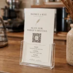
- QR codes: link to a landing page or digital card profile, not your homepage; minimum 15 x 15mm for reliable scanning
- Minimum type size: 8pt absolute floor; 9pt recommended for contact details
- Industry matters: tradies need a licence number; real estate agents need a suburb descriptor; creatives need a portfolio URL above a phone number
- Card stock: 350gsm minimum for a card that survives a jacket pocket and still feels premium when handed over
The Must-Have Business Card Checklist
Every business card brief should start with this checklist. These seven elements are non-negotiable regardless of industry, business size, or card style. Tick each one before sending files to print.
- Full name – the name you use professionally, prominent on the front
- Job title or professional descriptor – concise and specific, beneath your name
- Company name and logo – both unless your logo is a wordmark that includes the company name
- Mobile phone number – one number only, formatted as +61 4XX XXX XXX for international reach
- Business email address – domain email only; @gmail or @icloud signals a credibility problem
- Website URL – drop the https:// prefix; link to a purposeful destination, not a holding page
- Social handle or QR code – optional but increasingly standard; one platform only if social, and only if actively maintained
The table below shows status, recommended placement, and when each element can be skipped.
| Element | Status | Recommended placement | When to skip |
|---|---|---|---|
| Full name | Essential | Front, primary hierarchy | Never |
| Job title | Essential | Front, beneath name | Only if company name says it all |
| Company name / logo | Essential | Front, dominant visual | Never |
| Mobile phone | Essential | Back, first contact element | Never |
| Business email | Essential | Back, beneath phone | Never |
| Website URL | Essential | Back, beneath email | If site is genuinely empty |
| Physical address | Optional | Back, footer area | Non-retail, non-client-facing roles |
| LinkedIn URL | Optional | Back, alongside website | If profile is not maintained |
| QR code | Optional | Back, right column or bottom | If linked page is weak |
| Social handle (one only) | Optional | Back, footer | If not actively maintained |
| Pronouns | Optional | Front or back, near name | If not relevant to your context |
| Second phone number | Skip | – | Always – creates contact hesitation |
| Fax number | Skip | – | Always – obsolete |
| Multiple social handles | Skip | – | Always – choose one or none |
Ready to order? Paperlust Print Shop’s standard business cards are available with free overnight Startrack delivery across Australia. Upload your own design or use the hierarchy frameworks in this guide.
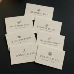
Front vs Back: How to Distribute Information Properly
Most business card design mistakes are really information distribution mistakes. Everything gets loaded onto the front because the front is where the designer spends their time, leaving the back as an afterthought or a blank reverse. A front-back strategy that assigns a specific job to each side produces a card that is both cleaner and more effective.
Front: the identity layer
The front answers one question: who are you? Your name, your job title, your company name, and your logo. Four elements maximum. The front is not where contact details live. It is where brand impression is made. A well-designed front with generous white space, a strong logo, and clear typographic hierarchy will be remembered. A front crammed with phone numbers, email addresses, and social handles will not.
If you use a full-bleed design, texture, or colour on the front (dark background, bold graphic, large brand illustration), lean into it. Let the front be purely visual and push all contact information to the back. The contrast between a visually bold front and a clean, functional back creates the kind of physical experience that makes a card worth keeping.
Back: the utility layer
The back answers the follow-up question: how do I reach you, and what should I do next? Phone, email, website, and QR code live here. A brief tagline or one-line value proposition can appear at the top of the back as a context reminder – useful when the card has been in a wallet for two weeks and the recipient needs a prompt about who you are. The back can carry more density than the front because it is a reference tool, not a first impression.
For two-sided cards, the front-back split also solves the most common layout problem: not enough room. When contact details are on the back, the front has room to breathe. When everything is on the front, nothing has room to be legible.
QR Codes and Digital Business Cards
As of 2026, every major smartphone operating system scans QR codes natively via the camera app. No third-party app is required. The barrier to QR adoption that existed five years ago is gone, which means a QR code on your business card is no longer a tech-forward differentiator. It is table stakes for roles where digital follow-through matters.
The question is not whether to include one. It is where it links.
- Link to a dedicated landing page, not your homepage. A page optimised for new contacts – brief bio, what you do, a single call to action – converts far better than a homepage built for everyone.
- Digital business card services such as HiHello or Popl generate QR codes that link to a mobile-optimised profile with all your contact details in one tap.
- Minimum size: 15 x 15mm for reliable scanning on a standard 90 x 55mm card.
- Include a one-line CTA: “Scan to connect” or “Scan for my portfolio” tells the recipient exactly what they get before they scan.
- Place it on the back, right column or bottom-right corner.
NFC-enabled cards
Near-field communication chips embedded in card stock allow a simple tap to a smartphone to open any URL. NFC-enabled cards are available from specialist print providers and typically add $2-5 per card to production cost. They are most relevant for founders, tech professionals, and enterprise sales roles. Note that NFC requires a smartphone with NFC enabled, so a QR code on the back remains a useful backup.
Industry-Specific Guidance
The seven essential elements apply universally, but the order of priority and the supplementary information that adds professional credibility varies significantly by industry. Use the table below as a starting point, then apply the hierarchy rules above to sequence your specific elements.
| Industry | Must include | Strong recommendation | Usually skip |
|---|---|---|---|
| Real estate | Full name, mobile, email, agency name/logo, licence number | Suburb or service area descriptor, professional headshot, QR to listings | Full street address, fax number |
| Medical / allied health | Full name with credentials (e.g. BPhysio, MBBS FRACGP), clinic name, clinic phone, website | Clinic address, appointment booking URL | Personal mobile, social handles |
| Legal | Full name, professional title (Solicitor / Barrister), firm name, direct phone, email | LinkedIn URL, practising certificate jurisdiction | Taglines, slogans, social handles |
| Creative / design | Full name, role descriptor (e.g. Brand Identity Designer), portfolio URL, email | Instagram handle or Behance URL, QR to portfolio | Formal job title if freelance and title adds nothing |
| Tradies | Business name, mobile, email, trade licence number, suburb or service area | After-hours number for emergencies, ABN | Website if genuinely empty or under construction |
| Consulting | Full name, title, company, mobile, email, LinkedIn URL | Booking or calendar link (e.g. Calendly), QR to profile | Physical address unless co-working space is client-facing |
| Hospitality / events | Business name, logo, venue or brand descriptor, mobile, email | Instagram handle, website with menu or gallery, address | Personal name if staff card for brand-led venue |
Licence and ABN requirements
Real estate agents operating in Australia are legally required to display their licence number on business cards and marketing materials in most states. Verify your state’s specific requirements before printing. Format and numbering conventions differ between NSW, VIC, QLD, WA, and SA.
For licensed trades (electricians, plumbers, builders, gas fitters), displaying your contractor licence number is legally required or strongly expected when presenting quotations to domestic clients in most Australian states and territories. ABN is expected on any card used in a business-to-business context. If you quote for commercial work, include both.
3 Information-Hierarchy Frameworks You Can Use Straight Away
These frameworks are information architecture guides. Use them to decide what information goes where before you open a design tool or talk to a printer. The card style and finish recommendations are starting points, not requirements.
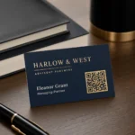
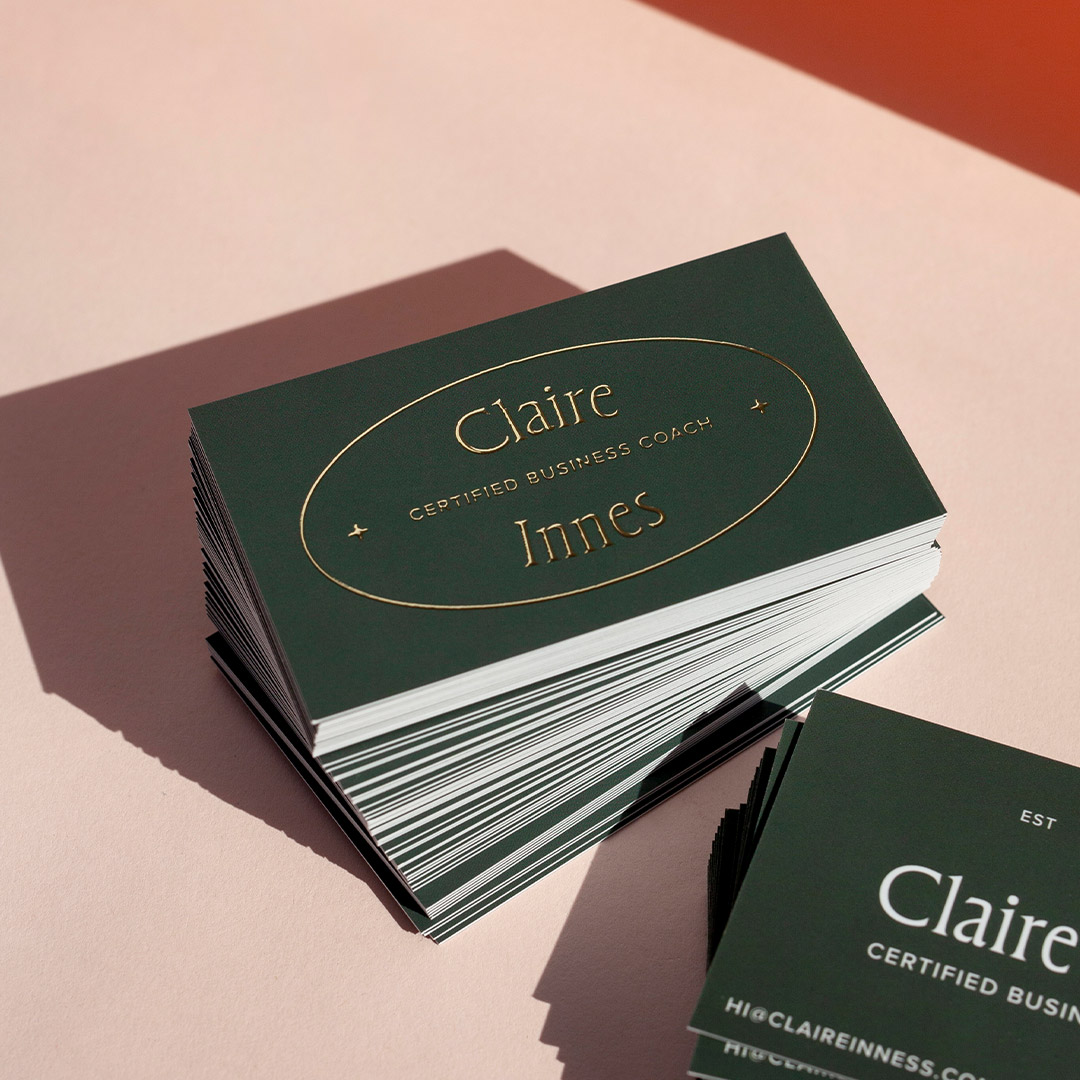
Framework 1: The Classic (name-forward)
The Classic places the individual at the centre of the card identity. It works for consultants, lawyers, accountants, financial planners, healthcare practitioners, and most professional services roles.
- Front: Your name (12-16pt, bold), job title directly beneath (10pt, regular), company logo top-right or bottom-right, optional company name below logo
- Back: Company name or logo at top, phone and email in two lines (9pt), website URL below, optional tagline or credential at the bottom in 8pt
- Card style: Standard or spot UV on name/logo; 350-400gsm matte or uncoated
- Key principle: The back functions as a reference card – clean, left-aligned, no decorative elements competing with contact information
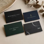
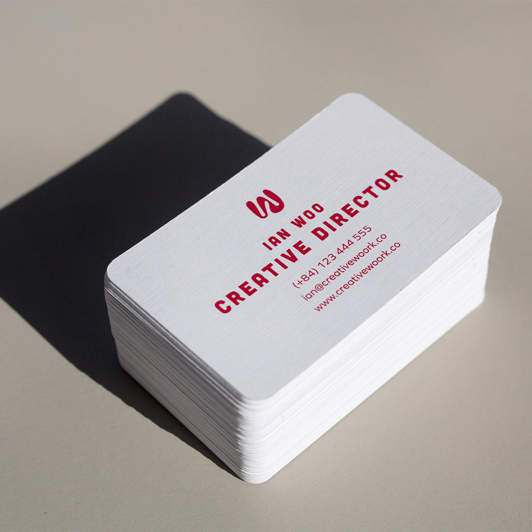
Framework 2: The Company-Forward
The Company-Forward centres brand over individual. It works for agency staff, franchise operators, hospitality businesses, retail, and any role where the company identity carries more weight than the individual’s name.
- Front: Logo large and dominant (centred or upper-left), company name in full, your name small at the bottom (8-9pt), job title optional
- Back: Your name and title at the top, phone, email, and website below, QR code bottom-right corner
- Card style: Premium finish on the front logo; clean matte back for contact readability
- Key principle: The front is marketing; the back is utility. The card as a whole carries both functions without either undermining the other
Framework 3: The Digital-First
The Digital-First card is built around the assumption that meaningful follow-up happens digitally. The QR code is a primary design element, not an afterthought. It works for tech founders, startup teams, creative professionals, conference speakers, and anyone whose digital presence converts better than a phone call.
- Front: Your name and role (left column, 60% of width), large QR code (right column, 35-40mm square minimum), company logo small at top-left
- Back: One-sentence value proposition in 11-12pt, email address, optional Instagram or LinkedIn handle, nothing else
- Card style: Spot UV or premium finish on the QR code draws attention to it; dark or coloured stock for the front to create visual contrast
- Key principle: The QR code is the call to action. Every other element supports it
What to Leave Off Your Business Card
The instinct to include more is understandable. But a card that tries to do everything ends up doing nothing well. These five elements consistently hurt more than they help.
1. Multiple phone numbers
Two phone numbers force the recipient to choose which one to call and when. That uncertainty creates friction at the exact moment you want action to be easy. Choose one number (mobile) and let voicemail and call forwarding handle the rest.
2. Multiple social media handles
Listing five social platforms communicates one thing: you have not thought about where you actually want the conversation to happen. Pick the platform that best reflects your work and your clients. If you are not actively posting on a platform, do not list it. A dormant profile discovered via your business card is worse than no profile at all.
3. Your street address (if you are not client-facing)
Brick-and-mortar retail, medical practices, and businesses where clients physically visit you need an address. Consultants, freelancers, remote teams, and digital agencies generally do not. A suburb or region descriptor (“Based in Melbourne’s inner north”) gives geographic context without the full address and takes a fraction of the space.
4. A complete list of services
Your website exists for this. A card listing eight service categories in 7pt type will not generate enquiries. One clear job title or a strong tagline does more qualifying work than a bulleted service list, because it prompts the recipient to ask you a question rather than attempting to read your brochure mid-conversation.
5. Generic corporate slogans
If a tagline cannot be claimed exclusively by your brand (if your competitor could run it without changing a word), cut it. Use that space for something unique: a specific value proposition, a certification, or simply more breathing room around your contact details.
Print Spec Checklist: Before You Send to Print
Use this checklist before uploading your files to order custom business cards. A single missed step can mean a reprint.
- File in CMYK colour mode (not RGB)
- 300 DPI resolution at final print size
- 3mm bleed on all sides
- Fonts embedded or converted to outlines
- Safe zone 3mm from all edges for all content
- Phone number includes +61 country code for international contacts
- Email is a domain address, not a personal account
- QR code minimum 15 x 15mm if included
- Card size 90 x 55mm (standard AU) unless intentionally using a non-standard format
For a detailed breakdown of sizes and formats, see the complete Australian business card sizes guide. For design layout guidance, see how to design business cards in 2026.

Frequently Asked Questions
What are the most important things to put on a business card?
The seven essentials are: your full name, job title, company name and logo, mobile phone number, business email address, and website URL. Every other element is optional. If space is tight, prioritise these seven and cut everything else before reducing type size.
Should I put my address on a business card?
Only if clients or customers visit you physically (retail stores, medical clinics, legal offices, trade showrooms). Consultants, freelancers, remote workers, and digital businesses generally do not need one. A suburb or region descriptor gives geographic context without the privacy exposure of a full street address.
How much information is too much on a business card?
A useful rule is the arm’s-length test: if you cannot read every element comfortably at arm’s length, there is too much. Most cards become overcrowded at more than seven or eight text elements. When in doubt, remove one element and see if the card reads better.
Should my business card have both a front and a back?
Two-sided cards give you the space to assign a clear job to each side (identity on the front, contact details on the back) without crowding either. Single-sided cards work for very simple layouts but struggle the moment you add a QR code, tagline, or address. For most professional contexts, a two-sided card is worth the small additional cost.
What size is a standard Australian business card?
The standard Australian business card size is 90 x 55mm. This is the same as the ISO 7810 ID-1 format used across most of the Asia-Pacific region. Always leave a 3mm safe zone inside each edge for bleed-and-trim tolerance.
Do I need a QR code on my business card?
Not universally, but increasingly yes for roles where digital follow-through matters. QR codes are scanned natively by all current smartphone operating systems in Australia without an app. If the destination page is strong (a portfolio, a booking system, a well-built landing page), a QR code meaningfully increases the value of the card. Always include a one-line CTA next to the QR code explaining what it does.
What font size should I use on a business card?
The minimum readable size for contact information on a standard 90 x 55mm card is 8pt. Recommended sizes: name at 12-16pt bold, job title at 10-12pt regular, contact details at 8-9pt regular. Never go below 7pt for any meaningful content.
Should I put my photo on a business card?
In most Australian industries, no. The exceptions are real estate agents (where a headshot is a strong industry norm) and financial planners. For everyone else, a photo competes with your logo and reduces space for information. If you do use one, size it at minimum 30 x 30mm and use a professionally taken headshot.
Which social media handle should I include on a business card?
One platform only, and only if you actively post content that reflects your professional brand. LinkedIn for B2B and professional services. Instagram for creative, hospitality, beauty, and retail. Facebook for community-based local businesses. A dormant profile found via your card creates a negative impression that outweighs any benefit.
How should I format my phone number on a business card?
Use the +61 international dialling format: +61 4XX XXX XXX for mobile numbers. Drop the leading zero from the domestic format (04XX becomes +61 4XX). This format is immediately dialable from any country without the recipient needing to look up Australian country codes.
What card stock should I use for a professional business card?
350gsm is a practical minimum for professional contexts. It survives normal handling and a jacket pocket without bending. For premium impressions, 400gsm and above paired with a soft-touch matte laminate or a specialty print finish creates a card with both physical weight and visual texture. See the standard business cards product page for current stock and finish options.
Order business cards with free overnight delivery across Australia. Paperlust Print Shop offers standard business cards printed on quality Australian stock, with fast turnaround and free Startrack overnight delivery. Upload your design or talk to the team about layout and finish options.