At a Glance
Most business cards fail at one job: making you memorable enough to follow up.
The seven most common mistakes are unreadable fonts, poor stock choice, missing contact methods, busy clutter, generic templates, low-quality finish, and treating the back like wasted space. All seven are fixable on the next print run.
- The single biggest mistake: fonts smaller than 8pt — over-40 buyers will not squint
- The second biggest: using paper-thin stock that signals ‘temporary’ before the recipient reads a word
- Easy fix that adds 2× perceived value: upgrade from 300gsm to 400gsm or add a soft-touch finish
- Always include: name, role, one primary contact method, website. Skip multiple phones, fax, every social handle
Your Card Is Costing You Clients (And You Don’t Even Know It)
Ready to fix your business cards?
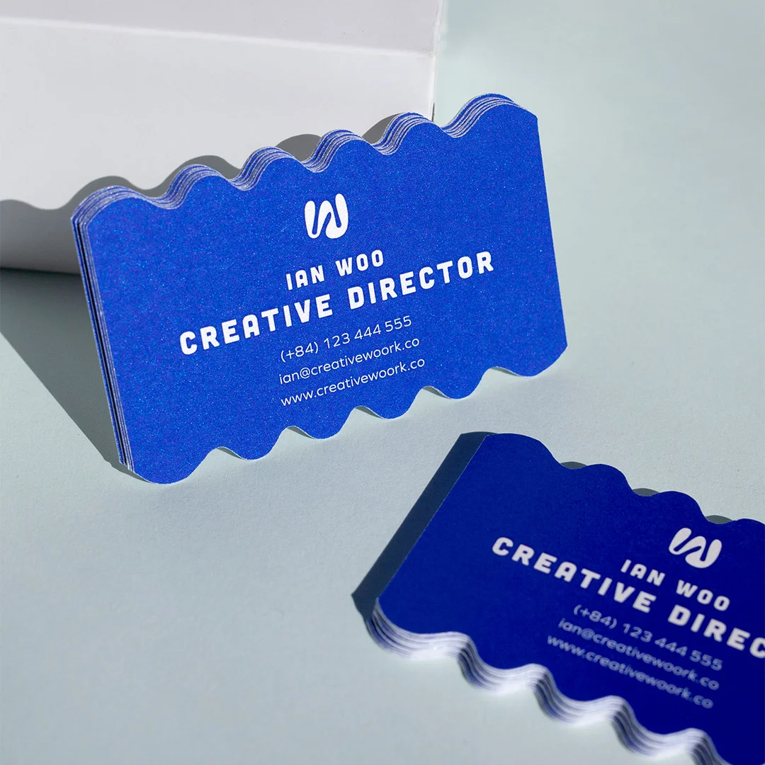
Standard, premium, and speciality business cards on stocks from 350gsm to 900gsm. Soft-touch, foil, letterpress, and embossed finishes available.
Here’s a scenario that plays out every single day:
You meet someone at a networking event. Great conversation. Clear mutual benefit. You hand them your business card. They smile, say “I’ll reach out,” and slip it into their pocket.
How to Choose the Right Business Card Setup for Your Role
The right business card configuration depends on what people will do with it. A card that goes into a wallet for occasional reference is configured differently from one handed out at a conference, which is different again from a card mailed in a follow-up package.
Choose standard 90×55mm + 350gsm + matte: the safe default for most professionals. Reads as professional without trying too hard, fits standard wallets, costs less than premium options.
Choose square or rounded-corner format: for creative professionals (designers, photographers, agencies) where the format itself signals brand thinking. Pair with thicker stock (400gsm+) and a finish — soft-touch, matte foil, or letterpress.
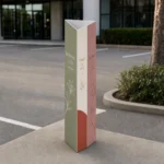
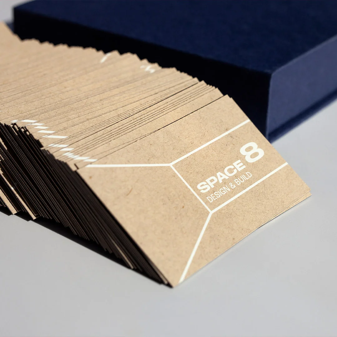
Choose textured or speciality stock (cotton, recycled, kraft): for brands where tactile differentiation matters — beauty, sustainability-led, artisan food and drink. Adds 30–50% to cost but lifts perceived value significantly.
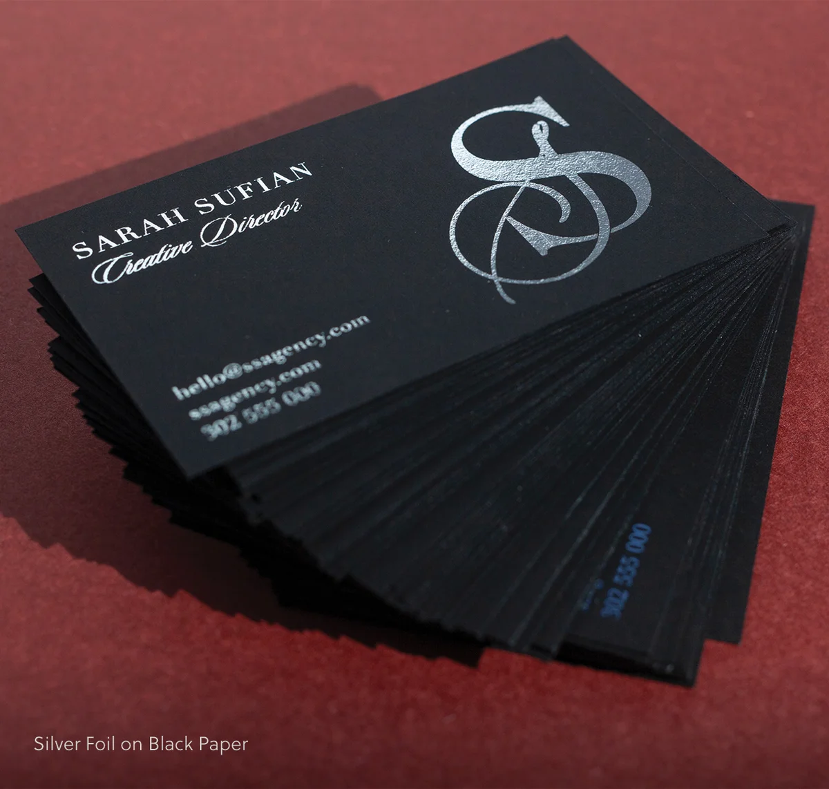
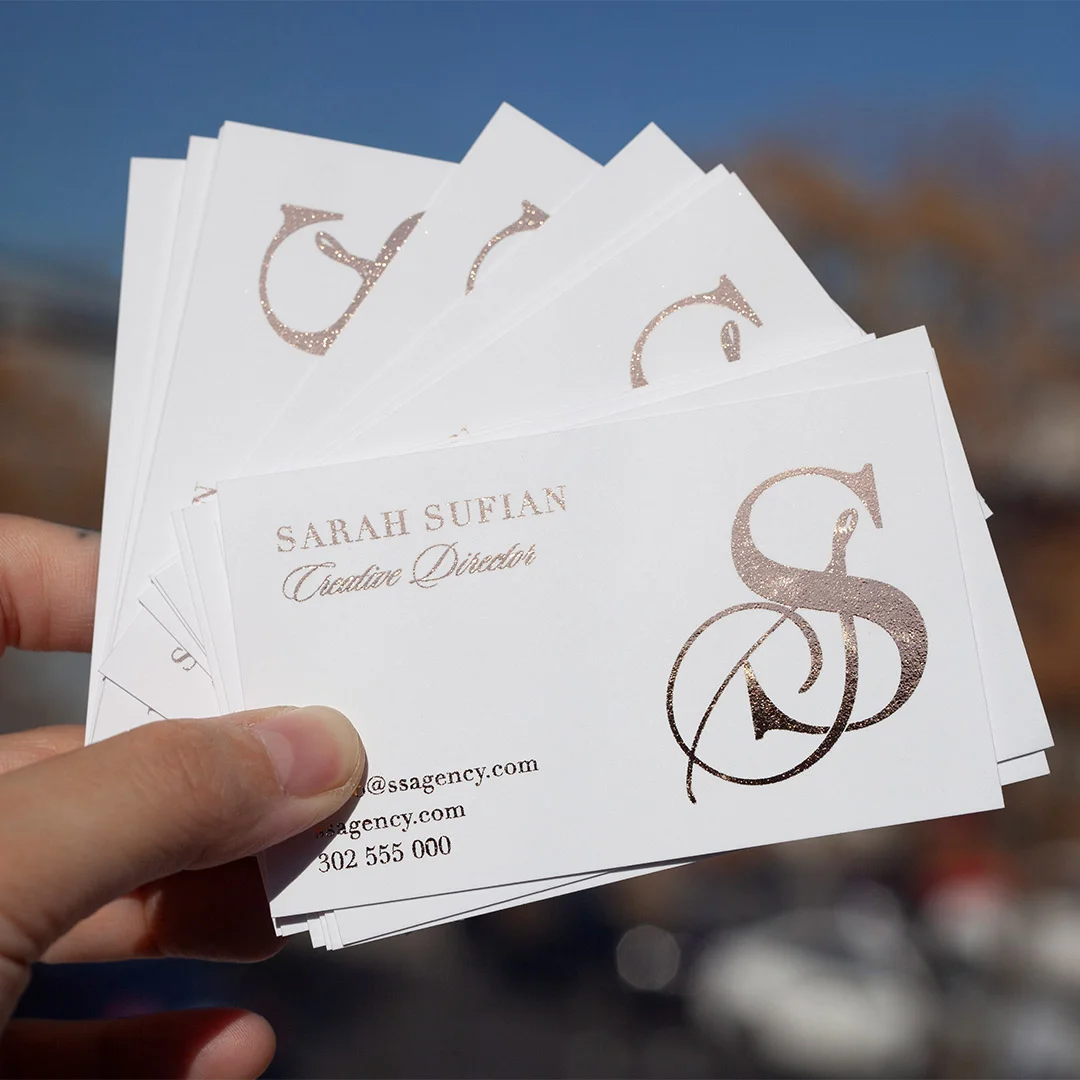
Choose minimalist + premium finish (foil edge, embossed monogram, double-thick): for senior-level or boutique-services professionals where the card needs to signal exclusivity. Worth the cost when the average client is high-value.
Two weeks later: crickets.
| Card setup | Stock weight | Best for | Per-card cost (relative) |
|---|---|---|---|
| Standard 90×55mm matte | 350gsm | Most professionals | $ (baseline) |
| Standard + soft-touch laminate | 350–400gsm | Premium professional services | $$ (+40%) |
| Square format + foil accent | 400gsm | Creative agencies, design, photography | $$$ (+80%) |
| Textured cotton or recycled | 400–540gsm | Sustainability, beauty, artisan brands | $$$ (+90%) |
| Letterpress or embossed | 540gsm+ | Boutique services, executive roles | $$$$ (+150%) |
| Double-thick (duplex) | 600–900gsm | Architects, consultancies, premium brands | $$$$ (+180%) |
What happened? Did they forget? Lose the card? Get busy?
Maybe. Or maybe your business card told them you weren’t worth following up with.
Brutal truth: Most business cards fail at their only job – making you memorable enough to deserve a follow-up.
We’ve printed business cards for thousands of Australian businesses. We’ve seen what works and what tanks. These 7 mistakes show up constantly, and they’re quietly killing your first impression.
The good news? They’re all fixable.
Mistake #1: Unreadable Fonts (The Squint Test Failure)
The Problem:
Your card uses:
- Fonts smaller than 8pt (your contact details are microscopic)
- Script/cursive fonts for critical info (looks fancy, reads like gibberish)
- Low-contrast color combos (grey text on white, light blue on cream)
Real example we see constantly:
Name in 18pt bold (good), but phone number in 6pt script font (why?!). The person can’t call you because they can’t read your number.
Why It’s Killing You:
People over 40 (often your highest-value clients) won’t squint at your card under a magnifying glass. They’ll just bin it and move on.
The squint test: Hold your card at arm’s length. Can you still read the name and phone number clearly? If not, your fonts are too small or too fancy.
The Fix:
Minimum font sizes:
- Name: 14pt+ (bold weight)
- Company/Role: 10-12pt
- Contact details: 8-10pt (NEVER smaller than 8pt)
Font rules:
- Use clean, readable fonts (Helvetica, Futura, Garamond, Baskerville)
- Script fonts ONLY for names (and only if they’re highly legible)
- Never use script for phone numbers, emails, or websites
Contrast rules:
- Black on white (classic, always works)
- White on dark navy/black (bold, readable)
- Dark color on cream/off-white (sophisticated)
- Avoid: Grey on white, light blue on white, any color on similar tone
The phone photo test: Take a photo of your card design in average lighting. Look at it on your phone. If any text is hard to read, fix it.
Mistake #2: Information Overload (The Cramming Problem)
The Problem:
Your card includes:
- 3 phone numbers (mobile, office, fax – it’s 2026, nobody faxes)
- 5 email addresses
- Physical address nobody needs
- Every social media handle (LinkedIn, Twitter, Instagram, Facebook, TikTok)
- A mission statement
- A list of services
- Certifications and awards
- A QR code with no clear purpose
Result: Visual chaos. Zero breathing room. Impossible to know what’s important.
Why It’s Killing You:
When everything is emphasized, nothing is. Your audience doesn’t know where to look first, so they don’t look at all.
The psychology: The human brain processes visual hierarchy in under 3 seconds. If your card doesn’t have a clear entry point (name → role → contact), people won’t invest mental effort figuring it out.
The Fix:
What actually needs to be on your card:
- Your name (largest text)
- Your actual role/what you do (secondary size)
- ONE primary contact method (mobile OR email, pick one as dominant)
- Company name + logo
- Website (where they go for everything else)
Optional additions (if space allows):
- One social handle (LinkedIn for B2B, Instagram for visual brands)
- A tagline/value proposition (10 words max)
What goes:
- Fax numbers (please)
- Multiple emails (pick your primary, put others on your website)
- Physical addresses (unless you’re retail/hospitality and people need to visit you)
- Service lists (that’s what your website is for)
- Mission statements (nobody reads them)
The whitespace rule: At least 30% of your card should be empty space. If it’s not, remove something.
Mistake #3: Cheap Cardstock (The Flimsy Fail)
The Problem:
- You ordered the cheapest possible option: 300gsm standard cardstock with no finish.
- When you hand someone your card, it bends. It feels… insubstantial. Disposable.
Why It’s Killing You:
Material = perceived value.
Subconsciously, people judge the quality of your business by the quality of your card. Thin, flimsy cardstock signals “budget operation” or “doesn’t care about details.”
This is especially brutal if you’re in a premium or professional industry. You’re charging $5,000+ for your service, but your card feels like it cost $20 for 1,000.
The weight test: Hold a standard 300gsm card, then hold a 400gsm card. The difference is immediately noticeable. One feels cheap. One feels quality.
The Fix:
- Minimum cardstock weight: 350gsm.
- Ideal: 400gsm+
The cost difference: Usually $20-40 extra per 500 cards. That’s $0.04-0.08 per card.
If handing out a card that doesn’t feel cheap is worth 8 cents, upgrade. (Spoiler: it is.)
Finish options:
- Matte lamination: Sophisticated, doesn’t show fingerprints, easy to write on
- Gloss lamination: Vibrant colors, shiny, more “polished”
- Uncoated: Natural paper feel (can be premium, but shows wear faster)
Our take: Matte + 400gsm = best all-around combo. Works for 90% of businesses.
Exception: If you’re genuinely a budget service (trades, volume-based work), standard stock is fine. But if you’re positioning as premium in any way, upgrade the cardstock.
Mistake #4: Wasting the Back Side (The Blank Canvas Problem)
The Problem:
- The back of your card is completely blank.
- You just wasted 50% of your printable real estate.
Why It’s Killing You:
The back of your card is free space. Using it strategically can:
- Reinforce your value proposition
- Showcase your work (for creatives)
- Provide a useful reference (for consultants/agencies)
- Give people a reason to keep the card
Leaving it blank = missed opportunity.
The Fix:
- Smart uses for the back of your card:
- Tagline/Value Proposition – “Brand strategy that actually sells” (clearer than “Marketing Consultant”)
- Services List (3 – 5 items max)
Good for consultants, agencies, multi-service businesses:
- Brand Strategy
- Web Design
- Content Marketing
3. Visual Brand Element
Pattern, texture, photo, illustration – reinforces your aesthetic
4. QR Code with Clear Purpose
“Scan to see my portfolio” (designers)
“Scan to book a free consultation” (consultants)
“Scan for our menu” (restaurants)
5. “Leave Blank for Notes” Section
Subtle but appreciated – gives people a reason to keep your card for reference
6. Testimonial Snippet
“Best accountant we’ve ever worked with” – Sarah T, Retail Owner
7. Mini Portfolio Sample (Photographers/Designers)
One stunning image that shows your work
What NOT to do:
- Repeat the exact same info from the front (pointless)
- Cram tiny text that nobody will read
- Leave it blank (wasted space)
The value test: Does the back of your card add value, or is it just decoration? If it’s just decoration, rethink it.
Mistake #5: Unclear Value Proposition (The “What Do You Actually Do?” Problem)
The Problem:
Your card says:
- “Entrepreneur”
- “Consultant”
- “Thought Leader”
- “Business Development”
- “CEO/Founder”
Cool. What do you actually do?
Why It’s Killing You:
Vague titles don’t give people a hook to remember you by or a reason to follow up.
“Entrepreneur” could mean anything from tech startup founder to pyramid scheme recruiter. “Consultant” is meaningless without context.
The mental filing system: When someone meets 20 people at a networking event, they mentally categorize each person. “Accountant for small business,” “Real estate agent in North Shore,” “Web designer for cafés.”
If they can’t file you into a clear category, you get filed into “I’ll check their website later” (translation: never).
The Fix:
- Replace vague titles with clear roles:
- ❌ Consultant
- ✅ Brand Strategy for Startups
- ❌ Entrepreneur
- ✅ Founder, [Company Name] | SaaS for Restaurants
- ❌ Business Development
- ✅ Sales Training for Tech Companies
- ❌ Creative
- ✅ Food Photographer | Melbourne
The clarity test: If a stranger reads your title, can they explain what you do to someone else in one sentence? If not, make it clearer.
Pro tip: Add a tagline on the back if your title is necessarily vague:
- Front: “Consultant”
- Back: “Helping law firms win more clients through content marketing”
Mistake #6: Outdated or Incorrect Contact Info (The Dead Link Problem)
The Problem:
Your card has:
- An old phone number (you changed carriers 6 months ago)
- A dead email (rebranded the business, new domain)
- Wrong website URL (typo, or you switched to a new domain)
- Old company name (you rebranded)
Someone tries to contact you. Email bounces. Phone disconnected. They give up.
Why It’s Killing You:
You literally can’t be reached.
This seems obvious, but we see it shockingly often. Businesses rebrand, change phone numbers, update domains, then keep handing out old cards for months because “we still have 800 left.”
Those 800 cards are now 800 missed opportunities.
The Fix:
Before every print run:
- Test your phone number (call it from another phone)
- Test your email (send yourself a test email)
- Test your website URL (type it exactly as printed, see if it loads)
- Verify your company name is current
- Double-check spelling (especially your own name and website)
The proofreading rule:
- You proofread
- Someone else proofreads
- You sleep on it, proofread again the next day
One typo = entire batch wasted.
The quantity strategy:
Don’t order 2,000 cards “to save money on bulk pricing” if there’s any chance your info will change in the next 12 months. Order 500-1,000 at a time. The per-unit cost difference is negligible, and you won’t be stuck with obsolete cards.
Mistake #7: Template Trap (The “I’ve Seen This Exact Card Before” Problem)
The Problem:
- You used a Canva or Vistaprint template, swapped in your name and phone number, and called it done.
- The design is… fine. Competent. Generic.
And the person you just handed it to has seen the exact same template 5 times this month.
Why It’s Killing You:
Templates are recognizable. They signal “I didn’t invest time or money into this.”
If you’re in a competitive industry, generic cards make you forgettable. If everyone else at the networking event has a custom design and you have Template #47, you blend into the background.
The psychology: Humans remember novelty. We forget sameness. Your card needs at least one memorable element to stick in someone’s mind.
The Fix:
If you’re using a template, customize it heavily:
Change:
- Color palette (brand colors, not template defaults)
- Typography (swap fonts entirely)
- Layout (flip orientation, adjust spacing)
- Add a unique element (custom icon, pattern, photo)
Goal: Even if you started with a template, it should look distinct by the time you’re done.
Better option: Hire a designer.
Cost: $200-500 for a custom business card design.
Benefit: It’s yours. It’s unique. It aligns with your brand.
ROI: If one extra client comes from a memorable card, it’s paid for itself 10x over.
DIY option: Use design tools like Adobe Illustrator, Figma, or Affinity Designer (not Canva) and design from scratch. Takes longer, but the result is original.
The originality test: Google Image Search your card design (or similar keywords). If you find nearly identical cards, redesign.
The Bonus Mistake: No Clear Next Step (The “Now What?” Problem)
The Problem:
Someone has your card. They’re interested. What do they do next? If the answer isn’t immediately obvious, many won’t do anything.
Why It’s Killing You:
People are busy and indecisive. If you don’t make the next step easy and clear, they’ll default to “I’ll reach out later” (never).
The Fix:
Add a soft call-to-action:
Examples:
- “Book a free consultation: [website URL]”
- “See my portfolio: [QR code]”
- “Text ‘QUOTE’ to [mobile] for pricing”
- “Connect on LinkedIn: [LinkedIn URL]”
- “Visit our showroom: [address + hours]”
The CTA rule: One clear next step. Not five options. One.
Where to put it:
- Under your contact details (front of card)
- Back of card (larger, more room)
- As a QR code with clear label (“Scan to book”)
The friction test: How many steps does someone need to take to work with you? If it’s more than 2 (visit website → contact form), simplify.
The “Does My Card Pass?” Checklist
Before you print, run through this:
Business Card Print QA Checklist
Readability
- ☐ All fonts are 8pt or larger
- ☐ High contrast between text and background
- ☐ Script fonts (if any) are only used for names and are legible
Information
- ☐ Name, role, company, and primary contact are clear
- ☐ No information overload (whitespace = at least 30%)
- ☐ All contact details are current and tested
Quality
- ☐ Cardstock is 350gsm minimum (ideally 400gsm+)
- ☐ Matte or gloss finish (not uncoated, unless intentional)
- ☐ Back of card is utilised (not blank)
Clarity
- ☐ My role/what I do is immediately clear
- ☐ There’s a clear next step (CTA)
- ☐ The design isn’t a recognisable template
Sanity Check
- ☐ At least 2 people have proofread it
- ☐ I’ve slept on it and reviewed again
- ☐ I would keep this card if someone handed it to me
If you checked “no” on more than 2 items, redesign before printing.
Real Examples: Before & After Fixes
Example 1: Financial Advisor
Before (Mistakes: #2 Information Overload, #5 Unclear Value)
- Name: John Smith
- Title: Financial Consultant
- Mobile, office phone, fax, email, LinkedIn, Facebook, Instagram
- Physical address
- Certifications list
After:
- Name: John Smith (large, bold)
- Title: Retirement Planning for Aussie Families (clear value)
- Mobile: [number]
- Email: [address]
- Website: [URL]
- Back: “Book a free 30-min strategy call: [QR code]”
Result: Clear, focused, professional. People know exactly what he does and how to reach him.
Example 2: Graphic Designer
Before (Mistakes: #3 Cheap Stock, #4 Blank Back, #7 Template)
- Standard 300gsm, Canva template, blank back
- Name + “Graphic Designer” + contact info
After:
- 400gsm matte cardstock
- Custom layout with brand colors
- Back: Portfolio QR code + mini showcase image
- Foil logo (shows understanding of premium finishes)
Result: The card itself is a portfolio sample. Instantly memorable.
Example 3: Real Estate Agent
Before (Mistakes: #1 Unreadable, #6 Outdated Info)
- Contact details in 6pt font
- Old phone number (changed 4 months ago)
- Low-contrast grey text on cream background
After:
- All text 8pt minimum
- Current phone number (tested)
- Black text on white (high contrast)
- Back: Recent sales snippets + “Thinking of selling? Let’s chat.”
Result: Readable, current, gives people a reason to call.
What to Do Next (Your Action Plan)
1. Pull out your current card (if you have one)
2. Run through the 7 mistakes checklist:
- Unreadable fonts?
- Information overload?
- Cheap cardstock?
- Blank back?
- Unclear value proposition?
- Outdated info?
- Generic template?
3. Fix the mistakes before your next print run
4. Test before printing 1,000:
- Order 100-250 cards first
- Hand them out, get feedback
- Adjust if needed, then order full run
5. Set a review reminder: Every 6-12 months, check if your info is still current
Need help fixing your card? We offer free design consultations – send us your current card (or design file), and we’ll flag any issues before you print. Get a free review →
Final Thoughts: Your Card Is Your First Impression (Don’t Blow It)
You get one chance to make a first impression. Your business card is often that chance.
A bad card doesn’t just fail to impress – it actively undermines your credibility.
Good news: All 7 of these mistakes are fixable. Most cost nothing to fix (just better design decisions). The ones that cost money (cardstock upgrade, designer fee) are tiny investments compared to the cost of lost opportunities.
Fix your card. Then hand it out with confidence.
Related Articles:
- How to Design Business Cards That Actually Get Kept
- Premium Business Card Finishes Explained (Foil, UV, Emboss)
- What to Put on a Business Card (The Essential Elements)
Want a sample pack before ordering?
Order a free sample pack to feel the stock weights, finishes, and printing quality in person before committing to a print run.
Related reading from the Print Shop blog: Types of Stickers and How to Choose the Right One | Standard Business Cards | Foil Stickers
Frequently Asked Questions
What is the most common business card mistake people make?
Overcrowding the card with information is the most frequent mistake. People try to include every phone number, every social handle, their full address, a tagline, and a logo – and the result is a card that’s visually exhausting and hard to act on. A business card should do one job: make it easy for someone to follow up. Include your name, one contact method, your role or business, and a website. Everything else is noise. If you’re unsure what to cut, ask yourself: would anyone actually use this information from a business card? If not, remove it.
Do cheap business cards actually hurt your brand?
Yes – more than most people expect. A thin, flimsy card printed on budget stock communicates something about how a business values itself. People form impressions quickly and physically, and a card that bends easily or has muddy print quality creates doubt. This doesn’t mean you need to spend a lot – standard cards from $0.28/card inc GST can look excellent if the design is clean and the print quality is high. The mistake is choosing the absolute cheapest option without considering how the card will feel in someone’s hand after you’ve left the room.
How much should I spend on business cards?
The right spend depends on how you use cards and what they need to achieve. For high-volume networking or trade events, standard business cards from $0.28/card work well – they’re cost-effective and professional. For client-facing roles where the card needs to reinforce a premium brand, flat foil cards from $1.52/card or duplex options from $2.27/card are worth considering. The real question is: what’s the cost of a weak first impression in your industry? For most professionals, spending a bit more per card on fewer, better cards beats handing out hundreds of forgettable ones. Browse our custom business cards to compare quality tiers and pricing.
What information should always be on a business card?
At minimum: your name, your role or what your business does, one primary contact method (phone or email – pick the one you actually want people to use), and a website or portfolio URL. A logo or visual brand element helps with recognition. Everything else is optional. A physical address is only necessary if location is part of the service. Multiple phone numbers, fax numbers, and every social platform are almost never necessary on the card itself – they can live on your website. Less information, larger type, better hierarchy.
How do I test a business card design before committing to a full print run?
Order a sample or proof before approving a large quantity. Most quality printers offer physical proofs so you can check color accuracy, stock feel, and finish before the full run goes to press. Review the design at actual size – not on screen – because what looks balanced at 100% zoom often reads differently when you’re holding a 90 x 55 mm card. Check that the smallest text is readable, that bleed and safe zones are correct, and that no critical elements sit too close to the edge. One proof can save a costly reprint. Explore options at business cards.